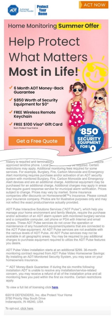
Nearing the end of the second year of the pandemic, it’s time for our annual look back on the year in email. As with the year before, many of us spent the year under at least partial lockdown. The businesses that could, continued to engage in email marketing. The ones that couldn’t…, well, the ones that couldn’t went out of business. A few companies stopped sending emails at the beginning of the situation back in 2020, only to discover that this wasn’t the right approach. When those companies started sending again, they found their deliverability had slipped (see Coming Back After Quarantine for more on this).
Looking back on this year’s mailings, one thing is readily apparent: email marketers have gotten far better at their jobs. There were far fewer mail merge and dynamic content errors this year. We’re also seeing a shift to simpler designs based on what works in email rather than what a graphic artist thinks is a good-looking composition. This is a double-edged sword, however. While it led to fewer mistakes, it also led to an increase in fairly uninteresting email designs. Most of the mailings we received this year followed the same header, hero image, text, and footer block format that you’ll find in every email template. It’s a good format, but when you see it too often your brain stops registering both the design and the content, and that’s never a good thing.
We’ll start with the gaffe heard round the world.
Testing… 1…2…3…
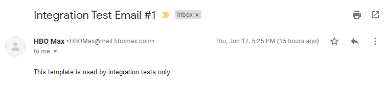
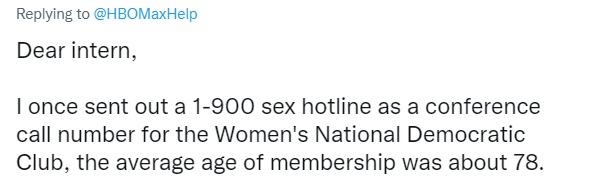
On June 17th of last year, all 44 million subscribers to HBOMax’s mailing list received the message shown above. People immediately started posting to Twitter about it. HBOMax went on Twitter to explain that it was an intern who made the mistake, promising to help the intern through it. This led to even more posts, with people defending the intern and admitting to some terrible mistakes of their own that they made while working as an intern. In one case, a person tweeted:
Proving things can always get worse.
They call me Hell. They call me Stacey.
Over the past few years, I’ve received many emails that began:
“Dear [first name]”
That has mostly gone away. Marketers now know that an attempt to be personal that fails has exactly the opposite effect. I also saw far fewer typos, which is probably a side effect of the improvements in spelling and grammar features and apps such as Grammarly.1
Now that marketers have learned the dangers of empty fields in their mail merges, some have made sure that there is always a first name to refer to in the subscriber data. This can also come at a cost. In this example, somewhere along the line, someone in the office decided that my first name was Greg (it’s not). This might be even worse than a dangling comma or a placeholder. At least there’s no confusion over whether or not the email is intended for me. Maybe there’s some guy named Greg out there wondering why he hasn’t heard from them.
Sometimes an ampersand remains an ampersand
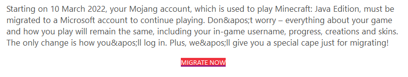
Mojang, the creators of Minecraft, have been owned by Microsoft since 2014. You’d think with a company like that behind them, you wouldn’t see these kinds of simple coding errors in the emails, and yet, here we are. “'” is a standard way to add an apostrophe in HTML, but I can’t see anyone doing that in email. More likely, the coding information got screwed up. Either way, a test send would have caught the problem.
Ma, fetch me the magnifying Glass!
I talked about this last year, but every year there are always a few people who haven’t learned that not everyone reads their emails on a desktop monitor. In fact, less that 20% of email is opened on the desktop now!2 Some graphic artists still like to design their emails like they’re pages from a magazine. Most email marketers have learned to either use media queries to make their mailings responsive or, at the very least, mobile friendly. Yet, there are a few who haven’t received the memo. It’s probably not coincidental that these examples come from sources with smaller email lists. Five years ago, this wasn’t at all uncommon, but the fact is almost everyone is reading email on their phones these days, and this type of email design is a relic of the past.
Hey! Who turned out the lights?
In 2020, there was a lot of chatter in the email marketing community about “dark mode.” A feature of many mobile devices, dark mode inverts the display, making the background black and the lettering white. This works well in most cases, but marketers who like to use unusual background and type colors could find their results turn into something strange if they’re not careful. The biggest problems occur with images, and specifically with PNG logos. Dark mode can’t invert a black logo with a transparent background, so the result is a black logo on a black background. Not exactly eye-catching.
Unsubscribe? Good luck!
One thing you never want to see when you click unsubscribe is a placeholder. This is from a Klaviyo service, but I doubt that ESP is entirely responsible, more likely someone was trying to set up their own unsubscribe page and did a poor job of it.
By far the worst offender when it comes to emails is Warby Parker. Clicking on their unsubscribe button, I received this notice:
On my laptop, this was showing up as DNS not found. On my desktop, I received the warning above. As you might imagine. Warby Parker’s emails now go to my spam folder.
Click to go…Oops!
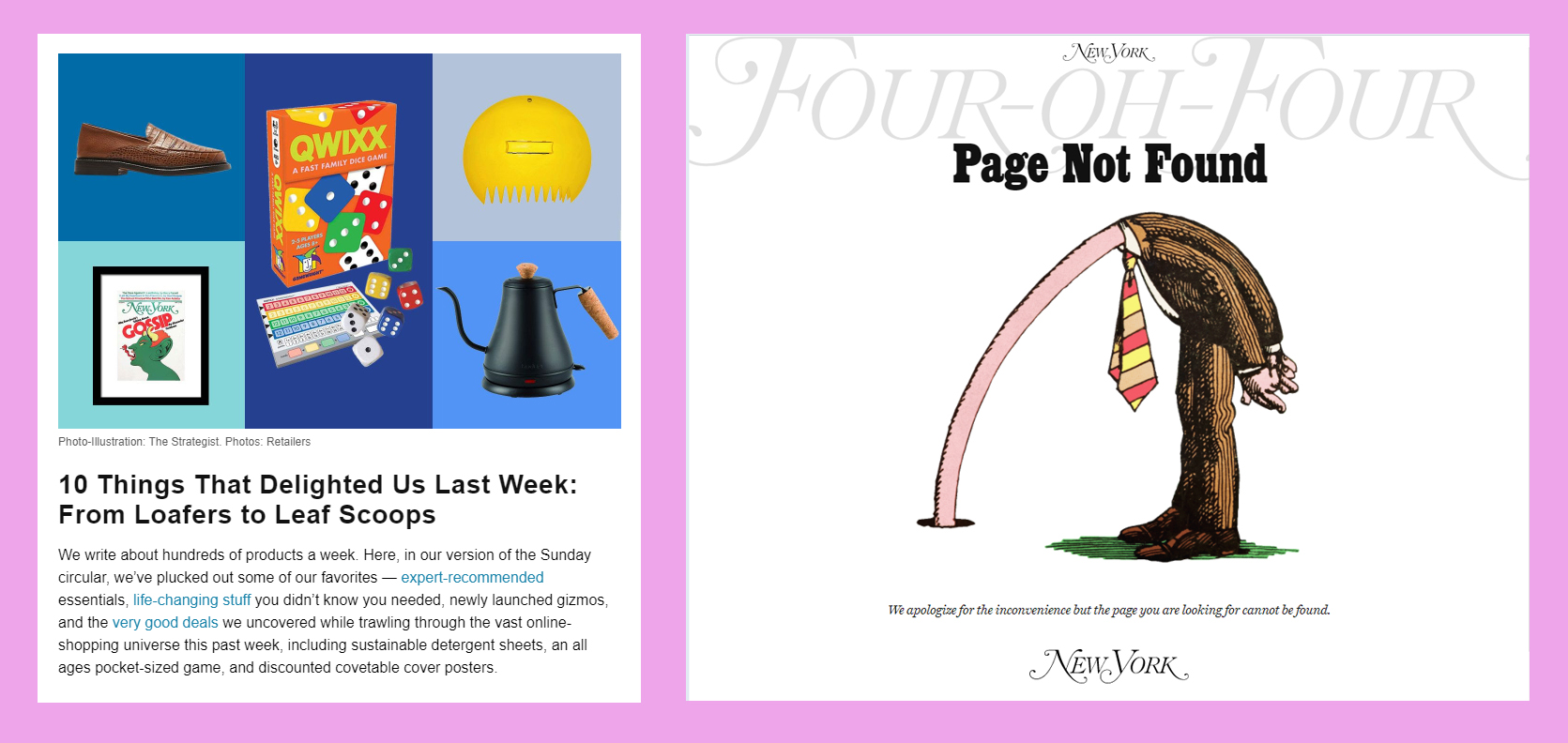
Some years, we received dozens of emails with broken or missing links. I was expecting dozens of these around the holidays—a prime time for this sort of thing when companies go into panic mode making sure their mailings get out on time—but this year there was far less of it than in the past. Of course, the thing to do is exactly what New York Magazine’s The Strategist newsletter did here, although few senders get this creative with their mistake.
You Already Said That
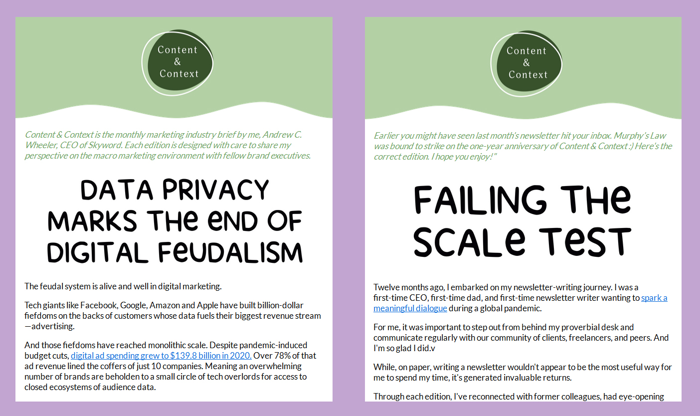
Forgetting a link is embarrassing, but how about sending out an email you already sent? I know that sometimes marketers will do this on purpose, but that’s clearly not what Skyword’s CEO Andrew Wheeler had in mind with his Content & Context newsletter. He admits it in the green subhead and the “Oops, wrong newsletter” in the subject line Fortunately, the marketing team was on the ball, and it only took a couple hours to straighten everything out.
Unclear on the Concept
There will always be spam, and if you want to see bad email formatting and grammar mistakes, you’ll find there’s no shortage of them in your spam folder. My personal favorite is when the spammer decides to send their email as a graphic (sometimes base64 encoded as well). This does get past the filter more often, and the spammers probably consider this a win, but while that email might just reach the inbox, they’ve lost the war. Any links they included are lost. By far the worst example of this I received was one that asked the recipient to cut and paste a long code number in order to deposit money into a bitcoin account. They didn’t stop to consider that you can’t cut and copy a number from a graphic (go ahead and insert your favorite Jean Luc Picard facepalm gif here).
And while we’re on the subject of spam, this one is one of my favorites:
It’s just ordinary spam, but I like the way it pretends to be about helping you avoid being a victim. Isn’t being a victim what spam is all about? It’s a bit like the used car dealer that calls himself “Honest Abe.”
That’s it for this year. If nothing else, this year’s mailings showed more people paying attention to the little things, or, at least, the use of templates has reduced the errors.
1. I’d include autocorrect here, but that feature, while good at correcting typos, sometimes leaves things unintelligible. I’d include a link here to the Damn You Autocorrect website, but it’s definitely NSFW.
2. This statistic is taken from SuperOffice’s article on the topic. Naturally, there are some discrepancies between various sources as to the actually number, but most agree that mobile device email viewing now far outstrips desktop viewing.
It’s that time again! Our annual looks back at email shenanigans. The things that worked and the things that didn’t. We look at the clever, the ill-advised and the sloppy. For our first example, we have one that is both clever and ill-conceived.
Please Read my … Email
As a rule, we don’t like to talk trash about the competition. We all make mistakes, and let he who is without sin, et cetera. Still, just to prove no one is above making mistakes, not even email marketing software providers (ESPs), here’s an example that turned up in our inbox earlier last year:
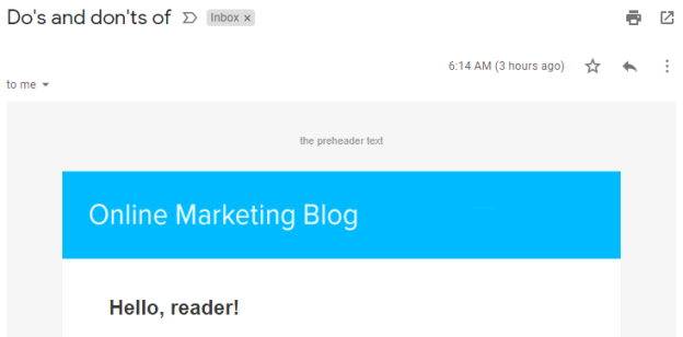
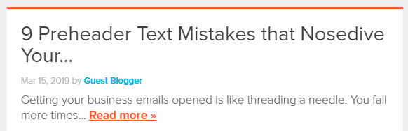
Look at the text above the blue banner. This has to be the most literal interpretation of the term “preheader text” you can get. At first glance, it might seem like it was intended as a placeholder, or maybe a novice worker was asked to “put the preheader text” at the top of the newsletter so they literally did. What they were trying to do here was a little too clever for its own good. By itself, the “Do’s and Don’ts of” subject line makes no sense, but if you receive the email in a client such as Gmail, which also displays the first text in an email, the message reads: “Do’s and Don’ts of…the preheader text.” If you click on the masthead it takes you to this:
It’s an interesting idea, but unless it’s viewed under exactly the right conditions, the concept falls apart.
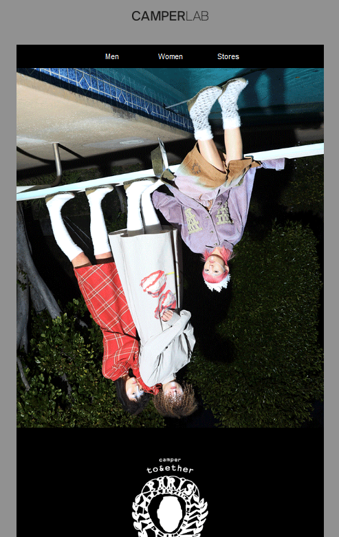
This Crazy, Upside-down World
This also may have been intentional, but, like the previous example, there is nothing in the copy to indicate it. The fact that it advertises footwear by the avant-garde fashion designer Bernhard Willhelm might have something to do with it. but from here, it looks like they simply forgot to look at the email before sending it.
A Browser is not an iPhone
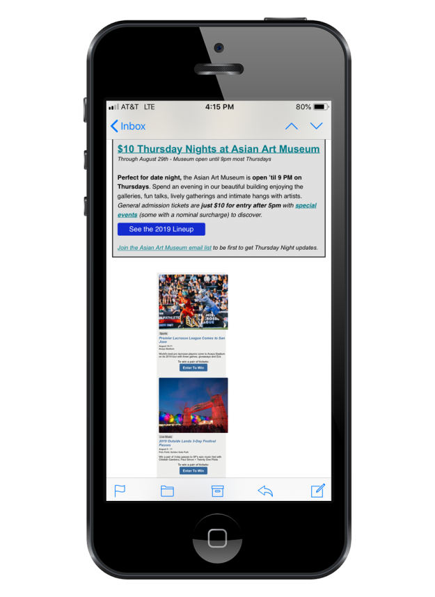
One simple way of checking the responsiveness of an email in a browser is to reduce the horizontal size of the browser window and see if the content re-positions itself for the smaller window. While this quick-and-dirty techniques works a lot of time, it can also fail. Witness the case of this mailing from FuncheapSF, a newsletter that lists free or cheap events in the Bay Area. If you check this by resizing your browser window, everything will look fine, but suddenly everything is out of whack on an iPhone.
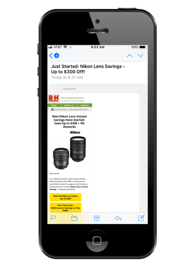
Getting the dimensions right can be tricky and should be tested before sending. B&H Photo is usually pretty good about this, but here’s one that slipped by them:
If you check this one in a browser, it functions as it should. The problem is between the media query and the max-width. You’ll only encounter it if you look at the email on an actual iPhone, or an email rendering service that can duplicate the iPhone environment accurately. Checking it on an actual phone is safer.
E for Effort
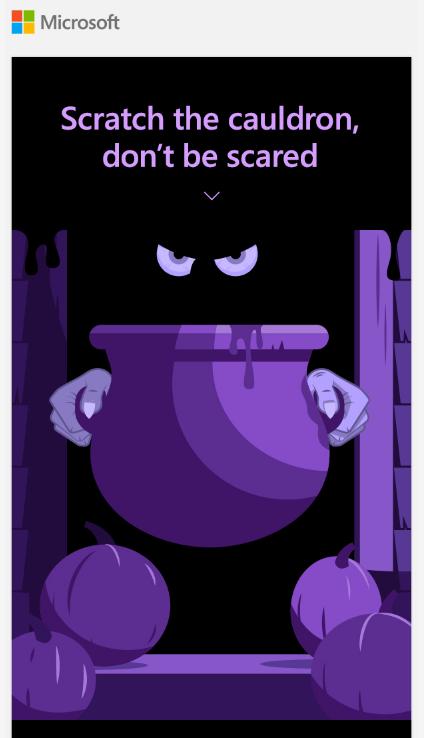
This past Halloween, Microsoft came up with a fun little email that offers a scratch-off panel that lets you use your mouse or finger to reveal a free offer. While it doesn’t work in all email clients, it offers a fall-back that will take you to a website where you can experience it outside of the email environment. Except Firefox, which takes you here: The funny thing is, when we opened the same email in other browsers, it did let us try out the scratch-off feature, but told us we didn’t win anything. At least the Firefox mistake gives us a discount.
Hurry, They’re Going Up Fast!
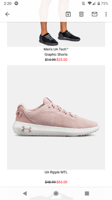
Whoever put together this email for the sports apparel and footwear store Under Armour wasn’t paying close attention. Normally the strikethrough price would be higher than the one you’re now offering (shown in red). Does anyone ever want to pay more for something that’s advertised at a lower price?
Self-Responding Email
As I’m sure you’ve noticed, emails with the same subject line and content are threaded in Gmail, so that if you and a friend are sending emails back and forth on a specific subject, these messages don’t completely takeover your inbox list. It’s a nice feature and it rarely has anything to do with email marketing since each new mailing is, as a rule, unique. A marketer might resend a message because the links were screwed up (although you don’t have to do this with Symphonie), but even then, they would normally change the subject line to let you know why they are sending you the message again. Here’s a case in point:
The content of these two emails is the same. Only the subject line and preheader have been changed, with the former subject line now appearing as the preheader.
But that’s not what’s happening with the Illyusa emails. The subject lines, and the content for these two emails is identical, and all the links seem to work in both emails. Perhaps they forgot they’d sent the message and sent it again. Or perhaps their email marketing software handles the email addresses in each segment as separate entries (a bad practice—see List Segmentation Landmines for more on this). Whatever the case, we ended up with a threaded promotional mailing.
A more extreme version of sending the same thing twice came from Forever 21, who actually pasted the same content into an email twice:
This could be something as simple as a person trying to paste finished content into their email marketing software and accidentally hitting the paste button twice. On the spectrum of email mistakes, this is minor.
Email as a Predictor of Business Honesty
At first we were confused when we opened this email. We usually read email with the images turned off at first to see how people are handling alt tags. Some email readers will put in default messages about missing images; others, such as Thunderbird, display nothing unless there’s an alt tag. Even so, if all of the images are missing, there’s usually the required fine print at the bottom to give you some idea of what you’re looking at, but not with this particular email. When we opened it, it was completely blank. After assigning it as spam, We checked out the message source and found the content consisted of two image with href links. The top image would have been acceptable, but turning the physical address and the unsub link into a graphic is always taboo. A closer examination of the email revealed that it was phony from top to bottom. A good rule of thumb: If the unsubscribe link is an image, mark it as spam.
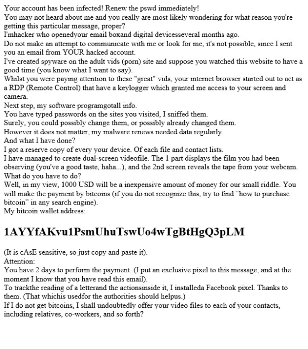
We get a lot of spam, but our favorite junk mail of the year came from this knucklehead:
It sounds so self assured. Putting aside, for the moment, the bad grammar, the fact that we don’t have a webcam attached to our computers, and that claiming an email came from our own account is not a good threat to try on someone who works in the email marketing industry, this scam is the king daddy of scam failures, Worried that spam filters would identify this for what it is, the scammer converted the entire message to a base64 encoded image! This means that even if you did want to give this bozo your money, there’s no way to copy and paste the bitcoin address per the instructions. All you’ll do is drag around the image.
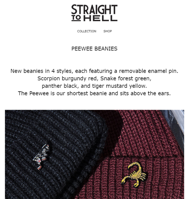
Beanie and Switch
Straight to Hell, a company specializing in hipster clothing, sent out an email advertising their new line of beanies. Most of this email was done well, with pictures of each beanie, and each image link going to that particular beanie. The only problem image was the first one, shown here. Which, when clicked, takes you to a page about their leather jackets, the subject of their previous mailing. Whenever an email has lots of links, and you’re working off an existing email there’s always a danger of this. Check every link!
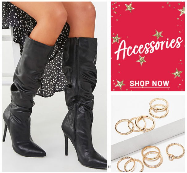
This gets back to a topic we’ve discussed in the past and will, undoubtedly discuss in the future. If you’re going to show a product, make sure the link on that item takes you to the page containing that item. Too often, we click on links to pictures of products, only to discover that the product is buried five pages deep in the display listings, but this next example is even more insidious than that:
Putting aside the fact that boots are not accessories, and ignoring the mysterious “si” that appears between the images at the bottom, clicking on the boots takes you to Forever 21’s sale section. After scrolling through all 15 pages, we never did find these boots. Oh well, they probably wouldn’t fit anyway.
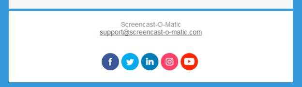
The Curse of the Template
Templates are a great way to get an email designed with a minimum of work. The only problem is that it’s also easier to miss things such as links. That’s what we suspect happened with this email from Screen-o-matic. Most of their social links work, until you get to the Instagram icon, which contains no link.
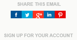
While we’re on the subject, We received an email the last week of 2019 using this social bar:
See any problems? Google shut down Google+ a year ago. Clicking on this link will get you the Google page explaining that the service no longer exists. Do all the social icons in your mailings work? Are you sure?
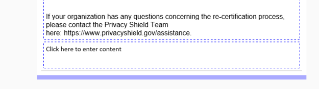
The other problem with templates is the danger of overlooking placeholders:
Whoever put this together should have noticed the empty content box at the bottom of their mailing, or, at the very least, got a second pair of eyes to look at it.
Problems of the Past
The other problem with previously-constructed emails is that if you never checked them thoroughly across all browsers and email clients, you might have issues that pop up again and again. Here is a problem that Target has had for at least a year now. In most email viewers, this email looks fine, but in Microsoft Windows’ Mail program, you get the rather confounding problem shown above. The image on the right looks fine, but the image on the left has the words “The picture can’t be displayed” appearing across the top. It seems like a strange thing to say, given that the image is actually there. Fortunately, the buttons that appear on the images make it a lot easier to trace the problem. In this case, it turns out that the folks at Target have inserted the image on the left as a background to a table cell, rather than simply place the image in the cell as was done on the right. An empty image placeholder sits inside the cell, for some reason. Since that image can’t be displayed, it results in the message over the background image. Considering that the audience for this particular type of email is the general public—the very people that are likely to use the Windows Mail program—and that the problem has existed for over a year, someone should have noticed it in the Target marketing department by now.
I Talk Real Good!
Really Good Emails is a website that offers a selection of recent emails that they think are particularly outstanding. It’s a good place to visit if you are looking for creative inspiration. Normally, their emails are well done, but this one came in a couple months ago that reads as if it was written by someone for whom English is a second—or maybe, third—language. RGE responded a couple days later with an apology that also serves as an enticement to explore their site further. Well done.
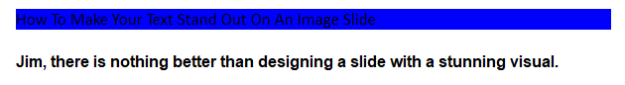
Color Theory 101
Considering the importance of good color use in every other aspect of marketing, it’s surprising how lackadaisically many marketers treat color in their mailings. The number one mistake comes from marketers who don’t bother to think about how their mailings will appear when people haven’t turned on the images. In the image above, the links are virtually impossible to read. This could have easily been remedy with a color:White (or color:#ffffff) style added to the alt text (for more on this, see The Finer Points of Styled Alt Tags).
While the absence of linked text color formatting is the number cause of unreadable text in emails, sometimes, the problem comes down to bad design:
Gold and pink are great colors for suggesting a certain pampered luxuriousness, but they don’t always go well together.
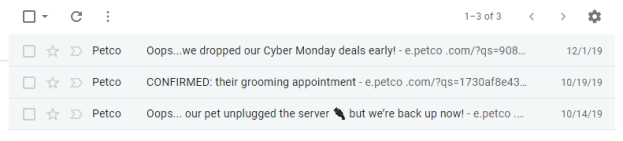
Oops…Just Kidding!
Petco isn’t exactly a fly-by-night organization, so I’m surprised to see that whoever is in charge of their email marketing thinks it’s okay to use techniques that are normally the providence of spammers. Neither of the emails with “Oops” in the subject line is an apology. They are simply promotional mailings. The email marked ‘CONFIRMED” is just an attempt to get you to use their dog grooming services. The fact that it’s all caps only furthers the suspicion that Petco’s email marketing manager comes from the world of spammers.
Click Here to See This Picture, Again!
If you’re going to add a link to an image, the best thing to do is to add a link that takes you to the page that the image references. Vinegar Syndrome did add a link, but it’s a link to the image in the email. Clicking on it just shows you the image by itself. I’m sure this one is a mistake. Remember to check your links. Fortunately, Vinegar Syndrome has provided other links in this mailing.
Dear Me
Missing names are a common mistake. They’re usually the result of using a mail merge command that requires content in the first name field. The problem is easy to avoid by using dynamic content instead. That way, if the first name field is empty, you can finish the salutation with something meaningful (e.g., “Dear Reader,” Dear Subscriber,” etc.). They also lose points for the white type in the footer on a pale pink background.
Blackboard Bold or Spam Folder Bait?
You may have received an email or two that appears to feature a unique font in the subject line and wondered “How’d they do that?” The answer is, the same way they use emojis in a subject line: by using alternative Unicode characters. Buried in Unicode are a few special characters that are virtually identical the standard alphabet except for their appearance. The most popular ones are those called the mathematical double-struck characters, sometimes referred to as “𝕓𝕝𝕒𝕔𝕜𝕓𝕠𝕒𝕣𝕕 𝕓𝕠𝕝𝕕.” There is also 𝕱𝖗𝖆𝖐𝖙𝖚𝖗 𝕭𝖔𝖑𝖉, ⓑⓤⓑⓑⓛⓔ ⓣⓔⓧⓣ, 𝒸𝓊𝓇𝓈𝒾𝓋ℯ, and many others. As fun as these things are to play with, we can’t recommend using them. They are often used by spammers to try and get their messages across without tripping the keyword searches, so there’s a higher chance that your email will end up in the junk folder with these characters. If you don’t believe it, take a look at your junk folder.
That’s it for this year. Do you have any examples of email marketing fails that you’d like to share with us? If so, let us know in the Reply box below.
Perhaps it’s because I had already spent so much time learning HTML, or perhaps it was just prejudice, but, until recently, I gave drag-and-drop email design solutions little consideration. After all, how hard is it to create a few divs and tables then add images and text? It’s not rocket science; it isn’t even Python. But after spending a few weeks using the new drag-and-drop interface in Goolara Symphonie, I’m here to say, I’m a believer.
Since its inception, Symphonie has had a visual editor to help with the creation of emails, but not a drag-and-drop template builder. As most of our customers already have HTML designers working for them, adding a drag-and-drop builder to Symphonie was never a priority.
Then, when we started testing the new interface, something surprising happened. We found it was both robust and easy to use. Sure, it’s easy to write the code for a basic HTML email, but the template builder was even faster. Best of all, the finished designs automatically include responsive media queries and those pesky conditionals so necessary for displaying your emails properly in Outlook and IE (example: <!–[if (mso)|(IE)]><table width=”100%” cellpadding=”0″ cellspacing=”0″ border=”0″><![endif]–>).
Suddenly the thought of creating an email from scratch again seemed challenging. Using the drag-and-drop interface it’s possible to create a multi-section email template (example: Logo, hero image, salutatory text, three sections with images, text, and buttons, and a footer) in a little over a minute (yes, I really did time this).
Now I’m firmly in the drag-and-drop editor camp. Even for simple emails, it is faster and easier to use. Additionally, we’ve added lots of ready-to-use templates (all included for free) to make the process even easier. We think you will enjoy the new feature as much as we have. If you want to see it in action, contact us for a demonstration.
Another year has come and gone, and although after the events of last year it seemed like the earth was about to spin off its axis, we’re still here and email is as strong as ever. It’s time once again for our annual look back at the best and worst examples of email of the past year. There are a few old favorites and a few surprises. We’ll start with that old chestnut that never seems to go away: The Bad Mail Merge.
Dear your name here,
A few years ago, faulty mail merges, like those in the example above above, were the most common mistakes we saw. Attempts to sound personal suddenly have the opposite effect, pulling back the curtain and showing that the email for what it is: a pre-written script with information inserted as needed. This particular template called for both a first name and a company name, neither of which was available. The use of dynamic content instead of a merge could have avoided this problem by given the mailing other options when information was missing. It’s never good when a company that is trying to sell you on their technological prowess can’t assemble an email correctly.
The example below is even more egregious since it purports to be aimed at a specific person. This, coupled with the formatting errors in the apparently meaningless text below the main message (see UTF-8 discussion below), sent this one on a quick trip to the Spam Folder.
While not as bad as either of the errors, another problem that cropped up in a new mailings was the repeat of my first name. Since I’m sure I never put my name in a field twice, I have to assume that the problem is somewhere in the email’s dynamic content structure.
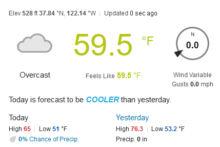
Aw Gee-Mail
Personalization can be a great way to start an email, but it has its limitations. The example above has my name, and a shout out the weather. The only problem, here’s the weather in Moraga for the day this email was sent:
Not exactly sunny. I’m not sure if the “sunshine” comment was a dynamic insert based on some erroneous weather predictor, or simply an educated guess on the part of the sender. Either way, receiving this message on the coldest, most overcast day of the summer made us chuckle.
Time’s a-Wastin’!
It seems like stores push closer and closer to Halloween when it comes to holiday sales. Kohl’s takes it one step further by announcing that you just have a few hours left for your Black Friday deals three weeks before Black Friday! From the content, it looks like this mailing was intended to be sent out on the 1st, but Black Friday threats simply won’t work in that case.
Musicians Who are Pushing
Gmail and other email clients like to give you a peek at what to expect before you open the mailing. You can use this your advantage with a preheader. Just make sure that when that preheader is abbreviated, you don’t end up with a different message. Musicbed made use of a preheader, but didn’t take into consideration what happened to the preheader when the window wasn’t big enough to fit the whole thing. They ended up with “musicians who are pushing,” instead of “musicians who are pushing the genre to new place.” Perhaps out of paranoia, Patrick James avoids the problem altogether by using a short preheader message followed by a long series of periods.
Amusingly, this particular problem isn’t limited to email. In 1998, a campaign in New York state to provide schools with pencils that featured an anti-drug message had to be pulled when kids started noticing that the more you sharpened the pencils, the more pro-drug the message became.
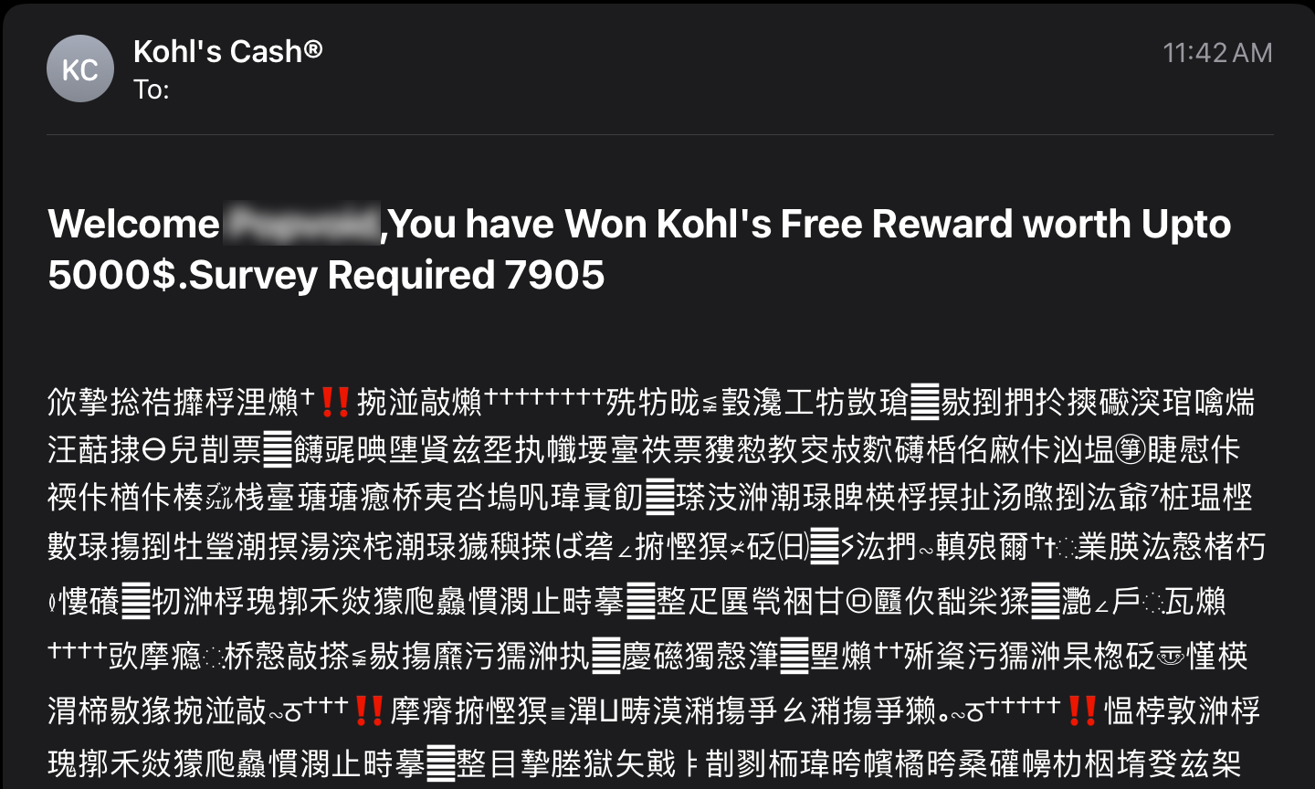
How you code your email can make the difference between a readable message and gibberish. An email written using 8-bit Unicode characters and then coded for 7-bit ASCII is going to have some problems. Some times you see this immediately in the subject lines:
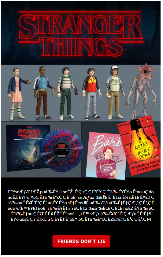
And sometimes it appears in the body copy. Normally, these snippets of code standout, and do little more than interfere with the design, but if you’ve created an email that relies directly on UTF-8 Unicode to get its idea across, you’re going to be in trouble. That’s what happened with ThinkGeek’s otherwise clever mailing:
The text below the image was supposed to be a humorous paragraph printed upside-down and backwards, as an in-joke to the Stranger Things TV show. If you look at the source code, you’ll find the original message was:
Which, when view right-side up and reversed, reads:
“We’re pretty excited for the next season of Stranger Things. (You may have noticed if you’ve visited us this month.) And we’re getting in all sorts of fun merchandise that’s just making us more excited. If you open our office freezer, you’ll find Eggos.”
Unfortunately, the email was sent without the Unicode specification required to render the sentence, turning the message into gibberish.
Email Tourette Syndrome
Sometimes you can end up with gibberish inserting itself in an email for other reasons. In the example above, it looks like the URL was accidentally and replaced with the ALT tag, leaving only the query string. In the examples below, the problem was a matter of placement of conditional comments. Conditional comments are a way to assign special instructions that only Internet Explorer will read. To everything else, they will appear as comments and won’t display. The problem is that they can sometimes show up as text depending on where they are placed in an email.
While we understand the value of conditional comments, people are beginning to migrate away from IE, in favor of better alternatives. You might want to check your subscriber base and see if you even need them anymore.
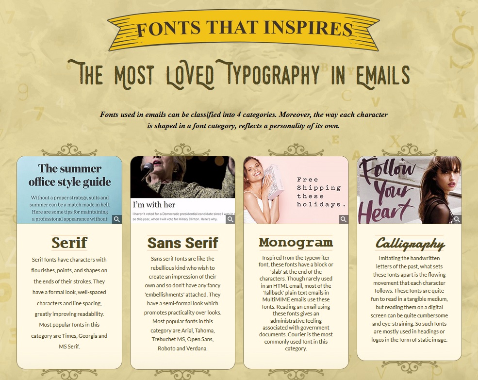
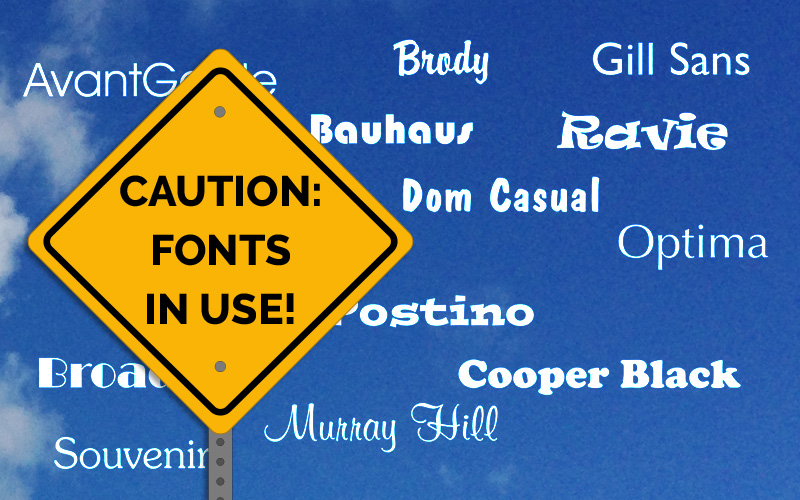
A Bad Case of Mono
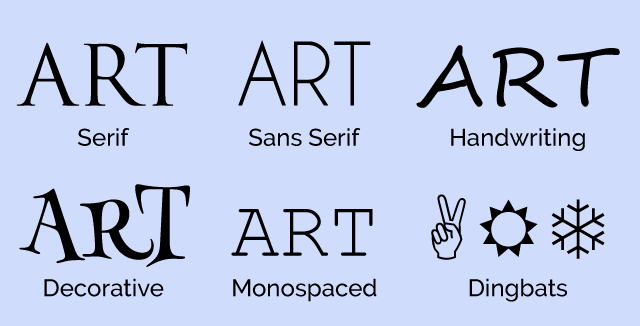
This image came in an email from the normally exceptional email marketers at Email Monks. For the moment, I’m going to ignore the grammatical error in the ribbon banner at the top and concentrate on the type categories shown. I have no problem with Serif and Sans Serif, but there’s no such type style as “Monogram.” These are monograms:
What they meant was “monospaced.” Their description doesn’t make much (if any) sense either (and one more grammatical error to boot). A monospaced font is a font in which every characters takes the same amount of space, so a lower case “i” will take as much room as an uppercase “M,” even though the two characters clearly require different amounts of space. While the fourth category (Calligraphy) is a legitimate font category, in this case I would have used the more general category of “Decorative” as the final classification (of which Calligraphic fonts are a subset).
Give Me Some Room!
This email from Tanga looks fine on a desktop computer, and even a tablet, but reduce it to iPhone size and it suddenly turns into this scrunched up mess. Looking at the code, we see that whoever designed this is much more comfortable with HTML than CSS. The content is rife with deprecated attributes and the designer has used cells with non-breaking spaces to create margins. Either this was created many years ago, or someone needs to brush up on their CSS.
As bad as this is, at least all the content still appears on the page (albeit in a very squished format). Not so for Vibes’ webinar announcement. While it will appear just fine in most email clients. Something in its code just falls apart when opened in Live Mail. We’ve discussed the problems with Live Mail in previous year-end reviews, but now that Microsoft has abandoned it, maybe the folks at Vibes didn’t think it was worth the effort to fix.
Responsible Responsive
Responsive design was all the rage a few years ago. As we discussed in Part Four of our Responsive Email Design series, if you use a standardized template, then setting up a responsive template has advantages. It will mean a little extra work at the start but will yield dividends later on. Clearly, the folks at BangGoods didn’t read that article, because this is how their mailings appear on an iPhone:
This is a perfect layout for a responsive approach. The three columns across is fine for a desktop monitor, but it is rendered almost unreadable on most phones. Media queries that realigned the three columns and enlarged them according to screen size would do a world of good here.
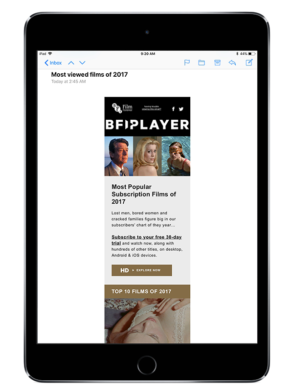
The British Film Institute (BFI) takes a different approach. They do use responsive design, but they only use one column, so the main purpose of the media query is the adjust the size of the tables based on the screen size. This works well for the iPhone:
But not so well for the iPad:
They had the right idea, but set the size change at the wrong point, leading to an unnecessarily small display on the iPad mini.
Unsubscribe? Fuggedaboutit!
Until this point, most of the mistakes we’ve listed have been embarrassing at worst, but these next two aren’t simply bad mistakes—they’re against the law. CAN-SPAM requires the ability to unsubscribe. That can be accomplished a number of ways, but the most common is with an unsubscribe link. If you put an unsubscribe link in your email, it better work. That’s not the case for Proline Tools and Longchamp. In the case of Proline Tools, clicking unsub takes you to the following page:
This suggests that the problem only was temporary, but a second attempt to click on the unsubscribe link a two weeks later yielded the same result.
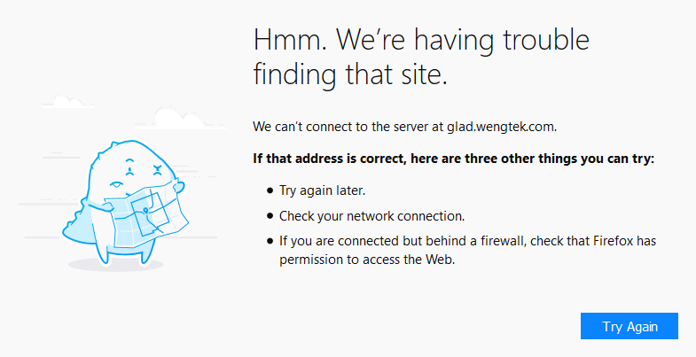
Similarly, clicking on the unsub link from Wengtek.com takes you to this page:
On the plus side, clicking on any link in the Wengtek mailing took me to this page, so this might simply be an ESP issue. Since the email purported to be from Longchamp, I would classify this one as Spam and move on.
tl;dr
A related problem occurs when you have too much text in your mailings. Some email clients, such as Gmail, will choose to cut off the message with the following notice:
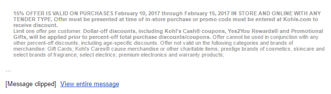
This particular email is from Kohl’s whose list of caveats and cautions could fill a book. When this happens, the unsubscribe link is not displayed. Does that mean the email is breaking the law? Probably not, but it does mean one more step to get to it. In case you’re interested, here is the entire block of legal notices at the bottom of that email (reduced for the sake of brevity):
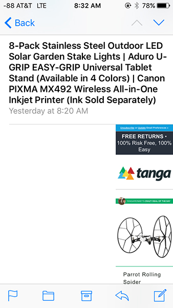
At least, in this case, the only thing missing besides the footer is a lot of legalese that no one ever reads anyway. Not so for Touch of Modern, whose email gets clipped like this:
Touch of Modern specializes in expensive products for gadget lovers and technophiles, and their emails are often a solid wall of these products. So much so, that they often get clipped for being too long. So how much is missing? When you click “View entire image,” you not only get the footer, but an additional 132 products are displayed as well. They would have been better off reducing the size of their email, concentrating on a few items each time, and using the website to present additional items.
The Good
This year we also saw some nice use of animated gifs and clever subject lines. The leader this year was EmailMonks, who offered games for Easter and Thanksgiving, an interactive Halloween mailings, and some clever videos and gifs. Where the email clients could interpret the code, the games could be played right there in the message. When that wasn’t possible the viewer was linked to the online version. The also get points for their clever use of poster gifs that do a good job of leading the viewer to the linked video (see Using HTML5 in Email: Video).
Cinemagraphs
One technique we were hoping to see more of this year was the use of cinemagraphs. These are the animated gifs that use animation sparingly to create the effect of a live video image. One company that put the technique to good use is Bourbon and Boots, who used a smoking cigar to draw the eye to the image. Subtle but effective, and it captures the essence of the company’s brand.
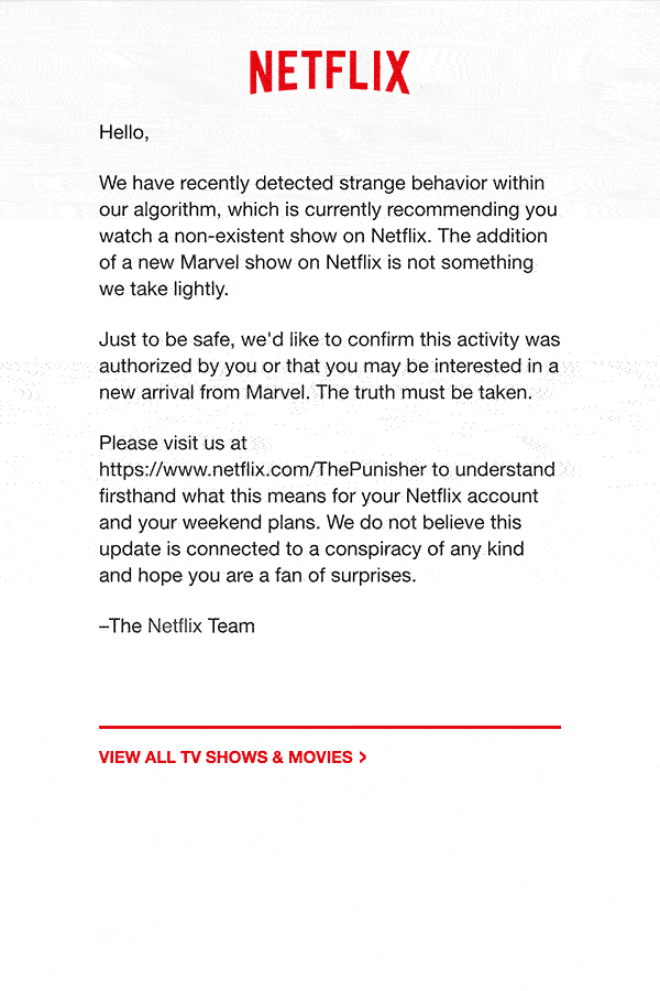
One of the cleverest uses of an animated gif came from Netflix, but they didn’t stop there. The design concept started with the subject line:
The blacked out lines and the subject matter make us slightly uneasy, but still curious. Upon opening the email, you are presented with a startling animated gif:
[Note: The original gif only goes through its animation one time, I’ve set it up to repeat to make it easier to view.]
A very clever combination of subject line and content used to create an effect.
Until Next Time
That will do it for this year. As usual, most of the errors could have easily been avoided by a little testing before sending. We were happy to that certain errors that were once very common, now only happen occasionally. Marketers are getting more email savvy and template designs are improving. As an added note, I recently heard from Jordie van Rijn from eMailMonday, who has created this pre-launch checklist you can use to make sure everything in order before you hit the send button.
By all accounts, 2016 was an extraordinarily eventful year. It saw the deaths of Fidel Castro, Muhammad Ali, David Bowie, Leonard Cohen, Carrie Fisher, George Michael, Leon Russell, Debbie Reynolds, Gene Wilder, and a whole host of others. Politically, it was the year of Brexit and a presidential election that caused the New York Times to take a hard look at their polling methodology. In sports, it was the year that the Chicago Cubs, after 108 years of losing, finally won a world series in a final game that played out like a movie script.
It was an eventful year in email too, but not necessarily in a good way. Some might argue that email—or, at least, email that wasn’t meant to be seen by the general public—helped lose the election for Hillary Clinton. August saw an organized subscription bomb attack of suspicious origin that temporarily landed several respectable news organizations on spam lists and caused Spamhaus to update their opt-in verification recommendations. In one respect, 2016 was a better than previous years. We saw fewer of the kind of clumsy design errors that we’ve seen in the past. Most of the really terrible errors came from sources that were questionable to begin with.
The Importance of Testing Across Platforms
It should go without saying that whenever you send out a message you should test it. If you are using Goolara Symphonie, or another ESP that has a preview feature built in, I’d start there. If you want to be extra careful, you can also send test mailings to several different addresses, or use the email previews available from Litmus and Email on Acid. Sometimes, a message looks fine in one email reader, but not so good in another. Here are some examples.
Aw Gee-Mail
If you’re going to have a problem displaying your email design in one provider, the provider should never be Gmail. After all, it is the most popular email reader out there, and it doesn’t cost anything to get an address, so what’s the problem? The folks at Orchard apparently didn’t learn this lesson, though. This particular email looked fine everywhere else, including the always problematic Live Mail, but completely fell apart in Gmail.
Dynamic Content Mishap
One time when you absolutely must test before sending is when you are using mail merge or dynamic content.1 The example above is an actual email, sent to us with the subject line: “Your email.” A blank space between “Hello” and the comma would have been better than this. Well constructed dynamic content instructions would have prevented this from happening.
Hide and Seek
A picture’s worth a thousand words, but this is email is pushing it. At first glance, it looks like Wired expects these images to do all the work, but look closely at the right edge of the top photo, just below the horizon. There’s a series of small dots there. A closer investigation reveals that those dots are the text hidden under each photo. This particular problem occurs in Microsoft’s recently abandoned Live Mail, and if Live Mail was the only email reader that had trouble with this mailing, I probably wouldn’t bother mentioning it. But Thunderbird also has trouble with the file, pushing the text and social links out to the right of the main table. Live Mail, at least, brings the text and social links back into the area where they belong, but then plops the photo down on top of everything. This wouldn’t matter if Wired bothered to provide meaningful alt tags, but the alt tags read: “Image for story 1,” “Image for story 2,” etc. Not exactly helpful.
A close inspection of the source code reveals the problem. Whoever put this email together did go to the trouble of using tables, but then they inserted divs into the mix. The code is also littered with ids and class tags that have no corresponding style instructions. It’s worth noting that all of the other mailings from the magazine look fine, and the ones for subscription offers include highly descriptive alt tags.
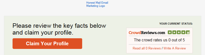
Honestly Missing Logo
That “Honest Mail Email Marketing” logo, looks suspiciously like nothing at all. A quick check of the HTML code reveals the problem:
They remembered to include the height, width, and border information. They even added alt text There’s only one thing missing: the actual source location for the image. Honestly, one test preview would have revealed this problem. There’s no excuse for it.
Code Fails
Some problems are simply the result of bad HTML. Sometimes it’s an out-and-out typo, but sometimes the problem is something subtle like including the DOCTYPE and HTML tags when you paste the email into the ESP app. Test previews and test send should catch most of these problems.
It’s Important, Procrustes
This email from Keurig suffers from a few problems. The image of the people chatting over coffee and the “Shop Today” button are obviously stretched. The designer put the correct size information in the properties for each of these images, but they forgot to add !important, so the sizing information was overridden in favor of the master table, stretching the images to match the master table’s 100% width requirement.
Knowing When to Link
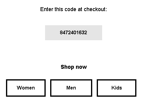
Having linking buttons is always a good idea, but knowing where to put the link is important. In this example from Camper, only the words “Women,” “Men,” and “Kids” are links. Since this text is placed in its own table, and that table has a bordered cell, it would make more sense to add the link to either the table or the cell. As it stands now, clicking anywhere inside the black border does nothing unless you click directly on the words. It’s a minor thing, but one worth remembering. Judging from the number of div tags in this email, I suspect that the author of this email is new to the form.
Button, Button, Who’s Got the Button?
Providing buttons that link to web content is never a bad idea. What is a bad idea is providing a button that is not a button at all. This email from Template Monster makes that mistake. Clicking on “Learn Now” simply brings up the image. To make matters worse, they’ve given it a blue border, further enforcing the perception that this is a link and not just an image.
Oops, I Did It Again!
Not to rag on Template Monster, but they don’t seem to have anyone checking the email before they send it. Here is the top of one of their emails:
Look at the href at the beginning of the line of code. This should link to their website, but it doesn’t. The pound sign (#) is a placer that indicates that although there is a link, it’s not going anywhere. Hover over it and it appears active, but clicking on it accomplishes nothing.
A little further down the page in the same email we get this:
The text in the orange button reads “Download You Gift.” I confess, I am always typing “you” instead of “your” so I can relate to this one, but a second pair of qualified eyes would have caught this immediately.
In the same email, every headline and image has a different link, even when they go to the same place. The headline about 20 free writing tools goes to the same page as the image next to it. I’m going to give them the benefit of the doubt on that one, and say that they did this to find out whether the images or the headlines are responsible for the most clickthroughs, but in the long run, isn’t that less important than the fact that they did click through?
That’s Code for …Code!
I love it when spammers screw up. This was already obviously a spam message without having to even open it, but upon opening you’re presented with the HTML code for the message. When putting together a mailing in your ESPs visual editor, always make sure you are in the right tab (usually marked HTML) before pasting HTML code. Otherwise this might happen to you. Of course, any decent email marketer would have previewed the mailing, but these people tend to work fast. I’m surprise this doesn’t happen more often, actually.
Shopping Links
Sometimes there’s nothing wrong with an email, until you click on one of the links. Then you suddenly find yourself staring at a page that has nothing to do with anything. Retail stores appear to be the worst offenders, which is odd since so much of their business is contingent on people getting to the right page and ordering the product they want.
I Know It’s Here Somewhere
Fab has, in the past, shown products in their mailings that aren’t on the landing page. In most cases, the products shown are available, but buried on the second or third page of the sale listings. That’s fine. Lots of companies do this, so the public is used to it. But in the email shown above, the “Cosmo Complete Set” and Captain America print don’t even show up in any of the lists. Clicking on them takes you to the a sale page, but neither product is on any of the sales pages. If you want to buy either of these items, you’ll need to enter them as search queries on the web site.
Now Go and Find Me
Normally, Bed, Bath & Beyond is one of the better companies when it comes to email marketing, they always provided meaningful alt tags, their design is easy to read on both a desktop computer and a mobile phone, and their links, in most cases, go directly to the products shown. Here is one of their rare missteps. Clicking on this product does not take you to the products, or even anywhere near the product. A clue lies in the button labeled “Find a Store”—only it’s not a button. Clicking anywhere in the image will take you to BB&B’s Find a Store page. I suppose they justify this by pointing out that the product isn’t available online, but that’s no reason that this couldn’t be included on a page with more information on the product.
Alt, Right?
I bring it up every year, but every year there are plenty of examples of companies forgetting to add alt information to the img tags. While it’s true that services such as Gmail and the iPhone display images as the default, some people still prefer to keep the images turned off. Alt tags not only impart information on what they are missing, they also can provide incentive to display images as well. Here’s an example from Warby Parker that demonstrates the worst case scenario:
Now here’s a company that knows how to do it right, Bed, Bath & Beyond:
Quite a difference. Perhaps the guys at Warby Parker assume that people will always want to display their images, a questionable assumption.
Unsubscribe Catastrophes
Unsubscribing should never be a hassle. Nobody is happy when a recipient unsubscribes, but it’s better than having that person mark your mailings as spam because they can’t figure out how else to get you to stop sending them things. Some marketers go to extraordinary lengths to making unsubscribing difficult, treading very close to the legal requirements of CAN-SPAM. A few cross over to the dark side. Here are this year’s worst offenders.
Unsubscribe? fUGGedaboutit!
CAN-SPAM has a few hard and fast rules. One of them is that you have to have an unsubscribe link. You also have to have a physical address. This email has neither. The supposed unsubscribe link takes you to the home page for the company. Not surprisingly, this email is not from an official UGG site at all, but a spammer that is trying to make their site look as legitimate as possible.
Email Purgatory
Unlike the previous email, this one is from a legitimate company (T-Mobile). This part of the email—which is commented in the HTML as “legal footer”—contains the physical address, privacy policy information, links to their various plan options, and instructions for how to ensure that email from them does not wind up in the spam folder. What it doesn’t include, however, is an unsubscribe link—an unequivocal violation of CAN-SPAM.
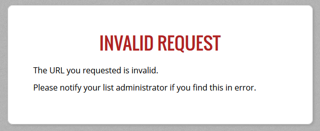
Go Ahead and Try to Unsubscribe! I Dare You!
When it comes to anti-spam laws, the USA is about the most lax, but they still require two things: A physical address and an unsubscribe link. So when I get an email like this, it makes my blood boil. Here’s what you get when you click the unsubscribe link:
As one might imagine, this one went straight to the spam folder.
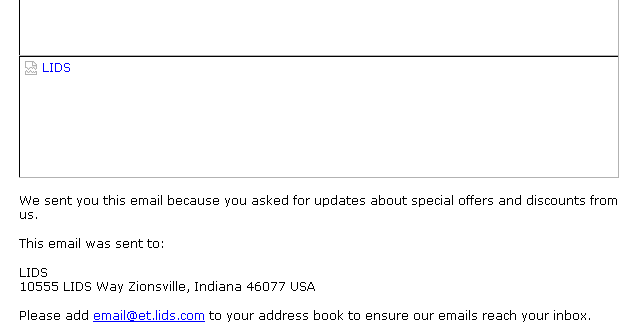
Crouching Promo and Hidden Unsub
A nearly as devious method of hiding the unsubscribe was used by Lids, a company that specializes in sports caps. Here’s the bottom of their email with the images turned off:
You can see there’s a physical address, but where’s the unsubscribe link? Now here’s the same section of the email with the images displayed:
Ah, there it is! They’ve made unsubscribe part of an image. To make matters worse, they used an image map to separate the various categories shown. I’m not sure what the thinking was here. Attempts to reach them went unanswered. Just to add insult to injury, I never signed up for this email, it was someone entering the wrong address either accidentally or on purpose.
Sure, There’s an Unsub. It’s Just Not Yours.
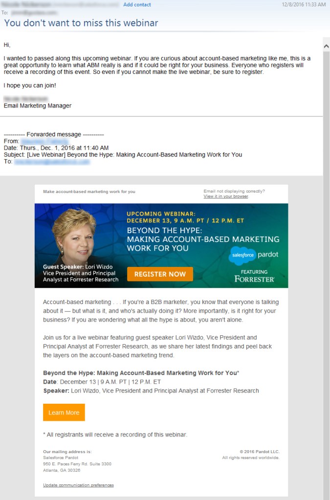
Another highly questionable approach to handling unsubscribes came from, of all companies, Salesforce:
I’ve blurred the names to save some embarrassment, but I can verify that the author of this email comes from Salesforce, promoting a webinar Salesforce has co-sponsored. Yes, there’s an unsubscribe link, but only in the forwarded content. Presumably that will only work for the original recipient, not for the person to whom the email was forwarded. This means that Salesforce, the largest SaaS-based, customer relationship management (CRM) provider on the planet, a company with its own email marketing solution, just sent me a promotional email without an unsubscribe link. It is a tactic worthy of a Viagra spammer. It doesn’t help that there’s a typo in the very first sentence. I dearly hope the author of this email is new to Salesforce.
Subject Line Fun
The subject line is the most important part of your mailing. If a subject line doesn’t provoke the recipient to open the email, then all your hard work providing good content and responsive design is for naught. Here area few subject lines that either failed miserably or worked brilliantly, or, in the case of the first example, simply overdid things.
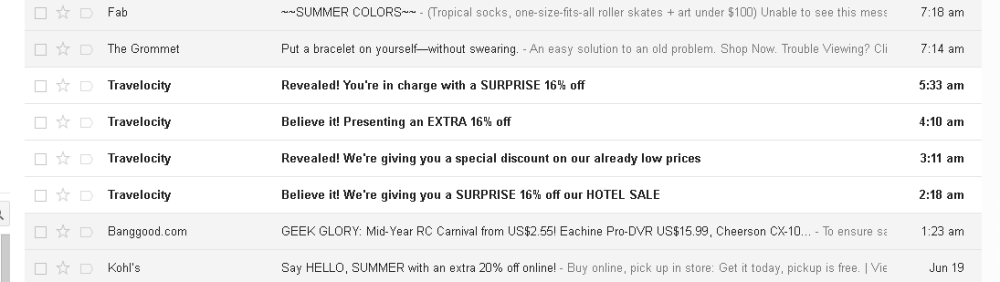
Hello, It’s Me Again
Some email marketing experts are big fans of the practice of sending high quantities of email to your recipient list. It is a topic hotly discussed on email marketing forums, and each side can back up their position with plenty of facts and figures. But even the most ardent fan of high-volume sending would agree that Travelocity is pushing it here, sending an email every hour or so from two in the morning to five. It doesn’t help that all of these were sent at times when no others were sending out email, leading to all four messages being bunched together. Perhaps that was the idea, to create a sort of billboard for Travelocity residing in the inbox.
Did I mention…?
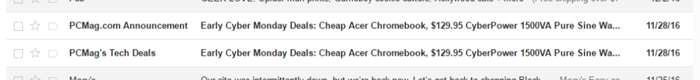
It’s not usual for companies to offer multiple newsletters. Nor is it unusual to send these newsletters out on the same day. What is unusual is the use exactly the same subject line and content on both mailings, right down to the “You are subscribed to PCMag Tech Deals as…” at the bottom of each page. Given that a normal announcement from PCMag reads “You are subscribed to PCMag Announcements as…” and is usually some sort of deal on a PCMag subscription, I’d chalk this one up to either a mistake or laziness.
I’m Either a Realtor or a Marketer
Even we email marketers make boneheaded mistakes. To their credit, the folks at EEC caught this and quickly followed up with an apology.
A Special Odaer, Ordrre, Ordeorr…Oh Forget It!
“Order” is a hard word to screw up, but whoever put this email together seems to have had a terrible time with it. They misspelled it in the subject line, and then again in the content.
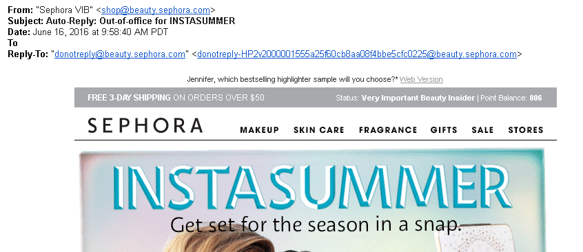
Okay, I’m not REALLY Out of the Office
I think I know what Sephora was trying to do here. This was an attempt to equate being out of the office with their summertime contest. Sending a fake out-of-office autoreply isn’t the worst misuse of a subject line, but it’s pretty sneaky and isn’t likely to endear you to anyone.
You know nothing, Jon Snow.
As a fan of Game of Thrones, I enjoyed the use of GoT references in the subject line and “friendly” from, but I’m not sure that a company that specializes in predictive marketing is the right place for this approach. This link leads to a series of videos in which they try to show the marketing lessons available in the HBO series. That is more a testament to the ability of the human brain to find patterns where none exist than any marketing subplots lurking in George R.R. Martin’s on-going saga. This kind of subject is better served on a site such as ThinkGeek, which specializes in products attached to all aspects of geekdom, from TV shows or computer games. For them, even this is acceptable:
A combination of keystrokes known as the Konami Code, a cheat that gives gamers additional powers while playing. If you’re in the real estate business, this probably isn’t a good subject line, but it works quite well for a company whose primary audience resembles the cast from The Big Bang Theory.
Location, Location, Location!
Sometimes, a subject line, by itself isn’t anything special, but where you find it makes all the differences. I found this one in my spam folder. I could say “Physician heal thyself,” but this just demonstrates what a complicated subject deliverability is.
That’s it for this year! We can’t wait to see what 2017 will bring. We predict more email address providers will follow Gmail’s lead in allowing CSS in email. On one hand, this means we can get more creative in our email designs, but on the other hand, it means more places for things to go wrong. If there is a moral to this blog post, it should be obvious by now: test, test, test. For more on the subject of how to deal with email mistakes, check out our white paper on the subject: Oops! – Handling and resolving email marketing mistakes.
1. If you’re not using dynamic content, you’re missing a real opportunity to improve your email engagement results. Jordie van Rijn explains how and why in his article, Making the most out of Dynamic Email Marketing. For more on Goolara Symphonie’s powerful dynamic content visits, visit our dynamic content page.
We all get them, especially around the holidays: those emails with little pictographs in the subject line. At Halloween, they are jack-o-lanterns and ghosts (🎃, 👻), further into winter they might be snowmen or Christmas trees (☃, 🎄). Sometimes they relate to the sender’s industry. Guitar Center, for instance, regularly uses the guitar pictograph (🎸), while Webdesigner News starts every subject line with the image of a pencil (✏). These are emojis, and have become popular tools for spicing up subject lines to make them more appealing. In this article we’ll take a look at the pros and cons of using emojis, and things to look out for when using them.
Emoji or Emoticon?
First let’s get the out of the way the inevitable question, “What is the difference between an emoji and an emoticon?” An emoticon is a facial expression created using the limited assortment of punctuation that is available in basic English text. The most well-known example is the colon and right parenthesis indicating a smiling face: :) . The alternative to basic text is Unicode, a character coding system designed to include every character in every language. In Unicode, there is an emoji for a smiling face (☺), along with a large assortment of other tiny pictographs. Unlike a smiling face created with a colon and a right parenthesis, the emoji is one character, not two. There are several emojis you can choose from to indicate various levels of mirth (😄😃😀😊😁), along with characters for nearly every other human emotion (😯😨😭😡😳).
Emojis got their start on Japanese mobile phones, where they were used to replace emoticons. Although the names sound similar, the word emoji has nothing to do with emotions. It is a combination of the Japanese words for “picture” (e – 絵) and “character” (mo-ji – 文字).Their worldwide acceptance began when Apple decided to include emojis as a feature on its iPhones in 2009. Then in 2010, hundreds of emojis were encoded and introduced in the Unicode Standard, and more are added every day. As of this writing, there are 722 emojis available with Unicode character coding. Emojis have popped up everywhere from Android phones to Gmail.
As befitting their Japanese roots, some emojis are specifically aimed at Japanese culture and leave westerners scratching their heads. Emojis for foods such and Dango (🍡) and Oden (🍢), and festivals such as Tanabata (🎋) and Tsukimi (🎑) presumably don’t see much use in America and Europe, while other symbols, such as the white flower (💮) might be used, but in an entirely different context from how it’s used in Japan (in Japan it is used to mean “well done”).
Where Are They?
Unless you are using an iPhone to write your mailings, which is highly doubtful, finding the emojis on a keyboard can be tricky. You can type in the Unicode directly, but that is a pain in the neck, and you first have to know these codes to type them. For instance, to add an airplane (✈) to your subject line, you’d need to type in U+2708 (hold down the Ctrl+Alt+Shift keys, type U, type 2708, then hit enter). It’s a lot of work for one character, and it doesn’t always work anyway. Some desktop systems have shortcuts for inserting emojis, or special pull-down menus, but these are still slow. The easiest way to add emojis that we’ve found is iEmoji.com, which lets you compose the subject line on their web page, then copy and paste it to your email marketing software. But some care should be taken when doing this, which leads us to the next point: Why do some emojis work in subject lines and others don’t?
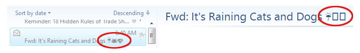
Question Marks and Empty Squares
Have you tried using emojis in your subject lines, only to have them replaced by small squares or questions marks? There are two primary causes for this. The first is that you are using a newer, unusual emoji that is not included across all systems. The country flags, for instance, do not show up in most email reader subject lines, and often not in the content either. In most email readers, the newer ability to choose the skin tones of certain emojis isn’t available, and will add blank squares or question marks to a subject line (more on this below). When using emojis in the subject line, it is safest to stick to the default emojis, which usually appear in yellow.
With a few email readers, such as Live Mail, how it displays can even depend on where it is in the software. Take this example:
All three emojis appear in the list window on the left, but not in the title window on the right. The first emoji (the umbrella) appears correctly in both areas, while the others (the cat and dog) appear as empty boxes on the right. The reason for this is because the umbrella is one of the original emojis that were introduced in 1995. As a rule, these will appear in your subject lines more often than the newer emojis will. Some of these characters, such as the smiley face (☺), musical notes (♪ ♫), and card suits (♠ ♣ ♥ ♦) were added early on, and are available as symbol characters in basic English character sets.1 Here is a list of the original 1995 emojis:
A second, and more likely cause of question marks in the subject line, is that your email is set to something other than Unicode. If the character you want to use is not available in the character set you are using, it will not appear in the subject line. Go to the settings while in your email marketing software and check the character encoding choice. If it doesn’t say “UTF-8” it’s probably not going to work in the subject line, even if it works in the content.
As a rule, it is never a good idea to use emojis to replace words in a subject line. If the emoji is replaced with a question mark, you might end up with a subject line that still makes sense, but says something you don’t want it to. For instance, if you replaced the word “love” with a heart in the subject line “You’ll ❤ our deals,” you could end up with this: “You’ll ? our ideas,” which isn’t exactly a confidence builder, and could be read as “You’ll question our deals.” In fact, a scan of various emails—and even web pages—shows that using the heart symbol to replace the word love might just be the number one gaffe. I even found the following line in an online article about emojis: “There’s a lot of ? for emoji these days….”
It is safer to put the emojis at the beginning and the ends of the subject lines, or as breaks between words. Even so, you should ask yourself: If a question mark appears instead, will it affect the subject line’s meaning?
I’m Not Mad, I’m Happy
In some cases, the emojis from one operating system are different enough from the emojis in another to cause confusion. Here, for instance is the emoji labeled “drooling face”:
Two appear happy, two appear unhappy, and the last one looks downright scared. One doesn’t even appear at all. While it is unusual for emojis to vary this much across platforms, it doesn’t hurt to check the emoji you plan to use to make sure it doesn’t change too drastically when viewed on different devices and operating systems. The easiest place to do this is at the Unicode Consortium’s Full Emoji Data page. There, you’ll find all the emojis—including a few that appear animated, such as the Gmail emojis, which sometimes cry, bounce up and down, or wink. The Unicode Consortium’s Data page also lists the date when each emoji was introduced, which can help you determine how safe it is to use that emoji. An emoji introduced in 2016 is probably not going to show up in a subject line, and might not even show up in the content.
Politically Correct Emojis
While animation is more site specific, and doesn’t affect the individual emojis, there is another recent addition to the emojis that will affect how and emoji behaves in a subject line. After people complained that the emojis of hands and faces were not ethnically inclusive enough, a feature was added whereby you can specify the gender of an emoji and its skin color. Care must be taken when using skin tones and genders as these add additional code to each emoji. For instance, the code for the left pointing finger emoji is U+1F448, while the code for the same emoji with pale skin is U+1F448+U+1F3FB. In subject lines, even if the original default emoji appears, the gender and color information will in most cases appear as empty square blocks or question marks. For this reason, it is best to stick to the basic emojis and avoid skin tones and gender additions until more mail readers are compatible with these features.
Emojis and Deliverability
As always, the most important question is: Can emojis affect the deliverability of an email? Our tests suggest that, under some circumstances, emojis do appear to have a negative effect on an email’s deliverability, but a minor one. Mailings with large quantities of emojis in the subject line and contents were more likely to end up in the spam folder, while those that used them more judiciously appeared to have no problems getting through. Obviously a subject line that is nothing but emojis is probably not a good idea. Some spam filters can identify is a subject line is nonsense, and a string of emojis looks just like gibberish. We recommend restricting the use of emojis in subject lines to no more than three, and to make sure there is actual text in the subject line as well. Keep in mind also that there may be aspects of your content that are pushing your mailings close to a negative rating, and the emojis won’t do anything to improve the situation. For for information on what to look out for, check out our white paper, Deliverability Enhanced.
As to which emojis provide the best open rates, a quick scan of the articles that discuss this shows that there is no consensus here. In all likelihood, this data changes from month to month anyway. The only meaningful answer is to see how they do in your own tests, and proceed accordingly. Like those articles that tell you which day of the week is best for sending, any article that claims to know which emoji performs best is working from a limited data set and should be taken with a grain of salt.
Test and Test Again
If you do plan to use emojis in your subject lines, our advice is, as always with any first time format experimentation, test and test again. We would also recommend paying closer attention than usual to the deliverability results in your tests. Some A/B split testing against subject lines without emojis or with different emojis isn’t a bad idea either. Emojis can be a fun way to enliven your subject lines and increase open rates, but it will still require testing with your own recipients to see if they’ll work for you.
1. It should be noted that the term “emoji” was not applied to these character, however, until Unicode version 6.0, released in 2010.
Another year has come and gone, and with it, another bagful of email catastrophes. Some of these are minor issues that could have been caught with a little more testing or another set of eyes, some are truly catastrophic, and a few problems are unique to that bane of email, Microsoft Live Mail.
Bad Links
It’s always a good idea to test your links before sending out an email, but even the best of us miss one from time to time. Here are a few we noticed this year.
You Know What I Mean!
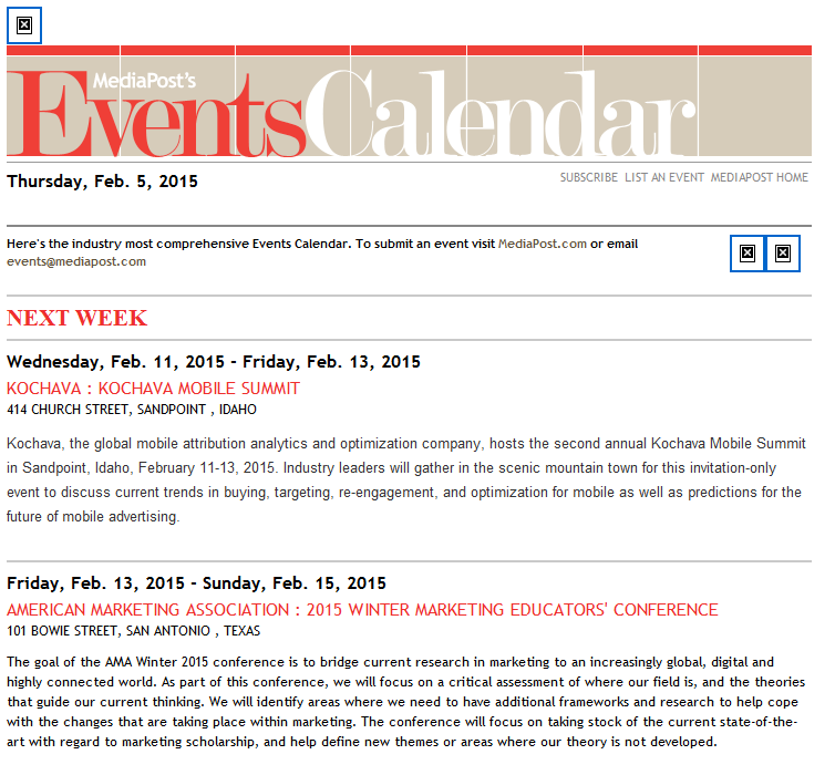
In this newsletter from last January, MediaPost created a link to the AMA conference without the all important “http://” at the beginning. While that works fine when you are entering a URL in the Address Bar, it won’t work in an href command. It doesn’t help that they’ve used base64 encoding on the message which moves us further from the link and is probably why their emails always end up in my Spam folder.
My Name is [Your Name]
I’ve talked about using placer information in previous year-end reviews. Placers are useful, but only if you don’t forget to remove them from the final mailings. In this case, the placer link “http://your.website.address.here/” was used on the image. Fortunately, there were actual links later in the message, which minimized the damage here.
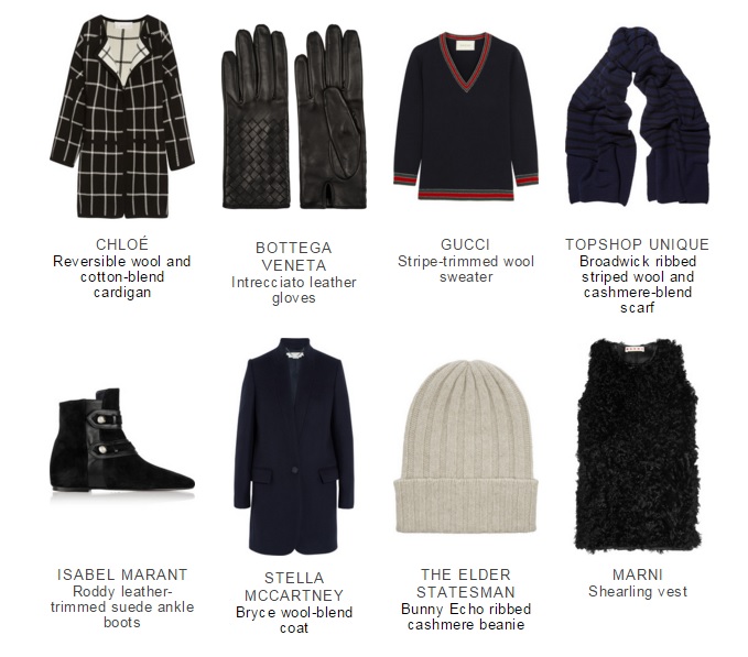
Spot the Panda
When you have several links in an email, there is always a danger that one won’t get its proper URL. Net-A-Porter does a good job of ensuring that every link goes to the item you click on, saving a lot of useless scrolling and page flipping (See last year’s Year-End Review for examples of this). But with this many unique links and more in every mailing, it was inevitable that they would miss one. In this case, it’s the Stella McCarthy coat on the bottom left, which links instead to Net-A-Porter’s emagazine.
Three Out of Nine is Not Good Odds
Getting one link wrong is forgivable. Getting six out of nine wrong is not. This email from Fab takes you to the same page no matter which of these images you click. The problem here is that six of the images are not even on the page. If you want to find them, you’ll have to search for them (they are on the site). Rule #1: Always make it easy for your customers to purchase things. Either create a landing page specifically for the items you’re showing, or link to each of them individually.
Psst! Wanna See a Picture?
This class sounds interesting, but if you click on the image it will take you to…the image. That’s right. It opens the image location. It doesn’t even take you to Sur La Table’s home page. You can eventually get there by clicking various other links on the page, but it seems like an image that says “Reserve Your Spot” should at least enable you to do just that.
Bad Formatting
Some mistakes are the result of formatting errors. One missing greater-than sign or comment tag and your entire design goes off the rails. Here are a few coding mistakes that we saw this year.
Dear First Name
This one is so common that we’re guaranteed to receive a few of these every year. Usually it is the first name that’s missing, but, as you can see from the third example, it can happen elsewhere in an email. I suspect that most of the time this comes about when someone is using a previous mailing to create a new one, and doesn’t pay attention to the merge fields and dynamic content. This is mostly just laziness. I know that Goolara Symphonie will maintain my merge data when I copy in this fashion, but I always replace it just to be on the safe side. Judging from these examples, I suspect that other ESPs are less forgiving.
MS Word + HTML = Disaster
Most people know better than to try and use Word for their HTML generator. Every once in a while, however, we get an email with the tell-tale “o:p” tag that Microsoft uses to allow you to convert the HTML back into a Word document. This email probably looked just fine in Microsoft Word, and it even looks okay in some visual editors, but it’s a disaster waiting to happen. Ironically, this particular mailing is all text and would have been easier to create directly in any ESP’s visual editor than in Word. This one will always fail in Live Mail (see section below) and often fails elsewhere as well. Here are a couple more examples:
These people would have all been better off typing their content in a plain text editor.
Bad Code Practices
Some problems are not the result of typos or inadequate testing. Some are simply bad practices. These aren’t mistakes in the strictest sense, but that doesn’t mean you shouldn’t watch out for them.
No Alts
Ever since Gmail started caching the images, we’ve seen an increase in the number of mailings that omit the alt tags. Here’s a perfect example of this from Warby Parker:
The only text in this mailing is the company’s address and a few links at the bottom. Now here’s one from Bed, Bath and Beyond where they’ve gone the extra mile to make sure that even with the images off, you know what their email is all about and have some impetus to click through:
Ya’ Got No Style!
Providing alt tags is a good practice, but if you’re using them in cells with dark backgrounds, remember to add style color information to the cell, in particular a color property such as #FFFFFF (white) and “text-decoration:none” to make sure the alt tag is readable. In the top example from the Westfield shopping center, the type is barely legible, but even that is only because it includes a link, which turns the type blue by default. The second example from TradePub.com, also includes a link, but the blue background makes it nearly impossible to read. For more information on how to create styled alt tags, see our white paper, Using Text & Images.
Formatting is for Sissies
I’ve removed the name and address information from the address above because it belongs to the competition. This email came without any formatting. No active links, no nothing. It was clearly a mistake, but there was no follow up apology; just a second mailing with completely different content twenty minutes later. Perhaps they are following that new “never say you’re sorry” attitude that is making the rounds on the Internet, or maybe they hoped no one would notice. Of course, one could point out that this email is, in fact, a violation of the CAN-SPAM act (inactive unsub link), but it’s probably moot.
Don’t Forget to Block
A perennial problem with sliced images in email is the problem of gaps. This is an easy one to prevent. The addition of “display: block” to each of the tags will go a long ways toward preventing this situation. Also watch out for things like padding and margin, which can also wreck a sliced image.
Live Mail Strikes Again
Every email reader has its own idiosyncrasies, but the one that seems to break email the most often is Live Mail. Here are some common problems—and one not so common problem—to look out for in Live Mail.
Watch Out for Links
The problem we see most often is the blue borders on images with links. Most of the time, it’s merely distracting, but in some cases, such as in the example above, it actually screws up the design. With other mail readers, putting an attribute such as “border: 0” (or “none”) in the
tag will eliminate the problem, and many of these mailings contain that instruction, but Live Mail requires this property to be put inside the tag. Put it anywhere else, and Live Mail ignores it.
Black is the New White
As discussed in last year’s email review, Live Mail does not like three-digit hex codes. You’ve assigned a background of #FFF (white)? Live Mail will treat it the same as #000 (black). Even if you have no customers using Live Mail, it’s a good idea to get into the practice of typing out the full six-digit hex codes.
Paragraph Alignment
This mailing from Duct Tape Marketing looks fine everywhere else, but open it in Live Mail and suddenly all the text is centered, including a list that appears later on the page. While this isn’t a complete catastrophe, it does make the text harder to read, which is never good. In this case, the problem comes back to the placing the style information between tags instead of inline.
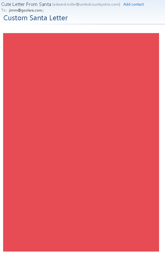
Email from a Mime
This is particularly weird phenomenon that only seems to happen in Live Mail. I received the email above shortly before Christmas. A big red block. That’s it. No text, no alt tags, and no “Show Images” link to indicate that anything was missing. Not surprisingly, it is an unsolicited email. It comes from a company that offers Santa letters for children. The email does have images (see below), but you couldn’t tell it from what I received in Live Mail. As far as Live Mail was concerned, this mailing was nothing more than a big red block. Here’s how it should have looked:
In a way, it’s probably just as well that nothing showed up. There are typos in nearly every line, they obviously didn’t bother with a test mailing, which would have showed that they used too many snowflakes (it only looks correct in Dreamweaver), and that kid is pretty obviously a stock image. This one would have ended up in this year-end review even if the images did show up.
Cascading Image Sizing
One of the weirdest anomalies We’ve encountered with Live Mail is the following one from Lionsbridge:
As a point of reference, here is the same thing sent to a Gmail address:
Quite a difference! After a bit of testing, we found that simply removing the doctype information at the top of the email’s code fixed the problem. This isn’t the first time we’ve encountered that particular issue. Our more recent tests with Live Mail show that this particular problem has been fixed. Nonetheless, as a rule, if you’re copying your code from an HTML editor, it’s a good idea to exclude the and tags from the process. The email software is going to wrap your information in those tags anyway. This doesn’t always mess things up, HTML is remarkably forgiving, but better safe than sorry. The truth is, the safest procedure for maximum compatibility is to omit everything except content between the body tags and to put inline any styles you have included, with the exceptions of the media queries and the usual boilerplate styles used to improve compatibility with various mailboxes.
Marketing Missteps
This next section is about mailings that use questionable marketing techniques to achieve their goals. Some could argue that these are effective because they get you to pay attention, but so will a car accident; that doesn’t make it a good thing.
It’s Our Special Interface!
CAN-SPAM requires that every promotional mailing includes an unsubscribe link that works, but there is nothing in the law that dictates exactly how you convey this message. This one’s from a questionable company, and would almost certainly have ended up in the spam folder had it been sent to my Gmail account, but my Live Mail account is set to accept a wider range of email. I don’t know about you, but I’d find it preferable to click “This is Spam” rather than click on that suspiciously worded unsubscribe. My advice: Stick to the tried-and-true “Click here to unsubscribe.” The unsubscribe link is no place to get clever.
About Your Account…
One of the most common techniques used by phishers is the one where they send you a notice about the way they are changing their charges on your bank account. The idea is for you to say, “Oh no!” and click the link, which takes you to a fake, but believable login page where you enter your bank login information. So it’s never a good idea when a legitimate company sends out an email that sets off the same alarm bells. Since I’ve never used PayPal with this account, the fact they sent this email to me means one of two things. Either they think I did give them a PayPal account (I did not), or they didn’t bother to segment the mailing. Both are bad, but the latter is unforgivable.
@SneakyMarketer is now following you!
Marketers are always looking for new ways to get you to look at their mailings. Sometimes they cross the line. PRWeek’s take off on Twitter’s following notices might have been okay had it been more obviously fake, and had had some truth to it. In fact, it’s just a come on to sign up for their webinar on social media.
Remember Me? No?
An insidious trend in spamming that showed up in my Inbox this year is the fake follow up. Here’s an example:
Looks legit, but a quick look at my Inbox, spam, and trash folder shows that no such original email was ever sent. This is not the first of these I’ve received, but it’s the first time that they went to the trouble of making it look like something was already sent.
Hello, It’s Me Again
Lately there’s been a lot of press about the advantages of sending more email instead of less. The folks at HubSpot must have taken this to heart, because this is what I found in my email inbox one morning:
Now I’m all for frequent mailings, but this is going a bit far. All kidding aside, I realize that this is more likely the result of their site’s automation, but it probably didn’t help things that most of these were sent during hours when many U.S. companies aren’t sending (I am surprised, however, that I didn’t get something between the eight o’clock and nine o’clock mailings).
Until Next Year
That’s all for this year. I normally like end with a few examples of good and/or clever mailing ideas, but this post is already pushing the limits of acceptable length for an online article. I’d like to thank Justin Khoo at FreshInbox for his help in diagnosing some of Live Mail’s idiosyncrasies. Keep emailing, and if there’s one takeaway from this article it’s this: Always test before sending.
A well-designed typeface is a thing of beauty. It can convey emotion, improve sales, and help define a corporate identity. For years, designers have been trying to figure how to use their favorite fonts in email, sometimes these attempts fail miserably, and other times they lead to other problems that you wouldn’t expect. Using fonts in email takes you into treacherous territory. Is it better to use inline font-family styles or convert everything to images? And what about web fonts? Can you use them in email marketing?
In this overview, we look at all the methods for using fonts in email that are available to marketers and designers. Some of these techniques qualify as best practices, while others should be avoided at all costs. A couple might even qualify as worst practices.
Before we get too deep into the subject, we’d like to point out that we’ll be using font and typeface interchangeably. In the past, “font” referred a specific size of a typeface, so Helvetica 12pt was one font and Helvetica 24pt was another. With the advent of digital publishing, these designations lost their meaning.
Types of Fonts
Fonts come in six basic types:
Serif
Serifs are those little feet that protrude from the edges of a character. Examples of this style of typeface include Century Schoolbook, Garamond, and Palatino. The most famous serif typeface is Times New Roman, which was created for the London Times by Stanley Morison. Serif typefaces are still the preferred choice for blocks of printed text. On the computer screen, they are little harder to read due to the effects of screen resolution of the serifs.
Sans Serif
If a typeface does not have those little feet, it is referred to as “sans serif.” Examples of sans serif typefaces include Franklin Gothic, Gill Sans, and Univers. The most well-known sans serif font is Helvetica, which is even the star of its own movie. The most common variation on Helvetica is Arial, which was specifically designed to match the font metrics of Helvetica. This was Microsoft’s way of getting around the license fees for Helvetica. San serif typefaces are preferred over serif typefaces for text on the computer screen. Some fonts, such as Verdana, were specifically designed for better readability on computer monitors.
Handwriting
A Handwriting font, as the name suggests, is one that resembles handwritten text. These fonts are also referred to as “Cursive” or “Script” fonts. Sometimes these are fancy, such as Park Avenue and Edwardian Script, and sometimes they are more casual, such as Comic Sans and Freestyle Script. Caution should be used with these fonts. As you’ll see when we get to the Web Fonts, cursive fonts usually default to Comic Sans, which is often a poor substitution.
Decorative
Decorative fonts are the ones that favor novelty over readability. They come in both serif and sans serif variations, and are usually restricted to logos and headlines. As a rule, they should never be used for blocks of text. Popular decorative fonts include Ad Lib, Jim Crow, Mesquite, Stencil, and Old English. They are sometimes used for logos, but, even here, are best used sparingly if at all. Because of the high level of variations between them, they should never be used in email.
Monospaced
Monospaced fonts are the ones that assign the same amount of space for each character. In a monospaced font, the ‘m’ takes the same amount of space as an ‘i’. This type of font is often used to display code, or to mimic an old typewriter. The most popular example of this is Courier. Monospaced fonts come in both serif versions, such as Courier, and sans serif versions, such as Consolas.
Dingbats
Dingbats are not fonts in the usual sense of the word, but, instead, have replaced the standard alphanumeric characters with little pictographs. In Webdings, for instance, a capital J renders a picture of an island with a palm tree, while in Wingdings it renders a smiley face. Dingbat fonts should never be used in email. You may like the idea of creating rebuses using Webdings, and it may look right on your PC; but if someone opens it on a Mac or some other system that doesn’t come with Webdings, they’ll only see gibberish.
Several pictographs are built into other typefaces as part of the Unicode (UTF-8). These are safer to use and sometimes are even used in subject lines (with ✈ and ❤ being particular favorites). Just make sure that you’ve encoded your mailing as UTF-8 and not 7-bit ASCII. Otherwise, you may end up with little squares or questions marks where the pictographs should be. It’s also important to remember that although there is some overlap in appearance between dingbat font characters and the pictographs that are available as part of the standard Unicode font set, they are not interchangeable. For example, the picture of the airplane in the middle on the left in the picture above is a capital Q in Wingdings. This one will not work in email. You need to use the airplane character as it is indicated in Unicode (you can find a handy chart of the Unicode dingbats and other special characters here).
Using a font directly
You can assign any typeface you want to your email content. Here, is an example of an inline style assigned to display in Helvetica:
Hello World
Of course, this doesn’t mean that your recipients are going to see the same thing on their computers that you see on yours. If the recipient does not have Helvetica installed in their system, they are going to see another font. As a rule, this will be Arial, but don’t count of the substitution to be automatic. By only listing one typeface in font-family style, you leave it up to the ISP, email client, or particular software to choose the alternative. This could end up being anything from Myriad Pro to Courier.
For this reason, it is always a good idea to provide a list of acceptable alternatives to the font-family style, starting with the preferred font, with the rest of the fonts following in order of preference:
Hello World
We’ve ended the list with the generic “sans-serif” as a safety measure to ensure that if none of the fonts listed are available, the text will still appear as a sans-serif font.
But what if your type absolutely has to be in a specific typeface? If it is part of your logo or associated with a specific branding campaign, you might not want the type replaced with anything else. In that case, your best bet is to convert the type to an image, but be careful—this is an overused technique that comes with some definite downsides.
Using Images for Type
At first, it seems like converting all your text to an image seems like a way to go. If you wanted to use Ad Lib for your headlines with Broadway for your text, an image would make sure that this (admittedly terrible) combination would look the same to everybody, regardless of their operating system, email client, or computer. But before you go converting all your mailings to images, there are a few important caveats to take into account.
No Text, No Inbox
First and foremost, you shouldn’t do it because it can affect deliverability. Shady email senders sometimes try and outsmart the spam filters by converting their text to an image in an attempt to elude the spam filters that check for certain words. As a consequence, many ISPs deduct points from a reputation score when they find only images in a message. This can be just enough of a negative to redirect your mailing from the Inbox to the Spam folder.
Not Text, No See
The second downside to using only images is that not all mailbox providers display images as a default. The Mail app on the iPhone does and Gmail does, but most others still default to image display off. If all your text has been converted into an image, you run the risk of missing potential sales for no better reason than that the recipient never saw your actual message.
Remember the Alt Tag
If you do plan to use an image to display text, the safest thing to do is to include the text in the image as an alt tag. That way if the recipient has image display turned off, he can still get an idea of what the picture contains. In the case of logos, you can also add styles to the alt tag to improve the email’s appearance. For more on this subject, see our white paper, Using Text and Images.
What About Web Fonts?
From time to time, people ask about using Google Web Fonts in email. If you are new to Google Web Fonts, these are fonts that you can use without having to have them installed either on your computer, or the computers of your recipients. There are other sources for web fonts, such as Adobe and Font Squirrel, but these usually require scripts, which do not work in email. Web fonts require you to add two pieces of information to your mailings—a tag with the URL for the font you want to use, and a font-family style attribute.
Web Fonts will only work when the email client recognizes the tag and can use it to download remote content (in this case, the fonts). Here’s an example of an email that was set using two Google Web Fonts—Luckiest Guy for the headline and Josefin Slab for the text. In this first example we’ve taken the HTML code provided by Google and stuck it in the mailing without further modification. Here is how the HTML it appears in a browser (in this case, Chrome) before it is sent as an email:
Now here’s the same email as it appears in various email clients and platforms:
As you can see, only the iPhone and Thunderbird rendered it correctly. Even here the fonts are only displayed when “Load Remote Images” is turned on (the default setting for the iPhone, but not for Thunderbird). Because Web Fonts require a link to work, these fonts are treated the same as images. If an email client defaults to “Images Off,” it’s not going to display Web Fonts either, even if it can. No images, no fonts.
The fact that cursive is listed as the font category for Luckiest Guy doesn’t help. It means that on PCs the headline defaults to various weights of Comic Sans, a font so detested that Weird Al Yankovic uses it as a gag in his song, “Tacky”. On Macs and iPhones, cursive defaults to Snell Roundhand which is better than Comic Sans, but is still a far cry the intended result. In the case of Live Mail, the fact that “serif” was listed as the fallback didn’t seem to matter. It still converted the text to Arial.
Of course, there’s nothing that says you have to use the HTML exactly as Google provides it. In the case of the Luckiest Guy font (and, I suspect, many others), you’d be better off ignoring their recommended category and choose one of your own. You’ll also want to add a few logical alternatives to the list. Here are the inline style settings for the headline after we’ve modified it:
There’s really nothing like Luckiest Guy that is common on computers, so I’ve chosen an assortment of bold display faces that you’ll find on many devices and platforms. Likewise, Josefin Slab is a hard one to match since slab-serifs (i.e., serifs that are squared off instead of pointed) are not that popular either. Here are the inline style settings for the body copy:
Rockwell and Clarendon are popular fonts, and although Georgia is not a slab-serif font, it is a common font and shares many characteristics with Clarendon. Here are the results:
As you can see, the results are still far from perfect, but they are better. If this level of discrepancy between fonts is acceptable to you, then you might find web fonts worth experimenting with. If your audience is made up primarily of iPhone and Mac users, it might be worthwhile. If your audience is primarily on PCs and Android phones, then it probably isn’t worth the effort.
Text Still Wins
When all is said and done, the advice we gave in Using Text to Deliver Your Message still stands: You’ll get the best results if you remain flexible on the font choices. Converting text to images where the font is important (such as logos and other branding) is acceptable, but even then, limit it as much as possible and make sure you’ve provided alt tags that are either informative or will make people want to display the images.
If the email that lands in our inboxes every day is any indication, people don’t spend enough time thinking about the effects that links have on images and text. Blue linked text on dark backgrounds, problematic borders, and unwanted underlines can all interfere with an email’s design. These are very easy fixes that should be in every email designer’s toolbox, so it’s a little puzzling why so many mailings don’t follow these simple rules.
Links on Images
In a previous article on this blog, we discussed ways to make sure your images link correctly in email. Image maps and image slicing offer ways to let portions of an image link to different pages, but that’s only part of the story. There is one more hidden pitfall in image handling that often goes overlooked. In fact, hardly a day goes by when I don’t see this particular mistake pop up in some email or another. You may think you’ve covered all your bases when it comes to linking images, but if you’re not careful, there’s one more trap waiting to trip you up.
To understand better take a look at this example:
As you can see, the last two sections of the image have links. The email viewing software saw the links and placed highlights around these sections. In this particular case, the link borders also throw off the text in the image, making it harder to read, although the text at the top and the bottom could have been—and should have been—actual text (see Using Text to Deliver Your Message), the blue line certainly makes matters worse.
The blue line doesn’t appear in all email viewers, which is why this is sometimes overlooked. If the email reader you normally use doesn’t do this, you might miss it. Unfortunately, the problem crops up most often in Microsoft email clients and mailboxes, which aren’t exactly low profile products. Sometimes it can interfere with the design in other ways. Here’s a button with rounded corners and a blue border that completely destroys the intended effect:
In this particular case, rather than create the button using the border-radius style in a colored table cell, they generated it as an image instead, so the email reader put a border on it to indicate it has a link.
The fix for this is easy, and should come almost as second nature to email designers. Let’s look at the image tag on the button:
Now here’s what’s missing in red:
border="0" />
It’s that simple. The addition of the border attribute is all it takes to eliminate this particular problem so why do so many emails still show up with blue borders? In all likelihood it’s because the sender is only checking against their default email client.
Lost in the Blue
With text, links default to blue underlined text in email. In one sense, this is usually a good thing. It wouldn’t serve much purpose to leave the text black with no underline. On the other hand, there are times when the blue color and the underscore can interfere with the design. Here’s an example of the button shown above recreated (as near I could) as a table cell instead of an image:
Borders aren’t an issue because it is no longer an image. The styles on the table cell are entered as inline styles, giving it specific text attributes and removing the underline that indicates it is a link. But here’s that same table cell, with the inline styles removed, allowing the text to revert to its default choices:
Not very useful. You can remove the underline by adding the style attribute “text-decoration: none,” but the text would still be blue. Just be careful that you haven’t assigned the text to appear in a color that is close to the default link color (which varies between browsers), email client systems aren’t smart enough to recognize the color of your text, and your links are likely to get lost.
Arranging Attributes
Browsers can be very forgiving when it comes to the order of attributes in your HTML. Email clients are not so generous. For this reason, you’ll sometimes encounter cases where a mailing looks just fine as a stand-alone web page, but then falls apart when it reaches the inbox. When this happens, you should check the order of your tags. Make sure things like yourtags are closed within their appropriate
tags, and thetags are closed within their
The email client that is the worst offender when it comes to creating this sort of havoc is, not surprisingly, Live Mail. The examples shown above come from this particular email client, and were, in some cases, okay in other email clients. As we discussed in our 2014 Year End Review, Live Mail brings its own set of idiosyncrasies to the table. Here’s an example of how a set of social buttons at the bottom of the page in an L.A. Times newsletter appeared in Live Mail:
And here is how it appeared in other email clients:
Those of you that have read the 2014 Year in Review article might guess that the black background is the result of using the three digit color code “#fff” instead of “#ffffff.” But the example above has nothing on this one from Lionbridge:
In this case, the buttons are overlapping each other, with each button appearing slightly smaller than the one to its right. Now here’s what this table looks like in every other email client:
Quite a difference! So what caused this strange cascading effect? We narrowed it down to the tag:
Normally, the tag has no effect on an email. Ironically, even this one wouldn’t have been a problem if the designer had left off the URL at the end. Then it would have worked just fine. Like the browsers, Live Mail has its own methods for dealing with the differences between HTML versions, and without the link, the software figures it out correctly. Of course, there’s really no reason to ever place a tag in an email. We recommend leaving them out. For that matter, the safest approach is to place only the styles you want for responsive purposes (which normally appear between thetags), and the actual content (which falls between thetags). Everything else serves no purpose in an email, and may actually create problems.
A Few Basic Rules
Getting links in email to appear the way you want them to is not difficult. It boils down to a few simple rules:
Always include border=0 in your tags
Use text-decoration: none to eliminate the underline on links
Assign a contrasting color on text links if the main content is blue
Place the style attributes for linked text in the tags
Eliminate superfluous code and tags, such as JavaScript and
These fixes are so easy to implement, it’s puzzling why many emails are still sent with these problems. In the grand scheme, these are relatively minor issues, but, as we have shown, little things can make a big difference.
In our last blog post, we talked about assembling an email that uses location-specific data to personalize an email. We showed how you can use content blocks to offer information for specific store locations based on the subscriber’s address. In this article we will talk about how to use geolocation in email to personalize each mailing. We won’t be discussing how to obtain address information for your subscribers. There are plenty of articles on that subject, and most of the techniques (surveys, special offers, etc.) are easy to come up with. For now, we will assume you already have this information and would like to put it to better use. For our example, we’ll be using the address locations for the recipients, to show information about the nearest store.
Finding Geolocations for Email
You may have the street addresses for your recipients, and the physical locations of your stores, but these won’t do you much good as they are. It is hard to compute anything from a street address. After all, 1945 Polaris Place, North St. Paul, MN is a lot harder to use in a formula than 45 and -93. To find the actual geolocations, you’ll need the geographic coordinates—in other words, the latitude and longitude. This may sound a bit daunting, but obtaining this information is relatively easy. There are several online sites, such as Batch Geocode and GPS Visualizer that can generate latitude and longitude numbers from street addresses automatically. Now you have the geolocation data you need for your email marketing campaign, but you still need to convert that data into nearest store location information.
More Than Maps
There are some web sites that will automatically take your store address list and your subscriber list and convert these into maps, with arrows showing the store locations. This is relatively easy to do thanks to the online map features in Google, Bing, Mapquest, and others, but there are surprisingly few sites that will give you the same information as text, and it’s text we want to enter in our subscriber database. Online maps are fine for website use, where you are free to use Javascript in your design, but email affords us no such luxury. We can create our own maps as images to insert in the email, which is exactly what we did in the previous post with the content blocks, but we’ll still need actual data that identifies which map (or content block) to display for each customer.
If you have an IT department with a programmer available, the formula for finding the nearest store locations based on each of your recipient’s location information is a simple one. For those using SQL Server or MySQL, it is easy to compute because the formulas are built into these relational database management systems. For the IT department using other methods to compute these distances, here’s a web page that lists nearly every programming language method of accomplishing this.
Using Excel
For the company with a limited number of stores and/or a minimal IT department, we’ve created an Excel spreadsheet that computes the closest store based on each customer’s geolocation information. It has an area where you enter your store latitudes and longitudes, and another where you enter the latitudes and longitudes of your recipients. These should be simple copy and paste procedures from the data you’ve already obtained using the geocoding applications. The formulas in the spreadsheet then compute the distances between the stores and the addresses, and compare them to find the closest store.
Aside from any adjustments you need to make for additional stores (our sample is set up for three), the only things you need to know are the latitudes and longitudes for your stores and your subscriber addresses. The best thing about this spreadsheet is that you don’t have to figure out the formula to use it. We’ve already entered the basic trigonometric function for finding the nearest location. You can simply plug in the values and let Excel do the rest. Computing the closest location involves several steps. We have broken these steps down in our Excel spreadsheet to make it easier to understand. Download the Excel spreadsheet here.
Once the values are computed, it’s a simple matter to import this data into a column in our original subscriber list. Now we have values we can work with. We can use this data to match the content block with the recipient, as we demonstrated in the previous post:
We can also use the data directly via mail merge or dynamic content to add individual details to the content, or the subject line (example: “Don’t miss the 40% off sale at our Stonestown store, this weekend”).
All The Data You Want
Of course, you don’t have to create a field containing the nearest store location. You can enter the geolocation data into your recipient demographics and work with it directly. With some email marketing software (such as Symphonie), you can create a custom mail merge tag that will run the mathematical logic to calculate the nearest store on-the-fly. This can be useful if you are computing many different distances, or your IT department can’t provide the resources when you need them.
Also keep in mind that it doesn’t have to be store locations. In our last post, we used similar data to compute the favorite teams for various locations. By creating separate fields for favorite teams we were able to use the data both for dynamic content purposes (example: If recipient lives in San Francisco, show the Giants image) and for merge purposes (Inserting the “favorite team” field in the email content).
Fine-tuning the Data
One thing this technique doesn’t take into account is the fact that some people don’t choose to shop at the store nearest to them. They might not like the location, or the personnel, or maybe they are using a mail drop that is located in another part of town. Gathering actual in-store data requires either a POS system that connects to membership information, or the credit card information obtained during purchases. As a rule, this isn’t that critical. Most people will understand why you showed the closest store. If someone does complain, you can always adjust their nearest store information to reflect their preference.
If you’re collecting address data as part of your email marketing effort, the best way to maximize the usefulness of that data is by adding geolocation data to the mix.