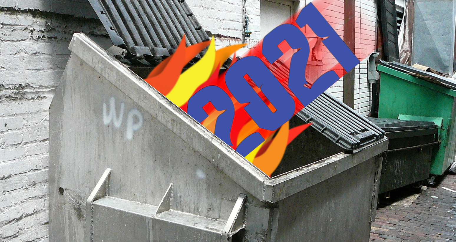
Nearing the end of the second year of the pandemic, it’s time for our annual look back on the year in email. As with the year before, many of us spent the year under at least partial lockdown. The businesses that could, continued to engage in email marketing. The ones that couldn’t…, well, the ones that couldn’t went out of business. A few companies stopped sending emails at the beginning of the situation back in 2020, only to discover that this wasn’t the right approach. When those companies started sending again, they found their deliverability had slipped (see Coming Back After Quarantine for more on this).
Looking back on this year’s mailings, one thing is readily apparent: email marketers have gotten far better at their jobs. There were far fewer mail merge and dynamic content errors this year. We’re also seeing a shift to simpler designs based on what works in email rather than what a graphic artist thinks is a good-looking composition. This is a double-edged sword, however. While it led to fewer mistakes, it also led to an increase in fairly uninteresting email designs. Most of the mailings we received this year followed the same header, hero image, text, and footer block format that you’ll find in every email template. It’s a good format, but when you see it too often your brain stops registering both the design and the content, and that’s never a good thing.
We’ll start with the gaffe heard round the world.
Testing… 1…2…3…
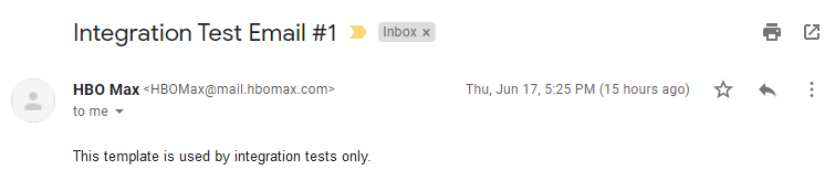
On June 17th of last year, all 44 million subscribers to HBOMax’s mailing list received the message shown above. People immediately started posting to Twitter about it. HBOMax went on Twitter to explain that it was an intern who made the mistake, promising to help the intern through it. This led to even more posts, with people defending the intern and admitting to some terrible mistakes of their own that they made while working as an intern. In one case, a person tweeted:
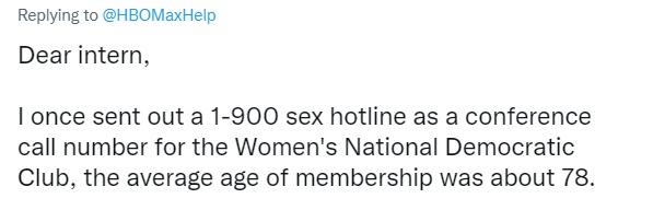
Proving things can always get worse.
They call me Hell. They call me Stacey.
Over the past few years, I’ve received many emails that began:
“Dear [first name]”
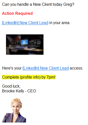
That has mostly gone away. Marketers now know that an attempt to be personal that fails has exactly the opposite effect. I also saw far fewer typos, which is probably a side effect of the improvements in spelling and grammar features and apps such as Grammarly.1
Now that marketers have learned the dangers of empty fields in their mail merges, some have made sure that there is always a first name to refer to in the subscriber data. This can also come at a cost. In this example, somewhere along the line, someone in the office decided that my first name was Greg (it’s not). This might be even worse than a dangling comma or a placeholder. At least there’s no confusion over whether or not the email is intended for me. Maybe there’s some guy named Greg out there wondering why he hasn’t heard from them.
Sometimes an ampersand remains an ampersand
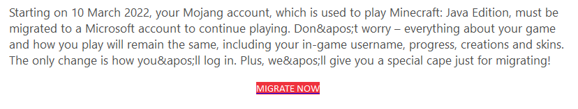
Mojang, the creators of Minecraft, have been owned by Microsoft since 2014. You’d think with a company like that behind them, you wouldn’t see these kinds of simple coding errors in the emails, and yet, here we are. “'” is a standard way to add an apostrophe in HTML, but I can’t see anyone doing that in email. More likely, the coding information got screwed up. Either way, a test send would have caught the problem.
Ma, fetch me the magnifying Glass!
I talked about this last year, but every year there are always a few people who haven’t learned that not everyone reads their emails on a desktop monitor. In fact, less that 20% of email is opened on the desktop now!2 Some graphic artists still like to design their emails like they’re pages from a magazine. Most email marketers have learned to either use media queries to make their mailings responsive or, at the very least, mobile friendly. Yet, there are a few who haven’t received the memo. It’s probably not coincidental that these examples come from sources with smaller email lists. Five years ago, this wasn’t at all uncommon, but the fact is almost everyone is reading email on their phones these days, and this type of email design is a relic of the past.
Hey! Who turned out the lights?
In 2020, there was a lot of chatter in the email marketing community about “dark mode.” A feature of many mobile devices, dark mode inverts the display, making the background black and the lettering white. This works well in most cases, but marketers who like to use unusual background and type colors could find their results turn into something strange if they’re not careful. The biggest problems occur with images, and specifically with PNG logos. Dark mode can’t invert a black logo with a transparent background, so the result is a black logo on a black background. Not exactly eye-catching.
Unsubscribe? Good luck!
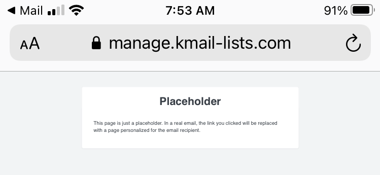
One thing you never want to see when you click unsubscribe is a placeholder. This is from a Klaviyo service, but I doubt that ESP is entirely responsible, more likely someone was trying to set up their own unsubscribe page and did a poor job of it.
By far the worst offender when it comes to emails is Warby Parker. Clicking on their unsubscribe button, I received this notice:
On my laptop, this was showing up as DNS not found. On my desktop, I received the warning above. As you might imagine. Warby Parker’s emails now go to my spam folder.
Click to go…Oops!
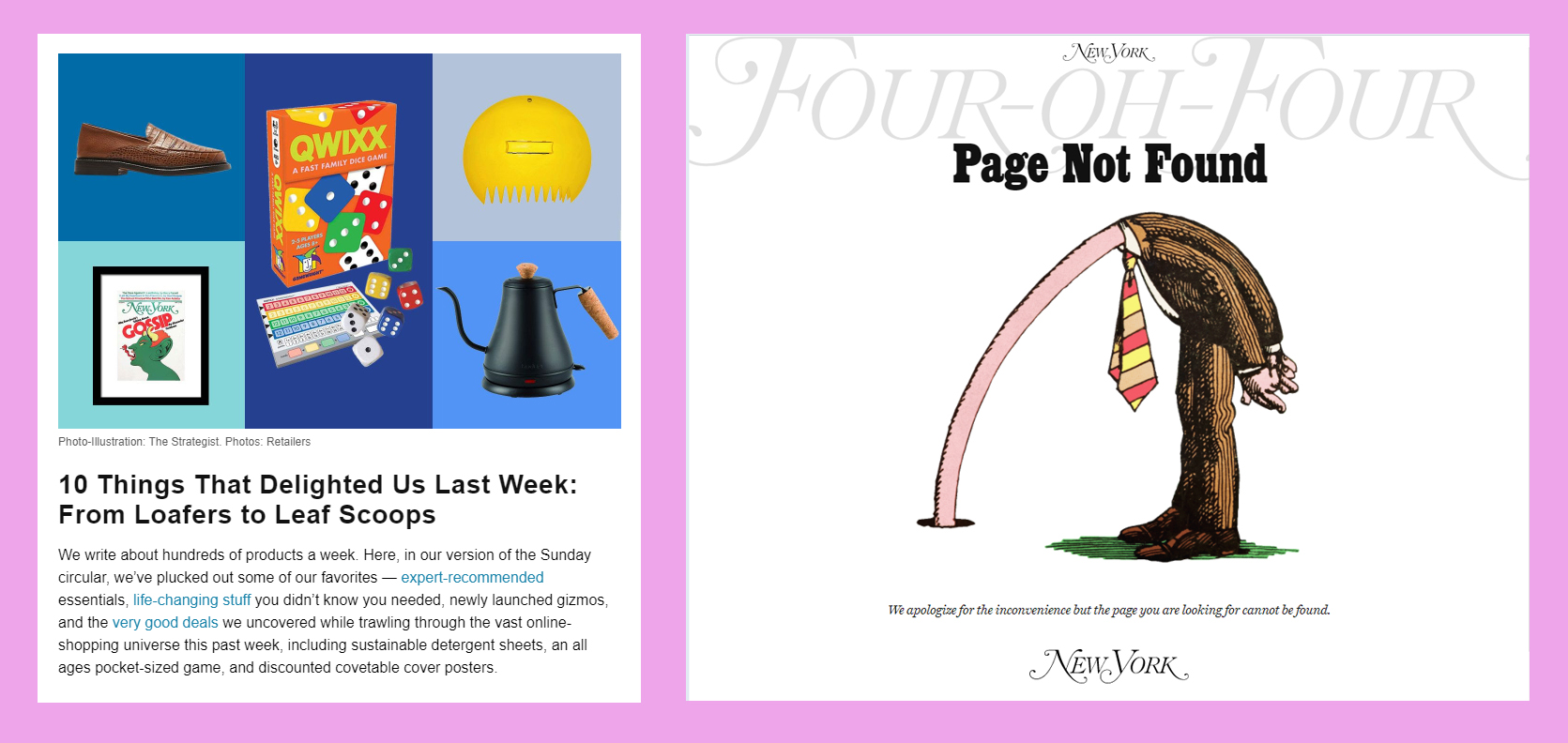
Some years, we received dozens of emails with broken or missing links. I was expecting dozens of these around the holidays—a prime time for this sort of thing when companies go into panic mode making sure their mailings get out on time—but this year there was far less of it than in the past. Of course, the thing to do is exactly what New York Magazine’s The Strategist newsletter did here, although few senders get this creative with their mistake.
You Already Said That
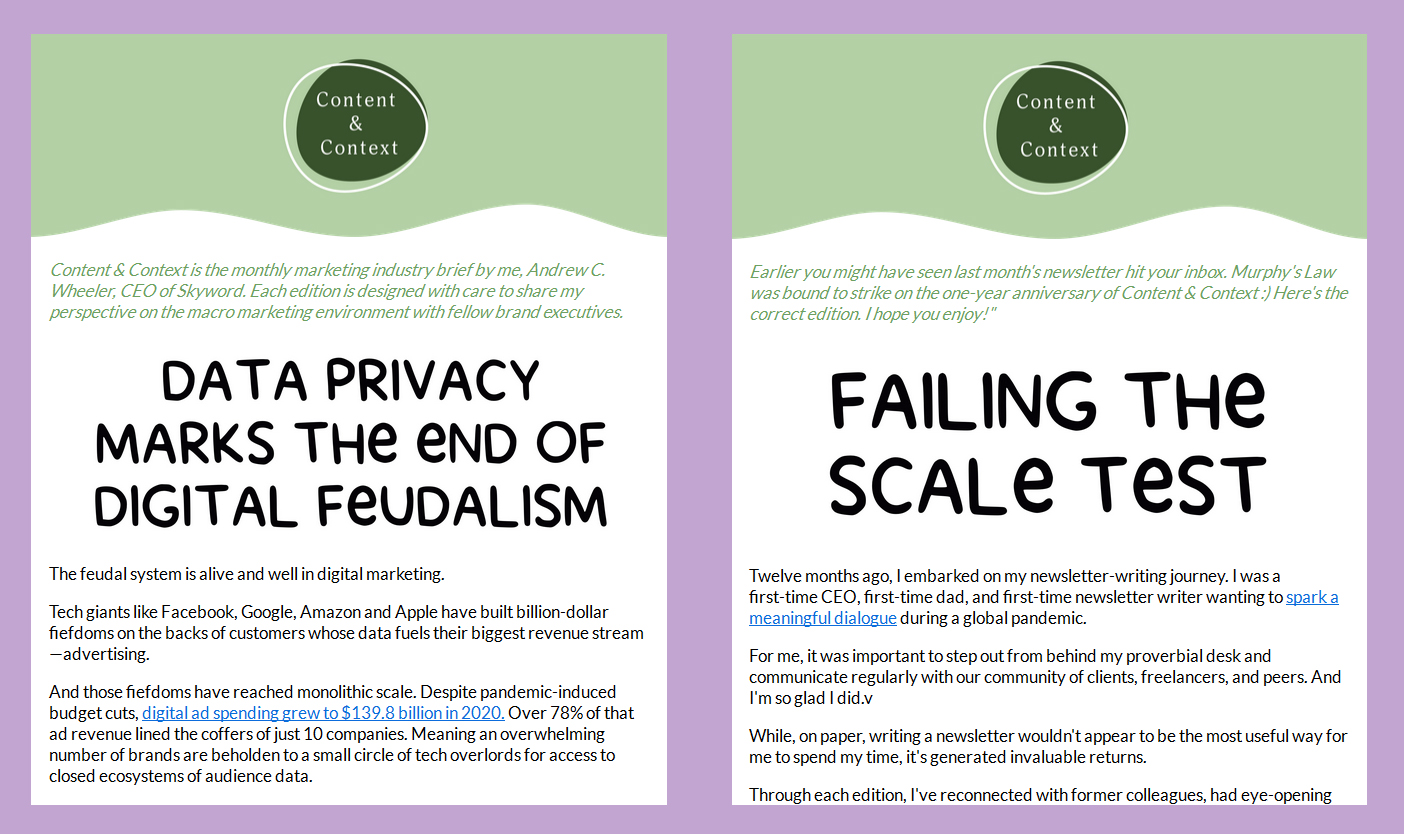
Forgetting a link is embarrassing, but how about sending out an email you already sent? I know that sometimes marketers will do this on purpose, but that’s clearly not what Skyword’s CEO Andrew Wheeler had in mind with his Content & Context newsletter. He admits it in the green subhead and the “Oops, wrong newsletter” in the subject line Fortunately, the marketing team was on the ball, and it only took a couple hours to straighten everything out.
Unclear on the Concept
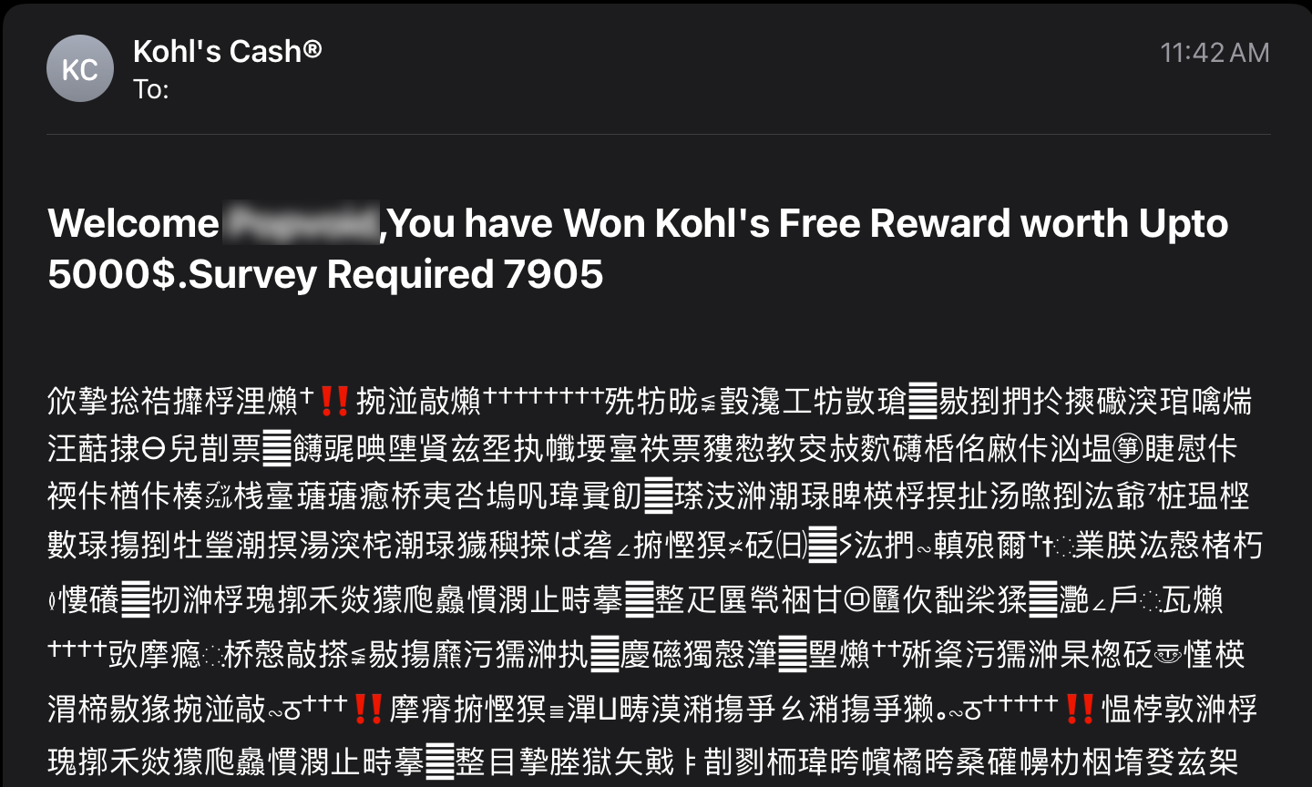
There will always be spam, and if you want to see bad email formatting and grammar mistakes, you’ll find there’s no shortage of them in your spam folder. My personal favorite is when the spammer decides to send their email as a graphic (sometimes base64 encoded as well). This does get past the filter more often, and the spammers probably consider this a win, but while that email might just reach the inbox, they’ve lost the war. Any links they included are lost. By far the worst example of this I received was one that asked the recipient to cut and paste a long code number in order to deposit money into a bitcoin account. They didn’t stop to consider that you can’t cut and copy a number from a graphic (go ahead and insert your favorite Jean Luc Picard facepalm gif here).
And while we’re on the subject of spam, this one is one of my favorites:

It’s just ordinary spam, but I like the way it pretends to be about helping you avoid being a victim. Isn’t being a victim what spam is all about? It’s a bit like the used car dealer that calls himself “Honest Abe.”
That’s it for this year. If nothing else, this year’s mailings showed more people paying attention to the little things, or, at least, the use of templates has reduced the errors.

1. I’d include autocorrect here, but that feature, while good at correcting typos, sometimes leaves things unintelligible. I’d include a link here to the Damn You Autocorrect website, but it’s definitely NSFW.
2. This statistic is taken from SuperOffice’s article on the topic. Naturally, there are some discrepancies between various sources as to the actually number, but most agree that mobile device email viewing now far outstrips desktop viewing.
© Goolara, LLC, 2022. Unauthorized use and/or duplication of this material without express and written permission from this site’s author and/or owner is strictly prohibited. Excerpts and links may be used, provided that full and clear credit is given to Goolara, LLC and the Goolara Blog with appropriate and specific directions (i.e., links) to the original content.
