By all accounts, 2016 was an extraordinarily eventful year. It saw the deaths of Fidel Castro, Muhammad Ali, David Bowie, Leonard Cohen, Carrie Fisher, George Michael, Leon Russell, Debbie Reynolds, Gene Wilder, and a whole host of others. Politically, it was the year of Brexit and a presidential election that caused the New York Times to take a hard look at their polling methodology. In sports, it was the year that the Chicago Cubs, after 108 years of losing, finally won a world series in a final game that played out like a movie script.
It was an eventful year in email too, but not necessarily in a good way. Some might argue that email—or, at least, email that wasn’t meant to be seen by the general public—helped lose the election for Hillary Clinton. August saw an organized subscription bomb attack of suspicious origin that temporarily landed several respectable news organizations on spam lists and caused Spamhaus to update their opt-in verification recommendations. In one respect, 2016 was a better than previous years. We saw fewer of the kind of clumsy design errors that we’ve seen in the past. Most of the really terrible errors came from sources that were questionable to begin with.
The Importance of Testing Across Platforms
It should go without saying that whenever you send out a message you should test it. If you are using Goolara Symphonie, or another ESP that has a preview feature built in, I’d start there. If you want to be extra careful, you can also send test mailings to several different addresses, or use the email previews available from Litmus and Email on Acid. Sometimes, a message looks fine in one email reader, but not so good in another. Here are some examples.
Aw Gee-Mail
If you’re going to have a problem displaying your email design in one provider, the provider should never be Gmail. After all, it is the most popular email reader out there, and it doesn’t cost anything to get an address, so what’s the problem? The folks at Orchard apparently didn’t learn this lesson, though. This particular email looked fine everywhere else, including the always problematic Live Mail, but completely fell apart in Gmail.
Dynamic Content Mishap
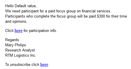
One time when you absolutely must test before sending is when you are using mail merge or dynamic content.1 The example above is an actual email, sent to us with the subject line: “Your email.” A blank space between “Hello” and the comma would have been better than this. Well constructed dynamic content instructions would have prevented this from happening.
Hide and Seek
A picture’s worth a thousand words, but this is email is pushing it. At first glance, it looks like Wired expects these images to do all the work, but look closely at the right edge of the top photo, just below the horizon. There’s a series of small dots there. A closer investigation reveals that those dots are the text hidden under each photo. This particular problem occurs in Microsoft’s recently abandoned Live Mail, and if Live Mail was the only email reader that had trouble with this mailing, I probably wouldn’t bother mentioning it. But Thunderbird also has trouble with the file, pushing the text and social links out to the right of the main table. Live Mail, at least, brings the text and social links back into the area where they belong, but then plops the photo down on top of everything. This wouldn’t matter if Wired bothered to provide meaningful alt tags, but the alt tags read: “Image for story 1,” “Image for story 2,” etc. Not exactly helpful.
A close inspection of the source code reveals the problem. Whoever put this email together did go to the trouble of using tables, but then they inserted divs into the mix. The code is also littered with ids and class tags that have no corresponding style instructions. It’s worth noting that all of the other mailings from the magazine look fine, and the ones for subscription offers include highly descriptive alt tags.
Honestly Missing Logo
That “Honest Mail Email Marketing” logo, looks suspiciously like nothing at all. A quick check of the HTML code reveals the problem:
<img src=”” alt=”Honest Mail Email Marketing Logo” width=”160″ height=”50″ border=”0″ style=”width:160px; height:50px;” />
They remembered to include the height, width, and border information. They even added alt text There’s only one thing missing: the actual source location for the image. Honestly, one test preview would have revealed this problem. There’s no excuse for it.
Code Fails
Some problems are simply the result of bad HTML. Sometimes it’s an out-and-out typo, but sometimes the problem is something subtle like including the DOCTYPE and HTML tags when you paste the email into the ESP app. Test previews and test send should catch most of these problems.
It’s Important, Procrustes
This email from Keurig suffers from a few problems. The image of the people chatting over coffee and the “Shop Today” button are obviously stretched. The designer put the correct size information in the properties for each of these images, but they forgot to add !important, so the sizing information was overridden in favor of the master table, stretching the images to match the master table’s 100% width requirement.
Knowing When to Link
Having linking buttons is always a good idea, but knowing where to put the link is important. In this example from Camper, only the words “Women,” “Men,” and “Kids” are links. Since this text is placed in its own table, and that table has a bordered cell, it would make more sense to add the link to either the table or the cell. As it stands now, clicking anywhere inside the black border does nothing unless you click directly on the words. It’s a minor thing, but one worth remembering. Judging from the number of div tags in this email, I suspect that the author of this email is new to the form.
Button, Button, Who’s Got the Button?
Providing buttons that link to web content is never a bad idea. What is a bad idea is providing a button that is not a button at all. This email from Template Monster makes that mistake. Clicking on “Learn Now” simply brings up the image. To make matters worse, they’ve given it a blue border, further enforcing the perception that this is a link and not just an image.
Oops, I Did It Again!
Not to rag on Template Monster, but they don’t seem to have anyone checking the email before they send it. Here is the top of one of their emails:
And here is the code for the logo at the top:
<a href=”#” style=”border:none;” target=”_blank”><img alt=”TemplateMonster” border=”0″ height=”40″…
Look at the href at the beginning of the line of code. This should link to their website, but it doesn’t. The pound sign (#) is a placer that indicates that although there is a link, it’s not going anywhere. Hover over it and it appears active, but clicking on it accomplishes nothing.
A little further down the page in the same email we get this:
The text in the orange button reads “Download You Gift.” I confess, I am always typing “you” instead of “your” so I can relate to this one, but a second pair of qualified eyes would have caught this immediately.
In the same email, every headline and image has a different link, even when they go to the same place. The headline about 20 free writing tools goes to the same page as the image next to it. I’m going to give them the benefit of the doubt on that one, and say that they did this to find out whether the images or the headlines are responsible for the most clickthroughs, but in the long run, isn’t that less important than the fact that they did click through?
That’s Code for …Code!
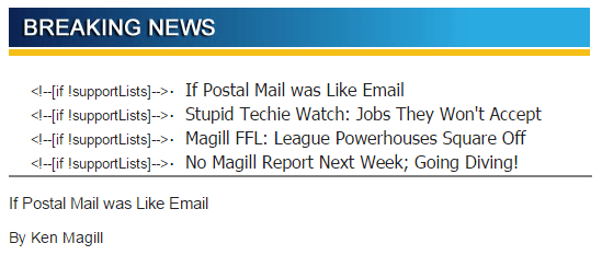
I love it when spammers screw up. This was already obviously a spam message without having to even open it, but upon opening you’re presented with the HTML code for the message. When putting together a mailing in your ESPs visual editor, always make sure you are in the right tab (usually marked HTML) before pasting HTML code. Otherwise this might happen to you. Of course, any decent email marketer would have previewed the mailing, but these people tend to work fast. I’m surprise this doesn’t happen more often, actually.
Shopping Links
Sometimes there’s nothing wrong with an email, until you click on one of the links. Then you suddenly find yourself staring at a page that has nothing to do with anything. Retail stores appear to be the worst offenders, which is odd since so much of their business is contingent on people getting to the right page and ordering the product they want.
I Know It’s Here Somewhere
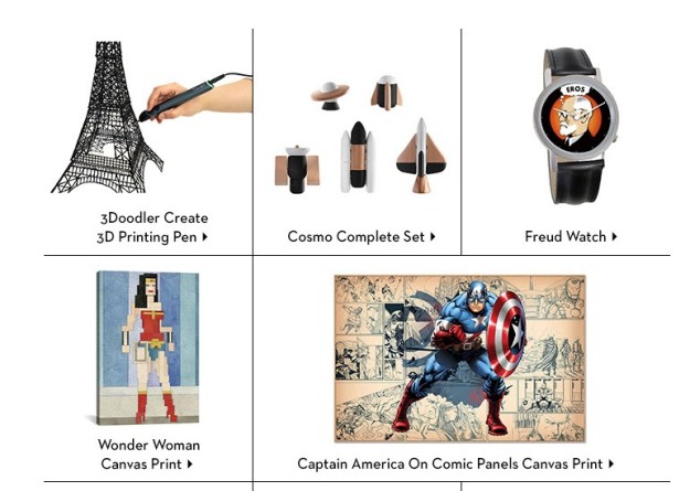
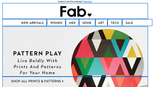
Fab has, in the past, shown products in their mailings that aren’t on the landing page. In most cases, the products shown are available, but buried on the second or third page of the sale listings. That’s fine. Lots of companies do this, so the public is used to it. But in the email shown above, the “Cosmo Complete Set” and Captain America print don’t even show up in any of the lists. Clicking on them takes you to the a sale page, but neither product is on any of the sales pages. If you want to buy either of these items, you’ll need to enter them as search queries on the web site.
Now Go and Find Me
Normally, Bed, Bath & Beyond is one of the better companies when it comes to email marketing, they always provided meaningful alt tags, their design is easy to read on both a desktop computer and a mobile phone, and their links, in most cases, go directly to the products shown. Here is one of their rare missteps. Clicking on this product does not take you to the products, or even anywhere near the product. A clue lies in the button labeled “Find a Store”—only it’s not a button. Clicking anywhere in the image will take you to BB&B’s Find a Store page. I suppose they justify this by pointing out that the product isn’t available online, but that’s no reason that this couldn’t be included on a page with more information on the product.
Alt, Right?
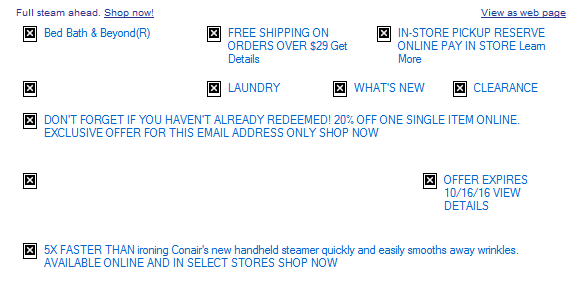
I bring it up every year, but every year there are plenty of examples of companies forgetting to add alt information to the img tags. While it’s true that services such as Gmail and the iPhone display images as the default, some people still prefer to keep the images turned off. Alt tags not only impart information on what they are missing, they also can provide incentive to display images as well. Here’s an example from Warby Parker that demonstrates the worst case scenario:
Now here’s a company that knows how to do it right, Bed, Bath & Beyond:
Quite a difference. Perhaps the guys at Warby Parker assume that people will always want to display their images, a questionable assumption.
Unsubscribe Catastrophes
Unsubscribing should never be a hassle. Nobody is happy when a recipient unsubscribes, but it’s better than having that person mark your mailings as spam because they can’t figure out how else to get you to stop sending them things. Some marketers go to extraordinary lengths to making unsubscribing difficult, treading very close to the legal requirements of CAN-SPAM. A few cross over to the dark side. Here are this year’s worst offenders.
Unsubscribe? fUGGedaboutit!
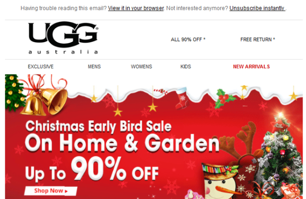
CAN-SPAM has a few hard and fast rules. One of them is that you have to have an unsubscribe link. You also have to have a physical address. This email has neither. The supposed unsubscribe link takes you to the home page for the company. Not surprisingly, this email is not from an official UGG site at all, but a spammer that is trying to make their site look as legitimate as possible.
Email Purgatory
Unlike the previous email, this one is from a legitimate company (T-Mobile). This part of the email—which is commented in the HTML as “legal footer”—contains the physical address, privacy policy information, links to their various plan options, and instructions for how to ensure that email from them does not wind up in the spam folder. What it doesn’t include, however, is an unsubscribe link—an unequivocal violation of CAN-SPAM.
Go Ahead and Try to Unsubscribe! I Dare You!
When it comes to anti-spam laws, the USA is about the most lax, but they still require two things: A physical address and an unsubscribe link. So when I get an email like this, it makes my blood boil. Here’s what you get when you click the unsubscribe link:
As one might imagine, this one went straight to the spam folder.
Crouching Promo and Hidden Unsub
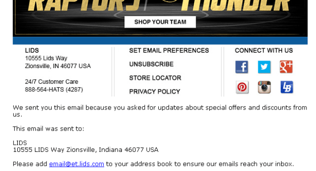
A nearly as devious method of hiding the unsubscribe was used by Lids, a company that specializes in sports caps. Here’s the bottom of their email with the images turned off:
You can see there’s a physical address, but where’s the unsubscribe link? Now here’s the same section of the email with the images displayed:
Ah, there it is! They’ve made unsubscribe part of an image. To make matters worse, they used an image map to separate the various categories shown. I’m not sure what the thinking was here. Attempts to reach them went unanswered. Just to add insult to injury, I never signed up for this email, it was someone entering the wrong address either accidentally or on purpose.
Sure, There’s an Unsub. It’s Just Not Yours.
Another highly questionable approach to handling unsubscribes came from, of all companies, Salesforce:
I’ve blurred the names to save some embarrassment, but I can verify that the author of this email comes from Salesforce, promoting a webinar Salesforce has co-sponsored. Yes, there’s an unsubscribe link, but only in the forwarded content. Presumably that will only work for the original recipient, not for the person to whom the email was forwarded. This means that Salesforce, the largest SaaS-based, customer relationship management (CRM) provider on the planet, a company with its own email marketing solution, just sent me a promotional email without an unsubscribe link. It is a tactic worthy of a Viagra spammer. It doesn’t help that there’s a typo in the very first sentence. I dearly hope the author of this email is new to Salesforce.
Subject Line Fun
The subject line is the most important part of your mailing. If a subject line doesn’t provoke the recipient to open the email, then all your hard work providing good content and responsive design is for naught. Here area few subject lines that either failed miserably or worked brilliantly, or, in the case of the first example, simply overdid things.
Hello, It’s Me Again
Some email marketing experts are big fans of the practice of sending high quantities of email to your recipient list. It is a topic hotly discussed on email marketing forums, and each side can back up their position with plenty of facts and figures. But even the most ardent fan of high-volume sending would agree that Travelocity is pushing it here, sending an email every hour or so from two in the morning to five. It doesn’t help that all of these were sent at times when no others were sending out email, leading to all four messages being bunched together. Perhaps that was the idea, to create a sort of billboard for Travelocity residing in the inbox.
Did I mention…?
It’s not usual for companies to offer multiple newsletters. Nor is it unusual to send these newsletters out on the same day. What is unusual is the use exactly the same subject line and content on both mailings, right down to the “You are subscribed to PCMag Tech Deals as…” at the bottom of each page. Given that a normal announcement from PCMag reads “You are subscribed to PCMag Announcements as…” and is usually some sort of deal on a PCMag subscription, I’d chalk this one up to either a mistake or laziness.
I’m Either a Realtor or a Marketer
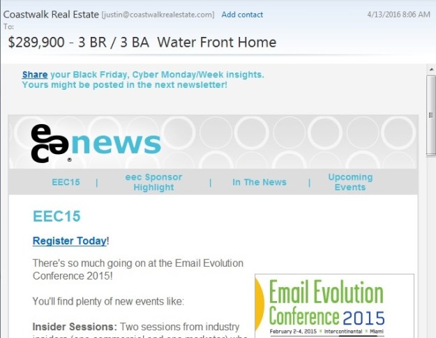
Even we email marketers make boneheaded mistakes. To their credit, the folks at EEC caught this and quickly followed up with an apology.
A Special Odaer, Ordrre, Ordeorr…Oh Forget It!
“Order” is a hard word to screw up, but whoever put this email together seems to have had a terrible time with it. They misspelled it in the subject line, and then again in the content.
Okay, I’m not REALLY Out of the Office
I think I know what Sephora was trying to do here. This was an attempt to equate being out of the office with their summertime contest. Sending a fake out-of-office autoreply isn’t the worst misuse of a subject line, but it’s pretty sneaky and isn’t likely to endear you to anyone.
You know nothing, Jon Snow.
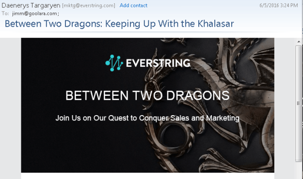
As a fan of Game of Thrones, I enjoyed the use of GoT references in the subject line and “friendly” from, but I’m not sure that a company that specializes in predictive marketing is the right place for this approach. This link leads to a series of videos in which they try to show the marketing lessons available in the HBO series. That is more a testament to the ability of the human brain to find patterns where none exist than any marketing subplots lurking in George R.R. Martin’s on-going saga. This kind of subject is better served on a site such as ThinkGeek, which specializes in products attached to all aspects of geekdom, from TV shows or computer games. For them, even this is acceptable:
A combination of keystrokes known as the Konami Code, a cheat that gives gamers additional powers while playing. If you’re in the real estate business, this probably isn’t a good subject line, but it works quite well for a company whose primary audience resembles the cast from The Big Bang Theory.
Location, Location, Location!
Sometimes, a subject line, by itself isn’t anything special, but where you find it makes all the differences. I found this one in my spam folder. I could say “Physician heal thyself,” but this just demonstrates what a complicated subject deliverability is.
That’s it for this year! We can’t wait to see what 2017 will bring. We predict more email address providers will follow Gmail’s lead in allowing CSS in email. On one hand, this means we can get more creative in our email designs, but on the other hand, it means more places for things to go wrong. If there is a moral to this blog post, it should be obvious by now: test, test, test. For more on the subject of how to deal with email mistakes, check out our white paper on the subject: Oops! – Handling and resolving email marketing mistakes.
1. If you’re not using dynamic content, you’re missing a real opportunity to improve your email engagement results. Jordie van Rijn explains how and why in his article, Making the most out of Dynamic Email Marketing. For more on Goolara Symphonie’s powerful dynamic content visits, visit our dynamic content page.

