It’s that time again! Our annual looks back at email shenanigans. The things that worked and the things that didn’t. We look at the clever, the ill-advised and the sloppy. For our first example, we have one that is both clever and ill-conceived.
Please Read my … Email
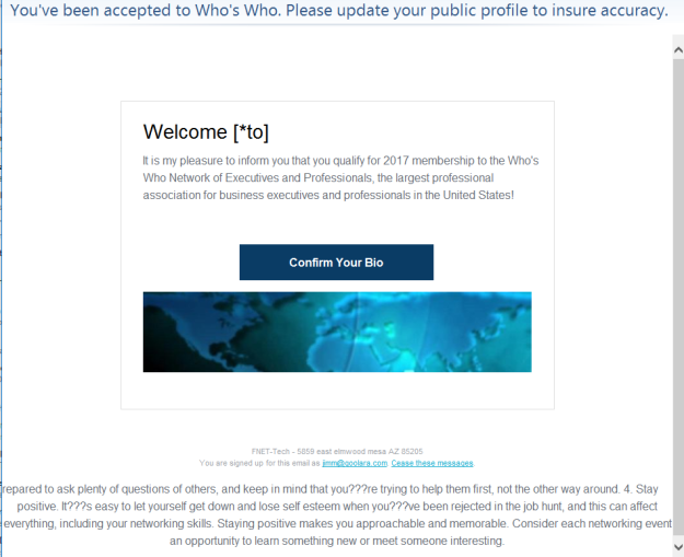
As a rule, we don’t like to talk trash about the competition. We all make mistakes, and let he who is without sin, et cetera. Still, just to prove no one is above making mistakes, not even email marketing software providers (ESPs), here’s an example that turned up in our inbox earlier last year:
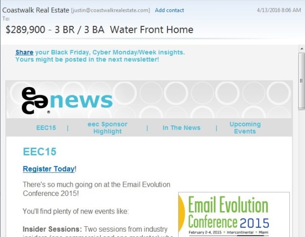
 Look at the text above the blue banner. This has to be the most literal interpretation of the term “preheader text” you can get. At first glance, it might seem like it was intended as a placeholder, or maybe a novice worker was asked to “put the preheader text” at the top of the newsletter so they literally did. What they were trying to do here was a little too clever for its own good. By itself, the “Do’s and Don’ts of” subject line makes no sense, but if you receive the email in a client such as Gmail, which also displays the first text in an email, the message reads: “Do’s and Don’ts of…the preheader text.” If you click on the masthead it takes you to this:
 It’s an interesting idea, but unless it’s viewed under exactly the right conditions, the concept falls apart.
This Crazy, Upside-down World
 This also may have been intentional, but, like the previous example, there is nothing in the copy to indicate it. The fact that it advertises footwear by the avant-garde fashion designer Bernhard Willhelm might have something to do with it. but from here, it looks like they simply forgot to look at the email before sending it.
A Browser is not an iPhone
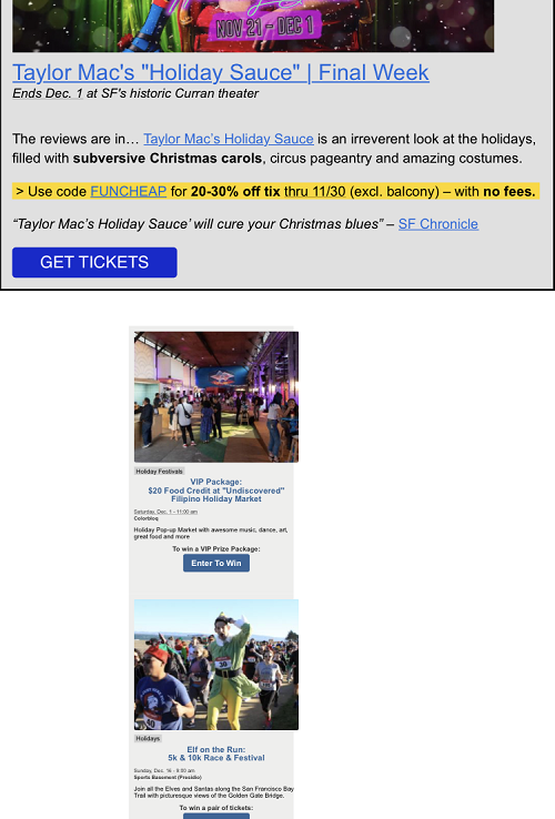
 One simple way of checking the responsiveness of an email in a browser is to reduce the horizontal size of the browser window and see if the content re-positions itself for the smaller window. While this quick-and-dirty techniques works a lot of time, it can also fail. Witness the case of this mailing from FuncheapSF, a newsletter that lists free or cheap events in the Bay Area. If you check this by resizing your browser window, everything will look fine, but suddenly everything is out of whack on an iPhone.
Getting the dimensions right can be tricky and should be tested before sending. B&H Photo is usually pretty good about this, but here’s one that slipped by them:
 If you check this one in a browser, it functions as it should. The problem is between the media query and the max-width. You’ll only encounter it if you look at the email on an actual iPhone, or an email rendering service that can duplicate the iPhone environment accurately. Checking it on an actual phone is safer.
E for Effort
 This past Halloween, Microsoft came up with a fun little email that offers a scratch-off panel that lets you use your mouse or finger to reveal a free offer. While it doesn’t work in all email clients, it offers a fall-back that will take you to a website where you can experience it outside of the email environment. Except Firefox, which takes you here:
 The funny thing is, when we opened the same email in other browsers, it did let us try out the scratch-off feature, but told us we didn’t win anything. At least the Firefox mistake gives us a discount.
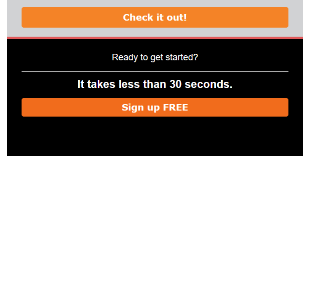
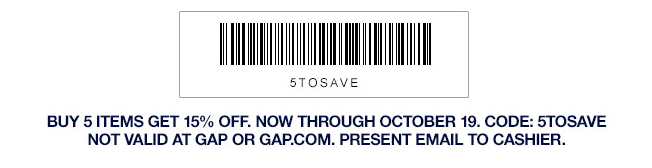
Hurry, They’re Going Up Fast!
 Whoever put together this email for the sports apparel and footwear store Under Armour wasn’t paying close attention. Normally the strikethrough price would be higher than the one you’re now offering (shown in red). Does anyone ever want to pay more for something that’s advertised at a lower price?
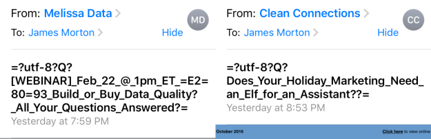
Self-Responding Email
![]() As I’m sure you’ve noticed, emails with the same subject line and content are threaded in Gmail, so that if you and a friend are sending emails back and forth on a specific subject, these messages don’t completely takeover your inbox list. It’s a nice feature and it rarely has anything to do with email marketing since each new mailing is, as a rule, unique. A marketer might resend a message because the links were screwed up (although you don’t have to do this with Symphonie), but even then, they would normally change the subject line to let you know why they are sending you the message again. Here’s a case in point:
As I’m sure you’ve noticed, emails with the same subject line and content are threaded in Gmail, so that if you and a friend are sending emails back and forth on a specific subject, these messages don’t completely takeover your inbox list. It’s a nice feature and it rarely has anything to do with email marketing since each new mailing is, as a rule, unique. A marketer might resend a message because the links were screwed up (although you don’t have to do this with Symphonie), but even then, they would normally change the subject line to let you know why they are sending you the message again. Here’s a case in point:
 The content of these two emails is the same. Only the subject line and preheader have been changed, with the former subject line now appearing as the preheader.
But that’s not what’s happening with the Illyusa emails. The subject lines, and the content for these two emails is identical, and all the links seem to work in both emails. Perhaps they forgot they’d sent the message and sent it again. Or perhaps their email marketing software handles the email addresses in each segment as separate entries (a bad practice—see List Segmentation Landmines for more on this). Whatever the case, we ended up with a threaded promotional mailing.
A more extreme version of sending the same thing twice came from Forever 21, who actually pasted the same content into an email twice:
 This could be something as simple as a person trying to paste finished content into their email marketing software and accidentally hitting the paste button twice. On the spectrum of email mistakes, this is minor.
Email as a Predictor of Business Honesty

At first we were confused when we opened this email. We usually read email with the images turned off at first to see how people are handling alt tags. Some email readers will put in default messages about missing images; others, such as Thunderbird, display nothing unless there’s an alt tag. Even so, if all of the images are missing, there’s usually the required fine print at the bottom to give you some idea of what you’re looking at, but not with this particular email. When we opened it, it was completely blank. After assigning it as spam, We checked out the message source and found the content consisted of two image with href links. The top image would have been acceptable, but turning the physical address and the unsub link into a graphic is always taboo. A closer examination of the email revealed that it was phony from top to bottom. A good rule of thumb: If the unsubscribe link is an image, mark it as spam.
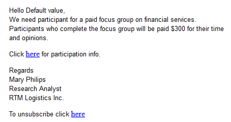
We get a lot of spam, but our favorite junk mail of the year came from this knucklehead:
 It sounds so self assured. Putting aside, for the moment, the bad grammar, the fact that we don’t have a webcam attached to our computers, and that claiming an email came from our own account is not a good threat to try on someone who works in the email marketing industry, this scam is the king daddy of scam failures, Worried that spam filters would identify this for what it is, the scammer converted the entire message to a base64 encoded image! This means that even if you did want to give this bozo your money, there’s no way to copy and paste the bitcoin address per the instructions. All you’ll do is drag around the image.
Beanie and Switch
 Straight to Hell, a company specializing in hipster clothing, sent out an email advertising their new line of beanies. Most of this email was done well, with pictures of each beanie, and each image link going to that particular beanie. The only problem image was the first one, shown here. Which, when clicked, takes you to a page about their leather jackets, the subject of their previous mailing. Whenever an email has lots of links, and you’re working off an existing email there’s always a danger of this. Check every link!
This gets back to a topic we’ve discussed in the past and will, undoubtedly discuss in the future. If you’re going to show a product, make sure the link on that item takes you to the page containing that item. Too often, we click on links to pictures of products, only to discover that the product is buried five pages deep in the display listings, but this next example is even more insidious than that:
 Putting aside the fact that boots are not accessories, and ignoring the mysterious “si” that appears between the images at the bottom, clicking on the boots takes you to Forever 21’s sale section. After scrolling through all 15 pages, we never did find these boots. Oh well, they probably wouldn’t fit anyway.
The Curse of the Template
 Templates are a great way to get an email designed with a minimum of work. The only problem is that it’s also easier to miss things such as links. That’s what we suspect happened with this email from Screen-o-matic. Most of their social links work, until you get to the Instagram icon, which contains no link.
While we’re on the subject, We received an email the last week of 2019 using this social bar:
 See any problems? Google shut down Google+ a year ago. Clicking on this link will get you the Google page explaining that the service no longer exists. Do all the social icons in your mailings work? Are you sure?
The other problem with templates is the danger of overlooking placeholders:
 Whoever put this together should have noticed the empty content box at the bottom of their mailing, or, at the very least, got a second pair of eyes to look at it.
Problems of the Past
 The other problem with previously-constructed emails is that if you never checked them thoroughly across all browsers and email clients, you might have issues that pop up again and again. Here is a problem that Target has had for at least a year now. In most email viewers, this email looks fine, but in Microsoft Windows’ Mail program, you get the rather confounding problem shown above. The image on the right looks fine, but the image on the left has the words “The picture can’t be displayed” appearing across the top. It seems like a strange thing to say, given that the image is actually there. Fortunately, the buttons that appear on the images make it a lot easier to trace the problem. In this case, it turns out that the folks at Target have inserted the image on the left as a background to a table cell, rather than simply place the image in the cell as was done on the right. An empty image placeholder sits inside the cell, for some reason. Since that image can’t be displayed, it results in the message over the background image. Considering that the audience for this particular type of email is the general public—the very people that are likely to use the Windows Mail program—and that the problem has existed for over a year, someone should have noticed it in the Target marketing department by now.
I Talk Real Good!
Really Good Emails is a website that offers a selection of recent emails that they think are particularly outstanding. It’s a good place to visit if you are looking for creative inspiration. Normally, their emails are well done, but this one came in a couple months ago that reads as if it was written by someone for whom English is a second—or maybe, third—language.
 RGE responded a couple days later with an apology that also serves as an enticement to explore their site further.
 Well done.
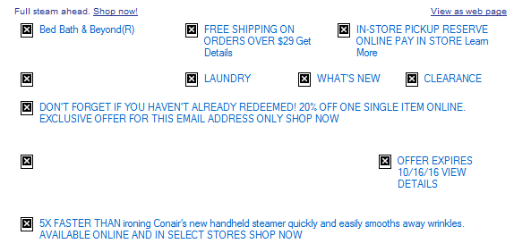
Color Theory 101
 Considering the importance of good color use in every other aspect of marketing, it’s surprising how lackadaisically many marketers treat color in their mailings. The number one mistake comes from marketers who don’t bother to think about how their mailings will appear when people haven’t turned on the images. In the image above, the links are virtually impossible to read. This could have easily been remedy with a color:White (or color:#ffffff) style added to the alt text (for more on this, see The Finer Points of Styled Alt Tags).
While the absence of linked text color formatting is the number cause of unreadable text in emails, sometimes, the problem comes down to bad design:
 Gold and pink are great colors for suggesting a certain pampered luxuriousness, but they don’t always go well together.
Oops…Just Kidding!
 Petco isn’t exactly a fly-by-night organization, so I’m surprised to see that whoever is in charge of their email marketing thinks it’s okay to use techniques that are normally the providence of spammers. Neither of the emails with “Oops” in the subject line is an apology. They are simply promotional mailings. The email marked ‘CONFIRMED” is just an attempt to get you to use their dog grooming services. The fact that it’s all caps only furthers the suspicion that Petco’s email marketing manager comes from the world of spammers.
Click Here to See This Picture, Again!
 If you’re going to add a link to an image, the best thing to do is to add a link that takes you to the page that the image references. Vinegar Syndrome did add a link, but it’s a link to the image in the email. Clicking on it just shows you the image by itself. I’m sure this one is a mistake. Remember to check your links. Fortunately, Vinegar Syndrome has provided other links in this mailing.
Dear Me
 Missing names are a common mistake. They’re usually the result of using a mail merge command that requires content in the first name field. The problem is easy to avoid by using dynamic content instead. That way, if the first name field is empty, you can finish the salutation with something meaningful (e.g., “Dear Reader,” Dear Subscriber,” etc.). They also lose points for the white type in the footer on a pale pink background.
Blackboard Bold or Spam Folder Bait?
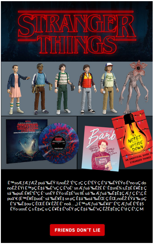
![]() You may have received an email or two that appears to feature a unique font in the subject line and wondered “How’d they do that?” The answer is, the same way they use emojis in a subject line: by using alternative Unicode characters. Buried in Unicode are a few special characters that are virtually identical the standard alphabet except for their appearance. The most popular ones are those called the mathematical double-struck characters, sometimes referred to as “𝕓𝕝𝕒𝕔𝕜𝕓𝕠𝕒𝕣𝕕 𝕓𝕠𝕝𝕕.” There is also 𝕱𝖗𝖆𝖐𝖙𝖚𝖗 𝕭𝖔𝖑𝖉, ⓑⓤⓑⓑⓛⓔ ⓣⓔⓧⓣ, 𝒸𝓊𝓇𝓈𝒾𝓋ℯ, and many others. As fun as these things are to play with, we can’t recommend using them. They are often used by spammers to try and get their messages across without tripping the keyword searches, so there’s a higher chance that your email will end up in the junk folder with these characters. If you don’t believe it, take a look at your junk folder.
You may have received an email or two that appears to feature a unique font in the subject line and wondered “How’d they do that?” The answer is, the same way they use emojis in a subject line: by using alternative Unicode characters. Buried in Unicode are a few special characters that are virtually identical the standard alphabet except for their appearance. The most popular ones are those called the mathematical double-struck characters, sometimes referred to as “𝕓𝕝𝕒𝕔𝕜𝕓𝕠𝕒𝕣𝕕 𝕓𝕠𝕝𝕕.” There is also 𝕱𝖗𝖆𝖐𝖙𝖚𝖗 𝕭𝖔𝖑𝖉, ⓑⓤⓑⓑⓛⓔ ⓣⓔⓧⓣ, 𝒸𝓊𝓇𝓈𝒾𝓋ℯ, and many others. As fun as these things are to play with, we can’t recommend using them. They are often used by spammers to try and get their messages across without tripping the keyword searches, so there’s a higher chance that your email will end up in the junk folder with these characters. If you don’t believe it, take a look at your junk folder.
That’s it for this year. Do you have any examples of email marketing fails that you’d like to share with us? If so, let us know in the Reply box below.