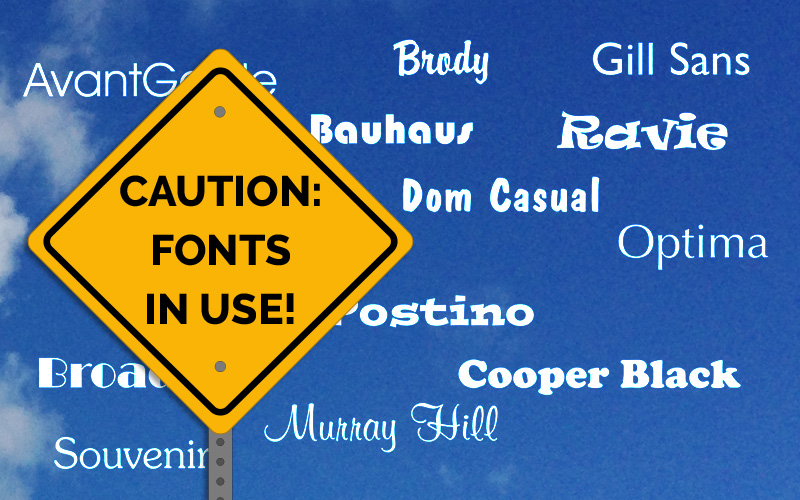
 A well-designed typeface is a thing of beauty. It can convey emotion, improve sales, and help define a corporate identity. For years, designers have been trying to figure how to use their favorite fonts in email, sometimes these attempts fail miserably, and other times they lead to other problems that you wouldn’t expect. Using fonts in email takes you into treacherous territory. Is it better to use inline font-family styles or convert everything to images? And what about web fonts? Can you use them in email marketing?
In this overview, we look at all the methods for using fonts in email that are available to marketers and designers. Some of these techniques qualify as best practices, while others should be avoided at all costs. A couple might even qualify as worst practices.
Before we get too deep into the subject, we’d like to point out that we’ll be using font and typeface interchangeably. In the past, “font” referred a specific size of a typeface, so Helvetica 12pt was one font and Helvetica 24pt was another. With the advent of digital publishing, these designations lost their meaning.
Types of Fonts
Fonts come in six basic types:
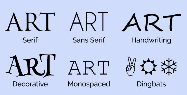
Serif
 Serifs are those little feet that protrude from the edges of a character. Examples of this style of typeface include Century Schoolbook, Garamond, and Palatino. The most famous serif typeface is Times New Roman, which was created for the London Times by Stanley Morison. Serif typefaces are still the preferred choice for blocks of printed text. On the computer screen, they are little harder to read due to the effects of screen resolution of the serifs.
Sans Serif
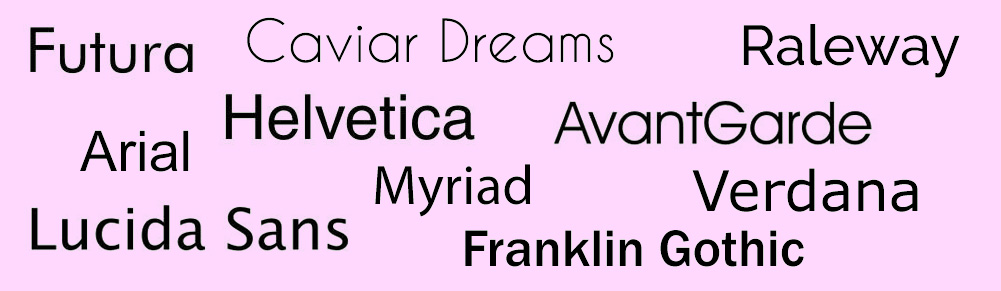 If a typeface does not have those little feet, it is referred to as “sans serif.” Examples of sans serif typefaces include Franklin Gothic, Gill Sans, and Univers. The most well-known sans serif font is Helvetica, which is even the star of its own movie. The most common variation on Helvetica is Arial, which was specifically designed to match the font metrics of Helvetica. This was Microsoft’s way of getting around the license fees for Helvetica. San serif typefaces are preferred over serif typefaces for text on the computer screen. Some fonts, such as Verdana, were specifically designed for better readability on computer monitors.
Handwriting
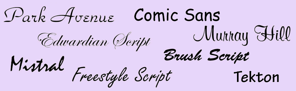 A Handwriting font, as the name suggests, is one that resembles handwritten text. These fonts are also referred to as “Cursive” or “Script” fonts. Sometimes these are fancy, such as Park Avenue and Edwardian Script, and sometimes they are more casual, such as Comic Sans and Freestyle Script. Caution should be used with these fonts. As you’ll see when we get to the Web Fonts, cursive fonts usually default to Comic Sans, which is often a poor substitution.
Decorative
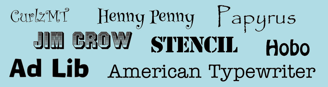 Decorative fonts are the ones that favor novelty over readability. They come in both serif and sans serif variations, and are usually restricted to logos and headlines. As a rule, they should never be used for blocks of text. Popular decorative fonts include Ad Lib, Jim Crow, Mesquite, Stencil, and Old English. They are sometimes used for logos, but, even here, are best used sparingly if at all. Because of the high level of variations between them, they should never be used in email.
Monospaced
 Monospaced fonts are the ones that assign the same amount of space for each character. In a monospaced font, the ‘m’ takes the same amount of space as an ‘i’. This type of font is often used to display code, or to mimic an old typewriter. The most popular example of this is Courier. Monospaced fonts come in both serif versions, such as Courier, and sans serif versions, such as Consolas.
Dingbats
 Dingbats are not fonts in the usual sense of the word, but, instead, have replaced the standard alphanumeric characters with little pictographs. In Webdings, for instance, a capital J renders a picture of an island with a palm tree, while in Wingdings it renders a smiley face. Dingbat fonts should never be used in email. You may like the idea of creating rebuses using Webdings, and it may look right on your PC; but if someone opens it on a Mac or some other system that doesn’t come with Webdings, they’ll only see gibberish.
Several pictographs are built into other typefaces as part of the Unicode (UTF-8). These are safer to use and sometimes are even used in subject lines (with ✈ and ❤ being particular favorites). Just make sure that you’ve encoded your mailing as UTF-8 and not 7-bit ASCII. Otherwise, you may end up with little squares or questions marks where the pictographs should be. It’s also important to remember that although there is some overlap in appearance between dingbat font characters and the pictographs that are available as part of the standard Unicode font set, they are not interchangeable. For example, the picture of the airplane in the middle on the left in the picture above is a capital Q in Wingdings. This one will not work in email. You need to use the airplane character as it is indicated in Unicode (you can find a handy chart of the Unicode dingbats and other special characters here).
Using a font directly
You can assign any typeface you want to your email content. Here, is an example of an inline style assigned to display in Helvetica:
Hello World
Of course, this doesn’t mean that your recipients are going to see the same thing on their computers that you see on yours. If the recipient does not have Helvetica installed in their system, they are going to see another font. As a rule, this will be Arial, but don’t count of the substitution to be automatic. By only listing one typeface in font-family style, you leave it up to the ISP, email client, or particular software to choose the alternative. This could end up being anything from Myriad Pro to Courier.
For this reason, it is always a good idea to provide a list of acceptable alternatives to the font-family style, starting with the preferred font, with the rest of the fonts following in order of preference:
Hello World
We’ve ended the list with the generic “sans-serif” as a safety measure to ensure that if none of the fonts listed are available, the text will still appear as a sans-serif font.
But what if your type absolutely has to be in a specific typeface? If it is part of your logo or associated with a specific branding campaign, you might not want the type replaced with anything else. In that case, your best bet is to convert the type to an image, but be careful—this is an overused technique that comes with some definite downsides.
Using Images for Type
At first, it seems like converting all your text to an image seems like a way to go. If you wanted to use Ad Lib for your headlines with Broadway for your text, an image would make sure that this (admittedly terrible) combination would look the same to everybody, regardless of their operating system, email client, or computer. But before you go converting all your mailings to images, there are a few important caveats to take into account.
No Text, No Inbox
First and foremost, you shouldn’t do it because it can affect deliverability. Shady email senders sometimes try and outsmart the spam filters by converting their text to an image in an attempt to elude the spam filters that check for certain words. As a consequence, many ISPs deduct points from a reputation score when they find only images in a message. This can be just enough of a negative to redirect your mailing from the Inbox to the Spam folder.
Not Text, No See
The second downside to using only images is that not all mailbox providers display images as a default. The Mail app on the iPhone does and Gmail does, but most others still default to image display off. If all your text has been converted into an image, you run the risk of missing potential sales for no better reason than that the recipient never saw your actual message.
Remember the Alt Tag
If you do plan to use an image to display text, the safest thing to do is to include the text in the image as an alt tag. That way if the recipient has image display turned off, he can still get an idea of what the picture contains. In the case of logos, you can also add styles to the alt tag to improve the email’s appearance. For more on this subject, see our white paper, Using Text and Images.
What About Web Fonts?
From time to time, people ask about using Google Web Fonts in email. If you are new to Google Web Fonts, these are fonts that you can use without having to have them installed either on your computer, or the computers of your recipients. There are other sources for web fonts, such as Adobe and Font Squirrel, but these usually require scripts, which do not work in email. Web fonts require you to add two pieces of information to your mailings—a tag with the URL for the font you want to use, and a font-family style attribute.
Web Fonts will only work when the email client recognizes the tag and can use it to download remote content (in this case, the fonts). Here’s an example of an email that was set using two Google Web Fonts—Luckiest Guy for the headline and Josefin Slab for the text. In this first example we’ve taken the HTML code provided by Google and stuck it in the mailing without further modification. Here is how the HTML it appears in a browser (in this case, Chrome) before it is sent as an email:
 Now here’s the same email as it appears in various email clients and platforms:
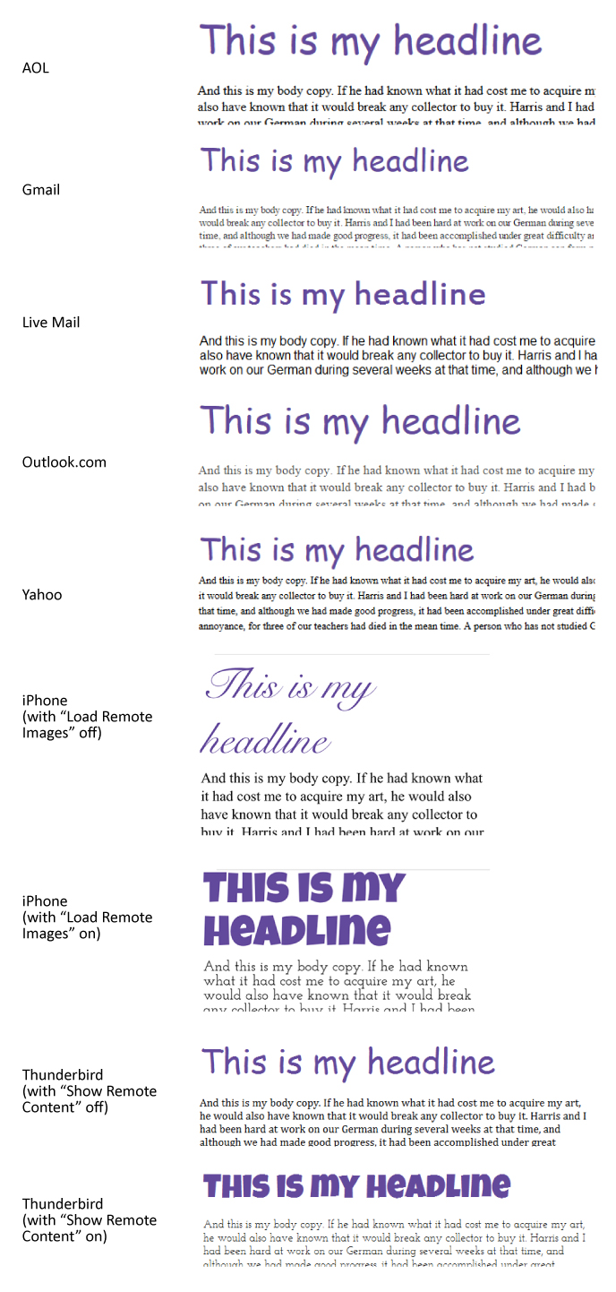 As you can see, only the iPhone and Thunderbird rendered it correctly. Even here the fonts are only displayed when “Load Remote Images” is turned on (the default setting for the iPhone, but not for Thunderbird). Because Web Fonts require a link to work, these fonts are treated the same as images. If an email client defaults to “Images Off,” it’s not going to display Web Fonts either, even if it can. No images, no fonts.
The fact that cursive is listed as the font category for Luckiest Guy doesn’t help. It means that on PCs the headline defaults to various weights of Comic Sans, a font so detested that Weird Al Yankovic uses it as a gag in his song, “Tacky”. On Macs and iPhones, cursive defaults to Snell Roundhand which is better than Comic Sans, but is still a far cry the intended result. In the case of Live Mail, the fact that “serif” was listed as the fallback didn’t seem to matter. It still converted the text to Arial.
Of course, there’s nothing that says you have to use the HTML exactly as Google provides it. In the case of the Luckiest Guy font (and, I suspect, many others), you’d be better off ignoring their recommended category and choose one of your own. You’ll also want to add a few logical alternatives to the list. Here are the inline style settings for the headline after we’ve modified it:
style=”font-family: ‘Luckiest Guy’, Impact, Haettenschweiler, ‘Franklin Gothic Bold’, ‘Arial Black’, sans-serif; font-size: 3em; color: #63499B”
There’s really nothing like Luckiest Guy that is common on computers, so I’ve chosen an assortment of bold display faces that you’ll find on many devices and platforms. Likewise, Josefin Slab is a hard one to match since slab-serifs (i.e., serifs that are squared off instead of pointed) are not that popular either. Here are the inline style settings for the body copy:
style=”font-family: ‘Josefin Slab’, Memphis, Lubalin, Rockwell, Clarendon, Georgia, serif; font-size: 1em;”
Rockwell and Clarendon are popular fonts, and although Georgia is not a slab-serif font, it is a common font and shares many characteristics with Clarendon. Here are the results:
 As you can see, the results are still far from perfect, but they are better. If this level of discrepancy between fonts is acceptable to you, then you might find web fonts worth experimenting with. If your audience is made up primarily of iPhone and Mac users, it might be worthwhile. If your audience is primarily on PCs and Android phones, then it probably isn’t worth the effort.
Text Still Wins
When all is said and done, the advice we gave in Using Text to Deliver Your Message still stands: You’ll get the best results if you remain flexible on the font choices. Converting text to images where the font is important (such as logos and other branding) is acceptable, but even then, limit it as much as possible and make sure you’ve provided alt tags that are either informative or will make people want to display the images.