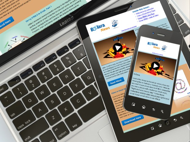
In our last article on Responsive Design we examined Adobe’s new Edge Reflow program, which is designed to help facilitate the process of responsive website design. Unfortunately, we found that, like Dreamweaver, Edge Reflow is designed almost exclusively for website production, with no tools for creating responsive email files.* There is, of course, an alternative, and that is to code it yourself. Before you tune out completely, keep in mind that as long as you don’t try to get too fancy, creating media queries is not that daunting. This article is designed to help you get past the main stumbling blocks inherent in using responsive design in emails. As always, the K.I.S.S. rule applies. Keep things simple and you shouldn’t have any trouble building an effective responsive design. Once you’ve created your basic template, building new templates becomes a lot easier.
Email is Not a Web Page
The first thing to remember is that email design has certain characteristics that are substantially different from those of a web page. It is this fact that make both Dreamweaver and Reflow frustrating to work with at times. The main points of difference are:
- Email cannot use JavaScript
- Email cannot use separate CSS files
- Tables are still the best way to control positioning
- Some email clients can use head tag styles, but some cannot
- Inline styles are always more compatible than styles in the head tag.
With a responsive web page, it is not unusual to have several CSS and JavaScript files connected to a page. Email design has no such luxury. Images are separate files, but everything else better be contained within the email if you want it to work.
The second thing to remember is that every email client plays by its own rules. Some ignore any expressions that appear in the head tags, which means your responsive design won’t work with that email client. As we discussed in the first article in this series, Gmail will use the head tag information if you view the mail on your iPhone with Apple’s Mail app, but not if you view it with Google’s Gmail app. Even with two email clients that both accept head tag styles, there may be display differences, so thorough testing is necessary every step of the way.
Tables Not Divs
Before you begin coding your responsive design media queries, you need to make sure you are starting on the right foot, and that means using tables. If you hang around web designers, or, at least, hang around the forums that web designers hang around, you’ve probably heard the mantra that you should be using divs not tables. “[Y]ou MUST use tables for tabular data!” A web designer on Stack Overflow posted. “Tables exist for that purpose, you MUST avoid tables only for layout purposes by using divs instead.” True enough if you’re designing a web site, but as every email designer knows, divs don’t always work in email. Outlook.com, for instance, ignores floats and margins, two of the primary components necessary for positioning elements on a page. This is especially ironic considering that Outlook.com is just about the only email client that actually uses most of the new HTML5 tags.
As with any other element on a page, tables can be assigned different attributes in the media queries. The main difference with responsive design is that elements with different media query attributes will need to be in separate tables to behave predictably. But before we get to that, let’s look at the basics of a media query.
Start Simple
For your first responsive design, it’s a good idea to start simple. It’s possible to have instructions for a dozen different sizes of screens, but it is not really necessary unless you’ve designed your email with multiple columns, which is generally not recommended. Depending on your design, you will want to switch to a mobile version of the email when the screen size falls somewhere between 500 and 600 pixels. Let’s say you’ve decided to switch to the mobile display at 525 pixels. Your media query would begin like this:
@media screen and (max-width: 525px)
You may want to use a smaller or a larger number, that is up to you. Smaller smart phones and the early iPhones had screen resolutions of 320×480 pixels. This number has increased substantially over the past few years. Newer iPhones have screen resolutions of 640×1,136 pixels, and the Sony Xperia Z Ultra and Samsung Galaxy S4 come in at a whopping 1,080×1,920 pixels, which rivals some desktop monitors.
These numbers may suggest that, at 640 pixels, the iPhone should display the full sized version of the email, but it will not. The number of pixels listed in the media query and the screen resolution are not equivalent. Newer iPhones, for instance, have a resolution of 640 across, but a device width of 320. This is because the width information in CSS does not take into account the iPhone’s retina display which doubles the number of pixels available. Likewise, the Samsung Galaxy Note II’s 720 pixel resolution comes in at 480 pixels in screen width. Of course, you can take pixel densities into account when you define your media queries, but this will only add an unnecessary layer of work to your email design. You may also want to create an intermediate set of rules for tablets and the very large phones (“phablets”), but keep in mind that this will add another media query and another set of instructions to your head tags. Also keep in mind that, if properly designed, your email should be readable on these devices without requiring any responsive adjustments. An email with a max-width of 650 pixels wide with 12 point type should be perfectly readable on any tablet (some people prefer to use the more cautious 600px).
From CSS to Email
With media queries, you can move elements around or hide them to your heart’s content.
If you are using Dreamweaver or a similar program to create your email, you may want to do everything using a CSS file to ensure consistency throughout the email, and to make it easier to change individual elements at a later date. Just remember that you’ll eventually need to convert all that information to inline styles. You could take the CSS file and stick its contents between style tags in the head, but not all email clients use head tag information. For the most compatible results, after you’ve added the CSS information to the style tag, you should next run the whole thing through an inline styler. This will inline everything, but it may also throw out the media queries at the same time. If so, you’ll need to replace these.
When you are finished, the top of your email’s HTML will look something like this:
<style type=”text/css”>
.ReadMsgBody {width: 100%;}
.ExternalClass {width: 100%;}
blockquote .original-only, .WordSection1 .original-only {display: none !important;}
blockquote table.forwarded-only, .WordSection1 table.forwarded-only {display: block !important;}
@media screen and (max-width: 525px) {
td[class=”SecondKitten”]{
display:none !important;}
img[class=”SecondKitten”]{
width: 100px !important;
height: auto !important;
padding-bottom: 20px !important;}
img[class=”FirstKitten”]{
width: 300px !important;
height: auto !important;
padding-bottom: 20px !important;}…
…</style>
<body>…
The expressions at the top that appear before the media query are there to eliminate email formatting issues. The first two expressions are for Hotmail, and the others are there to reset HTML5 elements to display elements as block elements, which helps control formatting things such as tables and lists.
The three style classes shown after the media query affect different parts of the design. The first one (td[class=”SecondKitten”]) causes the table cell (td) to disappear when the email is viewed on any device that is less than 525 pixels across. The second one (img[class=”FirstKitten”]) forces the image (img) to shrink to the width of 100 pixels, regardless of its original width. Likewise, the third class (img[class=”FirstKitten”]) forced the image to expand to 300 pixels.
Down in the body of the email, you’ll see something along these lines:
<img src=”http://placekitten.com/200/200″ alt=”Meow!” height=”200″ width=”200″ border=”0″ style=”display: block; font-family: Arial; color: #ffffff;” class=”FirstKitten”>
The “FirstKitten” class indicates that if the screen’s width is 525 pixels or less, the image’s dimensions shift from 200×200 to 300×300. Normally, you’d want to reduce your image for a smaller screen, but this example demonstrates that you are not limited to only reductions. Just keep in mind that enlarging above an image’s resolution may result in some pixelation of the image.
A little further down in the body of the HTML, you’ll find this table cell information:
<td width=”200″ align=”center” style=”padding: 0;” class=”Second Kitten”><img src=”http://placekitten.com/200/250″ alt=”Meow! Meow!” height=”250″ width=”200″ border=”0″ style=”display: block; font-family: Arial; color: #ffffff; font-size: 18px;” class=”Second Kitten”></td>
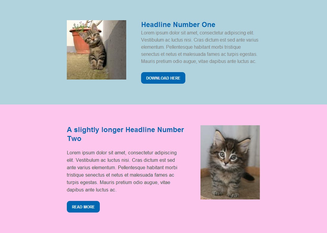
Since the media query attribute assigned to the cell (td) has a display value of “none,” the entire cell disappears when viewed on a small screen, even though the img class is active and has its own values. Here’s our sample file as it appears on a monitor (Click here to view full-sized version of the image):

Images used in this demo are courtesy of placekitten.com.
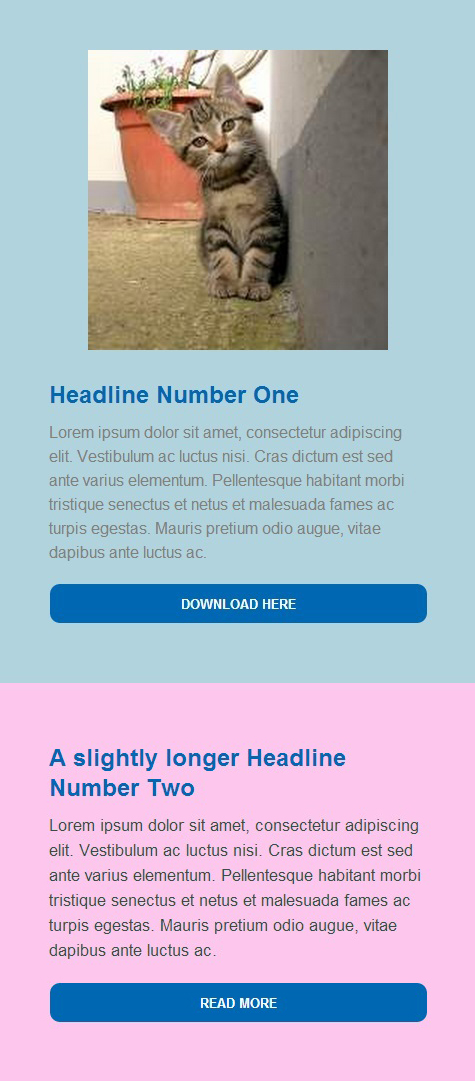
And here’s the same file when viewed on an iPhone:

You can see that a few interesting things have happened. The kitten at the top of the page became larger, deteriorating the image slightly, while the kitten at the bottom of the page disappeared entirely. The call-to-action buttons lose their original size attributes and switch to the attributes in the media query, which specify 100%. This causes the buttons to stretch across the width of the display, which works well for small screens, but would look bad on a monitor.
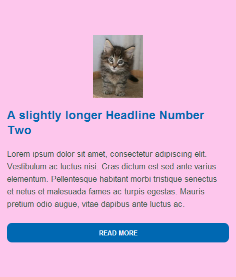
Now, suppose we change the “SecondKitten” td class as follows:
td[class=”SecondKitten”]{
display:100% !important;}
Now the second box in the email appears like this on an iPhone (or similar small-screen device):

You’ll notice that since the cell is allowed to display and given a value of 100%, the image appears, but now the attributes under the img class=”SecondKitten” take effect. The picture is visible, but reduced to 100 pixels across because that was the width indicated it should be when the screen size falls below 525 pixels. **
Design for the Least Compatible Client
As I’m sure you’ve noticed, not all email clients are created equal. Outlook.com, for instance, does a great job of rendering HTML5 code, but it ignores floats and margins in divs. Some email clients can handle head tags, and some can’t. While it is fun to try and create complex responsive designs that adapt to different devices, you’ll still need to design your email so that when all else fails, it is still readable under the widest variety of circumstances. It might be fun, for instance, to swap out entire sections using “display:none” as an inline attribute, but it won’t do you much good if any of your recipients are using Gmail because Gmail strips out the “display:none” attribute from the email. The old adage in email design is that you should “design your email like it’s 1999.” A better approach is to design for Least Compatible Client (LCC). Don’t put anything in your body tags—other than class selectors for the media queries—that won’t work in every situation. That way, you’ll always have an email that will look as good as it can under any circumstances.***
Responsive Writing
A quick survey we did recently indicated that most of the email designers who are actually creating responsive layouts are not using visual editors such as Dreamweaver, but coding by hand using HTML-oriented text editors such as TextWrangler, Sublime Text, or Ultra Edit. Although Dreamweaver does have tools for creating responsive templates, as mentioned in our other posts on the subject, it is aimed primarily at web designers and often adds unwanted code to your files. If this all sounds a bit daunting, it shouldn’t. Remember our initial advice: keep it simple. Besides, remember that others have gone before you and there is no reason to reinvent the wheel.
Learning From Others
A great way to learn more about how to use responsive design is to open the source code for the responsive emails you receive and see what they’re doing. In most cases, you’ll see a lot of expressions under each media query that aren’t used. This is because everyone is working from a template to which they may have added things they’ve needed over time. A particular email may only use four or five instructions, but the media query section may have a dozen or more extra expressions. Those extra expressions add slightly to the size of the email, but only slightly. Web pages can be a great source of ideas for responsive design, but they often rely on JavaScript to implement certain aspects, so approach with caution.
One excellent source of responsive design examples is Media Queries. This web site is a collection of the best responsive design pages on the Internet. It contains hundreds of dazzling examples of responsive web design. This is a great place to go if you are looking for ideas. Odds are there is an example here that matches your concept. All of the examples are web pages, so most include JavaScript. Formatting varies widely, from carefully formatted and commented, to one big, indecipherable, block of code.
Another source for bare bones responsive email design ideas is Code Pen, an online sandbox for testing HTML. While most of the examples given on this site are for web design, a search for “responsive email” will yield several useful examples of emails that were created to be responsive.
There are also some very good online tutorials available on YouTube. These range in quality from professionally-made, “I-can’t-believe-they’re-not-charging-for-this” instructions, to people with indecipherable accents talking into their laptops at the local Starbucks. Lynda.com also features a thorough tutorial on responsive email design by Chris Converse (includes sample files).
Test, Test Test…
However you choose to create your responsive email, you’ll need to test it across as many different platforms and devices as possible. Sometimes things may look perfectly acceptable across nine clients and devices and then the tenth one will send you back to the drawing board. As with all code, a misplaced percentage sign or missing bracket can ruin everything. Due to the nature of responsive design, it can be difficult to tell if your media query is working until you see it in action.
In the next installment of our series on Responsive Design in Email, I’ll discuss the process I went through to come up with a good responsive design, and what I learned along the way.
* The latest release of DreamweaverCC, now includes the option “Define in page” for media queries. By using this command, you can add the media queries to the top of the HTML document and still inline all the style information. With this change to Dreamweaver, it might be possible now to use it to create responsive email designs within the program. It’s nice to see Adobe finally paying attention to the needs of email designers.
** If you would like a copy of the original HTML file, you can download it as a zip file here, or as a text file here.
*** This advice does not include Styled Alt Tags, which may not work in certain clients, but these are less an aspect of design than a fallback when images are not displayed.


 The Goolara Blog