Email design has its own rules and requirements. In this article we look at ways to improve the effectiveness of your email messaging with the smart use of text.
An important aspect of email is, of course, design. Graphic artists spend a lot of time adjusting images and page layouts to make their work look as perfect as possible. To the lay person, who is not accustomed to the ways of a designer, their endless fussing over which of three nearly identical colors they should use might seem like overkill, but graphic artists understand that good design is important to sales. A company’s website, brochures, business cards and everything else need to reflect their brand and they need to look good.
When the Internet came along, it threw a bit of a curve ball to many graphic artists. They had to learn new skills to get around the limitations of HTML. These are the same skills they need to make good looking email, but the number one mistake made by many graphic artists is to treat email design the same as web design. Email brings with it a host of unique design issues that are completely different from web design. The biggest difference comes in the way email handles images and text, and this is where many designers fall down.
A common technique for controlling the appearance of text on a website is to place the text in a graphic. In this way, the choice of fonts, placement, and other characteristics can be maintained even if the viewer does not have those fonts installed. But using this technique on email is not a good idea, for two reasons.
No Image = No Text
The default setting for most email clients is to block images. Among smart phones, only the iPhone displays images as a default. Of course, some people turn on the images, but most people tend to leave things with the default settings; it’s human nature.
Good Alt Tags will go a long ways toward helping people understand what they are missing, but even here, not all email browsers display the alt tags, and Microsoft Outlook 2007 goes one step further, adding its own security messages to the empty image boxes. Put another way, if you are using graphics-based messages, over half of your recipients are receiving it in the blandest form possible, and some aren’t seeing it at all.
If you really want to make sure that your message is reaching your public, you’ll need to offer some text to the recipients beyond what might or might not appear in your alt tags.
Text-to-Image Ratio
ISPs cannot read the text in images. Spammers know this and sometimes use images to get around filters that might shuttle their content automatically to the bulk folder. As a consequence, many ISPs now look at the text-to-image ratio to identify possible spam. When a marketer puts all the focus on images, the deliverability metrics suffer (as do open and clickthrough rates). Remember that the ISPs are ultimately the ones in control in this process, and a beautifully crafted image with the best marketing message in the world means nothing if the user never sees it.
A Tale of Two Emails
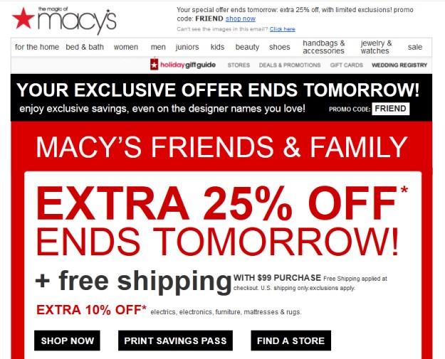
For purposes of this article, I am going restrict my conversation to two emails I recently received. One is from Macy’s and the other is from J. Crew. One is done with a good understanding of email and how it works; the other is designed using the traditional text as image approach and is less effective. I’ve used a few different email browsers here to show how different browsers treat missing images. First, here’s the Macy’s ad with images (only the top is shown here—there are more images below):
Now, here’s the same ad with the images turned off (in Gmail):

As you can see, almost no information is lost. The ad still gets the point across and aside from the Macy’s logo and some other small formatted items, all the information you need is visible and visually interesting.
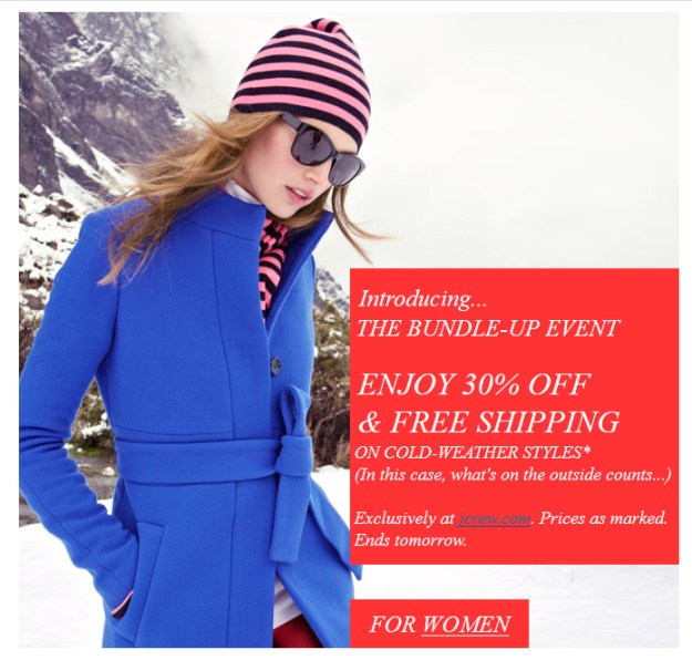
Now let’s look at J. Crew. Here is the ad with the images displayed:
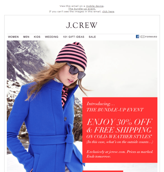
It looks fine, but here’s how it looked when it arrived in my inbox (in Live Mail):
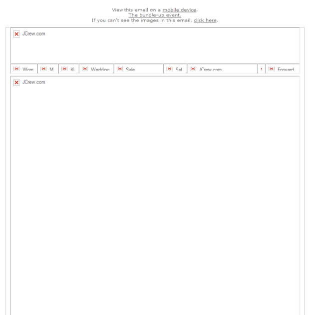
Not so interesting anymore. What does this tell me besides the fact that it came from J. Crew? Even a few reasonably commented alt tags would have helped here, but all we get is “JCrew.com.” What makes this email so frustrating is that the problem could have easily been avoided with some care and forethought. Let’s look at the hero image. Here’s the original:
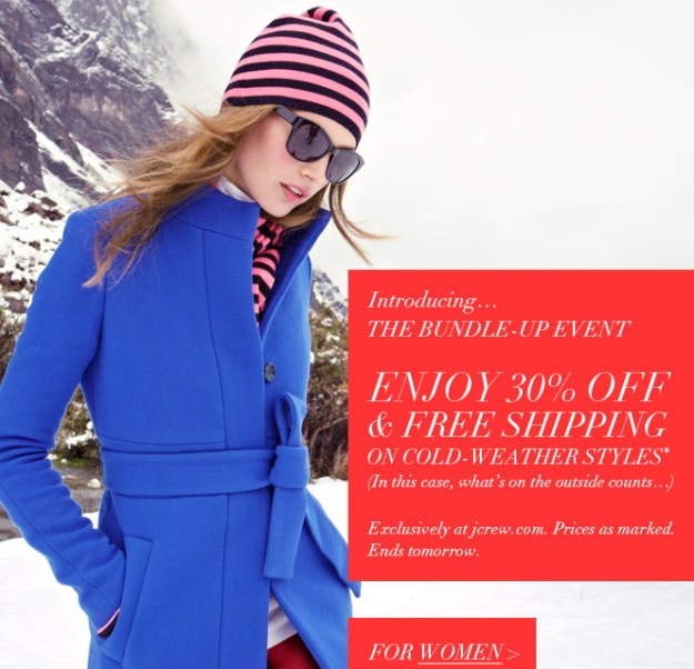
The first thing you’ll notice is that the text is separate from the image. This makes it a perfect choice for using actual text instead of a graphic. By dividing the image into sections and placing these sections in a table, we can achieve the following:
Aside from a font change, this version delivers the same message, but more importantly, here is this version of the message when the images are blocked (in YahooMail):

Now the message of the email is still rendered and readable to all recipients, regardless of their email browser settings. Graphic designers probably won’t find this solution particularly satisfying, but the visual dynamics created here by the text make it far more likely that recipients will respond to the email.
Everyone wants the best looking email possible. Of course, you want your images to display, and, of course, good design is paramount to better email response rates, but if it’s a choice between looking good and selling your products and services, then the choice becomes obvious. Images are great for making email visually appealing, but remember that text in email, like text on your website, is always more effective when it is left as text and not converted into an image. Plan accordingly.