 If the email that lands in our inboxes every day is any indication, people don’t spend enough time thinking about the effects that links have on images and text. Blue linked text on dark backgrounds, problematic borders, and unwanted underlines can all interfere with an email’s design. These are very easy fixes that should be in every email designer’s toolbox, so it’s a little puzzling why so many mailings don’t follow these simple rules.
Links on Images
In a previous article on this blog, we discussed ways to make sure your images link correctly in email. Image maps and image slicing offer ways to let portions of an image link to different pages, but that’s only part of the story. There is one more hidden pitfall in image handling that often goes overlooked. In fact, hardly a day goes by when I don’t see this particular mistake pop up in some email or another. You may think you’ve covered all your bases when it comes to linking images, but if you’re not careful, there’s one more trap waiting to trip you up.
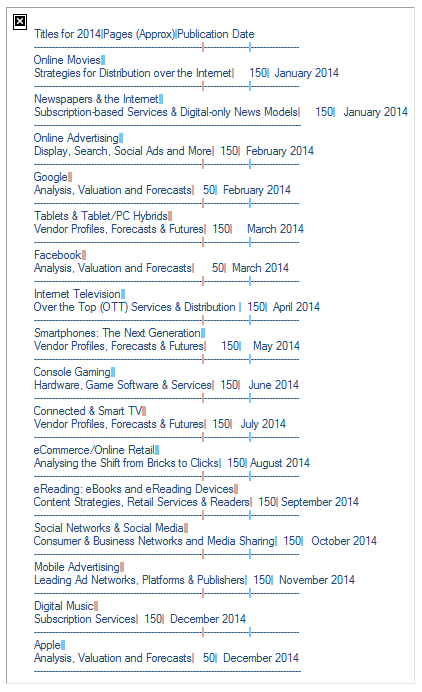
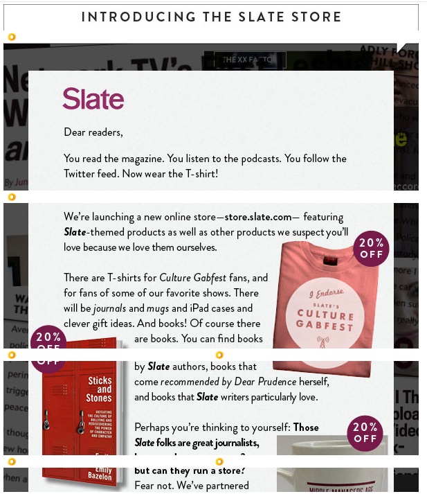
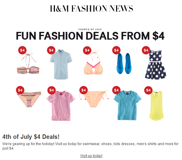
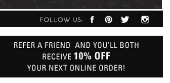
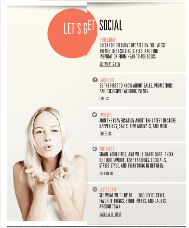
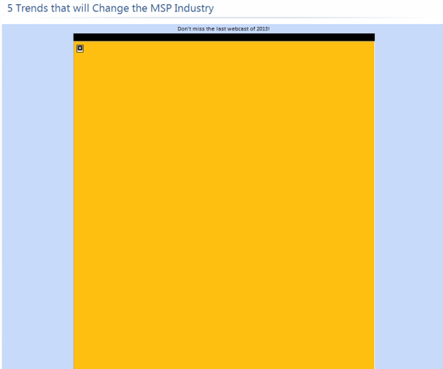
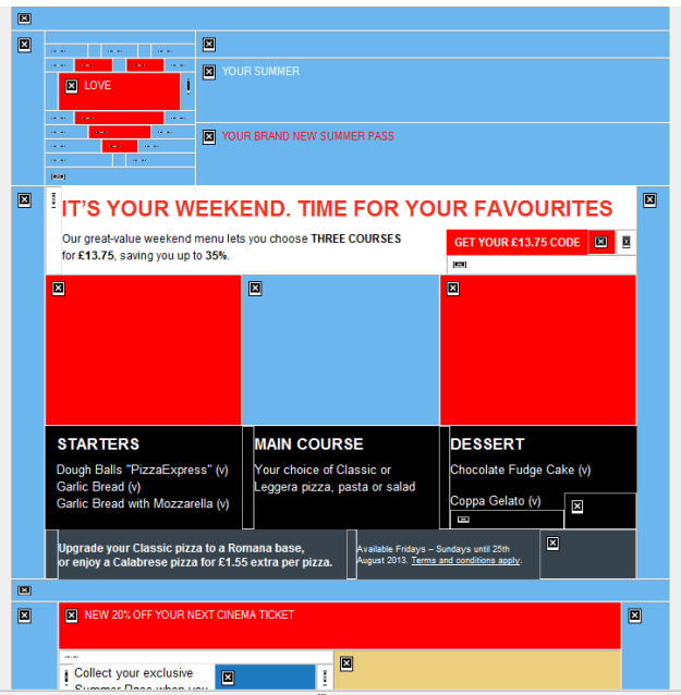
To understand better take a look at this example:
 As you can see, the last two sections of the image have links. The email viewing software saw the links and placed highlights around these sections. In this particular case, the link borders also throw off the text in the image, making it harder to read, although the text at the top and the bottom could have been—and should have been—actual text (see Using Text to Deliver Your Message), the blue line certainly makes matters worse.
The blue line doesn’t appear in all email viewers, which is why this is sometimes overlooked. If the email reader you normally use doesn’t do this, you might miss it. Unfortunately, the problem crops up most often in Microsoft email clients and mailboxes, which aren’t exactly low profile products. Sometimes it can interfere with the design in other ways. Here’s a button with rounded corners and a blue border that completely destroys the intended effect:
 In this particular case, rather than create the button using the border-radius style in a colored table cell, they generated it as an image instead, so the email reader put a border on it to indicate it has a link.
The fix for this is easy, and should come almost as second nature to email designers. Let’s look at the image tag on the button:
Now here’s what’s missing in red:
border="0" />
It’s that simple. The addition of the border attribute is all it takes to eliminate this particular problem so why do so many emails still show up with blue borders? In all likelihood it’s because the sender is only checking against their default email client.
Lost in the Blue
With text, links default to blue underlined text in email. In one sense, this is usually a good thing. It wouldn’t serve much purpose to leave the text black with no underline. On the other hand, there are times when the blue color and the underscore can interfere with the design. Here’s an example of the button shown above recreated (as near I could) as a table cell instead of an image:
 Borders aren’t an issue because it is no longer an image. The styles on the table cell are entered as inline styles, giving it specific text attributes and removing the underline that indicates it is a link. But here’s that same table cell, with the inline styles removed, allowing the text to revert to its default choices:
 Not very useful. You can remove the underline by adding the style attribute “text-decoration: none,” but the text would still be blue. Just be careful that you haven’t assigned the text to appear in a color that is close to the default link color (which varies between browsers), email client systems aren’t smart enough to recognize the color of your text, and your links are likely to get lost.
Arranging Attributes
Browsers can be very forgiving when it comes to the order of attributes in your HTML. Email clients are not so generous. For this reason, you’ll sometimes encounter cases where a mailing looks just fine as a stand-alone web page, but then falls apart when it reaches the inbox. When this happens, you should check the order of your tags. Make sure things like yourtags are closed within their appropriate
tags, and thetags are closed within their
tags.
One area you should be especially careful is with the tags. We’ve seen occasions where attempts to insert other tags inside of the tags—such as and
tags—have resulted in broken links. It’s far safer to make tags the innermost tag set, and wrap the other tags around it, with the exception of the tag, which is self-contained (i.e., requires no closing tag). Also keep in mind that the tag wants to add certain style attributes to your text. To override these attributes, you need to change the style attributes of the tag, not the text. Adding a span won’t always work. To illustrate, here is a screenshot of the same tag rendered three different ways:
 The middle line is the only one that is correct here. All three lines were given the same style attributes (style=”font-weight: bold; color: #ee5500; text-decoration: none;”). The top example had the style attributes inserted into tags that were placed inside the tags; in the middle example, the styles were added directly to the tag; and in the bottom example, the styles were inserted into tags that start before the tags and end after them. As you can see, all three lines had different results. In some email clients, the top two were correct, but none of them rendered the third line correctly. Adding “!important” to the styles had no effect. Clearly the best way to control the attributes of text in an tag is by assigning the styles within that tag. Any other method can yield unpredictable results.
Live Spelled Backwards is Evil
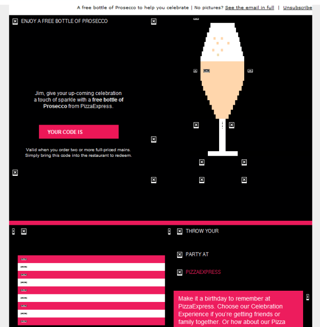
The email client that is the worst offender when it comes to creating this sort of havoc is, not surprisingly, Live Mail. The examples shown above come from this particular email client, and were, in some cases, okay in other email clients. As we discussed in our 2014 Year End Review, Live Mail brings its own set of idiosyncrasies to the table. Here’s an example of how a set of social buttons at the bottom of the page in an L.A. Times newsletter appeared in Live Mail:
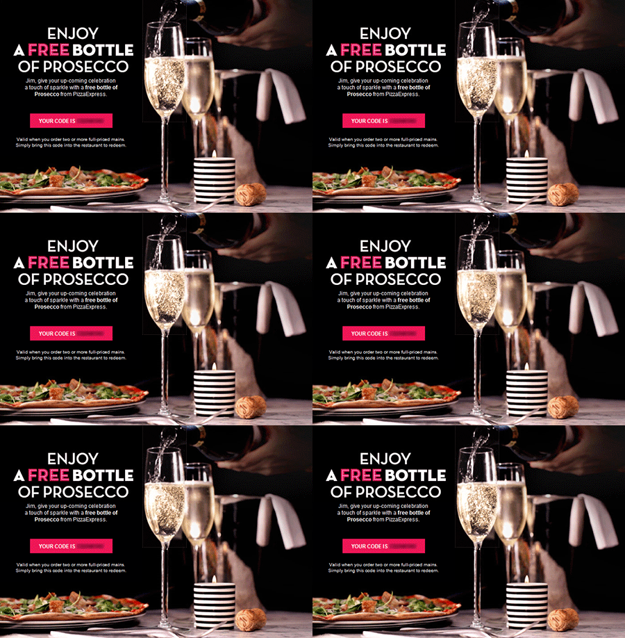
 And here is how it appeared in other email clients:
 Those of you that have read the 2014 Year in Review article might guess that the black background is the result of using the three digit color code “#fff” instead of “#ffffff.” But the example above has nothing on this one from Lionbridge:
 In this case, the buttons are overlapping each other, with each button appearing slightly smaller than the one to its right. Now here’s what this table looks like in every other email client:
 Quite a difference! So what caused this strange cascading effect? We narrowed it down to the tag:
Normally, the tag has no effect on an email. Ironically, even this one wouldn’t have been a problem if the designer had left off the URL at the end. Then it would have worked just fine. Like the browsers, Live Mail has its own methods for dealing with the differences between HTML versions, and without the link, the software figures it out correctly. Of course, there’s really no reason to ever place a tag in an email. We recommend leaving them out. For that matter, the safest approach is to place only the styles you want for responsive purposes (which normally appear between thetags), and the actual content (which falls between thetags). Everything else serves no purpose in an email, and may actually create problems.
A Few Basic Rules
Getting links in email to appear the way you want them to is not difficult. It boils down to a few simple rules:
- Always include border=0 in your
tags
- Use text-decoration: none to eliminate the underline on links
- Assign a contrasting color on text links if the main content is blue
- Place the style attributes for linked text in the tags
- Eliminate superfluous code and tags, such as JavaScript and
These fixes are so easy to implement, it’s puzzling why many emails are still sent with these problems. In the grand scheme, these are relatively minor issues, but, as we have shown, little things can make a big difference.


