Another year has come and gone, and with it, another bagful of email catastrophes. Some of these are minor issues that could have been caught with a little more testing or another set of eyes, some are truly catastrophic, and a few problems are unique to that bane of email, Microsoft Live Mail.
Bad Links
It’s always a good idea to test your links before sending out an email, but even the best of us miss one from time to time. Here are a few we noticed this year.
You Know What I Mean!
 In this newsletter from last January, MediaPost created a link to the AMA conference without the all important “http://” at the beginning. While that works fine when you are entering a URL in the Address Bar, it won’t work in an href command. It doesn’t help that they’ve used base64 encoding on the message which moves us further from the link and is probably why their emails always end up in my Spam folder.
My Name is [Your Name]
 I’ve talked about using placer information in previous year-end reviews. Placers are useful, but only if you don’t forget to remove them from the final mailings. In this case, the placer link “http://your.website.address.here/” was used on the image. Fortunately, there were actual links later in the message, which minimized the damage here.
Spot the Panda
 When you have several links in an email, there is always a danger that one won’t get its proper URL. Net-A-Porter does a good job of ensuring that every link goes to the item you click on, saving a lot of useless scrolling and page flipping (See last year’s Year-End Review for examples of this). But with this many unique links and more in every mailing, it was inevitable that they would miss one. In this case, it’s the Stella McCarthy coat on the bottom left, which links instead to Net-A-Porter’s emagazine.
Three Out of Nine is Not Good Odds
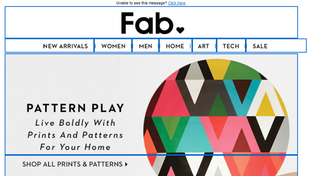
 Getting one link wrong is forgivable. Getting six out of nine wrong is not. This email from Fab takes you to the same page no matter which of these images you click. The problem here is that six of the images are not even on the page. If you want to find them, you’ll have to search for them (they are on the site). Rule #1: Always make it easy for your customers to purchase things. Either create a landing page specifically for the items you’re showing, or link to each of them individually.
Psst! Wanna See a Picture?
 This class sounds interesting, but if you click on the image it will take you to…the image. That’s right. It opens the image location. It doesn’t even take you to Sur La Table’s home page. You can eventually get there by clicking various other links on the page, but it seems like an image that says “Reserve Your Spot” should at least enable you to do just that.
Bad Formatting
Some mistakes are the result of formatting errors. One missing greater-than sign or comment tag and your entire design goes off the rails. Here are a few coding mistakes that we saw this year.
Dear First Name


 This one is so common that we’re guaranteed to receive a few of these every year. Usually it is the first name that’s missing, but, as you can see from the third example, it can happen elsewhere in an email. I suspect that most of the time this comes about when someone is using a previous mailing to create a new one, and doesn’t pay attention to the merge fields and dynamic content. This is mostly just laziness. I know that Goolara Symphonie will maintain my merge data when I copy in this fashion, but I always replace it just to be on the safe side. Judging from these examples, I suspect that other ESPs are less forgiving.
MS Word + HTML = Disaster
 Most people know better than to try and use Word for their HTML generator. Every once in a while, however, we get an email with the tell-tale “o:p” tag that Microsoft uses to allow you to convert the HTML back into a Word document. This email probably looked just fine in Microsoft Word, and it even looks okay in some visual editors, but it’s a disaster waiting to happen. Ironically, this particular mailing is all text and would have been easier to create directly in any ESP’s visual editor than in Word. This one will always fail in Live Mail (see section below) and often fails elsewhere as well. Here are a couple more examples:
 These people would have all been better off typing their content in a plain text editor.
Bad Code Practices
Some problems are not the result of typos or inadequate testing. Some are simply bad practices. These aren’t mistakes in the strictest sense, but that doesn’t mean you shouldn’t watch out for them.
No Alts
Ever since Gmail started caching the images, we’ve seen an increase in the number of mailings that omit the alt tags. Here’s a perfect example of this from Warby Parker:
 The only text in this mailing is the company’s address and a few links at the bottom. Now here’s one from Bed, Bath and Beyond where they’ve gone the extra mile to make sure that even with the images off, you know what their email is all about and have some impetus to click through:

Ya’ Got No Style!

 Providing alt tags is a good practice, but if you’re using them in cells with dark backgrounds, remember to add style color information to the cell, in particular a color property such as #FFFFFF (white) and “text-decoration:none” to make sure the alt tag is readable. In the top example from the Westfield shopping center, the type is barely legible, but even that is only because it includes a link, which turns the type blue by default. The second example from TradePub.com, also includes a link, but the blue background makes it nearly impossible to read. For more information on how to create styled alt tags, see our white paper, Using Text & Images.
Formatting is for Sissies
 I’ve removed the name and address information from the address above because it belongs to the competition. This email came without any formatting. No active links, no nothing. It was clearly a mistake, but there was no follow up apology; just a second mailing with completely different content twenty minutes later. Perhaps they are following that new “never say you’re sorry” attitude that is making the rounds on the Internet, or maybe they hoped no one would notice. Of course, one could point out that this email is, in fact, a violation of the CAN-SPAM act (inactive unsub link), but it’s probably moot.
Don’t Forget to Block
 A perennial problem with sliced images in email is the problem of gaps. This is an easy one to prevent. The addition of “display: block” to each of the
 tags will go a long ways toward preventing this situation. Also watch out for things like padding and margin, which can also wreck a sliced image.
Live Mail Strikes Again
Every email reader has its own idiosyncrasies, but the one that seems to break email the most often is Live Mail. Here are some common problems—and one not so common problem—to look out for in Live Mail.
Watch Out for Links
 The problem we see most often is the blue borders on images with links. Most of the time, it’s merely distracting, but in some cases, such as in the example above, it actually screws up the design. With other mail readers, putting an attribute such as “border: 0” (or “none”) in the
Black is the New White
 As discussed in last year’s email review, Live Mail does not like three-digit hex codes. You’ve assigned a background of #FFF (white)? Live Mail will treat it the same as #000 (black). Even if you have no customers using Live Mail, it’s a good idea to get into the practice of typing out the full six-digit hex codes.
Paragraph Alignment
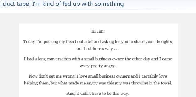 This mailing from Duct Tape Marketing looks fine everywhere else, but open it in Live Mail and suddenly all the text is centered, including a list that appears later on the page. While this isn’t a complete catastrophe, it does make the text harder to read, which is never good. In this case, the problem comes back to the placing the style information between tags instead of inline.
Email from a Mime
 This is particularly weird phenomenon that only seems to happen in Live Mail. I received the email above shortly before Christmas. A big red block. That’s it. No text, no alt tags, and no “Show Images” link to indicate that anything was missing. Not surprisingly, it is an unsolicited email. It comes from a company that offers Santa letters for children. The email does have images (see below), but you couldn’t tell it from what I received in Live Mail. As far as Live Mail was concerned, this mailing was nothing more than a big red block. Here’s how it should have looked:
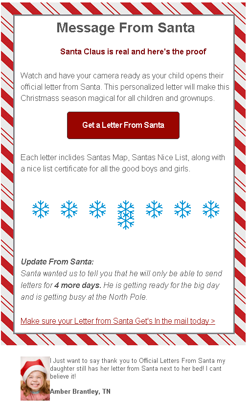 In a way, it’s probably just as well that nothing showed up. There are typos in nearly every line, they obviously didn’t bother with a test mailing, which would have showed that they used too many snowflakes (it only looks correct in Dreamweaver), and that kid is pretty obviously a stock image. This one would have ended up in this year-end review even if the images did show up.
Cascading Image Sizing
One of the weirdest anomalies We’ve encountered with Live Mail is the following one from Lionsbridge:
 As a point of reference, here is the same thing sent to a Gmail address:
 Quite a difference! After a bit of testing, we found that simply removing the doctype information at the top of the email’s code fixed the problem. This isn’t the first time we’ve encountered that particular issue. Our more recent tests with Live Mail show that this particular problem has been fixed. Nonetheless, as a rule, if you’re copying your code from an HTML editor, it’s a good idea to exclude the and tags from the process. The email software is going to wrap your information in those tags anyway. This doesn’t always mess things up, HTML is remarkably forgiving, but better safe than sorry. The truth is, the safest procedure for maximum compatibility is to omit everything except content between the body tags and to put inline any styles you have included, with the exceptions of the media queries and the usual boilerplate styles used to improve compatibility with various mailboxes.
Marketing Missteps
This next section is about mailings that use questionable marketing techniques to achieve their goals. Some could argue that these are effective because they get you to pay attention, but so will a car accident; that doesn’t make it a good thing.
It’s Our Special Interface!
 CAN-SPAM requires that every promotional mailing includes an unsubscribe link that works, but there is nothing in the law that dictates exactly how you convey this message. This one’s from a questionable company, and would almost certainly have ended up in the spam folder had it been sent to my Gmail account, but my Live Mail account is set to accept a wider range of email. I don’t know about you, but I’d find it preferable to click “This is Spam” rather than click on that suspiciously worded unsubscribe. My advice: Stick to the tried-and-true “Click here to unsubscribe.” The unsubscribe link is no place to get clever.
About Your Account…
 One of the most common techniques used by phishers is the one where they send you a notice about the way they are changing their charges on your bank account. The idea is for you to say, “Oh no!” and click the link, which takes you to a fake, but believable login page where you enter your bank login information. So it’s never a good idea when a legitimate company sends out an email that sets off the same alarm bells. Since I’ve never used PayPal with this account, the fact they sent this email to me means one of two things. Either they think I did give them a PayPal account (I did not), or they didn’t bother to segment the mailing. Both are bad, but the latter is unforgivable.
@SneakyMarketer is now following you!
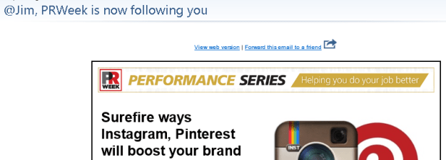 Marketers are always looking for new ways to get you to look at their mailings. Sometimes they cross the line. PRWeek’s take off on Twitter’s following notices might have been okay had it been more obviously fake, and had had some truth to it. In fact, it’s just a come on to sign up for their webinar on social media.
Remember Me? No?
An insidious trend in spamming that showed up in my Inbox this year is the fake follow up. Here’s an example:
 Looks legit, but a quick look at my Inbox, spam, and trash folder shows that no such original email was ever sent. This is not the first of these I’ve received, but it’s the first time that they went to the trouble of making it look like something was already sent.
Hello, It’s Me Again
Lately there’s been a lot of press about the advantages of sending more email instead of less. The folks at HubSpot must have taken this to heart, because this is what I found in my email inbox one morning:
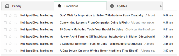 Now I’m all for frequent mailings, but this is going a bit far. All kidding aside, I realize that this is more likely the result of their site’s automation, but it probably didn’t help things that most of these were sent during hours when many U.S. companies aren’t sending (I am surprised, however, that I didn’t get something between the eight o’clock and nine o’clock mailings).
Until Next Year
That’s all for this year. I normally like end with a few examples of good and/or clever mailing ideas, but this post is already pushing the limits of acceptable length for an online article. I’d like to thank Justin Khoo at FreshInbox for his help in diagnosing some of Live Mail’s idiosyncrasies. Keep emailing, and if there’s one takeaway from this article it’s this: Always test before sending.