Tag Archives: HTML

Making Links Look Good

broken linksIf the email that lands in our inboxes every day is any indication, people don’t spend enough time thinking about the effects that links have on images and text. Blue linked text on dark backgrounds, problematic borders, and unwanted underlines can all interfere with an email’s design. These are very easy fixes that should be in every email designer’s toolbox, so it’s a little puzzling why so many mailings don’t follow these simple rules.

Links on Images

In a previous article on this blog, we discussed ways to make sure your images link correctly in email. Image maps and image slicing offer ways to let portions of an image link to different pages, but that’s only part of the story. There is one more hidden pitfall in image handling that often goes overlooked. In fact, hardly a day goes by when I don’t see this particular mistake pop up in some email or another. You may think you’ve covered all your bases when it comes to linking images, but if you’re not careful, there’s one more trap waiting to trip you up.

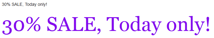
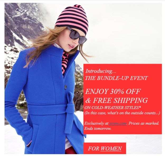
To understand better take a look at this example:

bad border
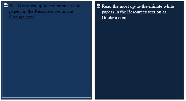
As you can see, the last two sections of the image have links. The email viewing software saw the links and placed highlights around these sections. In this particular case, the link borders also throw off the text in the image, making it harder to read, although the text at the top and the bottom could have been—and should have been—actual text (see Using Text to Deliver Your Message), the blue line certainly makes matters worse.

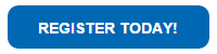
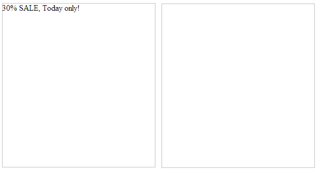
The blue line doesn’t appear in all email viewers, which is why this is sometimes overlooked. If the email reader you normally use doesn’t do this, you might miss it. Unfortunately, the problem crops up most often in Microsoft email clients and mailboxes, which aren’t exactly low profile products. Sometimes it can interfere with the design in other ways. Here’s a button with rounded corners and a blue border that completely destroys the intended effect:

button with borderIn this particular case, rather than create the button using the border-radius style in a colored table cell, they generated it as an image instead, so the email reader put a border on it to indicate it has a link.

The fix for this is easy, and should come almost as second nature to email designers. Let’s look at the image tag on the button:

Register Today!

Now here’s what’s missing in red:

Register Today!border="0" />

It’s that simple. The addition of the border attribute is all it takes to eliminate this particular problem so why do so many emails still show up with blue borders? In all likelihood it’s because the sender is only checking against their default email client.

Lost in the Blue

With text, links default to blue underlined text in email. In one sense, this is usually a good thing. It wouldn’t serve much purpose to leave the text black with no underline. On the other hand, there are times when the blue color and the underscore can interfere with the design. Here’s an example of the button shown above recreated (as near I could) as a table cell instead of an image:

cell based buttonBorders aren’t an issue because it is no longer an image. The styles on the table cell are entered as inline styles, giving it specific text attributes and removing the underline that indicates it is a link. But here’s that same table cell, with the inline styles removed, allowing the text to revert to its default choices:

cell based button no changesNot very useful. You can remove the underline by adding the style attribute “text-decoration: none,” but the text would still be blue. Just be careful that you haven’t assigned the text to appear in a color that is close to the default link color (which varies between browsers), email client systems aren’t smart enough to recognize the color of your text, and your links are likely to get lost.

Arranging Attributes

Browsers can be very forgiving when it comes to the order of attributes in your HTML. Email clients are not so generous. For this reason, you’ll sometimes encounter cases where a mailing looks just fine as a stand-alone web page, but then falls apart when it reaches the inbox. When this happens, you should check the order of your tags. Make sure things like yourtags are closed within their appropriate
tags, and thetags are closed within their

tags.

One area you should be especially careful is with the tags. We’ve seen occasions where attempts to insert other tags inside of the tags—such as and

tags—have resulted in broken links. It’s far safer to make tags the innermost tag set, and wrap the other tags around it, with the exception of the tag, which is self-contained (i.e., requires no closing tag). Also keep in mind that the tag wants to add certain style attributes to your text. To override these attributes, you need to change the style attributes of the tag, not the text. Adding a span won’t always work. To illustrate, here is a screenshot of the same tag rendered three different ways:

link order
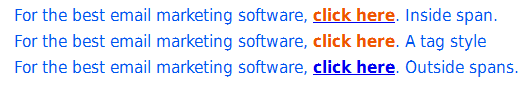
The middle line is the only one that is correct here. All three lines were given the same style attributes (style=”font-weight: bold; color: #ee5500; text-decoration: none;”). The top example had the style attributes inserted into tags that were placed inside the tags; in the middle example, the styles were added directly to the tag; and in the bottom example, the styles were inserted into tags that start before the tags and end after them. As you can see, all three lines had different results. In some email clients, the top two were correct, but none of them rendered the third line correctly. Adding “!important” to the styles had no effect. Clearly the best way to control the attributes of text in an tag is by assigning the styles within that tag. Any other method can yield unpredictable results.

Live Spelled Backwards is Evil

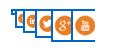
The email client that is the worst offender when it comes to creating this sort of havoc is, not surprisingly, Live Mail. The examples shown above come from this particular email client, and were, in some cases, okay in other email clients. As we discussed in our 2014 Year End Review, Live Mail brings its own set of idiosyncrasies to the table. Here’s an example of how a set of social buttons at the bottom of the page in an L.A. Times newsletter appeared in Live Mail:

bad callsAnd here is how it appeared in other email clients:

everywhere elseThose of you that have read the 2014 Year in Review article might guess that the black background is the result of using the three digit color code “#fff” instead of “#ffffff.” But the example above has nothing on this one from Lionbridge:

cascade effectIn this case, the buttons are overlapping each other, with each button appearing slightly smaller than the one to its right. Now here’s what this table looks like in every other email client:

okay versionQuite a difference! So what caused this strange cascading effect? We narrowed it down to the tag:


Normally, the tag has no effect on an email. Ironically, even this one wouldn’t have been a problem if the designer had left off the URL at the end. Then it would have worked just fine. Like the browsers, Live Mail has its own methods for dealing with the differences between HTML versions, and without the link, the software figures it out correctly. Of course, there’s really no reason to ever place a tag in an email. We recommend leaving them out. For that matter, the safest approach is to place only the styles you want for responsive purposes (which normally appear between thetags), and the actual content (which falls between thetags). Everything else serves no purpose in an email, and may actually create problems.

A Few Basic Rules

Getting links in email to appear the way you want them to is not difficult. It boils down to a few simple rules:

  • Always include border=0 in your tags
  • Use text-decoration: none to eliminate the underline on links
  • Assign a contrasting color on text links if the main content is blue
  • Place the style attributes for linked text in the tags
  • Eliminate superfluous code and tags, such as JavaScript and

These fixes are so easy to implement, it’s puzzling why many emails are still sent with these problems. In the grand scheme, these are relatively minor issues, but, as we have shown, little things can make a big difference.

Go to Goolara website

Responsive Design in Email, Part 4: Tales From the Front

Fighting for better email

[Note: Unlike most of our blog posts, this one comes from our Marketing Communications Specialist Jim Morton personally, recounting his adventures in the exploration of responsive design. Like many of you, much of Jim’s HTML work these days is confined to email design, which, as you know, plays by different rules from web design. We think that what Jim experienced in studying the subject is good information for anyone interested in trying their hand at responsive email design for the first time.]

In the previous three articles, I examined the proposition of using responsive design in email. At the beginning of the project, I knew about responsive design and how it worked, but I had never bothered with it. I designed my emails so they could be read on something as small as an iPhone viewed in landscape, but would still look good on a 27″ monitor; that seemed good enough.

But sometimes, “good enough” just isn’t good enough. One morning, while I was reading email on my way to work, I became aware of the fact that I read almost all of my personal email on my iPhone these days. A quick survey of people I know revealed this to be common trend among them as well. Then, on the Email Monday Blog, Jordie van Rijn cited a host of statistics indicating that mobile email can account for up to 65% of email opens depending on the audience. Should I be using responsive design to take advantage of this trend? I wondered.

Geniuses Only

The thing that kept me from taking the plunge into converting our email templates to responsive design was the same thing that has probably stopped a lot of you: namely, its reputation for being difficult. Responsive design, you’ll hear people say, is hard to implement and brings a whole new level of headaches to email design. The problem with this statement is it tends to be self-fulfilling. When I started this project, I carried that same baggage and found it difficult to get traction with my early efforts at it. Looking back at it, I see that a lot of my problems were the direct result of my preconceptions about responsive design’s supposed difficulty.

It was my trepidation over the process that led me to start with Dreamweaver, thinking that this might be an easier way to get responsive features up and running in my mailings. As many of you know, Dreamweaver has a nasty tendency to stick things you don’t need or want into your HTML, but I wasn’t too worried about this—Symphonie’s visual editor does a pretty good job of stripping such garbage out. However, I quickly discovered that Dreamweaver wasn’t going to help. In the first place, Dreamweaver insisted on creating separate CSS files for everything. Media queries weren’t handled directly, and when you chose fluid design, a CSS file and JavaScript file were automatically attached to the project—perfectly acceptable for a website, but not so good for email.

In early October, DreamweaverCC, added the option “Define in page” for media queries. By using this command, you can add the media queries to the top of the HTML document and the CSS information will automatically switch to inline for any formatting choices. This change to Dreamweaver makes it much easier to create responsive email designs within the program. It’s nice to see Adobe finally paying attention to the needs of email designers, but it came too late for my project.

On the Edge

It was with some interest that I read about Adobe’s latest product, Edge Reflow, which was specifically created to help make responsive design easier to facilitate. I’ve been using Adobe products for more years than I care to mention, and I am very comfortable with their programs. If anyone could make responsive design easier, it was going to be Adobe (full disclosure: I worked for Adobe as a technical writer and illustrator, but that was a long time ago). Since I was subscribed to Adobe Creative Suite, Edge Reflow was available in its beta test form. Could this be the solution to my problem?

Short answer: No. Perhaps if you are designing websites, Edge Reflow is a useful tool, but when it came to helping me design the email, it was of little value. If anything, it made the whole process more difficult by adding another layer of complexity (and files) to the process. To make matters worse, it required me to start from scratch and, worst of all, had no ability to contend with tables, nor did it offer any inline features. After spinning my wheels with this program for a few weeks, I concluded it wasn’t the answer I was looking for and continued my search (see Responsive Design in Email, Part 2: Edge Reflow for the full report).

BYOHTML

Eventually, I came to the conclusion that the only way I was going to get what I wanted was to go back to basics and write it all in HTML. I fired up my trusty Notepad++ and went to work. I started with the company newsletter. I had already designed it to be scalable, but I thought the images and buttons became too small to be useful in the scaled version. The layout was fairly simple—alternating image and text boxes divided into color coded section. How hard could it be?

Basic newsletter layout

At first, I tried to attach media queries to the previous version of the newsletter, but that proved to be impossible. In the original version the image and the associated text were part of the same table and the same row, so there was no way to get the image and the text to change their relationship to each other. Normally, this is one of the reasons email designers like tables—they keep things where they belong no matter what—but it’s not so good when you want things to move around more freely.

I thought about setting the positioning using divs, but I knew that Outlook.com doesn’t play nice with div floats or margins and I wanted to end up with an email that would look as good in as many email clients as possible. As with images and divs, you can control the appearance—or disappearance, as the case may be—of tables using media queries, but first I had to isolate the elements. For our newsletter, there were three primary elements: The image, its associated text, and the CTA button. By putting each of these in its own discreet table and nesting those three elements inside another table I was able to control the positions of all the elements with very little effort on my part.

The Compatibility Dilemma

Conceptually, the @media query is the heart of responsive design, and is pretty straightforward. You define styles to activate based on the @media query information, so you can move, resize, hide, and show different elements in your email. You may be tempted to try using the “display: none” attribute to control the appearance and disappearance of different sections based on the screen size, but I don’t recommend it. Not all email clients recognize this attribute, and when they don’t things break down terribly. Suddenly, you have a page with all versions of your content displayed stacked on top of each like a garage sale. Some clients, such as Gmail, force you to jump through so many hoops to get it to work that you might as well not bother. You’re still better off making sure that your email is readable under all circumstances than wrestling with multiple hidden versions. This particular issue gets right to the heart of the problem with responsive design.

However the biggest problem I faced in creating a cross-platform compatible design came from one company—Microsoft. While Google’s issues with the “display:none” tag forced me to rethink my design approach, it was Microsoft Outlook that generated the most problems for me. Getting my design to work across versions of Outlook was a study in frustration. My layout would work in Outlook 2003, 2007, and 2013, but not in 2010. Once I got it working in 2010, I’d go back to discover that it no longer looked right in 2007. The biggest problem was getting the tables to line up consistently. A quick search turned up a few articles on the subject of using Microsoft Outlook and responsive email design. Unfortunately, many of the solutions offered in these articles only shifted the problems to other versions of the software. I suspect that many of these people were working off the assumption that once they got the layout to work in their version of Outlook, it would work everywhere. In the end, the insertion of this tiny bit of code proved to be the only answer that actually worked:

style=”mso-table-lspace:0; mso-table-rspace:0;”

And even here I had to adjust the spacing in some of the tables to keep the images from interfering with the text.

Herein lies the biggest problem with responsive design in email. With so many different clients using so many different standards, finding out what works starts as an Easter egg hunt, and turns into a repetitious process of trial and error. While the technology of @media is conceptually simple and gives powerful options, individual vendors adoption of the required supporting elements has made it far more difficult and complicated than it should be. Perhaps when all—or almost all—the CSS commands are accepted across the board in email clients, then we will see some real strides forward in email design. Unfortunately, as we all know only too well, those wheels move very, very slowly.

Picking Your Battles

So was it worth it? I spent at least two weeks worth of studying and two more weeks of coding and layout, trying to get my initial design to work. I chased after a few concepts that led nowhere, and things that worked in some places fell apart in others. There was some satisfaction in seeing my final results in action, but I think I would have had less trouble with it had I not been searching for a shortcut to the coding part of the process. Ironically, the final design that actually worked came about after I threw out the file I had been working on and started over from scratch—that took me a day (of course, I had already done all the groundwork). Clearly, the web designer with a stronger background in responsive design will have a shorter learning curve than I did, but that can also bring with it erroneous assumptions about what will and won’t work. If you are new to responsive design, you’ll need to do some prep work before you can even start to code things. Of the resources I used, Chris Converse’s tutorial on Lynda.com was, by far, the most useful. As I mentioned in the previous post, looking at how others have tackled the problem is invaluable in coming up with good results.

The more complicated your email design is, the more of a hassle it will be to convert it. Goolara’s newsletter format is relatively simple, but it still took me a few weeks to get it where I wanted it. A complex design might prove resistant to a good responsive reworking solution. Whenever possible, designing your email with responsive in mind before you start is preferable, and will keep you from trying to fit a square peg in a round hole. As always, testing is crucial. While rendering services can be very helpful with catching errors, there were a few instances where what I received from the rendering service did not match the results I was getting with the actual email software, so use caution and test with actual mailings whenever possible.

The question you need to ask yourself is whether the effort you put into creating a responsive design is taking time away from segmentation and dynamic content efforts to make your mailings more personal. Larger companies, where the design is separate from the coding, won’t find this to be much of an issue, but if your designer is also the person who codes the file for email purposes, you’ll need to take into account the added time that they may require to get everything to work correctly. If it comes down to a choice between a nice responsive design and the good use of dynamic content, I would always choose the latter.  An email that addresses the specific interests and needs of a recipient is going to have more engagement than one that is merely easier to read on a phone. More and more people use their phones and “phablets” to read their email, but they’re still more likely to respond to an email that is relevant to them over one that merely looks good.

If you would like to see the results of my experiments, you can subscribe to the Goolara newsletter here, or you can write to me at jimm@goolara.com. You’ll also find me on Twitter: @JimAtGoolara. Happy emailing!

Go to Goolara website

Responsive Design in Email, Part 3: Handling Media Queries

Responsive design
In our last article on Responsive Design we examined Adobe’s new Edge Reflow program, which is designed to help facilitate the process of responsive website design. Unfortunately, we found that, like Dreamweaver, Edge Reflow is designed almost exclusively for website production, with no tools for creating responsive email files.* There is, of course, an alternative, and that is to code it yourself. Before you tune out completely, keep in mind that as long as you don’t try to get too fancy, creating media queries is not that daunting. This article is designed to help you get past the main stumbling blocks inherent in using responsive design in emails. As always, the K.I.S.S. rule applies. Keep things simple and you shouldn’t have any trouble building an effective responsive design. Once you’ve created your basic template, building new templates becomes a lot easier.

Email is Not a Web Page

The first thing to remember is that email design has certain characteristics that are substantially different from those of a web page. It is this fact that make both Dreamweaver and Reflow frustrating to work with at times. The main points of difference are:

  • Email cannot use JavaScript
  • Email cannot use separate CSS files
  • Tables are still the best way to control positioning
  • Some email clients can use head tag styles, but some cannot
  • Inline styles are always more compatible than styles in the head tag.

With a responsive web page, it is not unusual to have several CSS and JavaScript files connected to a page. Email design has no such luxury. Images are separate files, but everything else better be contained within the email if you want it to work.

The second thing to remember is that every email client plays by its own rules. Some ignore any expressions that appear in the head tags, which means your responsive design won’t work with that email client. As we discussed in the first article in this series, Gmail will use the head tag information if you view the mail on your iPhone with Apple’s Mail app, but not if you view it with Google’s Gmail app. Even with two email clients that both accept head tag styles, there may be display differences, so thorough testing is necessary every step of the way.

Tables Not Divs

Before you begin coding your responsive design media queries, you need to make sure you are starting on the right foot, and that means using tables. If you hang around web designers, or, at least, hang around the forums that web designers hang around, you’ve probably heard the mantra that you should be using divs not tables. “[Y]ou MUST use tables for tabular data!” A web designer on Stack Overflow posted. “Tables exist for that purpose, you MUST avoid tables only for layout purposes by using divs instead.” True enough if you’re designing a web site, but as every email designer knows, divs don’t always work in email. Outlook.com, for instance, ignores floats and margins, two of the primary components necessary for positioning elements on a page. This is especially ironic considering that Outlook.com is just about the only email client that actually uses most of the new HTML5 tags.

As with any other element on a page, tables can be assigned different attributes in the media queries. The main difference with responsive design is that elements with different media query attributes will need to be in separate tables to behave predictably. But before we get to that, let’s look at the basics of a media query.

Start Simple

For your first responsive design, it’s a good idea to start simple. It’s possible to have instructions for a dozen different sizes of screens, but it is not really necessary unless you’ve designed your email with multiple columns, which is generally not recommended. Depending on your design, you will want to switch to a mobile version of the email when the screen size falls somewhere between 500 and 600 pixels. Let’s say you’ve decided to switch to the mobile display at 525 pixels. Your media query would begin like this:

@media screen and (max-width: 525px)

You may want to use a smaller or a larger number, that is up to you. Smaller smart phones and the early iPhones had screen resolutions of 320×480 pixels. This number has increased substantially over the past few years. Newer iPhones have screen resolutions of 640×1,136 pixels, and the Sony Xperia Z Ultra and Samsung Galaxy S4 come in at a whopping 1,080×1,920 pixels, which rivals some desktop monitors.

These numbers may suggest that, at 640 pixels, the iPhone should display the full sized version of the email, but it will not. The number of pixels listed in the media query and the screen resolution are not equivalent. Newer iPhones, for instance, have a resolution of 640 across, but a device width of 320. This is because the width information in CSS does not take into account the iPhone’s retina display which doubles the number of pixels available. Likewise, the Samsung Galaxy Note II’s 720 pixel resolution comes in at 480 pixels in screen width. Of course, you can take pixel densities into account when you define your media queries, but this will only add an unnecessary layer of work to your email design. You may also want to create an intermediate set of rules for tablets and the very large phones (“phablets”), but keep in mind that this will add another media query and another set of instructions to your head tags. Also keep in mind that, if properly designed, your email should be readable on these devices without requiring any responsive adjustments. An email with a max-width of 650 pixels wide with 12 point type should be perfectly readable on any tablet (some people prefer to use the more cautious 600px).

From CSS to Email

With media queries, you can move elements around or hide them to your heart’s content.

If you are using Dreamweaver or a similar program to create your email, you may want to do everything using a CSS file to ensure consistency throughout the email, and to make it easier to change individual elements at a later date. Just remember that you’ll eventually need to convert all that information to inline styles. You could take the CSS file and stick its contents between style tags in the head, but not all email clients use head tag information. For the most compatible results, after you’ve added the CSS information to the style tag, you should next run the whole thing through an inline styler. This will inline everything, but it may also throw out the media queries at the same time. If so, you’ll need to replace these.

When you are finished, the top of your email’s HTML will look something like this:

<style type=”text/css”>

.ReadMsgBody {width: 100%;}

.ExternalClass {width: 100%;}

blockquote .original-only, .WordSection1 .original-only {display: none !important;}

blockquote table.forwarded-only, .WordSection1 table.forwarded-only {display: block !important;}

@media screen and (max-width: 525px) {

td[class=”SecondKitten”]{

display:none !important;}

img[class=”SecondKitten”]{

width: 100px !important;

height: auto !important;

padding-bottom: 20px !important;}

img[class=”FirstKitten”]{

width: 300px !important;

height: auto !important;

padding-bottom: 20px !important;}…

…</style>

<body>…

The expressions at the top that appear before the media query are there to eliminate email formatting issues. The first two expressions are for Hotmail, and the others are there to reset HTML5 elements to display elements as block elements, which helps control formatting things such as tables and lists.

The three style classes shown after the media query affect different parts of the design. The first one (td[class=”SecondKitten”]) causes the table cell (td) to disappear when the email is viewed on any device that is less than 525 pixels across. The second one (img[class=”FirstKitten”]) forces the image (img) to shrink to the width of 100 pixels, regardless of its original width. Likewise, the third class (img[class=”FirstKitten”]) forced the image to expand to 300 pixels.

Down in the body of the email, you’ll see something along these lines:

<img src=”http://placekitten.com/200/200&#8243; alt=”Meow!” height=”200″ width=”200″ border=”0″ style=”display: block; font-family: Arial; color: #ffffff;” class=”FirstKitten”>

The “FirstKitten” class indicates that if the screen’s width is 525 pixels or less, the image’s dimensions shift from 200×200 to 300×300. Normally, you’d want to reduce your image for a smaller screen, but this example demonstrates that you are not limited to only reductions. Just keep in mind that enlarging above an image’s resolution may result in some pixelation of the image.

A little further down in the body of the HTML, you’ll find this table cell information:

<td width=”200″ align=”center” style=”padding: 0;” class=”Second Kitten”><img src=”http://placekitten.com/200/250&#8243; alt=”Meow! Meow!” height=”250″ width=”200″ border=”0″ style=”display: block; font-family: Arial; color: #ffffff; font-size: 18px;” class=”Second Kitten”></td>

Since the media query attribute assigned to the cell (td) has a display value of “none,” the entire cell disappears when viewed on a small screen, even though the img class is active and has its own values. Here’s our sample file as it appears on a monitor (Click here to view full-sized version of the image):

Responsive Design on a Monitor

Images used in this demo are courtesy of placekitten.com.

And here’s the same file when viewed on an iPhone:

Responsive Design on an iPhone

You can see that a few interesting things have happened. The kitten at the top of the page became larger, deteriorating the image slightly, while the kitten at the bottom of the page disappeared entirely. The call-to-action buttons lose their original size attributes and switch to the attributes in the media query, which specify 100%. This causes the buttons to stretch across the width of the display, which works well for small screens, but would look bad on a monitor.

Now, suppose we change the “SecondKitten” td class as follows:

td[class=”SecondKitten”]{

display:100% !important;}

Now the second box in the email appears like this on an iPhone (or similar small-screen device):

100 pixel kitty

You’ll notice that since the cell is allowed to display and given a value of 100%, the image appears, but now the attributes under the img class=”SecondKitten” take effect. The picture is visible, but reduced to 100 pixels across because that was the width indicated it should be when the screen size falls below 525 pixels. **

Design for the Least Compatible Client

As I’m sure you’ve noticed, not all email clients are created equal. Outlook.com, for instance, does a great job of rendering HTML5 code, but it ignores floats and margins in divs. Some email clients can handle head tags, and some can’t. While it is fun to try and create complex responsive designs that adapt to different devices, you’ll still need to design your email so that when all else fails, it is still readable under the widest variety of circumstances. It might be fun, for instance, to swap out entire sections using “display:none” as an inline attribute, but it won’t do you much good if any of your recipients are using Gmail because Gmail strips out the “display:none” attribute from the email. The old adage in email design is that you should “design your email like it’s 1999.” A better approach is to design for Least Compatible Client (LCC). Don’t put anything in your body tags—other than class selectors for the media queries—that won’t work in every situation. That way, you’ll always have an email that will look as good as it can under any circumstances.***

Responsive Writing

A quick survey we did recently indicated that most of the email designers who are actually creating responsive layouts are not using visual editors such as Dreamweaver, but coding by hand using HTML-oriented text editors such as TextWrangler, Sublime Text, or Ultra Edit. Although Dreamweaver does have tools for creating responsive templates, as mentioned in our other posts on the subject, it is aimed primarily at web designers and often adds unwanted code to your files. If this all sounds a bit daunting, it shouldn’t. Remember our initial advice: keep it simple. Besides, remember that others have gone before you and there is no reason to reinvent the wheel.

Learning From Others

A great way to learn more about how to use responsive design is to open the source code for the responsive emails you receive and see what they’re doing. In most cases, you’ll see a lot of expressions under each media query that aren’t used. This is because everyone is working from a template to which they may have added things they’ve needed over time. A particular email may only use four or five instructions, but the media query section may have a dozen or more extra expressions. Those extra expressions add slightly to the size of the email, but only slightly. Web pages can be a great source of ideas for responsive design, but they often rely on JavaScript to implement certain aspects, so approach with caution.

One excellent source of responsive design examples is Media Queries. This web site is a collection of the best responsive design pages on the Internet. It contains hundreds of dazzling examples of responsive web design. This is a great place to go if you are looking for ideas. Odds are there is an example here that matches your concept. All of the examples are web pages, so most include JavaScript. Formatting varies widely, from carefully formatted and commented, to one big, indecipherable, block of code.

Another source for bare bones responsive email design ideas is Code Pen, an online sandbox for testing HTML. While most of the examples given on this site are for web design, a search for “responsive email” will yield several useful examples of emails that were created to be responsive.

There are also some very good online tutorials available on YouTube. These range in quality from professionally-made, “I-can’t-believe-they’re-not-charging-for-this” instructions, to people with indecipherable accents talking into their laptops at the local Starbucks. Lynda.com also features a thorough tutorial on responsive email design by Chris Converse (includes sample files).

Test, Test Test…

However you choose to create your responsive email, you’ll need to test it across as many different platforms and devices as possible. Sometimes things may look perfectly acceptable across nine clients and devices and then the tenth one will send you back to the drawing board. As with all code, a misplaced percentage sign or missing bracket can ruin everything. Due to the nature of responsive design, it can be difficult to tell if your media query is working until you see it in action.

In the next installment of our series on Responsive Design in Email, I’ll discuss the process I went through to come up with a good responsive design, and what I learned along the way.

* The latest release of DreamweaverCC, now includes the option “Define in page” for media queries. By using this command, you can add the media queries to the top of the HTML document and still inline all the style information. With this change to Dreamweaver, it might be possible now to use it to create responsive email designs within the program. It’s nice to see Adobe finally paying attention to the needs of email designers.

** If you would like a copy of the original HTML file, you can download it as a zip file here, or as a text file here.

*** This advice does not include Styled Alt Tags, which may not work in certain clients, but these are less an aspect of design than a fallback when images are not displayed.

The Finer Points of Styled Alt Tags

Whenever you send a mailing that contains images, there is a good possibility your email will end up being read by someone who has the images turned off. Most email clients default to images off, and many people leave it this way. That’s why it is always a good idea to include an alt tag that tells people what they’re missing. A good alt tag will inspire people to turn on the images. Images without alt tags are wasted opportunities.

A lot of people don’t realize that it is also possible to add style attributes to alt tags just like any other text. Styled alt tags don’t work in every email viewer, but when they do, they increase the visual dynamics of a mailing considerably. Like the alt information itself, the style attributes are included within the tag. As an example, consider the following bit of HTML:

30% SALE, Today only!

[IMPORTANT: For reasons known only to the people at WordPress, straight quotes are automatically converted to curly quotes. If you want to experiment with the HTML code listed in blue on this page, you will need to convert all the quotes in the code block back to straight quotes.]

Here is the same image sent two different ways. The example on the left is an ordinary alt tag, while the image on the right uses the code shown above.

Styled alt tag in Firefox

Not bad, but before you get too excited, there are some important things to consider before you use styled alt tags. Not all email clients and browsers handle styled alt tags the same way. The previous example was sent to a gmx.com email address and viewed in Firefox. Now here are the same two image boxes as they appear in Gmail with Firefox:

Styled alt tags in Gmail

In Firefox, Gmail and Yahoo don’t bother with the box dimensions, displaying the alt tags as lines of text instead. While not as useful as a box, which lets us know that we are missing an image, at least the text appears and is styled. But here’s what happens when we view the same email in Chrome:

Styled alt tags in Chrome

The styled information is missing because it is too long to fit on one line. In Chrome and Safari, if an alt tag is too long to fit on one line, it does not appear at all. This also is true for alt tags without style information, but, as you can see, the alt information fits without a problem as long as it isn’t styled. By increasing the font size, we’ve caused the text to wrap and disappear. The same thing happens on iPhones and Android phones.

By far, the least friendly applications when it comes to styled alt tags are the email viewing options offered by Microsoft. In Hotmail and Outlook.com, for instance, an email with the images turned off displays gray boxes with neither cell colors nor alt tags, styled or otherwise. In Outlook and Outlook Express, all styling is eliminated and every alt tag is prefaced with a statement about the protection of privacy. In Internet Explorer, styled alt tags viewed on non-Microsoft client sites keep the color information, but all other font characteristics are lost.

Opera will display styled alt tags, but, like Safari and Chrome, lines that are longer than the box width do not display properly. Unlike those browsers, however, Opera displays whatever text will fit the width of the box and the rest disappears off the right side of the image box.

To help you decide whether or not you want to use styled alt tags, we’ve constructed the following chart, that shows how the various clients, applications and browsers handle images and alt tags.

Styled Alt Tags chart

Based on the data in the chart, the most useful feature of styled alt tags is the ability to assign a color value to an alt tag, especially if most of your recipients are using Internet Explorer. It is the one style attribute that gets delivered across the most browser platforms. If you have alt information for a cell with a dark background color, adding style=”color: rgb(255, 255, 255);” to the IMG tag will help make the alt information visible. Here are two examples. In the box on the left, the alt tag has no style information. You can see that even though the cell color is slightly lighter than the one used for the styled alt tag, the alt information is difficult to read. The example on the right has the color attribute shown above added and is much easier to read.

Alt tag colors

The appearance of the text changes from browser to browser, so the alt tags should be checked by sending your test emails to one or two people who have access to the various browsers of various email clients. This is the surest way to check that your tags are viewable across various email clients and browsers. If you want to make the text appear larger, or in some other typeface, you’ll need to keep in mind that not everyone will be able to see your handiwork.

Using styled alt tags is a great way to add pizzazz to your email. As long as you are careful about the length and you test the email’s appearance across various browsers, there is really no downside to using them. The set-up is minimal, and you can always copy and paste the HTML information from previous emails once you’ve decided on styling attributes you want to use on a regular basis. If a substantial number of recipients are using Chrome and/or Safari, you’ll need to make sure that your alt tags are kept short and that any styling does cause the text to wrap. Also keep in mind that, as attractive as they are, they are not a substitute for actual text in the email (see Using Text to Deliver Your Message).

Want to learn more about how to use text and images in your email for maximum deliverability and effectiveness? Then check out our new white paper, Using Text and Images. Available in the Resources section of the Goolara website. Click here for a direct link.

Go to Goolara website

Using Text to Deliver Your Message

Email design isn't web design.Email design has its own rules and requirements. In this article we look at ways to improve the effectiveness of your email messaging with the smart use of text.

An important aspect of email is, of course, design. Graphic artists spend a lot of time adjusting images and page layouts to make their work look as perfect as possible. To the lay person, who is not accustomed to the ways of a designer, their endless fussing over which of three nearly identical colors they should use might seem like overkill, but graphic artists understand that good design is important to sales. A company’s website, brochures, business cards and everything else need to reflect their brand and they need to look good.

When the Internet came along, it threw a bit of a curve ball to many graphic artists. They had to learn new skills to get around the limitations of HTML. These are the same skills they need to make good looking email, but the number one mistake made by many graphic artists is to treat email design the same as web design. Email brings with it a host of unique design issues that are completely different from web design. The biggest difference comes in the way email handles images and text, and this is where many designers fall down.

A common technique for controlling the appearance of text on a website is to place the text in a graphic. In this way, the choice of fonts, placement, and other characteristics can be maintained even if the viewer does not have those fonts installed. But using this technique on email is not a good idea, for two reasons.

No Image = No Text

The default setting for most email clients is to block images. Among smart phones, only the iPhone displays images as a default. Of course, some people turn on the images, but most people tend to leave things with the default settings; it’s human nature.

Good Alt Tags will go a long ways toward helping people understand what they are missing, but even here, not all email browsers display the alt tags, and Microsoft Outlook 2007 goes one step further, adding its own security messages to the empty image boxes. Put another way, if you are using graphics-based messages, over half of your recipients are receiving it in the blandest form possible, and some aren’t seeing it at all.

If you really want to make sure that your message is reaching your public, you’ll need to offer some text to the recipients beyond what might or might not appear in your alt tags.

Text-to-Image Ratio

ISPs cannot read the text in images. Spammers know this and sometimes use images to get around filters that might shuttle their content automatically to the bulk folder. As a consequence, many ISPs now look at the text-to-image ratio to identify possible spam. When a marketer puts all the focus on images, the deliverability metrics suffer (as do open and clickthrough rates). Remember that the ISPs are ultimately the ones in control in this process, and a beautifully crafted image with the best marketing message in the world means nothing if the user never sees it.

A Tale of Two Emails

For purposes of this article, I am going restrict my conversation to two emails I recently received. One is from Macy’s and the other is from J. Crew. One is done with a good understanding of email and how it works; the other is designed using the traditional text as image approach and is less effective. I’ve used a few different email browsers here to show how different browsers treat missing images. First, here’s the Macy’s ad with images (only the top is shown here—there are more images below):

Macy's ad with images

Now, here’s the same ad with the images turned off (in Gmail):

Macy's ad with no images

As you can see, almost no information is lost. The ad still gets the point across and aside from the Macy’s logo and some other small formatted items, all the information you need is visible and visually interesting.

Now let’s look at J. Crew. Here is the ad with the images displayed:

J. Crew ad with images

It looks fine, but here’s how it looked when it arrived in my inbox (in Live Mail):

J. Crew ad with no images

Not so interesting anymore. What does this tell me besides the fact that it came from J. Crew? Even a few reasonably commented alt tags would have helped here, but all we get is “JCrew.com.” What makes this email so frustrating is that the problem could have easily been avoided with some care and forethought. Let’s look at the hero image. Here’s the original:

Example from J crew

The first thing you’ll notice is that the text is separate from the image. This makes it a perfect choice for using actual text instead of a graphic. By dividing the image into sections and placing these sections in a table, we can achieve the following:

alternate version of j crew hero image

Aside from a font change, this version delivers the same message, but more importantly, here is this version of the message when the images are blocked (in YahooMail):

J crew alternate without image

Now the message of the email is still rendered and readable to all recipients, regardless of their email browser settings. Graphic designers probably won’t find this solution particularly satisfying, but the visual dynamics created here by the text make it far more likely that recipients will respond to the email.

Everyone wants the best looking email possible. Of course, you want your images to display, and, of course, good design is paramount to better email response rates, but if it’s a choice between looking good and selling your products and services, then the choice becomes obvious. Images are great for making email visually appealing, but remember that text in email, like text on your website, is always more effective when it is left as text and not converted into an image. Plan accordingly.

Go to Goolara website