In the previous article in our Automated Email Workflows series, we looked at on-boarding campaigns and how to use email automation to simplify the process. As we saw, this was a variation on the classic drip campaign, but with some automation added to make sure that the mailings properly reflect the actions and requirements of the recipient. This time we’ll look at event-based campaigns, where the recipient has signed up for a specific event. An event might be online (e.g., a webinar) or at a physical location (e.g., a trade show).
An on-boarding automation has a fairly clear entry point—when new recipients are added to the system, they are automatically added to the on-boarding workflow as well. With an event-based workflow, you first must to decide who to invite, and decide how to handle the entries that come in late. In most cases, the recipients are identified through segmentation, based on what you know about each recipient. Your target audience could be anyone who’s purchased something, anyone who’s downloaded certain whitepapers, or—when it’s expedient and makes sense—everyone on your distribution list.
Where to Start
Once you’ve identified the audience, you’ll next have to decide the point at which the automation workflow begins. Should it start after a the initial invitation, or do you want the invitation to be the first step in the workflow process? It’s really six of one, half a dozen of the other. Sending a mailing targeted to the segment of recipients is easy, and then make the workflow use that same segment. Alternatively, you can start the workflow going with the segment as the target, and then have the first step in the workflow be the sending of the invitation.
Late to the Party
The next thing to consider is what to do with late arrivals. If the event is more than a few days after the initial invitation, there might be new people added to your list that you’ll want to tell about the event. If you don’t care whether or not new subscribers get invited to the event, then don’t worry about it, but if you want to take every opportunity to get the word out, you’ll need to make sure your workflow can properly handle entry at any point.
The basic idea of an event based workflow is to work backwards (or forwards) from the event’s date, sending reminders or confirmations as needed. For example, a webinar might start with an initial invitation three weeks before the event. If no enrollment is received, the recipient could be sent several more reminders before the webinar, and perhaps one more afterward. If we lay this out on a timeline, the flow would look something like this:
Running concurrently is the timeline for the recipients who have registered for the event. Once a recipient registers, the logic of the workflow needs to switch to one where advertising the webinar is no longer the focus, and instead the emails are sent to remind the recipient of the upcoming event. That flow would look more like this:
There are several ways a flexible workflow design tool would allow this structure to be diagrammed, and every ESP or digital marketing automation tool has its own method. One straightforward choice is to put each of the email steps shown in the diagrams above into the workflow with conditional logic to determine if it should be done or not. For example, the unregistered path has an email sent at nine days before the event. A logic node (sometimes called a decision diamond) should be put into the workflow to check at this nine-day-out point to see if the recipient has registered. If so, the email node is skipped, since we don’t want to remind recipients about an event for which they’ve already registered. In the same way, at the week-before point, a logic node should check if the recipient has registered, and only send the email if that is true.
Taking Care of Stragglers
That takes care of most of the logic, but what do we do about the recipients who’ve entered the list after the automation has begun? In our example, let’s say a recipient signs up to receive email eight days prior to the event. This is where the initial choice we discussed about whether the first email is sent outside the workflow or as the first step of the workflow makes some difference. If the first workflow step is to send the invitation email, then recipients who are newly added will automatically get that invitation, which could be ideal in this case. But we don’t want to send them the nine-day announcement a few seconds later, even though they would have received it in the standard flow. Workflows that allow entry after an initial invitation has been sent must have another piece of logic before each send node to determine if the timing is right. In this case, since we know the recipient entered at day eight, we should skip the nine-day announcement and let the workflow pick them up again at the four-day point.
Getting Help
With good workflow software these steps should be easy to implement. If you’re using Goolara Symphonie to implement the workflow, we’ll be happy to help you create any workflows you need. If you plan to do webinars or similar events on a regular basis, then you will want to set your automation up with master mailings that you can modify for each campaign. This requires even more forethought and work at the start, but can save hours of work in the long run.
In our last post, we looked at drip campaigns, which start at certain points, based on when the subscribers takes action, then send out regular mailings after that. With event-based workflows, everything revolves around the date of the event. All actions are based on this. While they are more complex than standard drip campaigns, event-based automations can also be quite simple, especially if you don’t allow new recipients to enter the workflow once the initial invitation is sent.
Another year has come and gone, and with it, another bagful of email catastrophes. Some of these are minor issues that could have been caught with a little more testing or another set of eyes, some are truly catastrophic, and a few problems are unique to that bane of email, Microsoft Live Mail.
Bad Links
It’s always a good idea to test your links before sending out an email, but even the best of us miss one from time to time. Here are a few we noticed this year.
You Know What I Mean!
In this newsletter from last January, MediaPost created a link to the AMA conference without the all important “http://” at the beginning. While that works fine when you are entering a URL in the Address Bar, it won’t work in an href command. It doesn’t help that they’ve used base64 encoding on the message which moves us further from the link and is probably why their emails always end up in my Spam folder.
My Name is [Your Name]
I’ve talked about using placer information in previous year-end reviews. Placers are useful, but only if you don’t forget to remove them from the final mailings. In this case, the placer link “http://your.website.address.here/” was used on the image. Fortunately, there were actual links later in the message, which minimized the damage here.
Spot the Panda
When you have several links in an email, there is always a danger that one won’t get its proper URL. Net-A-Porter does a good job of ensuring that every link goes to the item you click on, saving a lot of useless scrolling and page flipping (See last year’s Year-End Review for examples of this). But with this many unique links and more in every mailing, it was inevitable that they would miss one. In this case, it’s the Stella McCarthy coat on the bottom left, which links instead to Net-A-Porter’s emagazine.
Three Out of Nine is Not Good Odds
Getting one link wrong is forgivable. Getting six out of nine wrong is not. This email from Fab takes you to the same page no matter which of these images you click. The problem here is that six of the images are not even on the page. If you want to find them, you’ll have to search for them (they are on the site). Rule #1: Always make it easy for your customers to purchase things. Either create a landing page specifically for the items you’re showing, or link to each of them individually.
Psst! Wanna See a Picture?
This class sounds interesting, but if you click on the image it will take you to…the image. That’s right. It opens the image location. It doesn’t even take you to Sur La Table’s home page. You can eventually get there by clicking various other links on the page, but it seems like an image that says “Reserve Your Spot” should at least enable you to do just that.
Bad Formatting
Some mistakes are the result of formatting errors. One missing greater-than sign or comment tag and your entire design goes off the rails. Here are a few coding mistakes that we saw this year.
Dear First Name
This one is so common that we’re guaranteed to receive a few of these every year. Usually it is the first name that’s missing, but, as you can see from the third example, it can happen elsewhere in an email. I suspect that most of the time this comes about when someone is using a previous mailing to create a new one, and doesn’t pay attention to the merge fields and dynamic content. This is mostly just laziness. I know that Goolara Symphonie will maintain my merge data when I copy in this fashion, but I always replace it just to be on the safe side. Judging from these examples, I suspect that other ESPs are less forgiving.
MS Word + HTML = Disaster
Most people know better than to try and use Word for their HTML generator. Every once in a while, however, we get an email with the tell-tale “o:p” tag that Microsoft uses to allow you to convert the HTML back into a Word document. This email probably looked just fine in Microsoft Word, and it even looks okay in some visual editors, but it’s a disaster waiting to happen. Ironically, this particular mailing is all text and would have been easier to create directly in any ESP’s visual editor than in Word. This one will always fail in Live Mail (see section below) and often fails elsewhere as well. Here are a couple more examples:
These people would have all been better off typing their content in a plain text editor.
Bad Code Practices
Some problems are not the result of typos or inadequate testing. Some are simply bad practices. These aren’t mistakes in the strictest sense, but that doesn’t mean you shouldn’t watch out for them.
No Alts
Ever since Gmail started caching the images, we’ve seen an increase in the number of mailings that omit the alt tags. Here’s a perfect example of this from Warby Parker:
The only text in this mailing is the company’s address and a few links at the bottom. Now here’s one from Bed, Bath and Beyond where they’ve gone the extra mile to make sure that even with the images off, you know what their email is all about and have some impetus to click through:
Ya’ Got No Style!
Providing alt tags is a good practice, but if you’re using them in cells with dark backgrounds, remember to add style color information to the cell, in particular a color property such as #FFFFFF (white) and “text-decoration:none” to make sure the alt tag is readable. In the top example from the Westfield shopping center, the type is barely legible, but even that is only because it includes a link, which turns the type blue by default. The second example from TradePub.com, also includes a link, but the blue background makes it nearly impossible to read. For more information on how to create styled alt tags, see our white paper, Using Text & Images.
Formatting is for Sissies
I’ve removed the name and address information from the address above because it belongs to the competition. This email came without any formatting. No active links, no nothing. It was clearly a mistake, but there was no follow up apology; just a second mailing with completely different content twenty minutes later. Perhaps they are following that new “never say you’re sorry” attitude that is making the rounds on the Internet, or maybe they hoped no one would notice. Of course, one could point out that this email is, in fact, a violation of the CAN-SPAM act (inactive unsub link), but it’s probably moot.
Don’t Forget to Block
A perennial problem with sliced images in email is the problem of gaps. This is an easy one to prevent. The addition of “display: block” to each of the tags will go a long ways toward preventing this situation. Also watch out for things like padding and margin, which can also wreck a sliced image.
Live Mail Strikes Again
Every email reader has its own idiosyncrasies, but the one that seems to break email the most often is Live Mail. Here are some common problems—and one not so common problem—to look out for in Live Mail.
Watch Out for Links
The problem we see most often is the blue borders on images with links. Most of the time, it’s merely distracting, but in some cases, such as in the example above, it actually screws up the design. With other mail readers, putting an attribute such as “border: 0” (or “none”) in the
tag will eliminate the problem, and many of these mailings contain that instruction, but Live Mail requires this property to be put inside the tag. Put it anywhere else, and Live Mail ignores it.
Black is the New White
As discussed in last year’s email review, Live Mail does not like three-digit hex codes. You’ve assigned a background of #FFF (white)? Live Mail will treat it the same as #000 (black). Even if you have no customers using Live Mail, it’s a good idea to get into the practice of typing out the full six-digit hex codes.
Paragraph Alignment
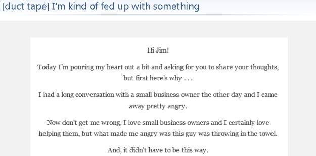
This mailing from Duct Tape Marketing looks fine everywhere else, but open it in Live Mail and suddenly all the text is centered, including a list that appears later on the page. While this isn’t a complete catastrophe, it does make the text harder to read, which is never good. In this case, the problem comes back to the placing the style information between tags instead of inline.
Email from a Mime
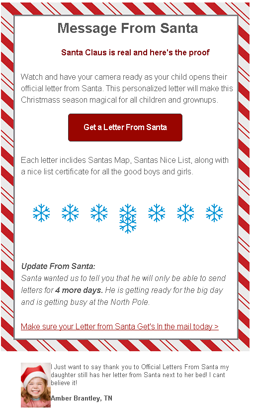
This is particularly weird phenomenon that only seems to happen in Live Mail. I received the email above shortly before Christmas. A big red block. That’s it. No text, no alt tags, and no “Show Images” link to indicate that anything was missing. Not surprisingly, it is an unsolicited email. It comes from a company that offers Santa letters for children. The email does have images (see below), but you couldn’t tell it from what I received in Live Mail. As far as Live Mail was concerned, this mailing was nothing more than a big red block. Here’s how it should have looked:
In a way, it’s probably just as well that nothing showed up. There are typos in nearly every line, they obviously didn’t bother with a test mailing, which would have showed that they used too many snowflakes (it only looks correct in Dreamweaver), and that kid is pretty obviously a stock image. This one would have ended up in this year-end review even if the images did show up.
Cascading Image Sizing
One of the weirdest anomalies We’ve encountered with Live Mail is the following one from Lionsbridge:
As a point of reference, here is the same thing sent to a Gmail address:
Quite a difference! After a bit of testing, we found that simply removing the doctype information at the top of the email’s code fixed the problem. This isn’t the first time we’ve encountered that particular issue. Our more recent tests with Live Mail show that this particular problem has been fixed. Nonetheless, as a rule, if you’re copying your code from an HTML editor, it’s a good idea to exclude the and tags from the process. The email software is going to wrap your information in those tags anyway. This doesn’t always mess things up, HTML is remarkably forgiving, but better safe than sorry. The truth is, the safest procedure for maximum compatibility is to omit everything except content between the body tags and to put inline any styles you have included, with the exceptions of the media queries and the usual boilerplate styles used to improve compatibility with various mailboxes.
Marketing Missteps
This next section is about mailings that use questionable marketing techniques to achieve their goals. Some could argue that these are effective because they get you to pay attention, but so will a car accident; that doesn’t make it a good thing.
It’s Our Special Interface!
CAN-SPAM requires that every promotional mailing includes an unsubscribe link that works, but there is nothing in the law that dictates exactly how you convey this message. This one’s from a questionable company, and would almost certainly have ended up in the spam folder had it been sent to my Gmail account, but my Live Mail account is set to accept a wider range of email. I don’t know about you, but I’d find it preferable to click “This is Spam” rather than click on that suspiciously worded unsubscribe. My advice: Stick to the tried-and-true “Click here to unsubscribe.” The unsubscribe link is no place to get clever.
About Your Account…
One of the most common techniques used by phishers is the one where they send you a notice about the way they are changing their charges on your bank account. The idea is for you to say, “Oh no!” and click the link, which takes you to a fake, but believable login page where you enter your bank login information. So it’s never a good idea when a legitimate company sends out an email that sets off the same alarm bells. Since I’ve never used PayPal with this account, the fact they sent this email to me means one of two things. Either they think I did give them a PayPal account (I did not), or they didn’t bother to segment the mailing. Both are bad, but the latter is unforgivable.
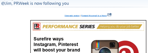
@SneakyMarketer is now following you!
Marketers are always looking for new ways to get you to look at their mailings. Sometimes they cross the line. PRWeek’s take off on Twitter’s following notices might have been okay had it been more obviously fake, and had had some truth to it. In fact, it’s just a come on to sign up for their webinar on social media.
Remember Me? No?
An insidious trend in spamming that showed up in my Inbox this year is the fake follow up. Here’s an example:
Looks legit, but a quick look at my Inbox, spam, and trash folder shows that no such original email was ever sent. This is not the first of these I’ve received, but it’s the first time that they went to the trouble of making it look like something was already sent.
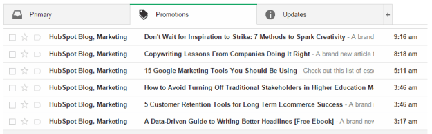
Hello, It’s Me Again
Lately there’s been a lot of press about the advantages of sending more email instead of less. The folks at HubSpot must have taken this to heart, because this is what I found in my email inbox one morning:
Now I’m all for frequent mailings, but this is going a bit far. All kidding aside, I realize that this is more likely the result of their site’s automation, but it probably didn’t help things that most of these were sent during hours when many U.S. companies aren’t sending (I am surprised, however, that I didn’t get something between the eight o’clock and nine o’clock mailings).
Until Next Year
That’s all for this year. I normally like end with a few examples of good and/or clever mailing ideas, but this post is already pushing the limits of acceptable length for an online article. I’d like to thank Justin Khoo at FreshInbox for his help in diagnosing some of Live Mail’s idiosyncrasies. Keep emailing, and if there’s one takeaway from this article it’s this: Always test before sending.
[Note: This is the second in a series of posts about automated workflows for email marketing. In part two, we look at the use of automation to create sophisticated drip campaigns. The examples used in these articles were created using Goolara Symphonie’s Automation features, but the information presented here is applicable to other systems as well.]
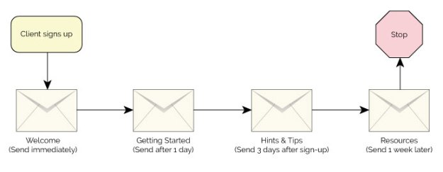
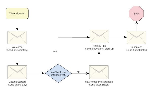
One of the simplest forms of automated workflows is an on-boarding campaign for a new client. In its simplest form, it goes something like this: Client A signs up for a product or service (let’s call him “Bob”), and thereafter receives regularly scheduled mailings instructing him in the ways he can use the product or service. Suppose Bob has signed up to use ABC Widgets SaaS inventory control system for his business. The first email he receives welcomes him to the service and explains all the advantages of ABC Widgets. The next mailing teaches him the basics of using the software. A few days later, he receives another email that might ask him to verify that he’s happy with the system and give him some more tips and ideas for using the software more efficiently. Finally, he receives a mailing with the information he needs to get help or move to the more advanced aspects of the system. In flowchart form, that might look something like this:
As you can see from the example above, the only automated aspect of this type of drip campaign is the starting point. After that, everything flows automatically based on the start date. In this respect, it is similar to a standard opt-in set-up, where a mailing is sent as soon as you sign up. Several email marketing software providers offer this particular style of drip campaign, and claim to offer automation, but true automation should offer much more than the ability to start a drip campaign at any given time. Full-featured email automation gives you the ability to get much more specific in what happens at each step along the way. For instance, you might want to branch out to two different results based on something that the client does or doesn’t do. For this, you’ll need to add logic to your automation.
Adding Logic
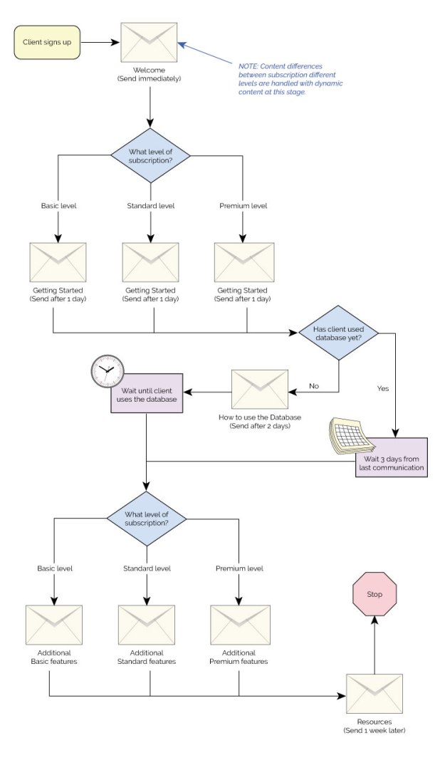
Suppose simply starting a drip campaign isn’t enough. Maybe you want to make sure that Bob implements the database in the ABC Widgets software as soon as possible. If Bob hasn’t started entering data into the database after a day or two, you’ll want to remind him of the importance of doing so, but you won’t want to remind him to do this if has already done it. Nobody likes to receive a notice like that, and it doesn’t make you look good with Bob either. To do this properly, you’ll need to add a logic point (also called a decision point) to your workflow that looks at Bob’s use of the software and offers different mailing choices based on that information. Here is the same drip campaign shown previously, but a decision point added to the workflow:
In our example, the decision point is a yes or no choice, in some software, that’s all you get. With some email marketing software, (such as Goolara Symphonie), you are not limited to this simple yes or no choice. You can branch the decision point in into as many alternative paths as you’d like. You might, for instance, offer multiple paths based on each recipient’s membership level, with each level receiving a different set of mailings.
Time Controls
You can also add additional trigger points that are activated when the client takes specific actions. These are in the form of “wait until” commands that come into play when the recipient makes a specific choice, such as clicking or opening certain pages. In our example, ABC Widgets could notify Bob when he finally does use the database feature, and offer additional tips and instructions after that. There’s no reason this couldn’t be an on-going set-up, with new information and suggestions being provided at different points during the on-boarding procedure and after.
Similarly, you can set up delays that are triggered based on their proximity to specific dates, such as birthdays or membership anniversaries. In our example, ABC Widget may want to notify Bob toward the end of a three-month trial period, or before the annual membership is due. These dates will be different for every client, which makes them ideal candidates for automation.
Split Test, Write Fields, and More
Other possible automation nodes include A/B splits, which is useful for split testing that requires different levels of interaction; write fields, which lets you completely change the content of each mailing based on any data you wish; and jump points, which are primarily used to help keep complicated workflows easy to manage. Not all ESPs offer all these features, but these represent a few of the more common nodes that you’ll encounter with advanced email marketing software.
Now let’s look at our original on-boarding campaign with a few more features added. In the example below, we’ve split the mailings into three different paths based on the subscription level for each client. The automation checks the subscription level, offers the correct email, looks at the actions of the client and proceeds with the automation based on whether or not the client has implemented the database. You could also set this up so that each of the three membership levels receives a completely different set of mailings for every step, but in our example, we’ve used dynamic content to change the data in the first and last mailings, allowing us to consolidate those two mailings. For more on dynamic content see the previous post, Personalizing Your Email Marketing.
If you are new to automation, you should start with a simple workflow and develop more complex ones as you get more familiar with the tools. One thing to be careful about is adding new functions to an existing automation. This is certainly acceptable and even preferable in many circumstances, but you’ll want to use email marketing software, such as Symphonie, that will flag possible recursive operations (operations that endlessly loop back on themselves) to make sure that your automated email workflows run smoothly.
[Note: This is the first in a series of posts about automated workflows for email marketing. In this, the first part, we will look at what you need to know before you get started creating an automated workflow. The examples used in these articles were created using Goolara Symphonie’s Automation features, but the information presented here is applicable to other systems as well.]
Automation is an important part of a complete email marketing program. It allows the person in charge of email marketing to work on other things while the emails that don’t require their attention are sent out automatically. If you are not using automated email workflows yet, you might be leaving money on the table. While they can take some time to set up, studies show that automated workflows improve sales results and pay for themselves in no time.
There are many interesting things that can be done with a flexible automation tool: drip campaigns, on-boarding programs, and shopping cart abandonment, to name but a few. But how do you get started implementing some of these programs? Let’s take a look.
Data is King
Your ability to personalize and tailor a program to an individual depends considerably on what you know about that person. You cannot, for instance, address someone by their first name in an email if you don’t have that information as a field in your demographics. Collecting useful data and providing it to your digital marketing solution is key to the success of any email marketing program. When working with automation, data is also king. A shopping cart abandonment program will only work if the data indicating an abandonment can be transferred from your shopping cart software. That leads us to the next question: How do we get that data into our system?
Real-time vs. Batch Processing
With automations, the sooner you can act on the data you’ve collected, the better. The ideal situation is when data can be transferred immediately. This is generally done through an API call responding to something that happens outside the system, such as a cart abandonment, a webinar sign-up, or a white paper download. If possible, you’ll want your programmers to setup a call to the digital marketing platform to transfer this data and activate the automation as soon as an event has occurred.
If it’s not possible to transfer data in real-time, you can try collecting the data once a day and transferring it to your digital marketing platform. This is an imperfect solution, however. Most people nowadays expect near instantaneous responses, but some examples where a response delay is more acceptable include, a drip associated with a webinar, follow-up to an event, such as a trade show, or something long term, such as a birthday reminder.
When There’s No External Data
If you can’t get real-time or batch data out of your internal systems, don’t panic. There are some situations where you can automate actions based on the data that is already in your digital marketing platform. One example is an on-boarding program. When a new recipient is added, they are automatically added to a drip campaign that provides automated emails to help them get started. Another example is automation based on open or clickthrough behavior. This can be dangerous, as many recipients don’t react well if they feel that their actions are being tracked, but it can be a useful tool to send administrative alerts to the salesperson or follow-up on the recipient’s demonstrated interest.
What Data?
So, what data should be provided in external data tables to facilitate a good automation program? Obviously, the email address. You won’t get far without that one. The email address is also the best identifier of each recipient since it’s the one piece of information that will be unique for everyone. Beyond that, it is a question of which data is actionable by your automation tool. You should be able to offer different paths within the automation flow based on the data provided. For example, knowing the date of the webinar will allow you to coordinate the drips so they are sent at the appropriate dates and times before and after the event.
Data to merge
Another important consideration is what data you will want for merging purposes. As an example, a shopping cart email that references some vague statement like “there are items in your cart” will not be as effective as one that references the specific item(s). The data may be usable in its native form (names, dates, and such), or it can be inserted into the message directly as HTML (as an invoice layout, for instance).
Utilizing Past Data
You’ll also want to look at the capabilities of your automation tool to make sure that it can handle simultaneous workflows for the same recipient, and that previous data is available for decision points in the workflow. If you offer events that have any overlap, like several webinars a month, it is important that your workflow can handle keeping track of which webinar the recipient has and hasn’t signed up for. Additionally, using the data from previous events can help you make the best decisions within a workflow. For example, you may offer a discount for a redeemed shopping cart the first few times a recipient abandons, but after a pattern of abandonments has been established you may want to cut out the discount to make sure recipients aren’t gaming your program. A good automation program should allow you to make decisions based on this previous history.
Next steps
Gathering data for your automation, deciding what data should be collected, and making a workflow that is intelligent based on past behaviors are several of the key things to consider when starting an automation program. After that is specifics of the different types of workflows, which we will look at in subsequent blog posts.
A well-designed typeface is a thing of beauty. It can convey emotion, improve sales, and help define a corporate identity. For years, designers have been trying to figure how to use their favorite fonts in email, sometimes these attempts fail miserably, and other times they lead to other problems that you wouldn’t expect. Using fonts in email takes you into treacherous territory. Is it better to use inline font-family styles or convert everything to images? And what about web fonts? Can you use them in email marketing?
In this overview, we look at all the methods for using fonts in email that are available to marketers and designers. Some of these techniques qualify as best practices, while others should be avoided at all costs. A couple might even qualify as worst practices.
Before we get too deep into the subject, we’d like to point out that we’ll be using font and typeface interchangeably. In the past, “font” referred a specific size of a typeface, so Helvetica 12pt was one font and Helvetica 24pt was another. With the advent of digital publishing, these designations lost their meaning.
Types of Fonts
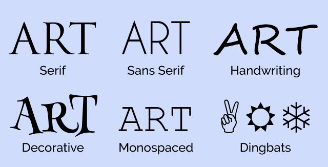
Fonts come in six basic types:
Serif
Serifs are those little feet that protrude from the edges of a character. Examples of this style of typeface include Century Schoolbook, Garamond, and Palatino. The most famous serif typeface is Times New Roman, which was created for the London Times by Stanley Morison. Serif typefaces are still the preferred choice for blocks of printed text. On the computer screen, they are little harder to read due to the effects of screen resolution of the serifs.
Sans Serif
If a typeface does not have those little feet, it is referred to as “sans serif.” Examples of sans serif typefaces include Franklin Gothic, Gill Sans, and Univers. The most well-known sans serif font is Helvetica, which is even the star of its own movie. The most common variation on Helvetica is Arial, which was specifically designed to match the font metrics of Helvetica. This was Microsoft’s way of getting around the license fees for Helvetica. San serif typefaces are preferred over serif typefaces for text on the computer screen. Some fonts, such as Verdana, were specifically designed for better readability on computer monitors.
Handwriting
A Handwriting font, as the name suggests, is one that resembles handwritten text. These fonts are also referred to as “Cursive” or “Script” fonts. Sometimes these are fancy, such as Park Avenue and Edwardian Script, and sometimes they are more casual, such as Comic Sans and Freestyle Script. Caution should be used with these fonts. As you’ll see when we get to the Web Fonts, cursive fonts usually default to Comic Sans, which is often a poor substitution.
Decorative
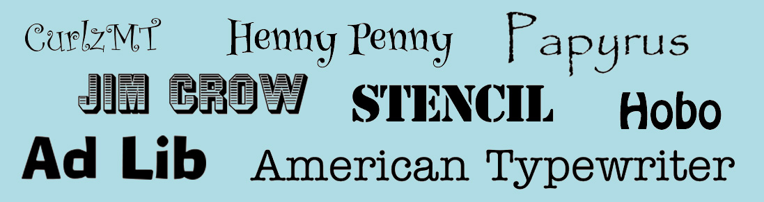
Decorative fonts are the ones that favor novelty over readability. They come in both serif and sans serif variations, and are usually restricted to logos and headlines. As a rule, they should never be used for blocks of text. Popular decorative fonts include Ad Lib, Jim Crow, Mesquite, Stencil, and Old English. They are sometimes used for logos, but, even here, are best used sparingly if at all. Because of the high level of variations between them, they should never be used in email.
Monospaced
Monospaced fonts are the ones that assign the same amount of space for each character. In a monospaced font, the ‘m’ takes the same amount of space as an ‘i’. This type of font is often used to display code, or to mimic an old typewriter. The most popular example of this is Courier. Monospaced fonts come in both serif versions, such as Courier, and sans serif versions, such as Consolas.
Dingbats
Dingbats are not fonts in the usual sense of the word, but, instead, have replaced the standard alphanumeric characters with little pictographs. In Webdings, for instance, a capital J renders a picture of an island with a palm tree, while in Wingdings it renders a smiley face. Dingbat fonts should never be used in email. You may like the idea of creating rebuses using Webdings, and it may look right on your PC; but if someone opens it on a Mac or some other system that doesn’t come with Webdings, they’ll only see gibberish.
Several pictographs are built into other typefaces as part of the Unicode (UTF-8). These are safer to use and sometimes are even used in subject lines (with ✈ and ❤ being particular favorites). Just make sure that you’ve encoded your mailing as UTF-8 and not 7-bit ASCII. Otherwise, you may end up with little squares or questions marks where the pictographs should be. It’s also important to remember that although there is some overlap in appearance between dingbat font characters and the pictographs that are available as part of the standard Unicode font set, they are not interchangeable. For example, the picture of the airplane in the middle on the left in the picture above is a capital Q in Wingdings. This one will not work in email. You need to use the airplane character as it is indicated in Unicode (you can find a handy chart of the Unicode dingbats and other special characters here).
Using a font directly
You can assign any typeface you want to your email content. Here, is an example of an inline style assigned to display in Helvetica:
Hello World
Of course, this doesn’t mean that your recipients are going to see the same thing on their computers that you see on yours. If the recipient does not have Helvetica installed in their system, they are going to see another font. As a rule, this will be Arial, but don’t count of the substitution to be automatic. By only listing one typeface in font-family style, you leave it up to the ISP, email client, or particular software to choose the alternative. This could end up being anything from Myriad Pro to Courier.
For this reason, it is always a good idea to provide a list of acceptable alternatives to the font-family style, starting with the preferred font, with the rest of the fonts following in order of preference:
Hello World
We’ve ended the list with the generic “sans-serif” as a safety measure to ensure that if none of the fonts listed are available, the text will still appear as a sans-serif font.
But what if your type absolutely has to be in a specific typeface? If it is part of your logo or associated with a specific branding campaign, you might not want the type replaced with anything else. In that case, your best bet is to convert the type to an image, but be careful—this is an overused technique that comes with some definite downsides.
Using Images for Type
At first, it seems like converting all your text to an image seems like a way to go. If you wanted to use Ad Lib for your headlines with Broadway for your text, an image would make sure that this (admittedly terrible) combination would look the same to everybody, regardless of their operating system, email client, or computer. But before you go converting all your mailings to images, there are a few important caveats to take into account.
No Text, No Inbox
First and foremost, you shouldn’t do it because it can affect deliverability. Shady email senders sometimes try and outsmart the spam filters by converting their text to an image in an attempt to elude the spam filters that check for certain words. As a consequence, many ISPs deduct points from a reputation score when they find only images in a message. This can be just enough of a negative to redirect your mailing from the Inbox to the Spam folder.
Not Text, No See
The second downside to using only images is that not all mailbox providers display images as a default. The Mail app on the iPhone does and Gmail does, but most others still default to image display off. If all your text has been converted into an image, you run the risk of missing potential sales for no better reason than that the recipient never saw your actual message.
Remember the Alt Tag
If you do plan to use an image to display text, the safest thing to do is to include the text in the image as an alt tag. That way if the recipient has image display turned off, he can still get an idea of what the picture contains. In the case of logos, you can also add styles to the alt tag to improve the email’s appearance. For more on this subject, see our white paper, Using Text and Images.
What About Web Fonts?
From time to time, people ask about using Google Web Fonts in email. If you are new to Google Web Fonts, these are fonts that you can use without having to have them installed either on your computer, or the computers of your recipients. There are other sources for web fonts, such as Adobe and Font Squirrel, but these usually require scripts, which do not work in email. Web fonts require you to add two pieces of information to your mailings—a tag with the URL for the font you want to use, and a font-family style attribute.
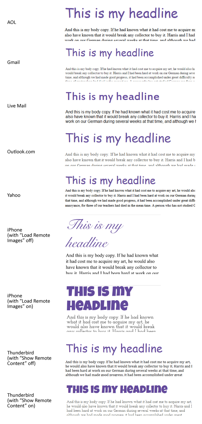
Web Fonts will only work when the email client recognizes the tag and can use it to download remote content (in this case, the fonts). Here’s an example of an email that was set using two Google Web Fonts—Luckiest Guy for the headline and Josefin Slab for the text. In this first example we’ve taken the HTML code provided by Google and stuck it in the mailing without further modification. Here is how the HTML it appears in a browser (in this case, Chrome) before it is sent as an email:
Now here’s the same email as it appears in various email clients and platforms:
As you can see, only the iPhone and Thunderbird rendered it correctly. Even here the fonts are only displayed when “Load Remote Images” is turned on (the default setting for the iPhone, but not for Thunderbird). Because Web Fonts require a link to work, these fonts are treated the same as images. If an email client defaults to “Images Off,” it’s not going to display Web Fonts either, even if it can. No images, no fonts.
The fact that cursive is listed as the font category for Luckiest Guy doesn’t help. It means that on PCs the headline defaults to various weights of Comic Sans, a font so detested that Weird Al Yankovic uses it as a gag in his song, “Tacky”. On Macs and iPhones, cursive defaults to Snell Roundhand which is better than Comic Sans, but is still a far cry the intended result. In the case of Live Mail, the fact that “serif” was listed as the fallback didn’t seem to matter. It still converted the text to Arial.
Of course, there’s nothing that says you have to use the HTML exactly as Google provides it. In the case of the Luckiest Guy font (and, I suspect, many others), you’d be better off ignoring their recommended category and choose one of your own. You’ll also want to add a few logical alternatives to the list. Here are the inline style settings for the headline after we’ve modified it:
There’s really nothing like Luckiest Guy that is common on computers, so I’ve chosen an assortment of bold display faces that you’ll find on many devices and platforms. Likewise, Josefin Slab is a hard one to match since slab-serifs (i.e., serifs that are squared off instead of pointed) are not that popular either. Here are the inline style settings for the body copy:
Rockwell and Clarendon are popular fonts, and although Georgia is not a slab-serif font, it is a common font and shares many characteristics with Clarendon. Here are the results:
As you can see, the results are still far from perfect, but they are better. If this level of discrepancy between fonts is acceptable to you, then you might find web fonts worth experimenting with. If your audience is made up primarily of iPhone and Mac users, it might be worthwhile. If your audience is primarily on PCs and Android phones, then it probably isn’t worth the effort.
Text Still Wins
When all is said and done, the advice we gave in Using Text to Deliver Your Message still stands: You’ll get the best results if you remain flexible on the font choices. Converting text to images where the font is important (such as logos and other branding) is acceptable, but even then, limit it as much as possible and make sure you’ve provided alt tags that are either informative or will make people want to display the images.
If the email that lands in our inboxes every day is any indication, people don’t spend enough time thinking about the effects that links have on images and text. Blue linked text on dark backgrounds, problematic borders, and unwanted underlines can all interfere with an email’s design. These are very easy fixes that should be in every email designer’s toolbox, so it’s a little puzzling why so many mailings don’t follow these simple rules.
Links on Images
In a previous article on this blog, we discussed ways to make sure your images link correctly in email. Image maps and image slicing offer ways to let portions of an image link to different pages, but that’s only part of the story. There is one more hidden pitfall in image handling that often goes overlooked. In fact, hardly a day goes by when I don’t see this particular mistake pop up in some email or another. You may think you’ve covered all your bases when it comes to linking images, but if you’re not careful, there’s one more trap waiting to trip you up.
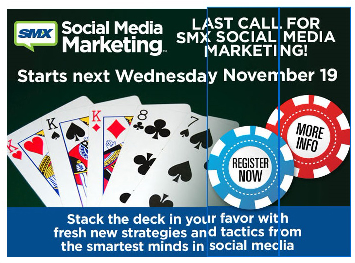
To understand better take a look at this example:
As you can see, the last two sections of the image have links. The email viewing software saw the links and placed highlights around these sections. In this particular case, the link borders also throw off the text in the image, making it harder to read, although the text at the top and the bottom could have been—and should have been—actual text (see Using Text to Deliver Your Message), the blue line certainly makes matters worse.
The blue line doesn’t appear in all email viewers, which is why this is sometimes overlooked. If the email reader you normally use doesn’t do this, you might miss it. Unfortunately, the problem crops up most often in Microsoft email clients and mailboxes, which aren’t exactly low profile products. Sometimes it can interfere with the design in other ways. Here’s a button with rounded corners and a blue border that completely destroys the intended effect:
In this particular case, rather than create the button using the border-radius style in a colored table cell, they generated it as an image instead, so the email reader put a border on it to indicate it has a link.
The fix for this is easy, and should come almost as second nature to email designers. Let’s look at the image tag on the button:
Now here’s what’s missing in red:
border="0" />
It’s that simple. The addition of the border attribute is all it takes to eliminate this particular problem so why do so many emails still show up with blue borders? In all likelihood it’s because the sender is only checking against their default email client.
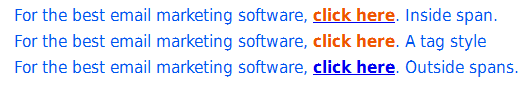
Lost in the Blue
With text, links default to blue underlined text in email. In one sense, this is usually a good thing. It wouldn’t serve much purpose to leave the text black with no underline. On the other hand, there are times when the blue color and the underscore can interfere with the design. Here’s an example of the button shown above recreated (as near I could) as a table cell instead of an image:
Borders aren’t an issue because it is no longer an image. The styles on the table cell are entered as inline styles, giving it specific text attributes and removing the underline that indicates it is a link. But here’s that same table cell, with the inline styles removed, allowing the text to revert to its default choices:
Not very useful. You can remove the underline by adding the style attribute “text-decoration: none,” but the text would still be blue. Just be careful that you haven’t assigned the text to appear in a color that is close to the default link color (which varies between browsers), email client systems aren’t smart enough to recognize the color of your text, and your links are likely to get lost.
Arranging Attributes
Browsers can be very forgiving when it comes to the order of attributes in your HTML. Email clients are not so generous. For this reason, you’ll sometimes encounter cases where a mailing looks just fine as a stand-alone web page, but then falls apart when it reaches the inbox. When this happens, you should check the order of your tags. Make sure things like yourtags are closed within their appropriate
tags, and thetags are closed within their
The email client that is the worst offender when it comes to creating this sort of havoc is, not surprisingly, Live Mail. The examples shown above come from this particular email client, and were, in some cases, okay in other email clients. As we discussed in our 2014 Year End Review, Live Mail brings its own set of idiosyncrasies to the table. Here’s an example of how a set of social buttons at the bottom of the page in an L.A. Times newsletter appeared in Live Mail:
And here is how it appeared in other email clients:
Those of you that have read the 2014 Year in Review article might guess that the black background is the result of using the three digit color code “#fff” instead of “#ffffff.” But the example above has nothing on this one from Lionbridge:
In this case, the buttons are overlapping each other, with each button appearing slightly smaller than the one to its right. Now here’s what this table looks like in every other email client:
Quite a difference! So what caused this strange cascading effect? We narrowed it down to the tag:
Normally, the tag has no effect on an email. Ironically, even this one wouldn’t have been a problem if the designer had left off the URL at the end. Then it would have worked just fine. Like the browsers, Live Mail has its own methods for dealing with the differences between HTML versions, and without the link, the software figures it out correctly. Of course, there’s really no reason to ever place a tag in an email. We recommend leaving them out. For that matter, the safest approach is to place only the styles you want for responsive purposes (which normally appear between thetags), and the actual content (which falls between thetags). Everything else serves no purpose in an email, and may actually create problems.
A Few Basic Rules
Getting links in email to appear the way you want them to is not difficult. It boils down to a few simple rules:
Always include border=0 in your tags
Use text-decoration: none to eliminate the underline on links
Assign a contrasting color on text links if the main content is blue
Place the style attributes for linked text in the tags
Eliminate superfluous code and tags, such as JavaScript and
These fixes are so easy to implement, it’s puzzling why many emails are still sent with these problems. In the grand scheme, these are relatively minor issues, but, as we have shown, little things can make a big difference.
Sometimes you might come up against a situation where the perfectly innocuous email you are sending has trouble getting delivered to certain addresses. You may have had no problems sending to that ISP in the past, and the mailing might even be based on a previous design that got through without problems, but suddenly you’re finding your mailings held up and greylisted. When this happens, you’ll want to check your mailing patterns for sharp increases in volume. If you see a spike like the one shown in the picture above, there’s a good chance you’ve uncovered the problem. It is easy enough to avoid, but it might require you to retool your approach to campaign marketing.
The Volume Factor
Besides using keywords, text-to-image ratios, bit.ly link redirects and a myriad of other ways to assess if an email is possible spam, ISPs and other mailbox providers also use your mailing patterns to identify when something’s wrong. If you suddenly decide to send out 100,000 emails, where you have previously been restricting your mailing output to a few thousand, you might find your mailing suddenly throttled way back on its delivery. Sudden spikes like this can cause even well-established companies to experience delivery problems. Email marketing programs that otherwise do not have deliverability issues will see their mailings blocked or greylisted when the volume of delivery jumps suddenly at irregular intervals.
On one level this makes perfect sense. If one day you suddenly saw a fifty-fold increase in traffic to your site, you’d immediately suspect something was wrong. The mailbox service providers react the same way, erring on the side of caution. Of course, if you regularly send 100,000 emails a day, the email provider won’t see anything unusual and will (unless there are other issues) allow your mailing to land in the Inbox.
This isn’t to say you have to send the same number of emails every day, but it does suggest that a little planning goes a long ways. Here are a few things to keep in mind:
Don’t be Sporadic
It’s okay to have spikes in your mailings as long as the occur at fairly regular intervals. You may have some problems the first time it happens, but if you do it regularly, most email service providers will adjust and allow more of your email through in the future. The chart shown at the top of this article shows what happens when a once time high-volume mailing arrives at a mailbox provider—alarm bells go off, even if you’ve had no deliverability problems in the past. If the same sender has a pattern of sending large quantities once a week, the odds are better that the mailing will get through.
Watch Out For Greylists
Provided there are no obvious spam triggering elements in your mailings, then, in all likelihood, emails stopped because the mailing’s been greylisted. In one sense, this is a good thing because it means the email will eventually reach the recipients, but it can also be a very bad thing if that particular mailing is time sensitive. A one-day only, Fourth of July sales announcement won’t do anyone much good if it doesn’t reach the Inbox until July fifth. Be especially careful if you’re planning on time-zone specific emails to arrive exactly when desired. You may want all the email delivered at 10:00, but it’s unlikely to happen.
Caution is always the best approach. Either send it out a little early, or make sure you have a policy in place if the mailing gets delayed. Even this might not help, though. While most ISPs throttle back the delivery of sudden, unexpected sending spikes, some ISPs will block a mailing completely if they feel the sudden spike is suspicious.
No Sudden Moves
Spreading the mailings out over a few days can also help avoid problems associated with a sudden spike in mailings. Then over time, if you keep your mailings on a regular schedule, you can consolidate these mailings into once mass mailing without difficulty. The window for most ISPs is about a month, but even monthly volume spikes will cause problems. A weekly spike has a better chance of getting through. Likewise, a regular pattern, such as every Tuesday, will work better than mailing spikes at random intervals.
You Don’t Have the Last Word
You can get as angry at the mailbox providers as you like, but if they decide to throttle back your time-sensitive emails, there’s not a lot you can do about it. Yelling at your email marketing software provider (ESP) and insisting that they must deliver your mailing when you want them delivered is placing the blame in the wrong place. The mailbox providers hold all the cards, so if they decide to greylist your mailing, there’s not much your ESP can do about it beyond verifying the reasons for the delivery problems. Any changes in tactics will have to come from your side of the equation.
The realities of deliverability cannot be overlooked, they require you to plan your promotional marketing scheduling carefully. If you are not the one in charge of the mailing schedule, you’ll want to make sure that the person who is in charge fully understands the factors involved in deliverability and how to best use the email marketing channel. Would there be a loss if a monthly newsletter was delivered over several days, or split into 25% a week? If not, then you might want to consider parsing the mailings out over a longer period of time, or, if you’ve decided to send more email on a regular basis, ramp up the sending over time.
Large volume mailing without encountering deliverability problems is easily achieved, but it might require you and the management to change your mindset on how you send email. Email clients aren’t going to change the way they do things just for you. You have to change to keep in sync with the way they do things. Make sure you’re consistent above all. If that’s not possible, try spreading out a large send over several hours. This gives the ISPs a chance to verify that your mailing is legit and will help ensure the mailing won’t run into major stoppages.
Another year has passed, and another year to look back on the best and the worst that business of email had to offer. We’ve been compiling them all year from a variety of sources. I’m sure that everyone reading this has received at least one of these. Some are typical, minor mistakes and some could kill a career. There are two main causes for most of the mistakes we encounter in email. The first is a marketing staff that is not allotted enough time to properly test and approve their mailings, and the second is a designer unfamiliar with the idiosyncrasies of email.
Bad Subject Lines
As I’m sure everyone one reading this blog already knows, nothing is more important to your open rate than the subject line. It doesn’t matter if you have the best, most compelling content in the world, if the subject line doesn’t pique the interest of your subscribers, they’ll never see your beautiful prose. That task alone is hard enough, but it doesn’t help if your attempts to make that subject more intriguing fail at their job.
Dear What’s Your Name
The most common error of this sort is the failed mail merge. You’ve undoubtedly received a few these over the years. Here are a few that we received just this year:
In most cases, a couple test emails, or even a test preview, will bring this particular mistake to light.
Happy HTML Holidays
As a rule, whoever does the email design at ThinkGeek does a great job. Their email is responsive for mobile, and cross platform compatible so that it still looks good when the email client strips out the style tags. They often use sophisticated HTML in their mailings, so I guess it was just a matter of time before they tried it on a subject line. The problem is, you can’t use HTML in a subject line. Here’s what they sent:
This is called over-thinking the problem (or under-thinking it). They could have achieved the effect they were looking for with the superscript 3 in Unicode:
While it’s true that some people might still have trouble with a UTF-8 subject line, those people are few and far between these days. Of course, since it is ThinkGeek, they could always claim they did it on purpose and that it was a joke intended for HTML-savvy people.
Testing, One… Two… Oops!
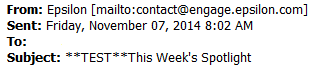
Testing is always a good idea. Sometimes people put the word “test” in the subject line to avoid confusing the mailing with other email. If you do this, just remember to take it out before you click “Send,” or your subscribers will receive something like the example shown above. Still, it could be worse. You could leave the word “Proof” in the subject line along with a complete set of demographic information.
Dear Mr. Panda-see
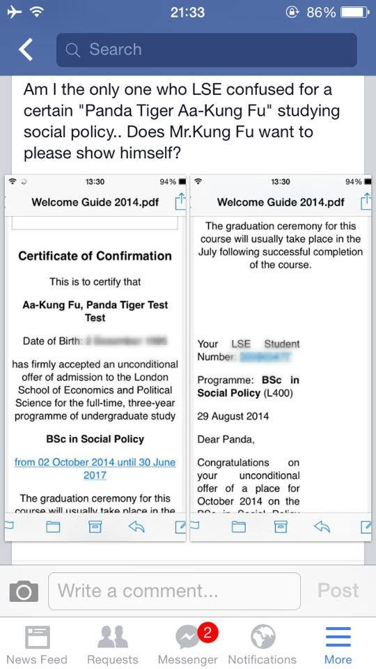
In September, the London School of Economics (LSE) got into trouble when they accidentally sent out 200 emails addressed to: “Aa-Kung Fu, Panda Tiger Test Test.” Most recipients react with befuddlement and amusement, but a few Asian students thought the name was an intentional slur. According to the BBC, the error was the “result of a technical problem with coding in the database used,” which is just a nice way of saying the problem occurred between the chair and the keyboard.
Email for Klingons?
Gack, as any Trekkie knows, is what Klingons eat, but this isn’t an infographic about that. This would be an ordinary typo under most circumstances, and we wouldn’t even bring it up, except that they managed to repeat the mistake in three places. First in the subject line, then in their weekly poster link, and finally in the email header. They eventually get it right in the content, and, happily, it is right in the link. This demonstrates both the problem with cutting-and-pasting, and the danger of letting Worf proofread your copy.
Transactional Mishaps
Transactional and triggered emails are the most powerful tools in an email marketer’s toolbox. With them you can send out highly tailored messages based on real-time information, or schedule mailings based on outside events. Unfortunately, not everyone understands that transactional mailings do require some initial set-up before they will work properly. Here are some examples of what happens when you don’t bother to put in any initial effort into your mailings.
Fill in the Blanks
The Alameda ferry was trying to send a message that the ferry would be late, but instead sent a fill-in-the-blanks questionnaire. It’s hard to say exactly where this error occurred. The lines where the text goes suggests that someone set up the template and sent it to the IT department to plug into their ESP’s API. Either they didn’t include instructions, or the IT person didn’t bother to read what was sent and set-up the template without the necessary modifications.
You Subscribed? Meh!
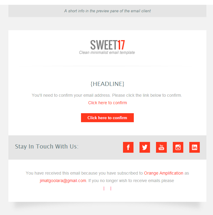
The winner for the absolute laziest piece of email marketing has to go to Orange Amplification, whose confirmation notice looks like they spent five seconds choosing a template and zero seconds modifying it for their company. If you ever need a poster child for the dangers of using templates, this is it.
My Bad!
The more email a company sends, the great chance they’ll make a mistake. So it’s no surprise that the best “Oops!” Emails come from retail sites that have high volume email marketing campaigns.
I Didn’t Even Know I was Pregnant!
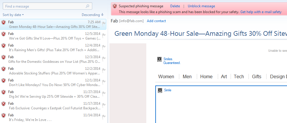
In May, Shutterfly caused a mini-scandal when they accidentally sent out a pregnancy congratulations notice to every single one of their subscribers. Many were not amused. Some unsubscribed on the spot. This is one of the few email goofs that actually made the Huffington Post. A few hours later, John Boris, Shutterfly’s CMO, sent out an apology. Quick response is always important in these situations, but Shutterfly missed an opportunity to use the mistake to their advantage. Fab, did better.
The Internet is Made of Cats
Kittens have become a popular placeholder for designers when putting together websites and emails, so it was just a matter of time before one these cats escaped and ended up in everyone’s inbox. Fab not only responded quickly and humorously, but turned it into a sales opportunity, offering a 10% discount to their recipients. Well played, Fab.
The Missing Links
It doesn’t take much to screw up a link. One missing character and the whole thing falls apart. Forget to add a link, and the promotional email loses its promotion. Here are some examples of this year’s link catastrophes.
Download now…uh, maybe not.
Long URLs are part and parcel of email links. As a rule, the email creator never should have to worry about these links. Their ESP software should provide the necessary link id information. Trying to type in a long URL with ID info attached to it is always a potential landmine. Take this email from Direct Marketing News:
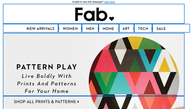
See that big, green “Download now” button? It seems like the logical place to click to download this white paper. Unfortunately, clicking on it results in nothing. Thankfully, the additional link in the copy below the image works just fine. A quick look at the HTML revealed the problem: In the link on the green button, one character is missing in the 105 character long link. Sometimes, that’s all it takes. Here’s one from Fab that had a perfectly good URL attached to the image, except the “http://” was missing:
No, You Can’t Join Us
Andrew Marc is luxury brand that likes to exude an aura of exclusivity. With this email, they took things to their logical conclusion by sending it without any links. Click on the line that reads “Shop Now at AndrewMarc.com >” and nothing happens. You’ll have to enter the URL yourself. We don’t imagine this inspired many people to follow through, but without links in the mailing, how will anyone ever know?
The DIY Approach
The H&M panel shown above looks just fine, but here’s what you get if you click on the “Shop Kids” button:
I suppose that technically, you’re still in the right department, but you’ll have to figure out for yourself what you want to look at.
We encountered a similar problem with Nasty Gal, when clicking on this:
Took us here:
Click and Seek
It seems like it should be a rule that whenever you click on a picture of an object in an email, you go to a page that features that object. You see a shirt you like, click on it, and there’s the page on the website where you can purchase that shirt. Nonetheless, every day an email lands in our inbox that blissfully ignores this rule. Here are just a few.
Email for the Color Blind
Fab, who normally does a good job with their email, sent out the example shown above featuring a red purse and a red speaker. Clicking on either the purse of the speaker takes you to the same page:
Well, there’s the red purse, but it looks like a gray speaker instead of a red one. No big deal, you think I’ll click on the gray speaker and there’ll be a color choice to click on. Nope! Clicking on the gray speaker (listed as “Salty Grey”) takes you to a page for that speaker in that color only! Yes, they do sell the speaker in red, but it will take you a few mouse clicks to find it.
You Can’t Have It!
Fab’s mailing may have required you to click in a few links to get to the product shown in the mailing, but at least it was there. This one from Nordstrom Rack takes things a step further and doesn’t allow you to see the product at all. You may be attracted to the leopard skin earmuffs shown above, but clicking on the picture takes you here:
That’s right: Hats. You can search the entire hats section and you won’t find those earmuffs. In fact, you can search the entire Cold Weather section and do a specific search for “earmuffs” and you won’t find them anywhere on the website. At what point does a product offering become bait-and-switch?
Please Like Me
Along the same lines is this email from H&M. It’s not just that clicking on the image doesn’t take you to the web page with this purse, it doesn’t even take you to the H&M website. Instead, it takes you to H&M’s Facebook event page. I suppose a giant image of the Facebook logo would have tipped off your subscribers.
Help Wanted: Email Designer
Sometimes the problems with an email have nothing to do with typos or missing links or accidental alignment problems, but come from the layout decisions of designers. Most of these are the result of designers knowing how to use HTML to design web sites, but not email. In fairness to the designers, some of these problems are very tricky to diagnose and solve.
3 Does Not Equal 6
When I first received this email, my initial reaction was, “This designer needs to be shot!” It didn’t help that the mailing came from a company that specializes in content marketing. I put it aside to discuss at the end of the year, but when I started to look at the email, I discovered that it looked fine everywhere except in Live Mail. A closer examination of the mailing’s HTML revealed the problem. The style attributes for the background color on the content cells were set using three digit hexadecimal codes (#fff). Microsoft has never been very good when it comes to dealing with three digit color codes. They work fine when setting the font color, but won’t work with the “bgcolor” attribute. A good rule of thumb: Always use the six digit code instead.
Non-Alignment Pacts
The old issue of alignment continues to rears its ugly head. Just this week we received the example shown above. A quick look at the HTML reveals a lot of responsive commands and some careful placement of table sizes. They might have even tested it, but if they did, they didn’t test it in any of Microsoft’s email clients. A few well placed “mso-table-lspace: 0; mso-table-rspace: 0;” values in the table styles might have solved the problem. They also made the mistake of putting the various pieces of an image into separate tables, which is just asking for trouble. Ironically, they did use “display:block” in the style attributes (normally, this is the primary reason images don’t line up), but only for the spacer gifs on the outside of the image.
H&M seems to have a problem lining up multiple images across an email. Here is an entirely different mailing with entirely different parameters, but a similar problem:
In this case, H&M did almost everything right, but they made one small mistake: The inner container table is set to 100% instead of the 700 pixels used for everything else in the table. As a result, the bigger your browser window is, the further apart the sets of small image appear. A lot of this mailing was designed to be responsive, but it doesn’t look as if anyone actually tested that design across multiple platforms.
I’m Going to Need a Bigger iPhone
Testing across a variety of platforms and devices is vital. Something might look great in Gmail and terrible in Outlook, or vice versa. An email might look good on your Mac and your PC, but then falls apart completely on a phone. This mailing from United Airlines looked just fine on my desktop monitor, but here’s what happened when I tried to look at it on my iPhone:
The Alternate Universe
In spite of Google’s decision a year ago to display images as the default, not everybody views email with images turned on. For this reason, a well-written and designed alt tag is good way to entice people to turn on the images for your mailing, or, at least, let them know what they are missing (for more about designing alt tags, see The Finer Points of Styled Alt Tags). Some alt tags, however, left us scratching our heads.
The Alt Tag as a Contract
While we are all for descriptive information in alt tags, Bed Bath & Beyond goes a little too far with this one. Sure, all that fine print is in the image, but that shouldn’t have been the case either. An asterisk with the fine print at the bottom of the email would have accomplished the same thing, allowed for a more creative alt tag and would have made for a lot more interesting graphic.
Simle and the World Simles With You
Fab normally does a great job with their email, but somewhere along the line an alt tag got misspelled. That wouldn’t have been a big deal, except that it has remained misspelled for the past year. More recently I’ve noticed that this particular template started getting flagged by my email reader.
I’d say it’s time to either rebuild it or retire it.
Things We Liked
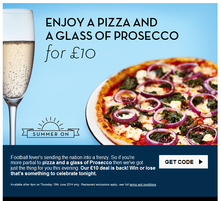
Not everything was bad news this year. A few companies went above and beyond the call in the email design. Here are our favorites, starting with one company that never fails to impress, Pizza Express.
Mosaic Fun
Pizza Express is a British company, so, in truth, there’s no point in our subscribing to their email. Those twenty-percent discount coupons for the Earl’s Court location don’t do us much good here in California. Pizza Express has proven themselves to be the masters of the mosaic. You’ll only see these mosaics if you have image display turned off, or catch a brief glimpse of them right before the images load. Here, for instance, is their email with images turned off for last Valentine’s Day:
And here’s the same email after you choose “Display Images”:
Sometimes they go for a more literal approach. Here’s one from last summer with the images turned off:
And here it is with the images turned on:
Pretty clever stuff. As much as we enjoy it, there are some downsides to this level of attention to detail. In the first place, it’s a lot of work for a weekly mailing, which is probably why they don’t use it that often. Each image must be sliced up and every table cell assigned a specific color value. In the second place, it encourages people to leave the images turned off, which affects the open rate numbers.
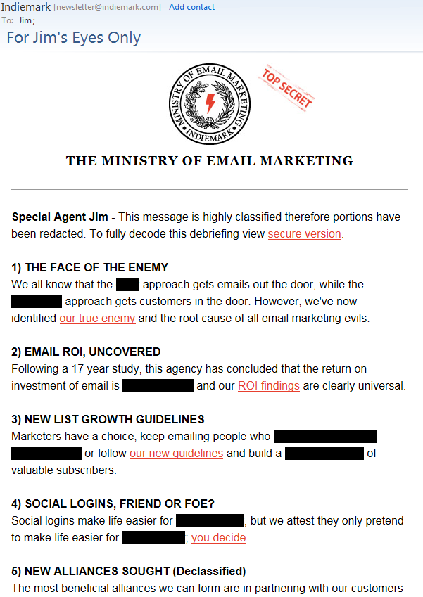
Secret Messages
Indiemark created a fun email this year that pokes fun at the recent security leaks by using blacked out lines of text that are visible when they are selected. They also have fun with mail merge, using the first name field in clever new ways.
Until Next Year!
That’s it for this year. We’d like to thank David Carpio and Tyler Stroud at Zeeto Media for their contribution. We were going to talk about some of the idiosyncrasies of Gmail’s new Preview Mode in the Promotions tab, but it’s still in beta and is showing no signs of ever being introduced to the public at large. We shall see what the next year brings. As long as marketing departments are faced with impossible deadlines and interns are tasked with creating emails, we’re sure to see more faux pas in the coming year.
Recently, while reading a newsletter from another Email Software Provider (ESP), we came across the following advice in a column titled “Ask the Experts.” A reader asked how can they keep their subscriber list clean. We were shocked by the advice they gave. They recommended the following:
Remove improperly formatted email addresses, duplicates, and syntax errors. Doing so will increase your deliverability rate.
An email address that hasn’t seen any engagement in opens or clicks within a predetermined time frame, (rule of thumb is around six months), should be removed from your list or targeted for a re-engagement campaign.
Use an online email validation tool to validate each email address to confirm it’s [sic] deliverable.
While we are fine with the second recommendation on the list, the first and last recommendations have us shaking our heads. The “expert” here seems to be suggesting that these are things you are going to have to handle on your own. Wouldn’t it make more sense for your ESP to handle these things for you? Let’s look at them one at a time.
Improperly Formatted Email Addresses
If you already have an established email program you shouldn’t have any “improperly formatted email addresses, duplicates, and syntax errors.” These should have been filtered out when the data was first imported into your ESP. Why would any ESP leave an obviously bad address, like bob@bob@aol.com, in your database? Perhaps if you have to pay by the address there’s some incentive for the ESP to keep these obvious mistakes in the database, but that’s a terrible way to make money. You are going to want an email marketing solution that is able to recognize these obviously bad addresses and remove them as soon as they are entered into your subscriber list.
Imaginary ISPs
While bob@bob@aol.com is a bad email address because it contains one too many @ symbols, its domain, aol.com, is legitimate. But what happens if the syntax is correct, but the domain is wrong. There’s nothing wrong with bob@zygodrillbits.com as an email address, except that there is no such domain zygodrillbits.com. Good email marketing software will also check the domains and remove the bad ones from the send list, so if one doesn’t exist, you won’t have to wait until you’ve started sending to find this out, and you shouldn’t have to run your list through third-party software to do so. Whether it’s syntactical errors that are the problem or bad domains, there is no reason your ESP shouldn’t automatically remove these improperly formatted and non-existent domains from your list. If your ESP isn’t already handling this, you should find another ESP immediately.
Hurting Delivery
As if that’s not enough, the “expert” goes on to say that leaving these addresses in your list will hurt your deliverability. How exactly would that happen? If the email address or domain is invalid the DNS system will tell you. No ISP could be contacted to deliver this email, so this bad address couldn’t possibly affect your deliverability. It could never get that far. Enter an address to gmail.moc instead of gmail.com, and Google will never here about it. The mailing will get stopped at the starting gate.
Invalid Domains
But improperly formatted email addresses are only half the story. Those are pretty obvious and are usually easy to spot. More difficult to recognize are the ones that appear to be legitimate addresses in every way but will return an invalid user response. Timfeldman@gmx.com may look like a perfectly acceptable email address, but it returns an invalid mailbox error. The quickest way to find out if an email address like this one is valid is to send to it, but you’re only going to want to do that once. Some email marketing software will send to an invalid address three or four times before giving up on it. This is asking for trouble. It’s a bit like someone knocking at your door looking for someone else, and then doing it again a few minutes later, and then again. You wouldn’t like it, and neither do the ISPs, which is why each time you retry, your reputation score takes a hit. Not a big one, but they add up, and the more it happens the worse it is for your reputation score.
So why do some ESPs allow more than one attempt to send to a bad email address? Mostly it’s out of laziness. Since every email client uses its own nomenclature to describe when an email isn’t valid, you can’t simply say, stop sending if you receive an “invalid user” message because the email client might decide to identify it as “invalid recipient,” “mailbox not found,” or some other variation on the message. There’s no end to the creativity of IT professionals when it comes to coming up with different ways to say exactly the same thing. To confound things more, some of these return messages are actually benign, notifying you that the mailbox is full or that the email has been temporarily rejected but is still valid.
Good, enterprise-level email marketing software, such as Goolara Symphonie, can distinguish between these different messages and stop sending to invalid addresses immediately while offering other courses of action for mailings that are detained for other reasons. Less robust systems often take the shortcut and simply try three times (in case it’s just a temporary problem) and then stop (in case it’s a bad address). This solution offers the worst of both worlds. With this method, every bad address hit you receive is automatically tripled. If you have 50 bad addresses, you’ll get 150 hits against your reputation score. Likewise, if the problem is temporary (mailbox full, for example), and the resends hit the mailbox full message three times, the ESP end up quarantining a perfectly good email address that might have been okay for a later mailing.
Online Email Validation
The advice column expert’s recommendation for how to handle these invalid email addresses is the last suggestion on their list, and it is as astounding as the first one: “Use an online email validation tool to validate each email address to confirm it’s [sic] deliverable.” In other words, they want you to send your list to a third-party to validate the addresses.
To understand what’s wrong with this approach, let’s look at two likely scenarios. In the first scenario, you are just starting a new email sending program. At this point, you shouldn’t have many email addresses unless you bought them or engaged in some other questionable practice. As we’ve already discussed, your ESP should eliminate any addresses with obvious syntax errors and duplicates automatically, and it should check all the domains as well to make sure they are valid. At this point you can try sending to these email addresses to find out which ones are not valid. If you have a high percentage of invalid addresses you may get blocked by some ISPs, or even by your Email Software Provider, but you shouldn’t have that many addresses when you are starting your email program, so this really shouldn’t come up. If you do get blocked it is probably worth looking at your list again because now you’ve got a bigger problem than a few invalid email addresses (and, honestly, the only likely way for this to happen is if you’ve purchased a list).
When Bad Addresses Happen to Good Senders
In the second scenario you are an established sender with a regular list of recipients. If the ESP is worth a hill of beans, every address you’ve sent to should be valid at this point, so the only questionable ones are the new addresses. Any previous bad addresses were purged when they were imported or when they were first sent to, so the only bad addresses will be those that have either gone bad since your last sending, or are new addresses on the list.
People sometimes provide bad addresses. They may be mistyped, or they may be intentionally incorrect. This is inevitable. As we’ve already pointed out, the obviously bad ones should never even make it into the system, but that leaves the ones that look fine, but are still invalid. These could hurt your deliverability, but only if you have an unusually high number of them. The percentage should be very small if you are using a good ESP and sending to your recipients on a regular basis.
The ISPs know that bad addresses can happen to good senders, so there is very little penalty for a small percentage of bad addresses. If you have less than one percentage of unknown users, it’s unlikely you’ll experience any deliverability problems.
So why would you take the subscriber list from your established email marketing program and send them to an outside firm to have them verified? The only reason would be that your ESP has no method of cleaning your list of bad addresses. If that’s the case, it’s time to start shopping for a better Email Software Provider. This is one of the fundamental things one should expect from an ESP.
The Real Secret to Good Deliverability
Going though your email addresses one at a time in search of bad email addresses is neither the best use of your time, nor the best way to improve your deliverability. Honestly, the best things you can do for it are make sure you send at least once a month, don’t buy lists, and make sure your email marketing software knows what to do with bad email addresses.
The Holiday Season is upon us, so we thought it might be fun to offer an infographic in the form a simple game of chance. Of course, your email marketing efforts should be anything but a game of chance. Careful planning, design, and testing will go a long ways toward improving your open rates. Keeping aware of your metrics and avoiding quick fixes, such as list purchasing, will keep your deliverability out of the red zone.
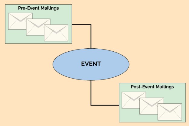
 Running concurrently is the timeline for the recipients who have registered for the event. Once a recipient registers, the logic of the workflow needs to switch to one where advertising the webinar is no longer the focus, and instead the emails are sent to remind the recipient of the upcoming event. That flow would look more like this:
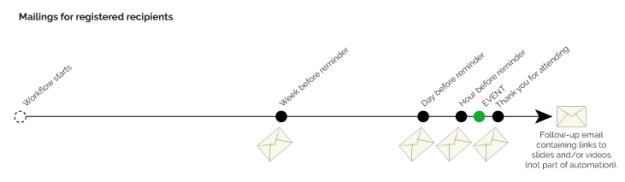 There are several ways a flexible workflow design tool would allow this structure to be diagrammed, and every ESP or digital marketing automation tool has its own method. One straightforward choice is to put each of the email steps shown in the diagrams above into the workflow with conditional logic to determine if it should be done or not. For example, the unregistered path has an email sent at nine days before the event. A logic node (sometimes called a decision diamond) should be put into the workflow to check at this nine-day-out point to see if the recipient has registered. If so, the email node is skipped, since we don’t want to remind recipients about an event for which they’ve already registered. In the same way, at the week-before point, a logic node should check if the recipient has registered, and only send the email if that is true.