Another year has passed, and another year to look back on the best and the worst that business of email had to offer. We’ve been compiling them all year from a variety of sources. I’m sure that everyone reading this has received at least one of these. Some are typical, minor mistakes and some could kill a career. There are two main causes for most of the mistakes we encounter in email. The first is a marketing staff that is not allotted enough time to properly test and approve their mailings, and the second is a designer unfamiliar with the idiosyncrasies of email.
Bad Subject Lines
As I’m sure everyone one reading this blog already knows, nothing is more important to your open rate than the subject line. It doesn’t matter if you have the best, most compelling content in the world, if the subject line doesn’t pique the interest of your subscribers, they’ll never see your beautiful prose. That task alone is hard enough, but it doesn’t help if your attempts to make that subject more intriguing fail at their job.
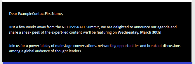
Dear What’s Your Name
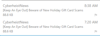
The most common error of this sort is the failed mail merge. You’ve undoubtedly received a few these over the years. Here are a few that we received just this year:


 In most cases, a couple test emails, or even a test preview, will bring this particular mistake to light.
Happy HTML Holidays
As a rule, whoever does the email design at ThinkGeek does a great job. Their email is responsive for mobile, and cross platform compatible so that it still looks good when the email client strips out the style tags. They often use sophisticated HTML in their mailings, so I guess it was just a matter of time before they tried it on a subject line. The problem is, you can’t use HTML in a subject line. Here’s what they sent:
 This is called over-thinking the problem (or under-thinking it). They could have achieved the effect they were looking for with the superscript 3 in Unicode:
 While it’s true that some people might still have trouble with a UTF-8 subject line, those people are few and far between these days. Of course, since it is ThinkGeek, they could always claim they did it on purpose and that it was a joke intended for HTML-savvy people.
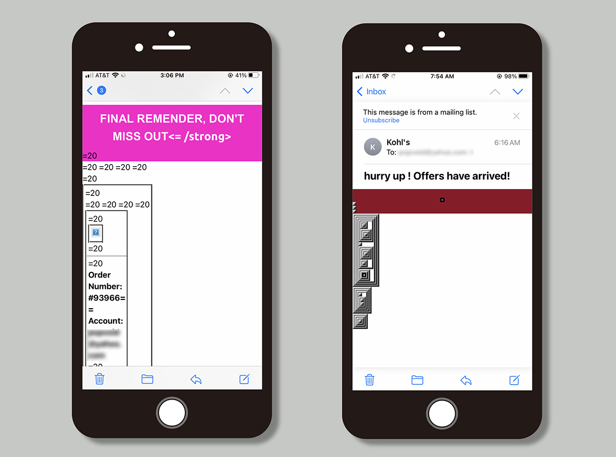
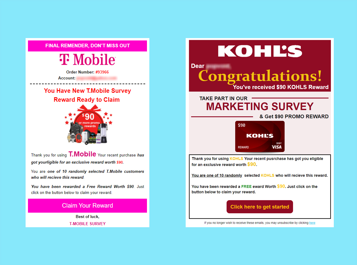
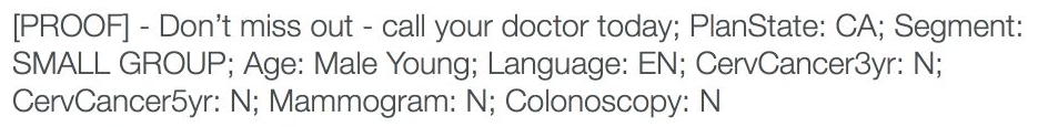
Testing, One… Two… Oops!
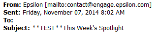 Testing is always a good idea. Sometimes people put the word “test” in the subject line to avoid confusing the mailing with other email. If you do this, just remember to take it out before you click “Send,” or your subscribers will receive something like the example shown above. Still, it could be worse. You could leave the word “Proof” in the subject line along with a complete set of demographic information.
Dear Mr. Panda-see
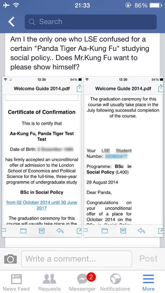 In September, the London School of Economics (LSE) got into trouble when they accidentally sent out 200 emails addressed to: “Aa-Kung Fu, Panda Tiger Test Test.” Most recipients react with befuddlement and amusement, but a few Asian students thought the name was an intentional slur.
According to the BBC, the error was the “result of a technical problem with coding in the database used,” which is just a nice way of saying the problem occurred between the chair and the keyboard.
Email for Klingons?
 Gack, as any Trekkie knows, is what Klingons eat, but this isn’t an infographic about that. This would be an ordinary typo under most circumstances, and we wouldn’t even bring it up, except that they managed to repeat the mistake in three places. First in the subject line, then in their weekly poster link, and finally in the email header. They eventually get it right in the content, and, happily, it is right in the link. This demonstrates both the problem with cutting-and-pasting, and the danger of letting Worf proofread your copy.
Transactional Mishaps
Transactional and triggered emails are the most powerful tools in an email marketer’s toolbox. With them you can send out highly tailored messages based on real-time information, or schedule mailings based on outside events. Unfortunately, not everyone understands that transactional mailings do require some initial set-up before they will work properly. Here are some examples of what happens when you don’t bother to put in any initial effort into your mailings.
Fill in the Blanks
 The Alameda ferry was trying to send a message that the ferry would be late, but instead sent a fill-in-the-blanks questionnaire. It’s hard to say exactly where this error occurred. The lines where the text goes suggests that someone set up the template and sent it to the IT department to plug into their ESP’s API. Either they didn’t include instructions, or the IT person didn’t bother to read what was sent and set-up the template without the necessary modifications.
You Subscribed? Meh!
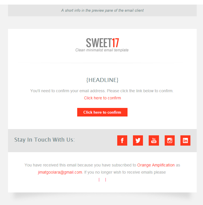 The winner for the absolute laziest piece of email marketing has to go to Orange Amplification, whose confirmation notice looks like they spent five seconds choosing a template and zero seconds modifying it for their company. If you ever need a poster child for the dangers of using templates, this is it.
My Bad!
The more email a company sends, the great chance they’ll make a mistake. So it’s no surprise that the best “Oops!” Emails come from retail sites that have high volume email marketing campaigns.
I Didn’t Even Know I was Pregnant!
 In May, Shutterfly caused a mini-scandal when they accidentally sent out a pregnancy congratulations notice to every single one of their subscribers. Many were not amused. Some unsubscribed on the spot. This is one of the few email goofs that actually made the Huffington Post. A few hours later, John Boris, Shutterfly’s CMO, sent out an apology. Quick response is always important in these situations, but Shutterfly missed an opportunity to use the mistake to their advantage. Fab, did better.
The Internet is Made of Cats
 Kittens have become a popular placeholder for designers when putting together websites and emails, so it was just a matter of time before one these cats escaped and ended up in everyone’s inbox. Fab not only responded quickly and humorously, but turned it into a sales opportunity, offering a 10% discount to their recipients. Well played, Fab.

The Missing Links
It doesn’t take much to screw up a link. One missing character and the whole thing falls apart. Forget to add a link, and the promotional email loses its promotion. Here are some examples of this year’s link catastrophes.
Download now…uh, maybe not.
Long URLs are part and parcel of email links. As a rule, the email creator never should have to worry about these links. Their ESP software should provide the necessary link id information. Trying to type in a long URL with ID info attached to it is always a potential landmine. Take this email from Direct Marketing News:
 See that big, green “Download now” button? It seems like the logical place to click to download this white paper. Unfortunately, clicking on it results in nothing. Thankfully, the additional link in the copy below the image works just fine. A quick look at the HTML revealed the problem: In the link on the green button, one character is missing in the 105 character long link. Sometimes, that’s all it takes. Here’s one from Fab that had a perfectly good URL attached to the image, except the “http://” was missing:

No, You Can’t Join Us
 Andrew Marc is luxury brand that likes to exude an aura of exclusivity. With this email, they took things to their logical conclusion by sending it without any links. Click on the line that reads “Shop Now at AndrewMarc.com >” and nothing happens. You’ll have to enter the URL yourself. We don’t imagine this inspired many people to follow through, but without links in the mailing, how will anyone ever know?
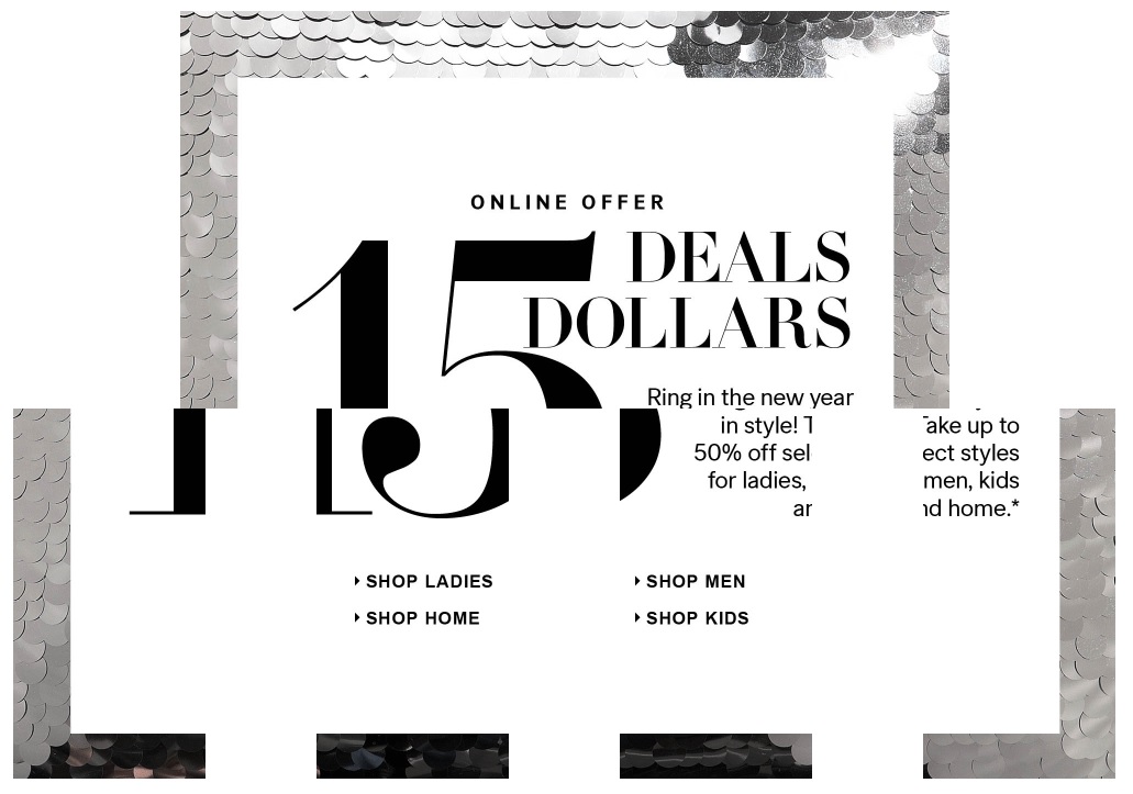
The DIY Approach
 The H&M panel shown above looks just fine, but here’s what you get if you click on the “Shop Kids” button:
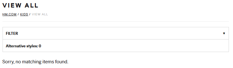 I suppose that technically, you’re still in the right department, but you’ll have to figure out for yourself what you want to look at.
We encountered a similar problem with Nasty Gal, when clicking on this:

Took us here:

Click and Seek
It seems like it should be a rule that whenever you click on a picture of an object in an email, you go to a page that features that object. You see a shirt you like, click on it, and there’s the page on the website where you can purchase that shirt. Nonetheless, every day an email lands in our inbox that blissfully ignores this rule. Here are just a few.
Email for the Color Blind
 Fab, who normally does a good job with their email, sent out the example shown above featuring a red purse and a red speaker. Clicking on either the purse of the speaker takes you to the same page:
 Well, there’s the red purse, but it looks like a gray speaker instead of a red one. No big deal, you think I’ll click on the gray speaker and there’ll be a color choice to click on. Nope! Clicking on the gray speaker (listed as “Salty Grey”) takes you to a page for that speaker in that color only! Yes, they do sell the speaker in red, but it will take you a few mouse clicks to find it.
You Can’t Have It!
 Fab’s mailing may have required you to click in a few links to get to the product shown in the mailing, but at least it was there. This one from Nordstrom Rack takes things a step further and doesn’t allow you to see the product at all. You may be attracted to the leopard skin earmuffs shown above, but clicking on the picture takes you here:
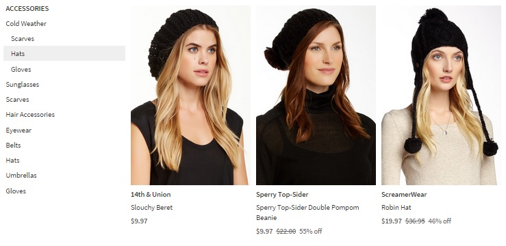 That’s right: Hats. You can search the entire hats section and you won’t find those earmuffs. In fact, you can search the entire Cold Weather section and do a specific search for “earmuffs” and you won’t find them anywhere on the website. At what point does a product offering become bait-and-switch?
Please Like Me
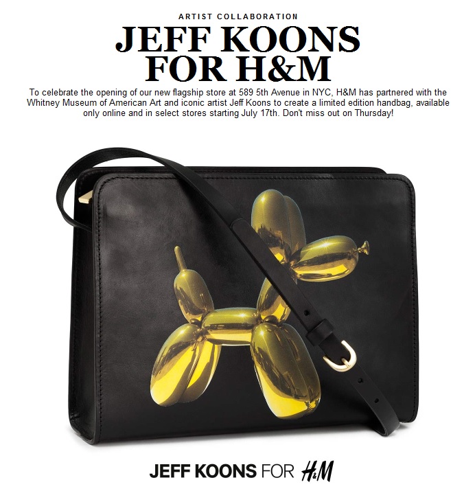 Along the same lines is this email from H&M. It’s not just that clicking on the image doesn’t take you to the web page with this purse, it doesn’t even take you to the H&M website. Instead, it takes you to H&M’s Facebook event page. I suppose a giant image of the Facebook logo would have tipped off your subscribers.
Help Wanted: Email Designer
Sometimes the problems with an email have nothing to do with typos or missing links or accidental alignment problems, but come from the layout decisions of designers. Most of these are the result of designers knowing how to use HTML to design web sites, but not email. In fairness to the designers, some of these problems are very tricky to diagnose and solve.
3 Does Not Equal 6
 When I first received this email, my initial reaction was, “This designer needs to be shot!” It didn’t help that the mailing came from a company that specializes in content marketing. I put it aside to discuss at the end of the year, but when I started to look at the email, I discovered that it looked fine everywhere except in Live Mail. A closer examination of the mailing’s HTML revealed the problem. The style attributes for the background color on the content cells were set using three digit hexadecimal codes (#fff). Microsoft has never been very good when it comes to dealing with three digit color codes. They work fine when setting the font color, but won’t work with the “bgcolor” attribute. A good rule of thumb: Always use the six digit code instead.
Non-Alignment Pacts
 The old issue of alignment continues to rears its ugly head. Just this week we received the example shown above. A quick look at the HTML reveals a lot of responsive commands and some careful placement of table sizes. They might have even tested it, but if they did, they didn’t test it in any of Microsoft’s email clients. A few well placed “mso-table-lspace: 0; mso-table-rspace: 0;” values in the table styles might have solved the problem. They also made the mistake of putting the various pieces of an image into separate tables, which is just asking for trouble. Ironically, they did use “display:block” in the style attributes (normally, this is the primary reason images don’t line up), but only for the spacer gifs on the outside of the image.
H&M seems to have a problem lining up multiple images across an email. Here is an entirely different mailing with entirely different parameters, but a similar problem:
 In this case, H&M did almost everything right, but they made one small mistake: The inner container table is set to 100% instead of the 700 pixels used for everything else in the table. As a result, the bigger your browser window is, the further apart the sets of small image appear. A lot of this mailing was designed to be responsive, but it doesn’t look as if anyone actually tested that design across multiple platforms.
I’m Going to Need a Bigger iPhone
Testing across a variety of platforms and devices is vital. Something might look great in Gmail and terrible in Outlook, or vice versa. An email might look good on your Mac and your PC, but then falls apart completely on a phone. This mailing from United Airlines looked just fine on my desktop monitor, but here’s what happened when I tried to look at it on my iPhone:

The Alternate Universe
In spite of Google’s decision a year ago to display images as the default, not everybody views email with images turned on. For this reason, a well-written and designed alt tag is good way to entice people to turn on the images for your mailing, or, at least, let them know what they are missing (for more about designing alt tags, see The Finer Points of Styled Alt Tags). Some alt tags, however, left us scratching our heads.
The Alt Tag as a Contract
 While we are all for descriptive information in alt tags, Bed Bath & Beyond goes a little too far with this one. Sure, all that fine print is in the image, but that shouldn’t have been the case either. An asterisk with the fine print at the bottom of the email would have accomplished the same thing, allowed for a more creative alt tag and would have made for a lot more interesting graphic.
Simle and the World Simles With You
 Fab normally does a great job with their email, but somewhere along the line an alt tag got misspelled. That wouldn’t have been a big deal, except that it has remained misspelled for the past year. More recently I’ve noticed that this particular template started getting flagged by my email reader.
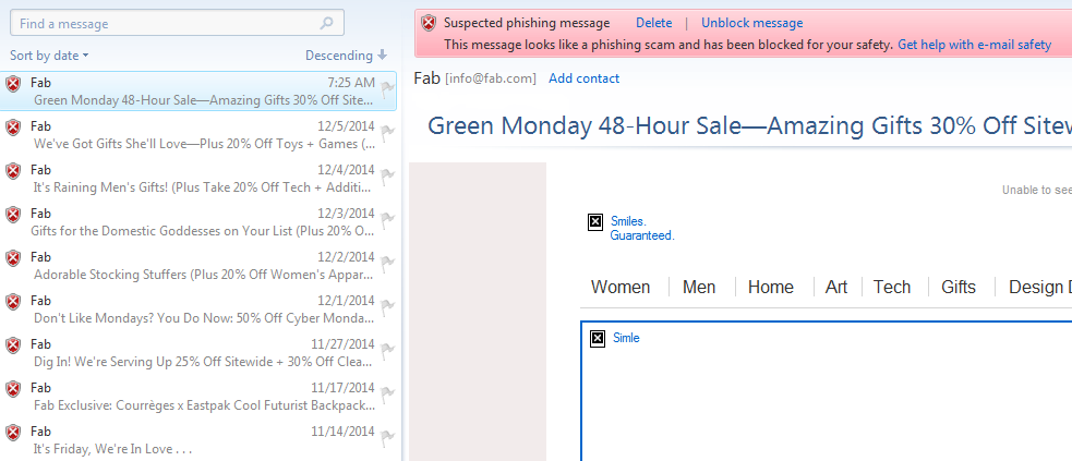 I’d say it’s time to either rebuild it or retire it.
Things We Liked
Not everything was bad news this year. A few companies went above and beyond the call in the email design. Here are our favorites, starting with one company that never fails to impress, Pizza Express.
Mosaic Fun
Pizza Express is a British company, so, in truth, there’s no point in our subscribing to their email. Those twenty-percent discount coupons for the Earl’s Court location don’t do us much good here in California. Pizza Express has proven themselves to be the masters of the mosaic. You’ll only see these mosaics if you have image display turned off, or catch a brief glimpse of them right before the images load. Here, for instance, is their email with images turned off for last Valentine’s Day:
 And here’s the same email after you choose “Display Images”:
 Sometimes they go for a more literal approach. Here’s one from last summer with the images turned off:
 And here it is with the images turned on:
 Pretty clever stuff. As much as we enjoy it, there are some downsides to this level of attention to detail. In the first place, it’s a lot of work for a weekly mailing, which is probably why they don’t use it that often. Each image must be sliced up and every table cell assigned a specific color value. In the second place, it encourages people to leave the images turned off, which affects the open rate numbers.
Secret Messages
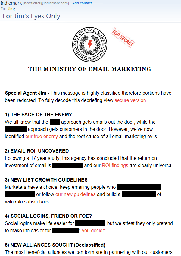 Indiemark created a fun email this year that pokes fun at the recent security leaks by using blacked out lines of text that are visible when they are selected. They also have fun with mail merge, using the first name field in clever new ways.
Until Next Year!
That’s it for this year. We’d like to thank David Carpio and Tyler Stroud at Zeeto Media for their contribution. We were going to talk about some of the idiosyncrasies of Gmail’s new Preview Mode in the Promotions tab, but it’s still in beta and is showing no signs of ever being introduced to the public at large. We shall see what the next year brings. As long as marketing departments are faced with impossible deadlines and interns are tasked with creating emails, we’re sure to see more faux pas in the coming year.