By all accounts, 2016 was an extraordinarily eventful year. It saw the deaths of Fidel Castro, Muhammad Ali, David Bowie, Leonard Cohen, Carrie Fisher, George Michael, Leon Russell, Debbie Reynolds, Gene Wilder, and a whole host of others. Politically, it was the year of Brexit and a presidential election that caused the New York Times to take a hard look at their polling methodology. In sports, it was the year that the Chicago Cubs, after 108 years of losing, finally won a world series in a final game that played out like a movie script.
It was an eventful year in email too, but not necessarily in a good way. Some might argue that email—or, at least, email that wasn’t meant to be seen by the general public—helped lose the election for Hillary Clinton. August saw an organized subscription bomb attack of suspicious origin that temporarily landed several respectable news organizations on spam lists and caused Spamhaus to update their opt-in verification recommendations. In one respect, 2016 was a better than previous years. We saw fewer of the kind of clumsy design errors that we’ve seen in the past. Most of the really terrible errors came from sources that were questionable to begin with.
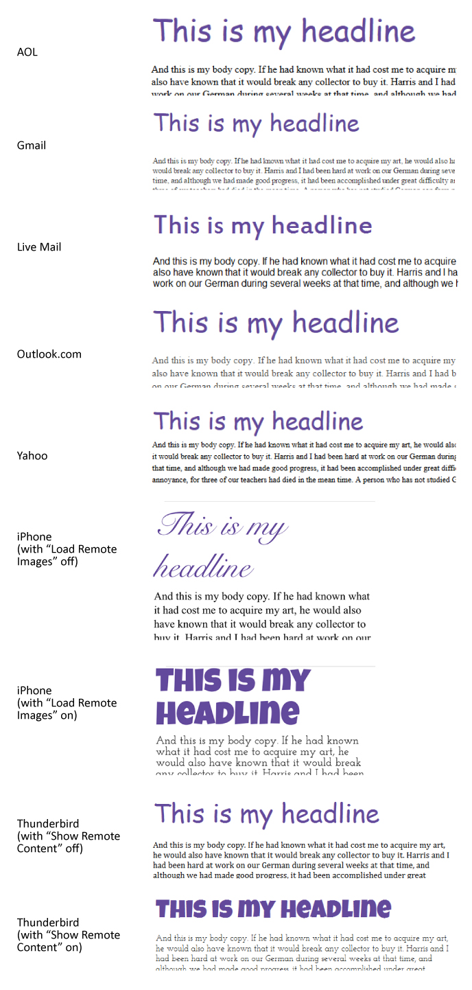
The Importance of Testing Across Platforms
It should go without saying that whenever you send out a message you should test it. If you are using Goolara Symphonie, or another ESP that has a preview feature built in, I’d start there. If you want to be extra careful, you can also send test mailings to several different addresses, or use the email previews available from Litmus and Email on Acid. Sometimes, a message looks fine in one email reader, but not so good in another. Here are some examples.
Aw Gee-Mail
If you’re going to have a problem displaying your email design in one provider, the provider should never be Gmail. After all, it is the most popular email reader out there, and it doesn’t cost anything to get an address, so what’s the problem? The folks at Orchard apparently didn’t learn this lesson, though. This particular email looked fine everywhere else, including the always problematic Live Mail, but completely fell apart in Gmail.
Dynamic Content Mishap
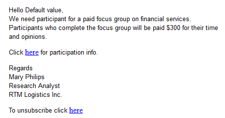
One time when you absolutely must test before sending is when you are using mail merge or dynamic content.1 The example above is an actual email, sent to us with the subject line: “Your email.” A blank space between “Hello” and the comma would have been better than this. Well constructed dynamic content instructions would have prevented this from happening.
Hide and Seek
A picture’s worth a thousand words, but this is email is pushing it. At first glance, it looks like Wired expects these images to do all the work, but look closely at the right edge of the top photo, just below the horizon. There’s a series of small dots there. A closer investigation reveals that those dots are the text hidden under each photo. This particular problem occurs in Microsoft’s recently abandoned Live Mail, and if Live Mail was the only email reader that had trouble with this mailing, I probably wouldn’t bother mentioning it. But Thunderbird also has trouble with the file, pushing the text and social links out to the right of the main table. Live Mail, at least, brings the text and social links back into the area where they belong, but then plops the photo down on top of everything. This wouldn’t matter if Wired bothered to provide meaningful alt tags, but the alt tags read: “Image for story 1,” “Image for story 2,” etc. Not exactly helpful.
A close inspection of the source code reveals the problem. Whoever put this email together did go to the trouble of using tables, but then they inserted divs into the mix. The code is also littered with ids and class tags that have no corresponding style instructions. It’s worth noting that all of the other mailings from the magazine look fine, and the ones for subscription offers include highly descriptive alt tags.
Honestly Missing Logo
That “Honest Mail Email Marketing” logo, looks suspiciously like nothing at all. A quick check of the HTML code reveals the problem:
They remembered to include the height, width, and border information. They even added alt text There’s only one thing missing: the actual source location for the image. Honestly, one test preview would have revealed this problem. There’s no excuse for it.
Code Fails
Some problems are simply the result of bad HTML. Sometimes it’s an out-and-out typo, but sometimes the problem is something subtle like including the DOCTYPE and HTML tags when you paste the email into the ESP app. Test previews and test send should catch most of these problems.
It’s Important, Procrustes
This email from Keurig suffers from a few problems. The image of the people chatting over coffee and the “Shop Today” button are obviously stretched. The designer put the correct size information in the properties for each of these images, but they forgot to add !important, so the sizing information was overridden in favor of the master table, stretching the images to match the master table’s 100% width requirement.
Knowing When to Link
Having linking buttons is always a good idea, but knowing where to put the link is important. In this example from Camper, only the words “Women,” “Men,” and “Kids” are links. Since this text is placed in its own table, and that table has a bordered cell, it would make more sense to add the link to either the table or the cell. As it stands now, clicking anywhere inside the black border does nothing unless you click directly on the words. It’s a minor thing, but one worth remembering. Judging from the number of div tags in this email, I suspect that the author of this email is new to the form.
Button, Button, Who’s Got the Button?
Providing buttons that link to web content is never a bad idea. What is a bad idea is providing a button that is not a button at all. This email from Template Monster makes that mistake. Clicking on “Learn Now” simply brings up the image. To make matters worse, they’ve given it a blue border, further enforcing the perception that this is a link and not just an image.
Oops, I Did It Again!
Not to rag on Template Monster, but they don’t seem to have anyone checking the email before they send it. Here is the top of one of their emails:
Look at the href at the beginning of the line of code. This should link to their website, but it doesn’t. The pound sign (#) is a placer that indicates that although there is a link, it’s not going anywhere. Hover over it and it appears active, but clicking on it accomplishes nothing.
A little further down the page in the same email we get this:
The text in the orange button reads “Download You Gift.” I confess, I am always typing “you” instead of “your” so I can relate to this one, but a second pair of qualified eyes would have caught this immediately.
In the same email, every headline and image has a different link, even when they go to the same place. The headline about 20 free writing tools goes to the same page as the image next to it. I’m going to give them the benefit of the doubt on that one, and say that they did this to find out whether the images or the headlines are responsible for the most clickthroughs, but in the long run, isn’t that less important than the fact that they did click through?
That’s Code for …Code!
I love it when spammers screw up. This was already obviously a spam message without having to even open it, but upon opening you’re presented with the HTML code for the message. When putting together a mailing in your ESPs visual editor, always make sure you are in the right tab (usually marked HTML) before pasting HTML code. Otherwise this might happen to you. Of course, any decent email marketer would have previewed the mailing, but these people tend to work fast. I’m surprise this doesn’t happen more often, actually.
Shopping Links
Sometimes there’s nothing wrong with an email, until you click on one of the links. Then you suddenly find yourself staring at a page that has nothing to do with anything. Retail stores appear to be the worst offenders, which is odd since so much of their business is contingent on people getting to the right page and ordering the product they want.
I Know It’s Here Somewhere
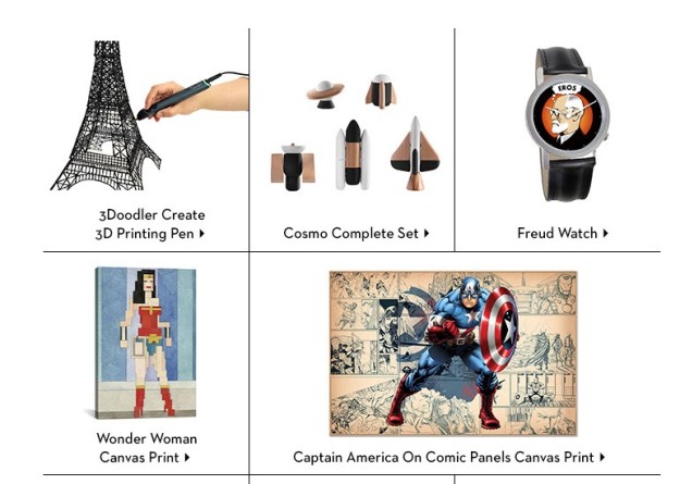
Fab has, in the past, shown products in their mailings that aren’t on the landing page. In most cases, the products shown are available, but buried on the second or third page of the sale listings. That’s fine. Lots of companies do this, so the public is used to it. But in the email shown above, the “Cosmo Complete Set” and Captain America print don’t even show up in any of the lists. Clicking on them takes you to the a sale page, but neither product is on any of the sales pages. If you want to buy either of these items, you’ll need to enter them as search queries on the web site.
Now Go and Find Me
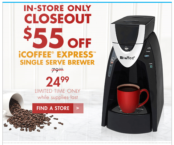
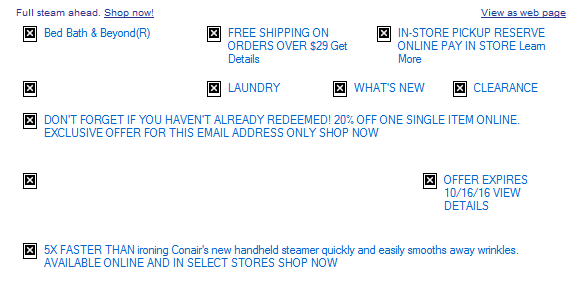
Normally, Bed, Bath & Beyond is one of the better companies when it comes to email marketing, they always provided meaningful alt tags, their design is easy to read on both a desktop computer and a mobile phone, and their links, in most cases, go directly to the products shown. Here is one of their rare missteps. Clicking on this product does not take you to the products, or even anywhere near the product. A clue lies in the button labeled “Find a Store”—only it’s not a button. Clicking anywhere in the image will take you to BB&B’s Find a Store page. I suppose they justify this by pointing out that the product isn’t available online, but that’s no reason that this couldn’t be included on a page with more information on the product.
Alt, Right?
I bring it up every year, but every year there are plenty of examples of companies forgetting to add alt information to the img tags. While it’s true that services such as Gmail and the iPhone display images as the default, some people still prefer to keep the images turned off. Alt tags not only impart information on what they are missing, they also can provide incentive to display images as well. Here’s an example from Warby Parker that demonstrates the worst case scenario:
Now here’s a company that knows how to do it right, Bed, Bath & Beyond:
Quite a difference. Perhaps the guys at Warby Parker assume that people will always want to display their images, a questionable assumption.
Unsubscribe Catastrophes
Unsubscribing should never be a hassle. Nobody is happy when a recipient unsubscribes, but it’s better than having that person mark your mailings as spam because they can’t figure out how else to get you to stop sending them things. Some marketers go to extraordinary lengths to making unsubscribing difficult, treading very close to the legal requirements of CAN-SPAM. A few cross over to the dark side. Here are this year’s worst offenders.
Unsubscribe? fUGGedaboutit!
CAN-SPAM has a few hard and fast rules. One of them is that you have to have an unsubscribe link. You also have to have a physical address. This email has neither. The supposed unsubscribe link takes you to the home page for the company. Not surprisingly, this email is not from an official UGG site at all, but a spammer that is trying to make their site look as legitimate as possible.
Email Purgatory
Unlike the previous email, this one is from a legitimate company (T-Mobile). This part of the email—which is commented in the HTML as “legal footer”—contains the physical address, privacy policy information, links to their various plan options, and instructions for how to ensure that email from them does not wind up in the spam folder. What it doesn’t include, however, is an unsubscribe link—an unequivocal violation of CAN-SPAM.
Go Ahead and Try to Unsubscribe! I Dare You!
When it comes to anti-spam laws, the USA is about the most lax, but they still require two things: A physical address and an unsubscribe link. So when I get an email like this, it makes my blood boil. Here’s what you get when you click the unsubscribe link:
As one might imagine, this one went straight to the spam folder.
Crouching Promo and Hidden Unsub
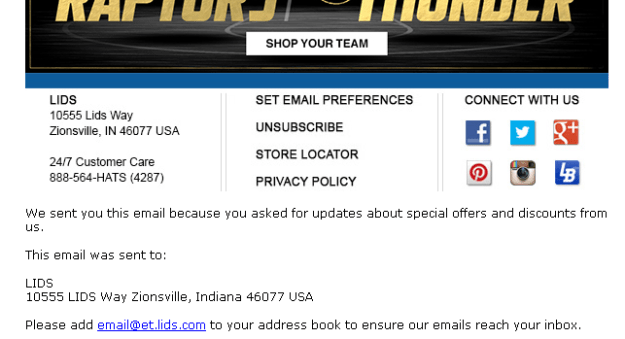
A nearly as devious method of hiding the unsubscribe was used by Lids, a company that specializes in sports caps. Here’s the bottom of their email with the images turned off:
You can see there’s a physical address, but where’s the unsubscribe link? Now here’s the same section of the email with the images displayed:
Ah, there it is! They’ve made unsubscribe part of an image. To make matters worse, they used an image map to separate the various categories shown. I’m not sure what the thinking was here. Attempts to reach them went unanswered. Just to add insult to injury, I never signed up for this email, it was someone entering the wrong address either accidentally or on purpose.
Sure, There’s an Unsub. It’s Just Not Yours.
Another highly questionable approach to handling unsubscribes came from, of all companies, Salesforce:
I’ve blurred the names to save some embarrassment, but I can verify that the author of this email comes from Salesforce, promoting a webinar Salesforce has co-sponsored. Yes, there’s an unsubscribe link, but only in the forwarded content. Presumably that will only work for the original recipient, not for the person to whom the email was forwarded. This means that Salesforce, the largest SaaS-based, customer relationship management (CRM) provider on the planet, a company with its own email marketing solution, just sent me a promotional email without an unsubscribe link. It is a tactic worthy of a Viagra spammer. It doesn’t help that there’s a typo in the very first sentence. I dearly hope the author of this email is new to Salesforce.
Subject Line Fun
The subject line is the most important part of your mailing. If a subject line doesn’t provoke the recipient to open the email, then all your hard work providing good content and responsive design is for naught. Here area few subject lines that either failed miserably or worked brilliantly, or, in the case of the first example, simply overdid things.
Hello, It’s Me Again
Some email marketing experts are big fans of the practice of sending high quantities of email to your recipient list. It is a topic hotly discussed on email marketing forums, and each side can back up their position with plenty of facts and figures. But even the most ardent fan of high-volume sending would agree that Travelocity is pushing it here, sending an email every hour or so from two in the morning to five. It doesn’t help that all of these were sent at times when no others were sending out email, leading to all four messages being bunched together. Perhaps that was the idea, to create a sort of billboard for Travelocity residing in the inbox.
Did I mention…?
It’s not usual for companies to offer multiple newsletters. Nor is it unusual to send these newsletters out on the same day. What is unusual is the use exactly the same subject line and content on both mailings, right down to the “You are subscribed to PCMag Tech Deals as…” at the bottom of each page. Given that a normal announcement from PCMag reads “You are subscribed to PCMag Announcements as…” and is usually some sort of deal on a PCMag subscription, I’d chalk this one up to either a mistake or laziness.
I’m Either a Realtor or a Marketer
Even we email marketers make boneheaded mistakes. To their credit, the folks at EEC caught this and quickly followed up with an apology.
A Special Odaer, Ordrre, Ordeorr…Oh Forget It!
“Order” is a hard word to screw up, but whoever put this email together seems to have had a terrible time with it. They misspelled it in the subject line, and then again in the content.
Okay, I’m not REALLY Out of the Office
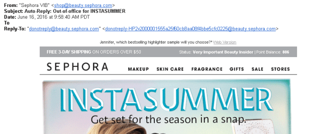
I think I know what Sephora was trying to do here. This was an attempt to equate being out of the office with their summertime contest. Sending a fake out-of-office autoreply isn’t the worst misuse of a subject line, but it’s pretty sneaky and isn’t likely to endear you to anyone.
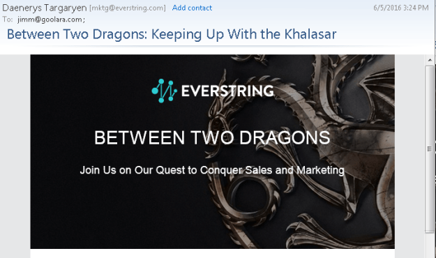
You know nothing, Jon Snow.
As a fan of Game of Thrones, I enjoyed the use of GoT references in the subject line and “friendly” from, but I’m not sure that a company that specializes in predictive marketing is the right place for this approach. This link leads to a series of videos in which they try to show the marketing lessons available in the HBO series. That is more a testament to the ability of the human brain to find patterns where none exist than any marketing subplots lurking in George R.R. Martin’s on-going saga. This kind of subject is better served on a site such as ThinkGeek, which specializes in products attached to all aspects of geekdom, from TV shows or computer games. For them, even this is acceptable:
A combination of keystrokes known as the Konami Code, a cheat that gives gamers additional powers while playing. If you’re in the real estate business, this probably isn’t a good subject line, but it works quite well for a company whose primary audience resembles the cast from The Big Bang Theory.
Location, Location, Location!
Sometimes, a subject line, by itself isn’t anything special, but where you find it makes all the differences. I found this one in my spam folder. I could say “Physician heal thyself,” but this just demonstrates what a complicated subject deliverability is.
That’s it for this year! We can’t wait to see what 2017 will bring. We predict more email address providers will follow Gmail’s lead in allowing CSS in email. On one hand, this means we can get more creative in our email designs, but on the other hand, it means more places for things to go wrong. If there is a moral to this blog post, it should be obvious by now: test, test, test. For more on the subject of how to deal with email mistakes, check out our white paper on the subject: Oops! – Handling and resolving email marketing mistakes.
1. If you’re not using dynamic content, you’re missing a real opportunity to improve your email engagement results. Jordie van Rijn explains how and why in his article, Making the most out of Dynamic Email Marketing. For more on Goolara Symphonie’s powerful dynamic content visits, visit our dynamic content page.
[Note: This is the second in a two-part series on subscription bombing and how to defuse it. Last time, we looked at the techniques used to create recent attacks. The time we look at the technique Spamhaus recommends as the best way to avoid ending up the victim of a subscription bombing: the CAPTCHA.]
As we discussed in our last blog article, the best way to prevent subscription attacks, according to spam listing companies such as Spamhaus, is to use a verification test in your email signup form. The best known of these, and the one that Spamhaus recommends by name is the CAPTCHA. CAPTCHAs can be a pain in the neck sometimes, and when they are not easy to solve they can cause people to just give up trying and leave your site. But newsletter signups that don’t require CAPTCHAs are just what subscription bombers look for. If you find yourself on the receiving end of one of these attacks, you’ll have a lot more work to do to recover your reputation score, and will, after that, have to use a CAPTCHA anyway. Having accepted, however unhappily, that CAPTCHAs are a necessity, we’ll look at different CAPTCHA technologies that are available today.
The best known form of CAPTCHA is the reCAPTCHA, version 1, which consists of a small box displaying two distorted words (usually consisting of one real word and one that is gibberish). You are asked to enter the words you see, and if your answers are incorrect, you are presented with two new words and asked to try again.
ReCAPTCHA was developed by a group of computer scientists at Carnegie Mellon University who recognized that CAPTCHA technology offered a great crowd-sourced way to achieve better OCR. If the OCR software couldn’t identify a word, sometimes humans could, which meant you could feed words to people that computers couldn’t recognize. That’s why in 2009, the ReCAPTCHA technology was acquired by Google for their Books project, and was used by the New York Times to digitized their archives. This seemed like a good way to block fake signups, but they didn’t factor in either advances in OCR software, or the low costs of doing business in third world countries.
Capturing CAPTCHAs
Almost as soon as they appeared, people started working on ways to crack the CAPTCHA codes. One company we found in India offers workers around 90¢ and hour to solve as many CAPTCHA codes as humanly possible. Those who can’t do it quickly or who make too many mistakes are kicked off the service. This is a time-consuming way to crack CAPTCHA codes, but by offering wages far below anything most people could live on the authors presumably make it worth the effort. Just to pour salt in the wound, anyone interested in doing this thankless work is expected to pay a fee to join.
Meanwhile, OCR software kept getting better, so it wasn’t long before someone had the bright idea of creating a bot that used OCR to identify the words in a CAPTCHA. It doesn’t always get it right. In fact, it often gets it wrong, but it doesn’t matter. Unlike a human, who is going to give up in frustration after a few tries, a bot can keep trying and trying until it gets it right. Since their advent, bots have become a major problem for word identification types of verification. To counter this, word-based CAPTCHAs became more distorted and harder to decipher for humans and bots alike. We’ve all seen the results of this battle over decipherability. We’ve all encountered CAPTCHAs so hard to identify that it takes us a few tries to get them right, and we all have better things to do with our time than enter meaningless words in an attempt to receive more email.
An assortment of actual CAPTCHAs collected from various sites.
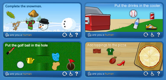
To solve this problem, a new kind of ReCAPTCHA was created that relies on the natural differences between software and the human brain. This made it easier for humans to recognize the words, while keeping it hard for the bots the do the same. In recent variations, a reCAPTCHA might ask users to identify images instead of scrambled type relying on human intuition to solve. Take this example:
At the top of CAPTCHA we are presented with an image (in this case, a cat) and asked to find all the images with matching content. This is a mixed bag. It will certainly block bots from finding a solution, but it also presents us with instructions that those of us who skew towards the Asperger‘s end of the spectrum and tend to take things too literally might also find perplexing. The picture at the top is an adult gray tabby, but the pictures below are all of kittens and only two are gray tabbies. We realize most people won’t get this granular with the data, and that’s what Google is counting on. The top picture is a cat, so humans will click on all the pictures of the same animal, even when every other aspect of the picture is different.
I’m Not a Robot
Two years ago, Google introduced a version of the ReCAPTCHA they call a “No CAPTCHA reCAPTCHA.” With this type of CAPTCHA, there’s no need to try and decipher heavily distorted words, or squint to make out blurry photographs of street numbers, or identify various animals. You check the box labeled “I’m not a robot” and you’re done. The No CAPTCHA reCAPTCHA uses Google’s Javascript API and a form, and appears, for now at least, to be an excellent choice for verification. Spamhaus likes it, and it produces the least amount of hassle in the signup process.
Gamifying the Process
A variation on the CAPTCHA that is designed to alleviate the annoyance of typing in meaningless words is the addition of gaming elements to the verification process. With this technique, you are asked to complete some simple task to verify that you are a human being. The task is always simple and resembles a children’s game in its approach. You might, for example, be asked to “put the carrots in the shopping cart.” The picture will show an image of an empty shopping cart with images of various groceries floating next to it. By clicking and dragging the image of the carrots to the image of the shopping cart, you verify that you are a human.
These gamified verification techniques are effective approaches to the problem, although we haven’t seen that many instances of their use. They appear to be acceptable to Spamhaus as well. According to them, “…any mechanism that successfully keeps bots from abusing signup forms is good and absolutely necessary nowadays. Captcha is currently the best mechanism, and whatever the captcha test does (task, game, whatever) is also fine as long as bots can not easily defeat it.”
Alternatives to CAPTCHA
CAPTCHA is, by no means, the only way to verify a signup. Programmers continue to invent new ways to foil the bad guys. A couple alternatives are the Honeypot and the Social signup. Before choosing either of these, you should note that Spamhaus prefers a CAPTCHA verification that requires the user to perform a task. That’s not to say these are not effective in blocking bots, only that implementing them might not help you get off the SBL. As of right now, a CAPTCHA-type mechanism is the safest way to go.
Honeypot Verification
One of the earliest attempts to simplify the process of signing up and restrict it to real people is the use of a honeypot. The idea is simple: A form is hidden in the HTML for a page, but it isn’t visible on the page, so no human visitor to the site should ever know about it. Since bots don’t visit pages this way, but, instead, look at each page’s code for forms, they will see the form and attempt to fill it out, thus identifying them as bots and not humans. It is a wickedly clever technique for fooling the bots, although, as we’ve already discussed, bots have gotten much more sophisticated over the years and are seldom fooled by this technique anymore. It can also cause problems with browsers that have CSS turned off, and with ones such as Safari that autofill forms. It is still in use, but is often combined with a more interactive signup.
The Social Approach
As social sites become more and more important to people’s daily lives, we’ve seen a corresponding growth in sites that require social signups. Instead of entering words or playing games, you are offered a button that says “Sign Up With Facebook.” This approach lays everything on the line, but it also stands a significantly higher chance of losing the audience. Several studies have shown that people just don’t like using their Facebook accounts for promotional purposes, still preferring email as the main source for sales announcements. We don’t recommend using this approach except for those rare cases where your Facebook profile is your main sales mechanism.
At this time, we recommend the “No CAPTCHA reCAPTCHA” for your verification purposes. It satisfies Spamhaus’s requirements, and it makes the signup process as easy as possible for your subscribers. Of course, if history is any indication (and it usually is), it’s just a matter of time before this approach is compromised, and we’ll have to find a new way to verify newsletter signups. It is important to remember that nothing in the field of email marketing remains static. There’s no set-it-and-forget-it solution. You’ll still want to keep track of your email data to see if there are any anomalies occurring.
On Monday, August 15, people all over the world woke up to find their email inboxes stuffed with unwanted email, victims of an organized and relentless “subscription bombing” attack. This attack used a bot designed to find sign-up forms and enter thousands of email addresses on a site before moving on to the next one, where the process was repeated. Before the bot was through, each address ended up subscribed to hundreds of newsletters. The owners of the email addresses remained unaware of what had happened until they started receiving the emails. Faced with what appeared to be unsolicited emails, they did what many people would do in this situation: they flagged the mailings as spam, which sent the reputation scores for the attacked companies spiraling down.1
Most of the companies that were victims of this attack were respectable, legitimate companies whose only crime was that they made their newsletter sign-up processes too easy, also making it easy for attackers to enter false information. Many well-respected email senders suddenly were having trouble landing in the inbox and were getting relegated to junk status. Even the New York Times felt the effects of this attack.
The attacks started over the weekend, but because not everyone checks their mail services on Saturdays and Sundays, by Monday morning some accounts were packed with new, unwanted emails. In many cases, the amount of emails was massive enough to make it impossible to identify and separate the legitimate mailings from the junk. More diligent people took the time to try and unsubscribe from these emails, but as security expert Brian Krebs noted, “By the time I’d finished deleting and unsubscribing from the first page of requests, there would be another page or two of new newsletter-related emails.” For most people, the easiest solution was to select all the new email and either delete it or mark it as spam, which sent reputation scores spiraling. Suddenly, hundreds of a company’s mailings were being identified as spam, landing several legitimate companies on blacklists.
High-profile companies that use a single opt-in method without a verification test appeared to be the most at risk, but were, by no means, the only ones affected. Many of the sign-up email addresses ended in “.gov,” suggesting that the attack might have had a political motive behind it. A belief strengthened by the recent Russian hacker reports. Some people have speculated that it was simply the work of bored computer geeks out for kicks. Whatever the reason, it caused many legitimate companies to wind up being blacklisted.
No Easy Unsubscribe
The problem was exacerbated by the fact that, by its very structure, there’s no quick way to mass unsubscribe from several email subscriptions. It’s easy to select a dozen emails and either delete them or send them to the spam folder, because both of these actions occur within the mail reader. Unsubscribing is a little trickier. Each piece of email must be unsubscribed from separately. There’s no way to select a batch of emails and unsubscribe from them en masse because the unsubscribe information for each piece of email is going to a different place and is handled in a different fashion. Some require verification, others present a display of settings that need to be unchecked.
Some services, such as Gmail, Outlook.com, and the latest update to the iPhone’s Mail app feature an unsubscribe button, but only when the unsubscribe link in the email leads to automatic unsubscribe. Links with multiple choices, or multiple step unsubscribes don’t show up. So when hundreds of emails arrive in the inbox at the same time, nobody (Brian Krebs notwithstanding) is going to go to the trouble of trying to unsubscribe separately from all those mailings. It is far easier to accomplish the same effect by selecting everything and deleting it, but since none of these emails were actually solicited, it is even more likely for people to use the spam button to show their dissatisfaction. When enough people do this, blacklisting services, such as SpamCop, Junk Email FIlter, Barracuda, and especially Spamhaus, sit up and take notice.
Blacklists
How each of these blacklist services handles junk mail varies, with equally varied results in terms of effectiveness. The most well-known and commonly used blacklisting service is Spamhaus. When Spamhaus decides to put you on their “Spamhaus Block List” (SBL), you’ve got a serious problem. Everyone from Yahoo to McAfee, and Gmail (to some extent) use the SBL data, so staying off this list is mandatory of you ever want your mailings to be read.
After this latest subscription attack, we saw several obviously legitimate news organizations end up on blacklists after this attack. Getting on this list is relatively easy. Getting off it often takes a concerted effort by your ESP or deliverability team. How difficult that process is will depend on several factors, such as past transgressions as well as subjective considerations, such as the general impression of your site by the people at the blacklist service (and not just Spamhaus either).
The Double Opt-In
Spamhaus has always maintained that the double opt-in (DOI—also known as the confirmed opt-in) will help prevent surreptitious sign-ups. Some services, such as MailChimp, now use double opt-ins exclusively (much to the dismay of their subscribers if the questions Quora and Reddit are any indication). But a DOI doesn’t solve the initial problem of bot sign-ups. Even Spamhaus acknowledges that a DOI does not automatically prevent your company from landing on their blacklist. The recipients will still receive that annoying first deluge of DOI verification mail, which, when thousands have been entered, is enough of a problem by itself. The double opt-in might keep the problem from compounding though, which is certainly preferable than continuing to send emails to increasingly more annoyed recipients.
For Canadian and European emails, where adequate verifications of acknowledged sign-ups are required, the double opt-in is already the safest option. While most ESPs (Goolara included) let you decide what sort of opt-in procedure you want to implement, you should be aware that a single opt-in puts you in greater danger of a malicious and erroneous sign-ups. If your site is popular enough to experience more than one or two sign-ups a day, you should consider switching to a double opt-in.
CAPTCHAs
Currently, Spamhaus recommends the use of a CAPTCHA as part of your sign-up process. A CAPTCHA requires an action by the user, such as solving an equation or identifying two words that are either distorted or partially obscured by a pattern. They are easy to implement and may be the only way to get your company off the SBL. The most common one is ReCAPTCHA, which is provided by Google, but there are others on the market. We also recommend using a CAPTCHA, but this technology brings its own set of issues, which we’ll take a look in more detail in our next blog post.
Worst Case Scenario
So what do you do if you’ve already fallen prey to an attack? Preventative maintenance is always the best course of action. Besides double opt-ins and the use of a CAPTCHA, a regular practice of looking at your report metrics and subscription sign-ups can alert you to potential problems before they get out of hand. Noticeable increases in the amount of email being greylisted or sent to the junk folders might be a warning sign of worse things to come. Sudden increases in sign-ups from “gov” sources can also indicate potential bot attacks, so you may want to segment out these mailings for closer examination. In most cases, though, these attacks are sudden and unexpected, and nothing you do once the attack starts will stop the problem from escalating.
If you do end up on a blacklist, you should notify your ESP immediately and see what steps they can take to solve the problem. Some ESPs, such as Goolara, also offer deliverability services, and they can help you get your IP removed from the blacklist. Otherwise, you might want to seek the services of a professional deliverability expert. As long as you don’t have a history of sending to spam traps (which will normally only occur if you don’t keep your list up to date, or have a nasty habit of buying questionable lists), you should be okay.
1. The reputation score is how email services identify whether a mailing has any value. The higher your reputation score, the better your chances of ending up in the inbox. For more information on this, see our white paper Deliverability Enhanced.
We all get them, especially around the holidays: those emails with little pictographs in the subject line. At Halloween, they are jack-o-lanterns and ghosts (🎃, 👻), further into winter they might be snowmen or Christmas trees (☃, 🎄). Sometimes they relate to the sender’s industry. Guitar Center, for instance, regularly uses the guitar pictograph (🎸), while Webdesigner News starts every subject line with the image of a pencil (✏). These are emojis, and have become popular tools for spicing up subject lines to make them more appealing. In this article we’ll take a look at the pros and cons of using emojis, and things to look out for when using them.
Emoji or Emoticon?
First let’s get the out of the way the inevitable question, “What is the difference between an emoji and an emoticon?” An emoticon is a facial expression created using the limited assortment of punctuation that is available in basic English text. The most well-known example is the colon and right parenthesis indicating a smiling face: :) . The alternative to basic text is Unicode, a character coding system designed to include every character in every language. In Unicode, there is an emoji for a smiling face (☺), along with a large assortment of other tiny pictographs. Unlike a smiling face created with a colon and a right parenthesis, the emoji is one character, not two. There are several emojis you can choose from to indicate various levels of mirth (😄😃😀😊😁), along with characters for nearly every other human emotion (😯😨😭😡😳).
Emojis got their start on Japanese mobile phones, where they were used to replace emoticons. Although the names sound similar, the word emoji has nothing to do with emotions. It is a combination of the Japanese words for “picture” (e – 絵) and “character” (mo-ji – 文字).Their worldwide acceptance began when Apple decided to include emojis as a feature on its iPhones in 2009. Then in 2010, hundreds of emojis were encoded and introduced in the Unicode Standard, and more are added every day. As of this writing, there are 722 emojis available with Unicode character coding. Emojis have popped up everywhere from Android phones to Gmail.
As befitting their Japanese roots, some emojis are specifically aimed at Japanese culture and leave westerners scratching their heads. Emojis for foods such and Dango (🍡) and Oden (🍢), and festivals such as Tanabata (🎋) and Tsukimi (🎑) presumably don’t see much use in America and Europe, while other symbols, such as the white flower (💮) might be used, but in an entirely different context from how it’s used in Japan (in Japan it is used to mean “well done”).
Where Are They?
Unless you are using an iPhone to write your mailings, which is highly doubtful, finding the emojis on a keyboard can be tricky. You can type in the Unicode directly, but that is a pain in the neck, and you first have to know these codes to type them. For instance, to add an airplane (✈) to your subject line, you’d need to type in U+2708 (hold down the Ctrl+Alt+Shift keys, type U, type 2708, then hit enter). It’s a lot of work for one character, and it doesn’t always work anyway. Some desktop systems have shortcuts for inserting emojis, or special pull-down menus, but these are still slow. The easiest way to add emojis that we’ve found is iEmoji.com, which lets you compose the subject line on their web page, then copy and paste it to your email marketing software. But some care should be taken when doing this, which leads us to the next point: Why do some emojis work in subject lines and others don’t?
Question Marks and Empty Squares
Have you tried using emojis in your subject lines, only to have them replaced by small squares or questions marks? There are two primary causes for this. The first is that you are using a newer, unusual emoji that is not included across all systems. The country flags, for instance, do not show up in most email reader subject lines, and often not in the content either. In most email readers, the newer ability to choose the skin tones of certain emojis isn’t available, and will add blank squares or question marks to a subject line (more on this below). When using emojis in the subject line, it is safest to stick to the default emojis, which usually appear in yellow.
With a few email readers, such as Live Mail, how it displays can even depend on where it is in the software. Take this example:
All three emojis appear in the list window on the left, but not in the title window on the right. The first emoji (the umbrella) appears correctly in both areas, while the others (the cat and dog) appear as empty boxes on the right. The reason for this is because the umbrella is one of the original emojis that were introduced in 1995. As a rule, these will appear in your subject lines more often than the newer emojis will. Some of these characters, such as the smiley face (☺), musical notes (♪ ♫), and card suits (♠ ♣ ♥ ♦) were added early on, and are available as symbol characters in basic English character sets.1 Here is a list of the original 1995 emojis:
A second, and more likely cause of question marks in the subject line, is that your email is set to something other than Unicode. If the character you want to use is not available in the character set you are using, it will not appear in the subject line. Go to the settings while in your email marketing software and check the character encoding choice. If it doesn’t say “UTF-8” it’s probably not going to work in the subject line, even if it works in the content.
As a rule, it is never a good idea to use emojis to replace words in a subject line. If the emoji is replaced with a question mark, you might end up with a subject line that still makes sense, but says something you don’t want it to. For instance, if you replaced the word “love” with a heart in the subject line “You’ll ❤ our deals,” you could end up with this: “You’ll ? our ideas,” which isn’t exactly a confidence builder, and could be read as “You’ll question our deals.” In fact, a scan of various emails—and even web pages—shows that using the heart symbol to replace the word love might just be the number one gaffe. I even found the following line in an online article about emojis: “There’s a lot of ? for emoji these days….”
It is safer to put the emojis at the beginning and the ends of the subject lines, or as breaks between words. Even so, you should ask yourself: If a question mark appears instead, will it affect the subject line’s meaning?
I’m Not Mad, I’m Happy
In some cases, the emojis from one operating system are different enough from the emojis in another to cause confusion. Here, for instance is the emoji labeled “drooling face”:
Two appear happy, two appear unhappy, and the last one looks downright scared. One doesn’t even appear at all. While it is unusual for emojis to vary this much across platforms, it doesn’t hurt to check the emoji you plan to use to make sure it doesn’t change too drastically when viewed on different devices and operating systems. The easiest place to do this is at the Unicode Consortium’s Full Emoji Data page. There, you’ll find all the emojis—including a few that appear animated, such as the Gmail emojis, which sometimes cry, bounce up and down, or wink. The Unicode Consortium’s Data page also lists the date when each emoji was introduced, which can help you determine how safe it is to use that emoji. An emoji introduced in 2016 is probably not going to show up in a subject line, and might not even show up in the content.
Politically Correct Emojis
While animation is more site specific, and doesn’t affect the individual emojis, there is another recent addition to the emojis that will affect how and emoji behaves in a subject line. After people complained that the emojis of hands and faces were not ethnically inclusive enough, a feature was added whereby you can specify the gender of an emoji and its skin color. Care must be taken when using skin tones and genders as these add additional code to each emoji. For instance, the code for the left pointing finger emoji is U+1F448, while the code for the same emoji with pale skin is U+1F448+U+1F3FB. In subject lines, even if the original default emoji appears, the gender and color information will in most cases appear as empty square blocks or question marks. For this reason, it is best to stick to the basic emojis and avoid skin tones and gender additions until more mail readers are compatible with these features.
Emojis and Deliverability
As always, the most important question is: Can emojis affect the deliverability of an email? Our tests suggest that, under some circumstances, emojis do appear to have a negative effect on an email’s deliverability, but a minor one. Mailings with large quantities of emojis in the subject line and contents were more likely to end up in the spam folder, while those that used them more judiciously appeared to have no problems getting through. Obviously a subject line that is nothing but emojis is probably not a good idea. Some spam filters can identify is a subject line is nonsense, and a string of emojis looks just like gibberish. We recommend restricting the use of emojis in subject lines to no more than three, and to make sure there is actual text in the subject line as well. Keep in mind also that there may be aspects of your content that are pushing your mailings close to a negative rating, and the emojis won’t do anything to improve the situation. For for information on what to look out for, check out our white paper, Deliverability Enhanced.
As to which emojis provide the best open rates, a quick scan of the articles that discuss this shows that there is no consensus here. In all likelihood, this data changes from month to month anyway. The only meaningful answer is to see how they do in your own tests, and proceed accordingly. Like those articles that tell you which day of the week is best for sending, any article that claims to know which emoji performs best is working from a limited data set and should be taken with a grain of salt.
Test and Test Again
If you do plan to use emojis in your subject lines, our advice is, as always with any first time format experimentation, test and test again. We would also recommend paying closer attention than usual to the deliverability results in your tests. Some A/B split testing against subject lines without emojis or with different emojis isn’t a bad idea either. Emojis can be a fun way to enliven your subject lines and increase open rates, but it will still require testing with your own recipients to see if they’ll work for you.
1. It should be noted that the term “emoji” was not applied to these character, however, until Unicode version 6.0, released in 2010.
Here at Goolara we’ve been seeing a recent rise in a peculiar method of gathering and hijacking information. The basic mechanism isn’t new, but the fact that it’s being used with clickthroughs appears to be a new twist. It is based on exploiting mistyped email addresses by purchasing domain names that are either misspelled or have letters added or removed. You might, for instance, intend to send an email to someone at a Gmail address, but because you typed too quickly, it’s going to “gmial.com” instead; or maybe your finger hit two keys at once, and the mailing is sent to “gmailk.com.” In both cases, the domains are registered and your mail is actually being processed by these sites. To put it another way: That mail you accidentally sent to the wrong address is being received by someone who has intentionally chosen their domain name to take advantage of this mistake. Is that someone you really want to have any of your email data?
This technique, called typosquatting, has long been used to trick people into visiting sites (called domain doppelgangers) that look a lot like the sites they are imitating.1 Most of it disappeared after laws were passed and some successful lawsuits were filed against these pretenders, but the legislation didn’t address the other part of the equation. The law can prevent them from mimicking an existing website, but anyone who has registered one of these domains still has the ability to receive any email sent to it. While a website could be construed as attempted fraud, simply receiving misaddressed email falls into a very gray area. Even this isn’t that new. These fakes sites have always accepted email. The new twist is that they are now apparently clicking on the links in the email they receive.
The Man-in-the-MailBox
It’s hard to know the reasons for these clickthroughs. It’s possible that they are intended to keep the address active and defray suspicion. Or it might be part of more complex scheme, such as the “Man-in-the-MailBox” scam detailed in a report on domain doppelgangers put out in 2011 by Peter Kim and Garret Gee of the Godai Group. In that report, Kim and Gee explained how they set up set up 30 doppelganger accounts for various firms and received 120,000 e-mails in the six-month testing period. Acting as middlemen, they would pass on data to the correct address and then send the information back to the intended recipient. In this way, they accrued 20 GBs of data that included everything from trade secrets to individual passwords.
It is also a method of verifying the links, which can be useful for ascertaining the value of each email address. This may seem like an inefficient way to collect addresses, but the evidence suggests that the processes here are handled primarily by bots, so minimal manpower is required. Like an army of ants, they achieve their goals methodically over time. If you intended, for instance, to send something to a specific address at Gmail, the typosquatter can now figure out the correct address without much difficulty and add it to their list. With the amount of email data passing through the Internet every hour, it is possible to build up a substantial list of names in no time.
Why It’s Important
You might be tempted to ask why this is important? After all, it’s only a few addresses here and there, but there are costs involved. Keep in mind that you’re paying for those addresses, and you’re paying for sending to those addresses. If you’re using an automated system to relay leads to your sales department, then clickthroughs from these sources can cause your sales staff to waste valuable time chasing down these imaginary leads and doing follow-ups that go nowhere.
It is also possible that some of these people are up to things far worse than merely collecting addresses. While many companies don’t accept email responses, some set up their mailings so that they send email replies to specific staff members. You don’t want to put your sales team in a situation where clicking on links from these sources—either accidentally or absentmindedly—lead to bigger problems. It is also worth remembering that these address mistakes simultaneous keep those subscribers from receiving your intended email while opening them up to receive email from these questionable sources.
Protecting Yourself
As you might imagine, protecting yourself against this problem can be tricky. Checking for typos only goes so far, and when your mailing list includes thousands of names, it’s almost impossible to catch them all. In Symphonie, we’ve added logic to the process that identifies and blocks these domains when we encounter them, so you don’t have to worry about the most commonly mistyped addresses. This doesn’t mean you shouldn’t stay on your guard, though. Like rust, these scammers never sleep and they are coming up with new naming variations all the time. Catching these people in that act is a responsibility we all share.
Requiring a double opt-in will help somewhat. Since, in most cases, the email address is initially entered by the subscriber, getting them to verify it will eliminate a lot of the potential for typos. It won’t keep you from accidentally sending the verification email to an incorrect address, but it will help keep that address off your recipient list. The mistyped address still has the potential to end up on scammer’s list, but at least you won’t be sending wasting your time and money sending mailings to them.
1. Technically, there is difference between typosquatting and domain doppelgangers. Typosquatting means a domain that is similar to the intended domain, but is misspelled, while a domain doppelganger will appear almost the same, but with periods either added, removed or misplaced (for instance yourcompanyc.om instead of yourcompany.com).
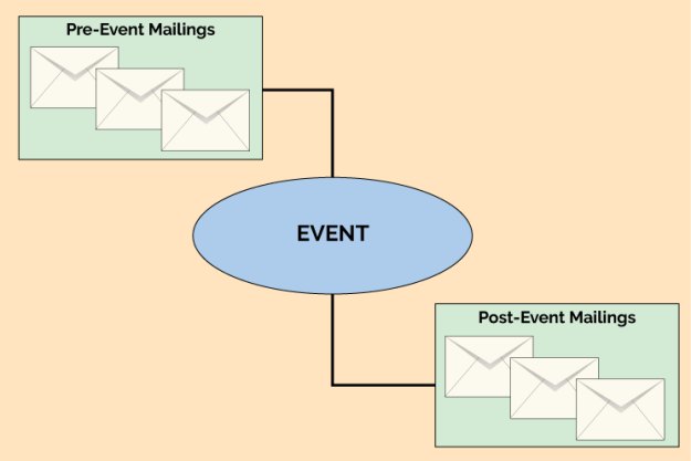
In the previous article in our Automated Email Workflows series, we looked at on-boarding campaigns and how to use email automation to simplify the process. As we saw, this was a variation on the classic drip campaign, but with some automation added to make sure that the mailings properly reflect the actions and requirements of the recipient. This time we’ll look at event-based campaigns, where the recipient has signed up for a specific event. An event might be online (e.g., a webinar) or at a physical location (e.g., a trade show).
An on-boarding automation has a fairly clear entry point—when new recipients are added to the system, they are automatically added to the on-boarding workflow as well. With an event-based workflow, you first must to decide who to invite, and decide how to handle the entries that come in late. In most cases, the recipients are identified through segmentation, based on what you know about each recipient. Your target audience could be anyone who’s purchased something, anyone who’s downloaded certain whitepapers, or—when it’s expedient and makes sense—everyone on your distribution list.
Where to Start
Once you’ve identified the audience, you’ll next have to decide the point at which the automation workflow begins. Should it start after a the initial invitation, or do you want the invitation to be the first step in the workflow process? It’s really six of one, half a dozen of the other. Sending a mailing targeted to the segment of recipients is easy, and then make the workflow use that same segment. Alternatively, you can start the workflow going with the segment as the target, and then have the first step in the workflow be the sending of the invitation.
Late to the Party
The next thing to consider is what to do with late arrivals. If the event is more than a few days after the initial invitation, there might be new people added to your list that you’ll want to tell about the event. If you don’t care whether or not new subscribers get invited to the event, then don’t worry about it, but if you want to take every opportunity to get the word out, you’ll need to make sure your workflow can properly handle entry at any point.
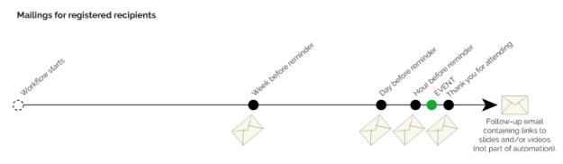
The basic idea of an event based workflow is to work backwards (or forwards) from the event’s date, sending reminders or confirmations as needed. For example, a webinar might start with an initial invitation three weeks before the event. If no enrollment is received, the recipient could be sent several more reminders before the webinar, and perhaps one more afterward. If we lay this out on a timeline, the flow would look something like this:
Running concurrently is the timeline for the recipients who have registered for the event. Once a recipient registers, the logic of the workflow needs to switch to one where advertising the webinar is no longer the focus, and instead the emails are sent to remind the recipient of the upcoming event. That flow would look more like this:
There are several ways a flexible workflow design tool would allow this structure to be diagrammed, and every ESP or digital marketing automation tool has its own method. One straightforward choice is to put each of the email steps shown in the diagrams above into the workflow with conditional logic to determine if it should be done or not. For example, the unregistered path has an email sent at nine days before the event. A logic node (sometimes called a decision diamond) should be put into the workflow to check at this nine-day-out point to see if the recipient has registered. If so, the email node is skipped, since we don’t want to remind recipients about an event for which they’ve already registered. In the same way, at the week-before point, a logic node should check if the recipient has registered, and only send the email if that is true.
Taking Care of Stragglers
That takes care of most of the logic, but what do we do about the recipients who’ve entered the list after the automation has begun? In our example, let’s say a recipient signs up to receive email eight days prior to the event. This is where the initial choice we discussed about whether the first email is sent outside the workflow or as the first step of the workflow makes some difference. If the first workflow step is to send the invitation email, then recipients who are newly added will automatically get that invitation, which could be ideal in this case. But we don’t want to send them the nine-day announcement a few seconds later, even though they would have received it in the standard flow. Workflows that allow entry after an initial invitation has been sent must have another piece of logic before each send node to determine if the timing is right. In this case, since we know the recipient entered at day eight, we should skip the nine-day announcement and let the workflow pick them up again at the four-day point.
Getting Help
With good workflow software these steps should be easy to implement. If you’re using Goolara Symphonie to implement the workflow, we’ll be happy to help you create any workflows you need. If you plan to do webinars or similar events on a regular basis, then you will want to set your automation up with master mailings that you can modify for each campaign. This requires even more forethought and work at the start, but can save hours of work in the long run.
In our last post, we looked at drip campaigns, which start at certain points, based on when the subscribers takes action, then send out regular mailings after that. With event-based workflows, everything revolves around the date of the event. All actions are based on this. While they are more complex than standard drip campaigns, event-based automations can also be quite simple, especially if you don’t allow new recipients to enter the workflow once the initial invitation is sent.
Another year has come and gone, and with it, another bagful of email catastrophes. Some of these are minor issues that could have been caught with a little more testing or another set of eyes, some are truly catastrophic, and a few problems are unique to that bane of email, Microsoft Live Mail.
Bad Links
It’s always a good idea to test your links before sending out an email, but even the best of us miss one from time to time. Here are a few we noticed this year.
You Know What I Mean!
In this newsletter from last January, MediaPost created a link to the AMA conference without the all important “http://” at the beginning. While that works fine when you are entering a URL in the Address Bar, it won’t work in an href command. It doesn’t help that they’ve used base64 encoding on the message which moves us further from the link and is probably why their emails always end up in my Spam folder.
My Name is [Your Name]
I’ve talked about using placer information in previous year-end reviews. Placers are useful, but only if you don’t forget to remove them from the final mailings. In this case, the placer link “http://your.website.address.here/” was used on the image. Fortunately, there were actual links later in the message, which minimized the damage here.
Spot the Panda
When you have several links in an email, there is always a danger that one won’t get its proper URL. Net-A-Porter does a good job of ensuring that every link goes to the item you click on, saving a lot of useless scrolling and page flipping (See last year’s Year-End Review for examples of this). But with this many unique links and more in every mailing, it was inevitable that they would miss one. In this case, it’s the Stella McCarthy coat on the bottom left, which links instead to Net-A-Porter’s emagazine.
Three Out of Nine is Not Good Odds
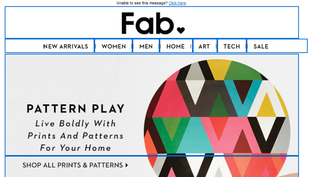
Getting one link wrong is forgivable. Getting six out of nine wrong is not. This email from Fab takes you to the same page no matter which of these images you click. The problem here is that six of the images are not even on the page. If you want to find them, you’ll have to search for them (they are on the site). Rule #1: Always make it easy for your customers to purchase things. Either create a landing page specifically for the items you’re showing, or link to each of them individually.
Psst! Wanna See a Picture?
This class sounds interesting, but if you click on the image it will take you to…the image. That’s right. It opens the image location. It doesn’t even take you to Sur La Table’s home page. You can eventually get there by clicking various other links on the page, but it seems like an image that says “Reserve Your Spot” should at least enable you to do just that.
Bad Formatting
Some mistakes are the result of formatting errors. One missing greater-than sign or comment tag and your entire design goes off the rails. Here are a few coding mistakes that we saw this year.
Dear First Name
This one is so common that we’re guaranteed to receive a few of these every year. Usually it is the first name that’s missing, but, as you can see from the third example, it can happen elsewhere in an email. I suspect that most of the time this comes about when someone is using a previous mailing to create a new one, and doesn’t pay attention to the merge fields and dynamic content. This is mostly just laziness. I know that Goolara Symphonie will maintain my merge data when I copy in this fashion, but I always replace it just to be on the safe side. Judging from these examples, I suspect that other ESPs are less forgiving.
MS Word + HTML = Disaster
Most people know better than to try and use Word for their HTML generator. Every once in a while, however, we get an email with the tell-tale “o:p” tag that Microsoft uses to allow you to convert the HTML back into a Word document. This email probably looked just fine in Microsoft Word, and it even looks okay in some visual editors, but it’s a disaster waiting to happen. Ironically, this particular mailing is all text and would have been easier to create directly in any ESP’s visual editor than in Word. This one will always fail in Live Mail (see section below) and often fails elsewhere as well. Here are a couple more examples:
These people would have all been better off typing their content in a plain text editor.
Bad Code Practices
Some problems are not the result of typos or inadequate testing. Some are simply bad practices. These aren’t mistakes in the strictest sense, but that doesn’t mean you shouldn’t watch out for them.
No Alts
Ever since Gmail started caching the images, we’ve seen an increase in the number of mailings that omit the alt tags. Here’s a perfect example of this from Warby Parker:
The only text in this mailing is the company’s address and a few links at the bottom. Now here’s one from Bed, Bath and Beyond where they’ve gone the extra mile to make sure that even with the images off, you know what their email is all about and have some impetus to click through:
Ya’ Got No Style!
Providing alt tags is a good practice, but if you’re using them in cells with dark backgrounds, remember to add style color information to the cell, in particular a color property such as #FFFFFF (white) and “text-decoration:none” to make sure the alt tag is readable. In the top example from the Westfield shopping center, the type is barely legible, but even that is only because it includes a link, which turns the type blue by default. The second example from TradePub.com, also includes a link, but the blue background makes it nearly impossible to read. For more information on how to create styled alt tags, see our white paper, Using Text & Images.
Formatting is for Sissies
I’ve removed the name and address information from the address above because it belongs to the competition. This email came without any formatting. No active links, no nothing. It was clearly a mistake, but there was no follow up apology; just a second mailing with completely different content twenty minutes later. Perhaps they are following that new “never say you’re sorry” attitude that is making the rounds on the Internet, or maybe they hoped no one would notice. Of course, one could point out that this email is, in fact, a violation of the CAN-SPAM act (inactive unsub link), but it’s probably moot.
Don’t Forget to Block
A perennial problem with sliced images in email is the problem of gaps. This is an easy one to prevent. The addition of “display: block” to each of the tags will go a long ways toward preventing this situation. Also watch out for things like padding and margin, which can also wreck a sliced image.
Live Mail Strikes Again
Every email reader has its own idiosyncrasies, but the one that seems to break email the most often is Live Mail. Here are some common problems—and one not so common problem—to look out for in Live Mail.
Watch Out for Links
The problem we see most often is the blue borders on images with links. Most of the time, it’s merely distracting, but in some cases, such as in the example above, it actually screws up the design. With other mail readers, putting an attribute such as “border: 0” (or “none”) in the
tag will eliminate the problem, and many of these mailings contain that instruction, but Live Mail requires this property to be put inside the tag. Put it anywhere else, and Live Mail ignores it.
Black is the New White
As discussed in last year’s email review, Live Mail does not like three-digit hex codes. You’ve assigned a background of #FFF (white)? Live Mail will treat it the same as #000 (black). Even if you have no customers using Live Mail, it’s a good idea to get into the practice of typing out the full six-digit hex codes.
Paragraph Alignment
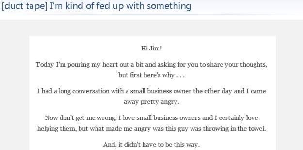
This mailing from Duct Tape Marketing looks fine everywhere else, but open it in Live Mail and suddenly all the text is centered, including a list that appears later on the page. While this isn’t a complete catastrophe, it does make the text harder to read, which is never good. In this case, the problem comes back to the placing the style information between tags instead of inline.
Email from a Mime
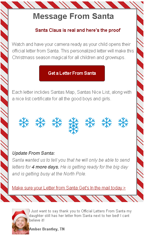
This is particularly weird phenomenon that only seems to happen in Live Mail. I received the email above shortly before Christmas. A big red block. That’s it. No text, no alt tags, and no “Show Images” link to indicate that anything was missing. Not surprisingly, it is an unsolicited email. It comes from a company that offers Santa letters for children. The email does have images (see below), but you couldn’t tell it from what I received in Live Mail. As far as Live Mail was concerned, this mailing was nothing more than a big red block. Here’s how it should have looked:
In a way, it’s probably just as well that nothing showed up. There are typos in nearly every line, they obviously didn’t bother with a test mailing, which would have showed that they used too many snowflakes (it only looks correct in Dreamweaver), and that kid is pretty obviously a stock image. This one would have ended up in this year-end review even if the images did show up.
Cascading Image Sizing
One of the weirdest anomalies We’ve encountered with Live Mail is the following one from Lionsbridge:
As a point of reference, here is the same thing sent to a Gmail address:
Quite a difference! After a bit of testing, we found that simply removing the doctype information at the top of the email’s code fixed the problem. This isn’t the first time we’ve encountered that particular issue. Our more recent tests with Live Mail show that this particular problem has been fixed. Nonetheless, as a rule, if you’re copying your code from an HTML editor, it’s a good idea to exclude the and tags from the process. The email software is going to wrap your information in those tags anyway. This doesn’t always mess things up, HTML is remarkably forgiving, but better safe than sorry. The truth is, the safest procedure for maximum compatibility is to omit everything except content between the body tags and to put inline any styles you have included, with the exceptions of the media queries and the usual boilerplate styles used to improve compatibility with various mailboxes.
Marketing Missteps
This next section is about mailings that use questionable marketing techniques to achieve their goals. Some could argue that these are effective because they get you to pay attention, but so will a car accident; that doesn’t make it a good thing.
It’s Our Special Interface!
CAN-SPAM requires that every promotional mailing includes an unsubscribe link that works, but there is nothing in the law that dictates exactly how you convey this message. This one’s from a questionable company, and would almost certainly have ended up in the spam folder had it been sent to my Gmail account, but my Live Mail account is set to accept a wider range of email. I don’t know about you, but I’d find it preferable to click “This is Spam” rather than click on that suspiciously worded unsubscribe. My advice: Stick to the tried-and-true “Click here to unsubscribe.” The unsubscribe link is no place to get clever.
About Your Account…
One of the most common techniques used by phishers is the one where they send you a notice about the way they are changing their charges on your bank account. The idea is for you to say, “Oh no!” and click the link, which takes you to a fake, but believable login page where you enter your bank login information. So it’s never a good idea when a legitimate company sends out an email that sets off the same alarm bells. Since I’ve never used PayPal with this account, the fact they sent this email to me means one of two things. Either they think I did give them a PayPal account (I did not), or they didn’t bother to segment the mailing. Both are bad, but the latter is unforgivable.
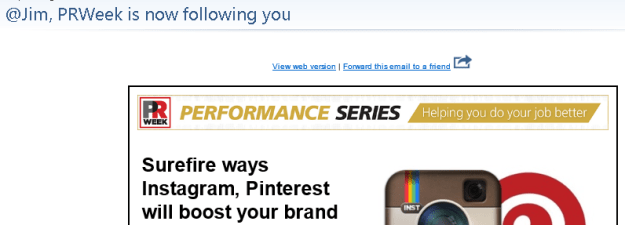
@SneakyMarketer is now following you!
Marketers are always looking for new ways to get you to look at their mailings. Sometimes they cross the line. PRWeek’s take off on Twitter’s following notices might have been okay had it been more obviously fake, and had had some truth to it. In fact, it’s just a come on to sign up for their webinar on social media.
Remember Me? No?
An insidious trend in spamming that showed up in my Inbox this year is the fake follow up. Here’s an example:
Looks legit, but a quick look at my Inbox, spam, and trash folder shows that no such original email was ever sent. This is not the first of these I’ve received, but it’s the first time that they went to the trouble of making it look like something was already sent.
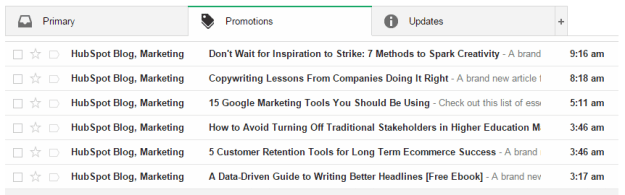
Hello, It’s Me Again
Lately there’s been a lot of press about the advantages of sending more email instead of less. The folks at HubSpot must have taken this to heart, because this is what I found in my email inbox one morning:
Now I’m all for frequent mailings, but this is going a bit far. All kidding aside, I realize that this is more likely the result of their site’s automation, but it probably didn’t help things that most of these were sent during hours when many U.S. companies aren’t sending (I am surprised, however, that I didn’t get something between the eight o’clock and nine o’clock mailings).
Until Next Year
That’s all for this year. I normally like end with a few examples of good and/or clever mailing ideas, but this post is already pushing the limits of acceptable length for an online article. I’d like to thank Justin Khoo at FreshInbox for his help in diagnosing some of Live Mail’s idiosyncrasies. Keep emailing, and if there’s one takeaway from this article it’s this: Always test before sending.
[Note: This is the second in a series of posts about automated workflows for email marketing. In part two, we look at the use of automation to create sophisticated drip campaigns. The examples used in these articles were created using Goolara Symphonie’s Automation features, but the information presented here is applicable to other systems as well.]
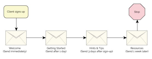
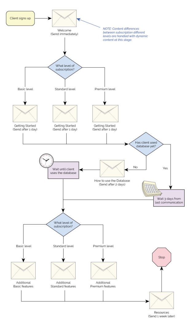
One of the simplest forms of automated workflows is an on-boarding campaign for a new client. In its simplest form, it goes something like this: Client A signs up for a product or service (let’s call him “Bob”), and thereafter receives regularly scheduled mailings instructing him in the ways he can use the product or service. Suppose Bob has signed up to use ABC Widgets SaaS inventory control system for his business. The first email he receives welcomes him to the service and explains all the advantages of ABC Widgets. The next mailing teaches him the basics of using the software. A few days later, he receives another email that might ask him to verify that he’s happy with the system and give him some more tips and ideas for using the software more efficiently. Finally, he receives a mailing with the information he needs to get help or move to the more advanced aspects of the system. In flowchart form, that might look something like this:
As you can see from the example above, the only automated aspect of this type of drip campaign is the starting point. After that, everything flows automatically based on the start date. In this respect, it is similar to a standard opt-in set-up, where a mailing is sent as soon as you sign up. Several email marketing software providers offer this particular style of drip campaign, and claim to offer automation, but true automation should offer much more than the ability to start a drip campaign at any given time. Full-featured email automation gives you the ability to get much more specific in what happens at each step along the way. For instance, you might want to branch out to two different results based on something that the client does or doesn’t do. For this, you’ll need to add logic to your automation.
Adding Logic
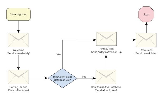
Suppose simply starting a drip campaign isn’t enough. Maybe you want to make sure that Bob implements the database in the ABC Widgets software as soon as possible. If Bob hasn’t started entering data into the database after a day or two, you’ll want to remind him of the importance of doing so, but you won’t want to remind him to do this if has already done it. Nobody likes to receive a notice like that, and it doesn’t make you look good with Bob either. To do this properly, you’ll need to add a logic point (also called a decision point) to your workflow that looks at Bob’s use of the software and offers different mailing choices based on that information. Here is the same drip campaign shown previously, but a decision point added to the workflow:
In our example, the decision point is a yes or no choice, in some software, that’s all you get. With some email marketing software, (such as Goolara Symphonie), you are not limited to this simple yes or no choice. You can branch the decision point in into as many alternative paths as you’d like. You might, for instance, offer multiple paths based on each recipient’s membership level, with each level receiving a different set of mailings.
Time Controls
You can also add additional trigger points that are activated when the client takes specific actions. These are in the form of “wait until” commands that come into play when the recipient makes a specific choice, such as clicking or opening certain pages. In our example, ABC Widgets could notify Bob when he finally does use the database feature, and offer additional tips and instructions after that. There’s no reason this couldn’t be an on-going set-up, with new information and suggestions being provided at different points during the on-boarding procedure and after.
Similarly, you can set up delays that are triggered based on their proximity to specific dates, such as birthdays or membership anniversaries. In our example, ABC Widget may want to notify Bob toward the end of a three-month trial period, or before the annual membership is due. These dates will be different for every client, which makes them ideal candidates for automation.
Split Test, Write Fields, and More
Other possible automation nodes include A/B splits, which is useful for split testing that requires different levels of interaction; write fields, which lets you completely change the content of each mailing based on any data you wish; and jump points, which are primarily used to help keep complicated workflows easy to manage. Not all ESPs offer all these features, but these represent a few of the more common nodes that you’ll encounter with advanced email marketing software.
Now let’s look at our original on-boarding campaign with a few more features added. In the example below, we’ve split the mailings into three different paths based on the subscription level for each client. The automation checks the subscription level, offers the correct email, looks at the actions of the client and proceeds with the automation based on whether or not the client has implemented the database. You could also set this up so that each of the three membership levels receives a completely different set of mailings for every step, but in our example, we’ve used dynamic content to change the data in the first and last mailings, allowing us to consolidate those two mailings. For more on dynamic content see the previous post, Personalizing Your Email Marketing.
If you are new to automation, you should start with a simple workflow and develop more complex ones as you get more familiar with the tools. One thing to be careful about is adding new functions to an existing automation. This is certainly acceptable and even preferable in many circumstances, but you’ll want to use email marketing software, such as Symphonie, that will flag possible recursive operations (operations that endlessly loop back on themselves) to make sure that your automated email workflows run smoothly.
[Note: This is the first in a series of posts about automated workflows for email marketing. In this, the first part, we will look at what you need to know before you get started creating an automated workflow. The examples used in these articles were created using Goolara Symphonie’s Automation features, but the information presented here is applicable to other systems as well.]
Automation is an important part of a complete email marketing program. It allows the person in charge of email marketing to work on other things while the emails that don’t require their attention are sent out automatically. If you are not using automated email workflows yet, you might be leaving money on the table. While they can take some time to set up, studies show that automated workflows improve sales results and pay for themselves in no time.
There are many interesting things that can be done with a flexible automation tool: drip campaigns, on-boarding programs, and shopping cart abandonment, to name but a few. But how do you get started implementing some of these programs? Let’s take a look.
Data is King
Your ability to personalize and tailor a program to an individual depends considerably on what you know about that person. You cannot, for instance, address someone by their first name in an email if you don’t have that information as a field in your demographics. Collecting useful data and providing it to your digital marketing solution is key to the success of any email marketing program. When working with automation, data is also king. A shopping cart abandonment program will only work if the data indicating an abandonment can be transferred from your shopping cart software. That leads us to the next question: How do we get that data into our system?
Real-time vs. Batch Processing
With automations, the sooner you can act on the data you’ve collected, the better. The ideal situation is when data can be transferred immediately. This is generally done through an API call responding to something that happens outside the system, such as a cart abandonment, a webinar sign-up, or a white paper download. If possible, you’ll want your programmers to setup a call to the digital marketing platform to transfer this data and activate the automation as soon as an event has occurred.
If it’s not possible to transfer data in real-time, you can try collecting the data once a day and transferring it to your digital marketing platform. This is an imperfect solution, however. Most people nowadays expect near instantaneous responses, but some examples where a response delay is more acceptable include, a drip associated with a webinar, follow-up to an event, such as a trade show, or something long term, such as a birthday reminder.
When There’s No External Data
If you can’t get real-time or batch data out of your internal systems, don’t panic. There are some situations where you can automate actions based on the data that is already in your digital marketing platform. One example is an on-boarding program. When a new recipient is added, they are automatically added to a drip campaign that provides automated emails to help them get started. Another example is automation based on open or clickthrough behavior. This can be dangerous, as many recipients don’t react well if they feel that their actions are being tracked, but it can be a useful tool to send administrative alerts to the salesperson or follow-up on the recipient’s demonstrated interest.
What Data?
So, what data should be provided in external data tables to facilitate a good automation program? Obviously, the email address. You won’t get far without that one. The email address is also the best identifier of each recipient since it’s the one piece of information that will be unique for everyone. Beyond that, it is a question of which data is actionable by your automation tool. You should be able to offer different paths within the automation flow based on the data provided. For example, knowing the date of the webinar will allow you to coordinate the drips so they are sent at the appropriate dates and times before and after the event.
Data to merge
Another important consideration is what data you will want for merging purposes. As an example, a shopping cart email that references some vague statement like “there are items in your cart” will not be as effective as one that references the specific item(s). The data may be usable in its native form (names, dates, and such), or it can be inserted into the message directly as HTML (as an invoice layout, for instance).
Utilizing Past Data
You’ll also want to look at the capabilities of your automation tool to make sure that it can handle simultaneous workflows for the same recipient, and that previous data is available for decision points in the workflow. If you offer events that have any overlap, like several webinars a month, it is important that your workflow can handle keeping track of which webinar the recipient has and hasn’t signed up for. Additionally, using the data from previous events can help you make the best decisions within a workflow. For example, you may offer a discount for a redeemed shopping cart the first few times a recipient abandons, but after a pattern of abandonments has been established you may want to cut out the discount to make sure recipients aren’t gaming your program. A good automation program should allow you to make decisions based on this previous history.
Next steps
Gathering data for your automation, deciding what data should be collected, and making a workflow that is intelligent based on past behaviors are several of the key things to consider when starting an automation program. After that is specifics of the different types of workflows, which we will look at in subsequent blog posts.
A well-designed typeface is a thing of beauty. It can convey emotion, improve sales, and help define a corporate identity. For years, designers have been trying to figure how to use their favorite fonts in email, sometimes these attempts fail miserably, and other times they lead to other problems that you wouldn’t expect. Using fonts in email takes you into treacherous territory. Is it better to use inline font-family styles or convert everything to images? And what about web fonts? Can you use them in email marketing?
In this overview, we look at all the methods for using fonts in email that are available to marketers and designers. Some of these techniques qualify as best practices, while others should be avoided at all costs. A couple might even qualify as worst practices.
Before we get too deep into the subject, we’d like to point out that we’ll be using font and typeface interchangeably. In the past, “font” referred a specific size of a typeface, so Helvetica 12pt was one font and Helvetica 24pt was another. With the advent of digital publishing, these designations lost their meaning.
Types of Fonts
Fonts come in six basic types:
Serif
Serifs are those little feet that protrude from the edges of a character. Examples of this style of typeface include Century Schoolbook, Garamond, and Palatino. The most famous serif typeface is Times New Roman, which was created for the London Times by Stanley Morison. Serif typefaces are still the preferred choice for blocks of printed text. On the computer screen, they are little harder to read due to the effects of screen resolution of the serifs.
Sans Serif
If a typeface does not have those little feet, it is referred to as “sans serif.” Examples of sans serif typefaces include Franklin Gothic, Gill Sans, and Univers. The most well-known sans serif font is Helvetica, which is even the star of its own movie. The most common variation on Helvetica is Arial, which was specifically designed to match the font metrics of Helvetica. This was Microsoft’s way of getting around the license fees for Helvetica. San serif typefaces are preferred over serif typefaces for text on the computer screen. Some fonts, such as Verdana, were specifically designed for better readability on computer monitors.
Handwriting
A Handwriting font, as the name suggests, is one that resembles handwritten text. These fonts are also referred to as “Cursive” or “Script” fonts. Sometimes these are fancy, such as Park Avenue and Edwardian Script, and sometimes they are more casual, such as Comic Sans and Freestyle Script. Caution should be used with these fonts. As you’ll see when we get to the Web Fonts, cursive fonts usually default to Comic Sans, which is often a poor substitution.
Decorative
Decorative fonts are the ones that favor novelty over readability. They come in both serif and sans serif variations, and are usually restricted to logos and headlines. As a rule, they should never be used for blocks of text. Popular decorative fonts include Ad Lib, Jim Crow, Mesquite, Stencil, and Old English. They are sometimes used for logos, but, even here, are best used sparingly if at all. Because of the high level of variations between them, they should never be used in email.
Monospaced
Monospaced fonts are the ones that assign the same amount of space for each character. In a monospaced font, the ‘m’ takes the same amount of space as an ‘i’. This type of font is often used to display code, or to mimic an old typewriter. The most popular example of this is Courier. Monospaced fonts come in both serif versions, such as Courier, and sans serif versions, such as Consolas.
Dingbats
Dingbats are not fonts in the usual sense of the word, but, instead, have replaced the standard alphanumeric characters with little pictographs. In Webdings, for instance, a capital J renders a picture of an island with a palm tree, while in Wingdings it renders a smiley face. Dingbat fonts should never be used in email. You may like the idea of creating rebuses using Webdings, and it may look right on your PC; but if someone opens it on a Mac or some other system that doesn’t come with Webdings, they’ll only see gibberish.
Several pictographs are built into other typefaces as part of the Unicode (UTF-8). These are safer to use and sometimes are even used in subject lines (with ✈ and ❤ being particular favorites). Just make sure that you’ve encoded your mailing as UTF-8 and not 7-bit ASCII. Otherwise, you may end up with little squares or questions marks where the pictographs should be. It’s also important to remember that although there is some overlap in appearance between dingbat font characters and the pictographs that are available as part of the standard Unicode font set, they are not interchangeable. For example, the picture of the airplane in the middle on the left in the picture above is a capital Q in Wingdings. This one will not work in email. You need to use the airplane character as it is indicated in Unicode (you can find a handy chart of the Unicode dingbats and other special characters here).
Using a font directly
You can assign any typeface you want to your email content. Here, is an example of an inline style assigned to display in Helvetica:
Hello World
Of course, this doesn’t mean that your recipients are going to see the same thing on their computers that you see on yours. If the recipient does not have Helvetica installed in their system, they are going to see another font. As a rule, this will be Arial, but don’t count of the substitution to be automatic. By only listing one typeface in font-family style, you leave it up to the ISP, email client, or particular software to choose the alternative. This could end up being anything from Myriad Pro to Courier.
For this reason, it is always a good idea to provide a list of acceptable alternatives to the font-family style, starting with the preferred font, with the rest of the fonts following in order of preference:
Hello World
We’ve ended the list with the generic “sans-serif” as a safety measure to ensure that if none of the fonts listed are available, the text will still appear as a sans-serif font.
But what if your type absolutely has to be in a specific typeface? If it is part of your logo or associated with a specific branding campaign, you might not want the type replaced with anything else. In that case, your best bet is to convert the type to an image, but be careful—this is an overused technique that comes with some definite downsides.
Using Images for Type
At first, it seems like converting all your text to an image seems like a way to go. If you wanted to use Ad Lib for your headlines with Broadway for your text, an image would make sure that this (admittedly terrible) combination would look the same to everybody, regardless of their operating system, email client, or computer. But before you go converting all your mailings to images, there are a few important caveats to take into account.
No Text, No Inbox
First and foremost, you shouldn’t do it because it can affect deliverability. Shady email senders sometimes try and outsmart the spam filters by converting their text to an image in an attempt to elude the spam filters that check for certain words. As a consequence, many ISPs deduct points from a reputation score when they find only images in a message. This can be just enough of a negative to redirect your mailing from the Inbox to the Spam folder.
Not Text, No See
The second downside to using only images is that not all mailbox providers display images as a default. The Mail app on the iPhone does and Gmail does, but most others still default to image display off. If all your text has been converted into an image, you run the risk of missing potential sales for no better reason than that the recipient never saw your actual message.
Remember the Alt Tag
If you do plan to use an image to display text, the safest thing to do is to include the text in the image as an alt tag. That way if the recipient has image display turned off, he can still get an idea of what the picture contains. In the case of logos, you can also add styles to the alt tag to improve the email’s appearance. For more on this subject, see our white paper, Using Text and Images.
What About Web Fonts?
From time to time, people ask about using Google Web Fonts in email. If you are new to Google Web Fonts, these are fonts that you can use without having to have them installed either on your computer, or the computers of your recipients. There are other sources for web fonts, such as Adobe and Font Squirrel, but these usually require scripts, which do not work in email. Web fonts require you to add two pieces of information to your mailings—a tag with the URL for the font you want to use, and a font-family style attribute.
Web Fonts will only work when the email client recognizes the tag and can use it to download remote content (in this case, the fonts). Here’s an example of an email that was set using two Google Web Fonts—Luckiest Guy for the headline and Josefin Slab for the text. In this first example we’ve taken the HTML code provided by Google and stuck it in the mailing without further modification. Here is how the HTML it appears in a browser (in this case, Chrome) before it is sent as an email:
Now here’s the same email as it appears in various email clients and platforms:
As you can see, only the iPhone and Thunderbird rendered it correctly. Even here the fonts are only displayed when “Load Remote Images” is turned on (the default setting for the iPhone, but not for Thunderbird). Because Web Fonts require a link to work, these fonts are treated the same as images. If an email client defaults to “Images Off,” it’s not going to display Web Fonts either, even if it can. No images, no fonts.
The fact that cursive is listed as the font category for Luckiest Guy doesn’t help. It means that on PCs the headline defaults to various weights of Comic Sans, a font so detested that Weird Al Yankovic uses it as a gag in his song, “Tacky”. On Macs and iPhones, cursive defaults to Snell Roundhand which is better than Comic Sans, but is still a far cry the intended result. In the case of Live Mail, the fact that “serif” was listed as the fallback didn’t seem to matter. It still converted the text to Arial.
Of course, there’s nothing that says you have to use the HTML exactly as Google provides it. In the case of the Luckiest Guy font (and, I suspect, many others), you’d be better off ignoring their recommended category and choose one of your own. You’ll also want to add a few logical alternatives to the list. Here are the inline style settings for the headline after we’ve modified it:
There’s really nothing like Luckiest Guy that is common on computers, so I’ve chosen an assortment of bold display faces that you’ll find on many devices and platforms. Likewise, Josefin Slab is a hard one to match since slab-serifs (i.e., serifs that are squared off instead of pointed) are not that popular either. Here are the inline style settings for the body copy:
Rockwell and Clarendon are popular fonts, and although Georgia is not a slab-serif font, it is a common font and shares many characteristics with Clarendon. Here are the results:
As you can see, the results are still far from perfect, but they are better. If this level of discrepancy between fonts is acceptable to you, then you might find web fonts worth experimenting with. If your audience is made up primarily of iPhone and Mac users, it might be worthwhile. If your audience is primarily on PCs and Android phones, then it probably isn’t worth the effort.
Text Still Wins
When all is said and done, the advice we gave in Using Text to Deliver Your Message still stands: You’ll get the best results if you remain flexible on the font choices. Converting text to images where the font is important (such as logos and other branding) is acceptable, but even then, limit it as much as possible and make sure you’ve provided alt tags that are either informative or will make people want to display the images.