Category Archives: Email marketing

Gmail Insights: What’s Behind Google’s Gmail Image Caching?

Google Gmail caching

Google certainly likes to tinker with Gmail. Last summer, they added tabs to the Gmail inbox, which some people predicted would lead to massive declines in opens and engagement and signal the eventual demise of email marketing, if not the entire western world. On this blog, we predicted that the fear of the Gmail tabs was overblown and that good, engaging subject lines and content would prevail. We’re happy to report that the statistics appear to bear this out. While some ESPs have reported slight drops in open rates, most, Goolara included, have seen little or no impact from the addition of tabs.

Then in December of 2013, Google threw another wrench into the works in the form of image caching. Now, any image in an email is served through Google’s own image proxy servers, and are transcoded before they are sent. So if your image URL in your email is this:

https://BusinessDoman.com/emailName/image.jpg

Gmail will replace it with a cached version of the image using a URL that looks something like this:

https://ci4.googleusercontent.com/proxy/v9mmAKvXPJRqZDvsFQYZvcnnM96a1DadPf3OB9Qmz5c-gNudNHYd8HGIxyTY34HrqZKiw3mLXVi608hMy1Vph5IR1_DNGybsE=s0-d-e1-ft#https://BusinessDoman.com/emailName/image.jpg

In other words, the images in that email are no longer coming from you—they are coming from Google. This isn’t anything new to email clients. Outlook.com and Yandex already cache images and have done so for a while. Given the response in the email marketing community to Google’s announcement, it is curious to see how little attention was paid when Outlook.com started caching images.

So how serious is this change? We’ve been testing emails with it over the past few weeks, and what we found did not make us happy. Here are our findings and conclusions.

Image Requests as a False Metric

At the same time that Google started caching images, they switched from a default of images turned off, to a default that displays images upon opening an email. As a result, the January stats for Gmail showed a marked uptick in the email client’s use. One source reported a 243% increase in Gmail opens. Of course, an email platform that opens images by default is going to return higher open rates than one that defaults to images turned off. The same source reported last summer that nearly two-thirds of all email was being opened on iPhones. It doesn’t take a mathematician to see there’s something wrong with that figure. Figures like this make email marketers happy, but it would be a mistake to put too much stock in them. Your Click Through Rate (CTR) is still a better metric for measuring actual engagement.

We were initially worried that Google’s new caching approach would create a situation where only the first open and the first link address would be recorded, but a test send revealed this not to be the case. If you send out three thousand emails, you’ll receive the correct number of opens. Where the metrics fall down is when it comes to the subsequent opens. These aren’t recorded, but reopens are notoriously misleading numbers when it comes to determining recipient engagement.

A bigger problem with Google’s caching approach is how it affects image replacement. In the past, if you sent an email with a problem image, you could replace that image on your server and any subsequent opens would see the new image. Now that Google is caching the images, this is no longer always true. Emails that were opened more than an hour after an image was replaced on the server fared okay, but emails that were opened within a few minutes after the image was replaced did not reflect the changes. Google does appear to replace modified images, but they do it in their own sweet time, which is bad news for marketers.

Where in World Are You?

One metric that is severely curtailed by Google’s image caching is the ability to geolocate a recipient based on the IP address. Any attempt to do so will return Google’s Mountain View headquarters. This is because it was Google, in fact, that requested the image. Our investigation shows that two separate and unrelated email addresses receive the same cached image and it is only on the first open that the image is requested from the sender’s server.

Information about the location of a user (based on their IP address), as well as information about the devices used to read the email (iPhone, tablet, desktop application, etc.) is rarely useful on an individual basis, but can be quite interesting in aggregate. Knowing that Sam Jones once used an iPhone to open an email while in Boston isn’t terribly useful, but knowing what percentage of users are opening with mobile devices is quite useful, and knowing where the bulk of your users are located around the world can help you determine how regional your content offers should be. Unfortunately, Google has now removed this information. It is still available for clickthroughs, as Google and others have not yet re-written these to go to Google’s proxy servers, but that’s not to say it won’t happen in the future.

Once is Enough

An aspect of Google’s new caching technique that has some email marketers up in arms is the fact that it completely eliminates any data on reopens. Once the image is on Google’s server, if an email is opened a second time, this fact is known only to Google. In truth, the value of the second open is questionable. Deleting adjacent emails and any accidental clicking of the email are treated as additional opens, but have little value in terms of engagement. The clickthrough rate is a more important number and fortunately for marketers everywhere, Google hasn’t found a way to take that away from the ESP metrics.

One interesting side effect we’ve noticed is that email senders with slow servers are getting a boost in content delivery thanks to Google’s Content Delivery Network (CDN). Retail senders such as Anne Taylor and Fab are showing noticeably faster image load times in Gmail than in our other email clients. On the other hand, companies that use third-party CDNs, such as Akami, CacheFly, and Amazon Web Services no longer have the speed advantage here when it comes to displaying images in Gmail. As to whether this is enough of an issue to affect the bottom lines at these CDNs, that remains to be seen, but it is doubtful. There are still plenty of other people out there using email viewing platforms other than Gmail.

All Your Data Are Belong to Us

So why is Google doing this? Google’s official explanation of the reason for this change is that “some senders try to use externally linked images in harmful ways.” They don’t explain exactly what they mean by this. They simply say it and assume we will nod in agreement. “Senders can’t use image loading to get information like your IP address or location,” which is true enough, but exactly why this is bad thing is not explained. They go on to say that this new approach will help avoid unwanted cookies, malware, and viruses.

“We’re just doing it to help you,” Google seems to be saying. “We have no other motive.” But let’s look at what Google had to do to get this up and running. With over 450 million active users, this isn’t a minor undertaking. First they had to set up proxy servers—many terabytes worth—to cache all these images. Then they had to devote time to coding the procedures that rewrite the URLs to send image requests to their servers, which normally means hours of testing, debugging, and retesting. That’s a lot of work. Clearly there has to be a benefit for Google.

It’s true that improving customer service is always good policy, but an important fact omitted from Google’s rationale is that data such as the IP addresses and the geolocations don’t magically disappear when Google caches the image. The sender may no longer get this data, but Google certainly does. What Google plans to do with this information remains to be seen. Google has already shown a tendency to take the long view on things, so we may not find out the reasons right away, but it would be naive to think that Google doesn’t plan to use this data.

Addendum: Perhaps in response to the complaints from ESPs about their new caching policy, Google quietly updated their Gmail system, allowing you to override the caching by including no-cache information in the image header:

Cache-Control: no-cache max-age=0

Some ESPs have already implemented this, and some have not. While this does help the ESPs track the number of opens a mailing will have, it doesn’t address the main downsides to Google’s new policy. The image request still comes from Google, not the recipient, so any information about recipient’s location or the device upon which the email was opened remains unknown to the sender. As far as anyone can tell, Google requested the image and it was sent to their servers in Mountain View. Whether Google will allow this information to be passed on to the ESPs at some future date remains to be seen. For now, that information belongs to Google and they’re not sharing it.

Go to Goolara website

2013: The Year in Email

2013 was an interesting year. 2012 ended with Oracle buying Eloqua, and 2013 ended with Oracle buying Responsys. Who will they buy next? 2013 began with Salesforce CEO Marc Beniot telling a crowd at CES that email was dead, and then turning around and buying ExactTarget a few months later. It was also the year that marketers finally got over their infatuation with social media after several reports showed that far-and-away the most effective digital channel for marketing is still email.

We’d like to take a look what landed in our inbox over the year. Here’s a round-up of some of the most interesting examples. Some of it is inspired, some of it is confusing, and some of it is just plain awful. Several of the mistakes shown here are things that can happen to any of us, but they stand as good reminders that email isn’t just about writing content and sending it—it is also about proofing and testing.

Alt Tag Fun

Ya’ got something against “T”s?

Alt tag goof

Lyris gets points for using a colored cells with reversed text, but if you ever needed a reminder to check your alt tags as carefully as you check your content, this is it. In Lyris’ defense, at least they had an alt tag. I can’t say the same for Hugo Boss, whose email always lands in my inbox looking exactly the same:
No alt tags

Slightly better—but only slightly—is J. Crew. Here’s their solution to the alt tag dilemma:

weak alt tags

Last September, for a week or two, someone who knew what they were doing must have taken over J. Crew’s email preparation, because suddenly the email was going out with actual, meaningful alt tags:

Good alt tags

Sadly, it appears to have been a blip on the chart. Within a couple weeks they were back to the generic “jcrew.com” alt tags on all their images.

You’re using an image because…?

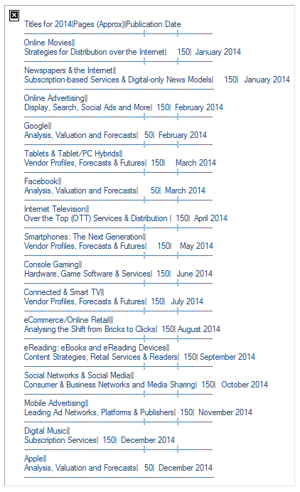
It’s always heartening to see someone use alt tags to further their message. That can be anything from a simple “Turn on your images to see what you’re missing,” to fully styled alt tag in a colored cell (see The Finer Points of Styled Alt Tags for more on how to do this). But this alt tag from Generator Research takes the cake:

wordy alt tag

Bizarrely, the missing image is nothing more than this same list as a gif file, which raises the question: Why bother with the image at all?

Delivery Problems

Some problems are beyond the control of the sender. Network slow downs, unexpected glitches, and certain browser extensions can ruin the best email design. Here are a few examples of emails that were probably fine back at the office, but ended up a mess when they arrived in our inbox.

Text still rules

Bad image display

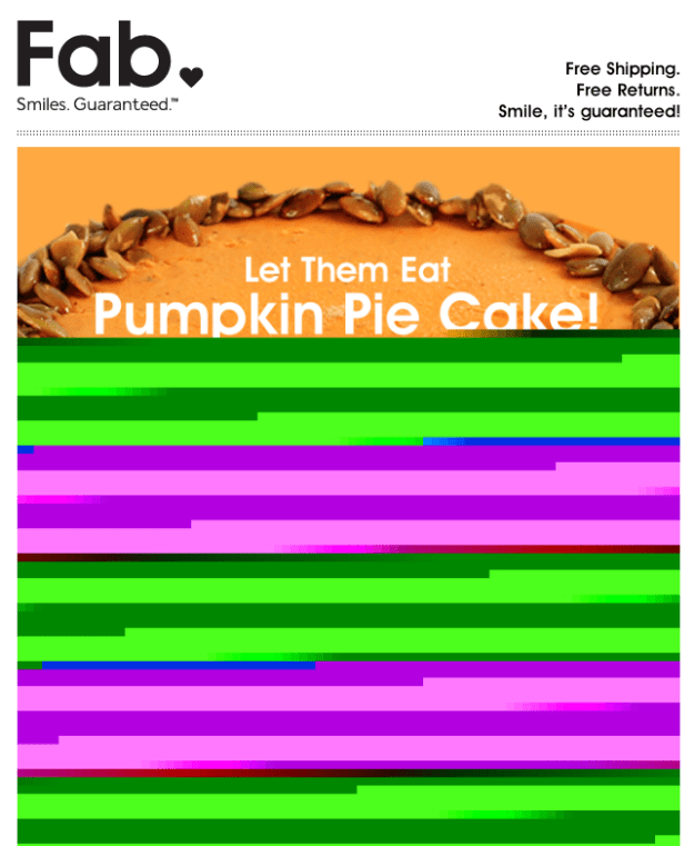
This is a great example of why you should always include text in your mailings. We’re not sure why this email from Fab got screwed up in transmission, but had they included some text it would have mattered less. As it stands, the only visible message is something about Pumpkin Pie Cake. Is it a product, a cookbook, or just a joke? I’ll never know because the only other text in this email were the legal notices, address, and unsubscribes mandated by the CAN-SPAM act.

WOT the heck?

WOT effect on display

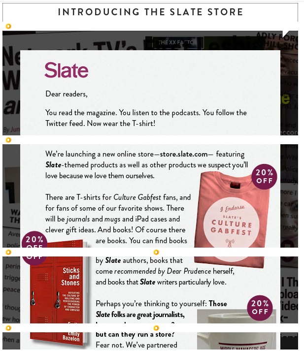
There are a lot of sneaky pitfalls that can ruin the best planned email. This one from Slate might have been okay had they not decided to convert everything in their mailing into images. They were careful to include the “display:block” command with each of the image sections, but because I use Web of Trust (WOT) with my browser, each of the image segments is slightly displaced by WOT’s symbol insertion. Admittedly, this wasn’t entirely their fault, but their choice to use an image instead of a combination of text and images certainly exacerbated the problem. Had they used actual text for the message and separated the decorative elements from the images that need links this wouldn’t have happened. [Note: For more information on this topic, see our blog post Using Text to Deliver Your Message.]

Subject Line & Sender Disasters

The single most important pieces of text in your email are your subject line and your ‘From’ address. Before they’ve even opened the message, these things will say something about you, and if that something is not good, then it doesn’t matter if that mailing has the best, most persuasive content in the world, no one will bother to look. Here are a some rookie mistakes from people who should know better.

Call me dyslexic

This piece of email came from Digital Marketing News:

Misspelled name
Digital News Marketing = DNM? If you’re going to misspell something, try not to let it be your From address.

Who is ANSI_X3.4-1968 anyway?

ANSI text issue

You may have seen this subject line structure before. The problem is that the encoding didn’t match the chosen character set. The headline used an em dash (it should read: “EEC 2014—Early Bird Special Ends Tomorrow”) but for that to work, the subject line must be encoded properly. You’ll see this most often when using email-injector programs, such as the Javamail API included in Java, instead of the software from a professional ESP. Any decent email marketing software should be able to avoid this problem. But even a single test email would have exposed this problem, so testing cannot be overlooked.

We care, now go away!

Do Not Reply

In our blog post, Of Senders and Subject Lines, we talked about what a bad idea it is to use “DoNotReply” as a sender address. Somehow, it’s not surprising that it’s a phone company that makes this mistake, but the fact they did it on an email claiming that “your opinion matters” almost pushes this one into satire.

The Linkin’ Logs

There is one simple rule in email design: If you have a picture of a product, the link on that picture should go to that product. Sadly this rule is sometimes ignored. Some marketers cut down on links in hopes of improving their deliverability (there are better ways to achieve this), but it can lead to its own problems. Here a few examples of bad linking choices.

Look at this! Now try to find it!

Inaccurate links

Bed, Bath & Beyond was the first out of the gate with Christmas-based emails. Before the candles had gone out on the Halloween pumpkins, BB&B was sending holiday messages. This email forgets the basic rule that when you show a product, make sure that the link goes to a page that features that product. In this email, clicking on any of these items takes you to the main page as noted in the red tabs below the images. In all these examples, the products shown are not on the first page, and in some cases, don’t show up until the last page. It would have been a far better strategy to either show a picture of the first product in the section, or link to the actual products and have the red sub-tabs go to those main landing pages.

No links

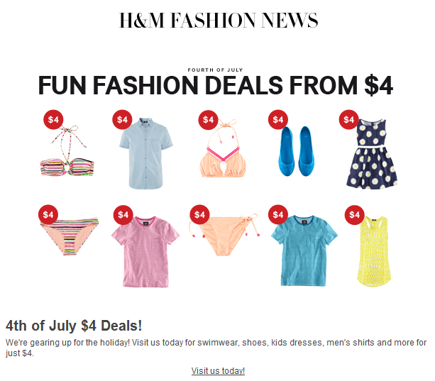
Even worse is this email from H&M. Not only don’t the individual images link to the products shown, they don’t link to anything at all. The only link in this email is at the little “Visit us today” text below the image. Way to miss an opportunity H&M. The same goes for NuForce, whose layout suggest there will be links, and was almost custom designed for image-mapped links, but no links exist.

No links

Alignment Issues

Alignment can be tricky. Forget one “display:block” command and everything falls apart. But some things just don’t need to happen. Here are a few problem emails that came our way last year:

Why did the web designer leave the restaurant?

If you haven’t heard the joke already, the punchline is: Because there were too many tables. Web designers hate tables. A few years back, it was mandated that tables should be for tabular dated only and not for image and text alignment. For that, we were told, you should use divs. The only problem with this advice is that someone forgot to tell the email clients, many of whom have barely entered the 21st century when it comes to HTML compatibility. So what happens when you hire a web designer to create your email? Most of the time, it’s not that big of a problem, but there are tell-tale signs if you know where to look. For instance, here is the right edge of three images in an Andrew Marc email:

aminsider2If you look closely, you’ll see that this is slightly misaligned. It’s a very small issue, and clearly the designer decided it wasn’t worth worrying about, but there is really no reason for these images to be out of alignment at all. The designer is showing his (or her) web design background by stacking these images up in a div. A simple table would have eliminated the misalignment entirely. This particular email also contained a chunk of JavaScript—a big no-no in email design, and the white gaps between the images have a whiff of “I meant to do that!” about them.

Still, in the grand scheme of things, it could be worse:

Misalignment #1

Misalignment #2

Misalignment #3

Some of these suffer from the classic missing “display:block” problem, but not all. The Old Navy/Piperlime email at the top was the result of a 100% width assignment on the first cell, instead of the desired 700px width. This was obviously an oversight, but a test email should have caught it.
Microsoft strikes again

We don’t know what it is about Microsoft, but they certainly do like to make designing email a challenge. Every email browser they offer is different. On one hand, Outlook.com can handle more HTML5 commands than any other email browser out there, while Live Mail seems to ignore almost everything. A recent development with Live Mail that’s worth keeping in mind is the way it handles style information, and, more importantly, the way it handles sizing. Here is the visible portion of an email we received recently:

Oversized empty window

And here is the same email after we chose “Display Images”:

With images displayed

This happens if the image or cell has included width information, but not height information. Had this particular image include both height and width, the text portion of the message would have displayed in the window, improving its odds of being read.

Put Your Money Where Your Mouth is

Practice what you preach.

Nobody says email has to be pretty, but if what you’re trying to promote is “beautiful email newsletters,” then you’d better have something to show for it. This monospaced, bland message does nothing to enforce the idea that the author knows anything about aesthetics.

Ending on a Good Note

Not all email is bad news. Some email marketers are doing an excellent job of making email interesting an exciting. Here are a few examples of above average work from the past year.

Thanks for Subscribing

Thanks for subscribing

Everyone sends out some sort of alert to notify people that they have subscribed to a company’s email, but few make it as much fun as Upworthy. The great thing about this notice is that it makes you look forward to receiving the email instead of immediately regretting signing up for it.

Beyond Mosaics

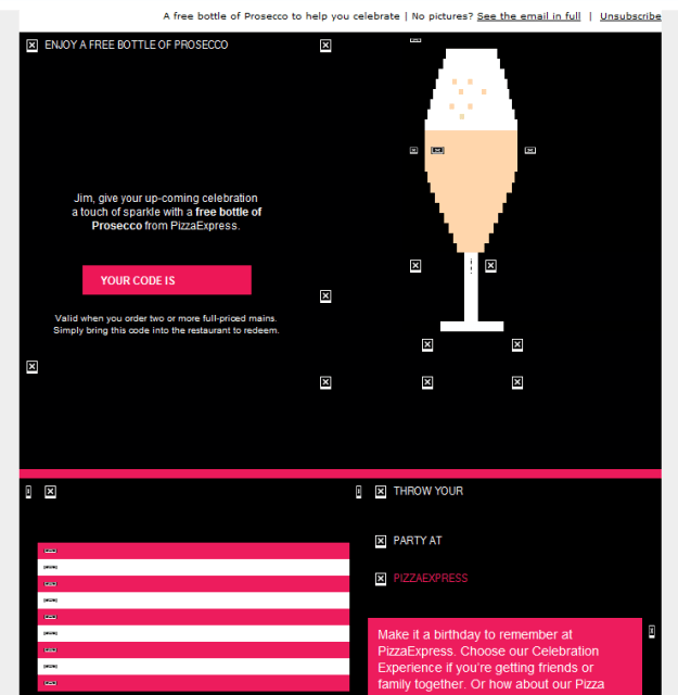
Last Spring, we did an article here that covered the use of Mosaics. Mosaics are a way to use colored table cells to imitate an image. Most of the time, mosaics aren’t worth the effort because they can needlessly increase your email’s file size if you try to make them too detailed, and end up looking clunky if you make them too coarse. Pizza Express in England has found a better way to deal with it by using mosaics sparingly and making them just detailed enough to get the idea across. Here’s a beautiful example of their work from last Valentine’s Day:

Valentine's Day

Normally, the mailings from Pizza Express don’t get this complex, but they always use colored cells to make their email interesting whether you have images turned on or not. In the example above, for instance, the cells use a palette of blue, red, and black for their background colors.

Pizza Express pulls out all the stops for their birthday email design, which looks like this when the images are turned off:

Happy Birthday!

Not bad, but the design goes further by using an animated gif when the images are displayed:

animated gifNice work Pizza Express.

We hope you’ve enjoyed this look back 2013. Perhaps there is some schadenfreude in seeing the mistakes of others, but here are things to be learned: make your email visually interesting, but not at the expense of text, don’t neglect the subject line, in email, tables still rule, and—most important of all—test before you send.

HAPPY NEW YEAR!

Go to Goolara website

The Complete Preheaders and Snippets Tutorial

Tricks for using preheaders

Every email client shows you the sender (usually the “Friendly From”) and the subject line. Some go a step further and display additional text below the subject line. Desktop programs such as Outlook and Thunderbird, browser clients such as Gmail and Yahoo, and devices such as the iPhone and some Android phones, all display this “snippet” of text. The snippet is a potential opportunity to increase the likelihood that your email will be opened, but it is often overlooked. We have already discussed the importance of a good “From” address in Best Practices Enhanced Vol. 1, and good Subject Lines on this blog, but the snippet, while not used everywhere, is used in enough email clients and on enough devices to warrant consideration when you are putting together your mailings.

Here is an example of how snippets display on an iPhone 5:

Email on an iPhone

You can see that the snippets for PBS and Wall Street Journal are not very inspired, while the snippet for Travelocity, at least, includes the most important bit of information from the email (“EXTRA 12% off today”). iPhone users can turn off the snippets or change the number of lines that are displayed, but four is the iPhone’s default setting, and people rarely bother to change default settings.

Here is another example taken from the desktop version of Gmail:

Gmail on computer

In this case, ThinkGeek, an online store that specializes in science fiction-themed knickknacks, has made sure that the next line of text after the subject line has some useful information, while the other vendors shown are counting on their subject line to do all the work. The worst offender here is Touch of Modernwhich is slightly ironic considering that this particular website says in its description that it is dedicated to “extraordinary design.” The subject line (“Something incredibly artful”) is so nondescript it almost seems like a placeholder, and the snippet that follows it only makes matters worse by begging to be added to your contact list. Fab’s first email subject line is long enough to push most of the snippet text out of the line. That works fine in Gmail on the desktop, but the iPhone only displays the first 35 – 40 characters in the subject line and devotes the next lines to snippet text. On the iPhone, most of the visible information, then, would be devoted to the click-to-view message, followed by the first alt tags on the images at the top of the page.

It’s a shame to waste this valuable real estate on things like “Click here to view as Web page,” “Unsubscribe,” and random alt tags when you could be using it to further promote your message. There are some easy ways to do this, and they don’t require major redesigns to your email. In this article we’ll look at some of these ways, including some advanced techniques that will help ensure your email gets noticed.

First Element Solution

The simplest, and most popular solution to the problem is to make sure that the first text in the email is meaningful information. Here’s a typical example:

Preheader sample

Old Navy has started their email with the line “Give something special and treat yourself too.” In email browsers that display snippets, the Subject line (“Amazing Gifts for Them…And You!”) is immediately followed by this line. By putting this sentence before the usual “View in Browser” and “Unsubscribe” links, Old Navy ensures that the snippet expands on their sales message. It is probably no coincidence that it rhymes as well.

Here’s a slightly more sophisticated approach from gdgt.com:

Second preheader sample

In this case, they’ve organized everything so that the first bit of text on the page is their image’s alt tag (“gdgt”), followed by two text-based links (“Reviews” and “Best Gadgets”). The alt tag and the two links all assemble into a meaningful phrase (“gdgt Reviews Best gadgets”) followed by the two lines of text on the left:

from and snippet

Cleverly, they’ve used “text-transform: uppercase” to make the links text appear in uppercase in the email, but still appear upper and lower case in the snippet. Unfortunately, they did all this at the expense of the “View in browser” link, which appears nowhere in this particular email. Knowing that alt tag text is also incorporated into snippets, some marketers takes this technique one step further by making sure that the image is the first element on the page, and that the image’s alt text contains the preheader message. With the technique, the alt text is also the first text on the page if image display is turned off.

The downside to using preheader text as a first element is that it runs the risk of drawing attention away from the primary message. This is especially true if, as with the Old Navy example shown above, the preheader text is also a link. For this reason, email marketers often assign a mid-tone color to the text and use “text-display: none” in its style information if the text also contains a link.

Preheader Div Solution

An alternative to the first element approach is to use a non-displaying div preheader that contains the information you want to appear in the snippet. This method affords greater flexibility because the text that appears in a div preheader does not have to appear anywhere else in the message. With this method you can either expand on the meaning of the subject line, give people the most important piece of information from the email, or paraphrase the text on the page as needed. Here is an example from Direct Marketing News (DMN):

div preheader sample

Ignoring, for the moment, the fact that DMN has mixed up their own initials in the From name, the div tag gets the piece of information that will appeal to the most people across immediately (“Register now for a chance to win an AMEX giftcard!”). A look at the actual email shows that this information does not appear in the top part of the message:

Top of email with preheader div

By using a preheader div, DMN was able to keep the top of the message on topic while allowing the snippet to act as an enticement to encourage registration. Had DMN not used the preheader div on this email, the text below the subject line would read: “View web version Leads, Channels, and the Ongoing Pursuit of ROI,” which may have worked with some segments of the market, but nothing beats a free gift (as long as it’s genuine).

But preheader divs come with one drawback. As we discussed in the series on Responsive Email Design, not all email clients handle invisible divs well. Some will go ahead and place the text on the page. For this reason, preheader div tags are usually configured something like this:

Preheader snippet text goes here.

The color attribute shown in the example is based on an email with a white background. Some marketers prefer to omit this color information since text on a background of the same color is seen by some spam filters as a negative quality and can effect the email’s deliverability. Some marketers set the font size to zero, but that comes with the same caveat as color on color.

Which is better?

So is it better to use a div or a preheader that appears as the first text on the page? Most email marketers use the first text approach. It is simpler to implement and is in less danger of being flagged as spam. It also eliminates the problem of compatibility. A preheader that appears as text on a page will work anywhere, whereas non-displaying divs might not.

On the other hand, if your email design is not conducive to the first text approach, and there is some message further down in the content that makes a better teaser line than the first text on the page, then the div approach is the better choice.

Preheader Best Practices

Whichever method you use, it is a good idea to make sure that the snippet is not misleading. If the snippet reads “Learn how to receive your personalized coffee mug,” there better be a way to do so in the email or you are only going to alienate your audience and come across as dishonest.

You also need to be careful about the wording in your preheader. A preheader sentence such as “All clothing is now 50% off for all platinum club members,” could shorten to “All clothing is now 50% off…,” which might make non-platinum club members angry when they finally see the full sentence. Rewording the sentence (e.g., “Platinum club members now get 50% off on all clothing”) so that the modifying information comes first will help avoid this problem. Also be careful with statements where the second half of the sentence contradicts the first half (e.g., “The Ford Fiesta is a great car, if you like visiting the repair shop”). Unless you are intentionally intending for the message to be cut off for a humorous effect, it’s a good idea to reword the line so that this won’t happen.

Another thing to watch out for is the Title tag, which the iPhone will include as the first text in the snippet, but other email clients, such as Gmail and Yahoo, will not. There may be times when you can take advantage of this idiosyncrasy, but in most cases you’ll want to remove the title tags from your email’s HTML to ensure that your preheader appears the same across all platforms.

Whether you choose to use a first text preheader, or the div version is up to you, but you should be doing one or the other. The various email clients give you a certain amount of text to get your message across, and if you’re not taking advantage of it, you are missing out on a simple and easy method to add to the potential selling power of your email.

Go to Goolara website

Responsive Design in Email, Part 4: Tales From the Front

Fighting for better email

[Note: Unlike most of our blog posts, this one comes from our Marketing Communications Specialist Jim Morton personally, recounting his adventures in the exploration of responsive design. Like many of you, much of Jim’s HTML work these days is confined to email design, which, as you know, plays by different rules from web design. We think that what Jim experienced in studying the subject is good information for anyone interested in trying their hand at responsive email design for the first time.]

In the previous three articles, I examined the proposition of using responsive design in email. At the beginning of the project, I knew about responsive design and how it worked, but I had never bothered with it. I designed my emails so they could be read on something as small as an iPhone viewed in landscape, but would still look good on a 27″ monitor; that seemed good enough.

But sometimes, “good enough” just isn’t good enough. One morning, while I was reading email on my way to work, I became aware of the fact that I read almost all of my personal email on my iPhone these days. A quick survey of people I know revealed this to be common trend among them as well. Then, on the Email Monday Blog, Jordie van Rijn cited a host of statistics indicating that mobile email can account for up to 65% of email opens depending on the audience. Should I be using responsive design to take advantage of this trend? I wondered.

Geniuses Only

The thing that kept me from taking the plunge into converting our email templates to responsive design was the same thing that has probably stopped a lot of you: namely, its reputation for being difficult. Responsive design, you’ll hear people say, is hard to implement and brings a whole new level of headaches to email design. The problem with this statement is it tends to be self-fulfilling. When I started this project, I carried that same baggage and found it difficult to get traction with my early efforts at it. Looking back at it, I see that a lot of my problems were the direct result of my preconceptions about responsive design’s supposed difficulty.

It was my trepidation over the process that led me to start with Dreamweaver, thinking that this might be an easier way to get responsive features up and running in my mailings. As many of you know, Dreamweaver has a nasty tendency to stick things you don’t need or want into your HTML, but I wasn’t too worried about this—Symphonie’s visual editor does a pretty good job of stripping such garbage out. However, I quickly discovered that Dreamweaver wasn’t going to help. In the first place, Dreamweaver insisted on creating separate CSS files for everything. Media queries weren’t handled directly, and when you chose fluid design, a CSS file and JavaScript file were automatically attached to the project—perfectly acceptable for a website, but not so good for email.

In early October, DreamweaverCC, added the option “Define in page” for media queries. By using this command, you can add the media queries to the top of the HTML document and the CSS information will automatically switch to inline for any formatting choices. This change to Dreamweaver makes it much easier to create responsive email designs within the program. It’s nice to see Adobe finally paying attention to the needs of email designers, but it came too late for my project.

On the Edge

It was with some interest that I read about Adobe’s latest product, Edge Reflow, which was specifically created to help make responsive design easier to facilitate. I’ve been using Adobe products for more years than I care to mention, and I am very comfortable with their programs. If anyone could make responsive design easier, it was going to be Adobe (full disclosure: I worked for Adobe as a technical writer and illustrator, but that was a long time ago). Since I was subscribed to Adobe Creative Suite, Edge Reflow was available in its beta test form. Could this be the solution to my problem?

Short answer: No. Perhaps if you are designing websites, Edge Reflow is a useful tool, but when it came to helping me design the email, it was of little value. If anything, it made the whole process more difficult by adding another layer of complexity (and files) to the process. To make matters worse, it required me to start from scratch and, worst of all, had no ability to contend with tables, nor did it offer any inline features. After spinning my wheels with this program for a few weeks, I concluded it wasn’t the answer I was looking for and continued my search (see Responsive Design in Email, Part 2: Edge Reflow for the full report).

BYOHTML

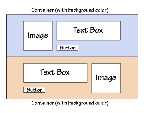
Eventually, I came to the conclusion that the only way I was going to get what I wanted was to go back to basics and write it all in HTML. I fired up my trusty Notepad++ and went to work. I started with the company newsletter. I had already designed it to be scalable, but I thought the images and buttons became too small to be useful in the scaled version. The layout was fairly simple—alternating image and text boxes divided into color coded section. How hard could it be?

Basic newsletter layout

At first, I tried to attach media queries to the previous version of the newsletter, but that proved to be impossible. In the original version the image and the associated text were part of the same table and the same row, so there was no way to get the image and the text to change their relationship to each other. Normally, this is one of the reasons email designers like tables—they keep things where they belong no matter what—but it’s not so good when you want things to move around more freely.

I thought about setting the positioning using divs, but I knew that Outlook.com doesn’t play nice with div floats or margins and I wanted to end up with an email that would look as good in as many email clients as possible. As with images and divs, you can control the appearance—or disappearance, as the case may be—of tables using media queries, but first I had to isolate the elements. For our newsletter, there were three primary elements: The image, its associated text, and the CTA button. By putting each of these in its own discreet table and nesting those three elements inside another table I was able to control the positions of all the elements with very little effort on my part.

The Compatibility Dilemma

Conceptually, the @media query is the heart of responsive design, and is pretty straightforward. You define styles to activate based on the @media query information, so you can move, resize, hide, and show different elements in your email. You may be tempted to try using the “display: none” attribute to control the appearance and disappearance of different sections based on the screen size, but I don’t recommend it. Not all email clients recognize this attribute, and when they don’t things break down terribly. Suddenly, you have a page with all versions of your content displayed stacked on top of each like a garage sale. Some clients, such as Gmail, force you to jump through so many hoops to get it to work that you might as well not bother. You’re still better off making sure that your email is readable under all circumstances than wrestling with multiple hidden versions. This particular issue gets right to the heart of the problem with responsive design.

However the biggest problem I faced in creating a cross-platform compatible design came from one company—Microsoft. While Google’s issues with the “display:none” tag forced me to rethink my design approach, it was Microsoft Outlook that generated the most problems for me. Getting my design to work across versions of Outlook was a study in frustration. My layout would work in Outlook 2003, 2007, and 2013, but not in 2010. Once I got it working in 2010, I’d go back to discover that it no longer looked right in 2007. The biggest problem was getting the tables to line up consistently. A quick search turned up a few articles on the subject of using Microsoft Outlook and responsive email design. Unfortunately, many of the solutions offered in these articles only shifted the problems to other versions of the software. I suspect that many of these people were working off the assumption that once they got the layout to work in their version of Outlook, it would work everywhere. In the end, the insertion of this tiny bit of code proved to be the only answer that actually worked:

style=”mso-table-lspace:0; mso-table-rspace:0;”

And even here I had to adjust the spacing in some of the tables to keep the images from interfering with the text.

Herein lies the biggest problem with responsive design in email. With so many different clients using so many different standards, finding out what works starts as an Easter egg hunt, and turns into a repetitious process of trial and error. While the technology of @media is conceptually simple and gives powerful options, individual vendors adoption of the required supporting elements has made it far more difficult and complicated than it should be. Perhaps when all—or almost all—the CSS commands are accepted across the board in email clients, then we will see some real strides forward in email design. Unfortunately, as we all know only too well, those wheels move very, very slowly.

Picking Your Battles

So was it worth it? I spent at least two weeks worth of studying and two more weeks of coding and layout, trying to get my initial design to work. I chased after a few concepts that led nowhere, and things that worked in some places fell apart in others. There was some satisfaction in seeing my final results in action, but I think I would have had less trouble with it had I not been searching for a shortcut to the coding part of the process. Ironically, the final design that actually worked came about after I threw out the file I had been working on and started over from scratch—that took me a day (of course, I had already done all the groundwork). Clearly, the web designer with a stronger background in responsive design will have a shorter learning curve than I did, but that can also bring with it erroneous assumptions about what will and won’t work. If you are new to responsive design, you’ll need to do some prep work before you can even start to code things. Of the resources I used, Chris Converse’s tutorial on Lynda.com was, by far, the most useful. As I mentioned in the previous post, looking at how others have tackled the problem is invaluable in coming up with good results.

The more complicated your email design is, the more of a hassle it will be to convert it. Goolara’s newsletter format is relatively simple, but it still took me a few weeks to get it where I wanted it. A complex design might prove resistant to a good responsive reworking solution. Whenever possible, designing your email with responsive in mind before you start is preferable, and will keep you from trying to fit a square peg in a round hole. As always, testing is crucial. While rendering services can be very helpful with catching errors, there were a few instances where what I received from the rendering service did not match the results I was getting with the actual email software, so use caution and test with actual mailings whenever possible.

The question you need to ask yourself is whether the effort you put into creating a responsive design is taking time away from segmentation and dynamic content efforts to make your mailings more personal. Larger companies, where the design is separate from the coding, won’t find this to be much of an issue, but if your designer is also the person who codes the file for email purposes, you’ll need to take into account the added time that they may require to get everything to work correctly. If it comes down to a choice between a nice responsive design and the good use of dynamic content, I would always choose the latter.  An email that addresses the specific interests and needs of a recipient is going to have more engagement than one that is merely easier to read on a phone. More and more people use their phones and “phablets” to read their email, but they’re still more likely to respond to an email that is relevant to them over one that merely looks good.

If you would like to see the results of my experiments, you can subscribe to the Goolara newsletter here, or you can write to me at jimm@goolara.com. You’ll also find me on Twitter: @JimAtGoolara. Happy emailing!

Go to Goolara website

Responsive Design in Email, Part 3: Handling Media Queries

Responsive design
In our last article on Responsive Design we examined Adobe’s new Edge Reflow program, which is designed to help facilitate the process of responsive website design. Unfortunately, we found that, like Dreamweaver, Edge Reflow is designed almost exclusively for website production, with no tools for creating responsive email files.* There is, of course, an alternative, and that is to code it yourself. Before you tune out completely, keep in mind that as long as you don’t try to get too fancy, creating media queries is not that daunting. This article is designed to help you get past the main stumbling blocks inherent in using responsive design in emails. As always, the K.I.S.S. rule applies. Keep things simple and you shouldn’t have any trouble building an effective responsive design. Once you’ve created your basic template, building new templates becomes a lot easier.

Email is Not a Web Page

The first thing to remember is that email design has certain characteristics that are substantially different from those of a web page. It is this fact that make both Dreamweaver and Reflow frustrating to work with at times. The main points of difference are:

  • Email cannot use JavaScript
  • Email cannot use separate CSS files
  • Tables are still the best way to control positioning
  • Some email clients can use head tag styles, but some cannot
  • Inline styles are always more compatible than styles in the head tag.

With a responsive web page, it is not unusual to have several CSS and JavaScript files connected to a page. Email design has no such luxury. Images are separate files, but everything else better be contained within the email if you want it to work.

The second thing to remember is that every email client plays by its own rules. Some ignore any expressions that appear in the head tags, which means your responsive design won’t work with that email client. As we discussed in the first article in this series, Gmail will use the head tag information if you view the mail on your iPhone with Apple’s Mail app, but not if you view it with Google’s Gmail app. Even with two email clients that both accept head tag styles, there may be display differences, so thorough testing is necessary every step of the way.

Tables Not Divs

Before you begin coding your responsive design media queries, you need to make sure you are starting on the right foot, and that means using tables. If you hang around web designers, or, at least, hang around the forums that web designers hang around, you’ve probably heard the mantra that you should be using divs not tables. “[Y]ou MUST use tables for tabular data!” A web designer on Stack Overflow posted. “Tables exist for that purpose, you MUST avoid tables only for layout purposes by using divs instead.” True enough if you’re designing a web site, but as every email designer knows, divs don’t always work in email. Outlook.com, for instance, ignores floats and margins, two of the primary components necessary for positioning elements on a page. This is especially ironic considering that Outlook.com is just about the only email client that actually uses most of the new HTML5 tags.

As with any other element on a page, tables can be assigned different attributes in the media queries. The main difference with responsive design is that elements with different media query attributes will need to be in separate tables to behave predictably. But before we get to that, let’s look at the basics of a media query.

Start Simple

For your first responsive design, it’s a good idea to start simple. It’s possible to have instructions for a dozen different sizes of screens, but it is not really necessary unless you’ve designed your email with multiple columns, which is generally not recommended. Depending on your design, you will want to switch to a mobile version of the email when the screen size falls somewhere between 500 and 600 pixels. Let’s say you’ve decided to switch to the mobile display at 525 pixels. Your media query would begin like this:

@media screen and (max-width: 525px)

You may want to use a smaller or a larger number, that is up to you. Smaller smart phones and the early iPhones had screen resolutions of 320×480 pixels. This number has increased substantially over the past few years. Newer iPhones have screen resolutions of 640×1,136 pixels, and the Sony Xperia Z Ultra and Samsung Galaxy S4 come in at a whopping 1,080×1,920 pixels, which rivals some desktop monitors.

These numbers may suggest that, at 640 pixels, the iPhone should display the full sized version of the email, but it will not. The number of pixels listed in the media query and the screen resolution are not equivalent. Newer iPhones, for instance, have a resolution of 640 across, but a device width of 320. This is because the width information in CSS does not take into account the iPhone’s retina display which doubles the number of pixels available. Likewise, the Samsung Galaxy Note II’s 720 pixel resolution comes in at 480 pixels in screen width. Of course, you can take pixel densities into account when you define your media queries, but this will only add an unnecessary layer of work to your email design. You may also want to create an intermediate set of rules for tablets and the very large phones (“phablets”), but keep in mind that this will add another media query and another set of instructions to your head tags. Also keep in mind that, if properly designed, your email should be readable on these devices without requiring any responsive adjustments. An email with a max-width of 650 pixels wide with 12 point type should be perfectly readable on any tablet (some people prefer to use the more cautious 600px).

From CSS to Email

With media queries, you can move elements around or hide them to your heart’s content.

If you are using Dreamweaver or a similar program to create your email, you may want to do everything using a CSS file to ensure consistency throughout the email, and to make it easier to change individual elements at a later date. Just remember that you’ll eventually need to convert all that information to inline styles. You could take the CSS file and stick its contents between style tags in the head, but not all email clients use head tag information. For the most compatible results, after you’ve added the CSS information to the style tag, you should next run the whole thing through an inline styler. This will inline everything, but it may also throw out the media queries at the same time. If so, you’ll need to replace these.

When you are finished, the top of your email’s HTML will look something like this:

<style type=”text/css”>

.ReadMsgBody {width: 100%;}

.ExternalClass {width: 100%;}

blockquote .original-only, .WordSection1 .original-only {display: none !important;}

blockquote table.forwarded-only, .WordSection1 table.forwarded-only {display: block !important;}

@media screen and (max-width: 525px) {

td[class=”SecondKitten”]{

display:none !important;}

img[class=”SecondKitten”]{

width: 100px !important;

height: auto !important;

padding-bottom: 20px !important;}

img[class=”FirstKitten”]{

width: 300px !important;

height: auto !important;

padding-bottom: 20px !important;}…

…</style>

<body>…

The expressions at the top that appear before the media query are there to eliminate email formatting issues. The first two expressions are for Hotmail, and the others are there to reset HTML5 elements to display elements as block elements, which helps control formatting things such as tables and lists.

The three style classes shown after the media query affect different parts of the design. The first one (td[class=”SecondKitten”]) causes the table cell (td) to disappear when the email is viewed on any device that is less than 525 pixels across. The second one (img[class=”FirstKitten”]) forces the image (img) to shrink to the width of 100 pixels, regardless of its original width. Likewise, the third class (img[class=”FirstKitten”]) forced the image to expand to 300 pixels.

Down in the body of the email, you’ll see something along these lines:

<img src=”http://placekitten.com/200/200&#8243; alt=”Meow!” height=”200″ width=”200″ border=”0″ style=”display: block; font-family: Arial; color: #ffffff;” class=”FirstKitten”>

The “FirstKitten” class indicates that if the screen’s width is 525 pixels or less, the image’s dimensions shift from 200×200 to 300×300. Normally, you’d want to reduce your image for a smaller screen, but this example demonstrates that you are not limited to only reductions. Just keep in mind that enlarging above an image’s resolution may result in some pixelation of the image.

A little further down in the body of the HTML, you’ll find this table cell information:

<td width=”200″ align=”center” style=”padding: 0;” class=”Second Kitten”><img src=”http://placekitten.com/200/250&#8243; alt=”Meow! Meow!” height=”250″ width=”200″ border=”0″ style=”display: block; font-family: Arial; color: #ffffff; font-size: 18px;” class=”Second Kitten”></td>

Since the media query attribute assigned to the cell (td) has a display value of “none,” the entire cell disappears when viewed on a small screen, even though the img class is active and has its own values. Here’s our sample file as it appears on a monitor (Click here to view full-sized version of the image):

Responsive Design on a Monitor

Images used in this demo are courtesy of placekitten.com.

And here’s the same file when viewed on an iPhone:

Responsive Design on an iPhone

You can see that a few interesting things have happened. The kitten at the top of the page became larger, deteriorating the image slightly, while the kitten at the bottom of the page disappeared entirely. The call-to-action buttons lose their original size attributes and switch to the attributes in the media query, which specify 100%. This causes the buttons to stretch across the width of the display, which works well for small screens, but would look bad on a monitor.

Now, suppose we change the “SecondKitten” td class as follows:

td[class=”SecondKitten”]{

display:100% !important;}

Now the second box in the email appears like this on an iPhone (or similar small-screen device):

100 pixel kitty

You’ll notice that since the cell is allowed to display and given a value of 100%, the image appears, but now the attributes under the img class=”SecondKitten” take effect. The picture is visible, but reduced to 100 pixels across because that was the width indicated it should be when the screen size falls below 525 pixels. **

Design for the Least Compatible Client

As I’m sure you’ve noticed, not all email clients are created equal. Outlook.com, for instance, does a great job of rendering HTML5 code, but it ignores floats and margins in divs. Some email clients can handle head tags, and some can’t. While it is fun to try and create complex responsive designs that adapt to different devices, you’ll still need to design your email so that when all else fails, it is still readable under the widest variety of circumstances. It might be fun, for instance, to swap out entire sections using “display:none” as an inline attribute, but it won’t do you much good if any of your recipients are using Gmail because Gmail strips out the “display:none” attribute from the email. The old adage in email design is that you should “design your email like it’s 1999.” A better approach is to design for Least Compatible Client (LCC). Don’t put anything in your body tags—other than class selectors for the media queries—that won’t work in every situation. That way, you’ll always have an email that will look as good as it can under any circumstances.***

Responsive Writing

A quick survey we did recently indicated that most of the email designers who are actually creating responsive layouts are not using visual editors such as Dreamweaver, but coding by hand using HTML-oriented text editors such as TextWrangler, Sublime Text, or Ultra Edit. Although Dreamweaver does have tools for creating responsive templates, as mentioned in our other posts on the subject, it is aimed primarily at web designers and often adds unwanted code to your files. If this all sounds a bit daunting, it shouldn’t. Remember our initial advice: keep it simple. Besides, remember that others have gone before you and there is no reason to reinvent the wheel.

Learning From Others

A great way to learn more about how to use responsive design is to open the source code for the responsive emails you receive and see what they’re doing. In most cases, you’ll see a lot of expressions under each media query that aren’t used. This is because everyone is working from a template to which they may have added things they’ve needed over time. A particular email may only use four or five instructions, but the media query section may have a dozen or more extra expressions. Those extra expressions add slightly to the size of the email, but only slightly. Web pages can be a great source of ideas for responsive design, but they often rely on JavaScript to implement certain aspects, so approach with caution.

One excellent source of responsive design examples is Media Queries. This web site is a collection of the best responsive design pages on the Internet. It contains hundreds of dazzling examples of responsive web design. This is a great place to go if you are looking for ideas. Odds are there is an example here that matches your concept. All of the examples are web pages, so most include JavaScript. Formatting varies widely, from carefully formatted and commented, to one big, indecipherable, block of code.

Another source for bare bones responsive email design ideas is Code Pen, an online sandbox for testing HTML. While most of the examples given on this site are for web design, a search for “responsive email” will yield several useful examples of emails that were created to be responsive.

There are also some very good online tutorials available on YouTube. These range in quality from professionally-made, “I-can’t-believe-they’re-not-charging-for-this” instructions, to people with indecipherable accents talking into their laptops at the local Starbucks. Lynda.com also features a thorough tutorial on responsive email design by Chris Converse (includes sample files).

Test, Test Test…

However you choose to create your responsive email, you’ll need to test it across as many different platforms and devices as possible. Sometimes things may look perfectly acceptable across nine clients and devices and then the tenth one will send you back to the drawing board. As with all code, a misplaced percentage sign or missing bracket can ruin everything. Due to the nature of responsive design, it can be difficult to tell if your media query is working until you see it in action.

In the next installment of our series on Responsive Design in Email, I’ll discuss the process I went through to come up with a good responsive design, and what I learned along the way.

* The latest release of DreamweaverCC, now includes the option “Define in page” for media queries. By using this command, you can add the media queries to the top of the HTML document and still inline all the style information. With this change to Dreamweaver, it might be possible now to use it to create responsive email designs within the program. It’s nice to see Adobe finally paying attention to the needs of email designers.

** If you would like a copy of the original HTML file, you can download it as a zip file here, or as a text file here.

*** This advice does not include Styled Alt Tags, which may not work in certain clients, but these are less an aspect of design than a fallback when images are not displayed.

Using HTML5 in Email: Video

Video in Email

[Note: This is the second of a two-part series on using HTML5 in email. In this article, we look at the audio and video tags.]

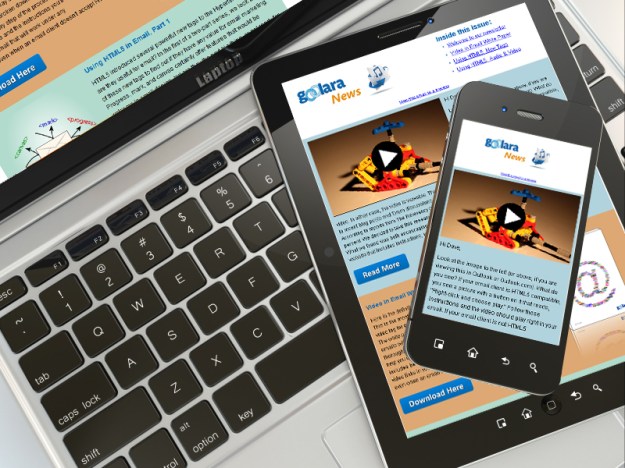
In HTML5, the tag that sparks the greatest interest to many marketers is the new video tag. The tag is designed to embed videos in web pages, but wouldn’t it be great if we could do likewise with email? That way, a recipient could see your video without being redirected to a web page. Over the years, marketers have attempted to accomplish this in a variety of ways. Some have tried embedding Base64 encoded versions of video files into email—a technique that bloats email worse than mosaics and is not recommended by any ESP on the planet. Another technique that some have tried is to offer a plug-in that enables video in email, but this means that with every video email you send, you must also send a link to a third-party solution that requires the user to install new software. Right off the bat, you’ve already lost your audience.

The most common and effective way to add video to an email is by inserting a frame grab from the video into the email and then linking it to the page on YouTube, Vimeo, or your own website:

video image

Often, people add a play button to the image—as we have done—to help identify the image as a link to a video, but it still requires people to move away from their email to another site. With the video tag, the recipient stays in your email. This is preferable, but, as with the HTML5 tags we discussed in the previous post, when, how, or even if it works is contingent on several factors.

Compatibility issues

First of all, your email marketing software may not recognize video tags and will eliminate the code from the email. Even if your software allows the code to be included (and Symphonie is one of those that will), there’s still no guarantee that the email clients will display the video. Gmail and Yahoo, for instance, ignore the video sources listed within the tags, but this doesn’t mean video tags are useless. Other standard HTML information such as text and img tags can be inserted between the tags and an email viewer will default to this information if it can’t play the video.

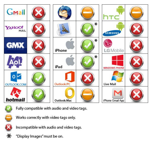
On top of all this, the way the different devices handle video tags also widely varies. iPhones, for instance, provide a play button, while Outlook.com and Thunderbird require you to right-click on the image and choose play, and only Outlook.com is compatible with the “autoplay” attribute. All other email viewers disable this feature. At first, the inability to play the video without first right-clicking to choose play looks as if it might be a problem. After all, what good is a video if no one can figure out how to play it? But another feature of the video tag is the ability to include a display image of your choosing, allowing you to insert the necessary instructions to make the video work:

Rightclick to play iamge

If you are interested in using video tags you’ll need to prepare the email to cover all the possible exigencies. This includes providing the display image for the email clients that can play videos, and alternative links for the ones that can’t. It requires some familiarity with basic HTML, but nothing too difficult. If you want to use videos in email, we recommend reading our white paper, Video in Email, available here.

Sound Advice

Audio works in even fewer places than video. Only Outlook.com allowed the MP3 file to play. In most of the other clients, the audio tag defaulted to the alternative link. In Thunderbird, both the audio controls and the alternative link disappeared, but the program allowed the Ogg file to play if autoplay is on, but provides no way to pause it. If the file is not set to autoplay, there are no visible controls to make it play at all. On the iPhone, the file will play as long as “display images” is turned on (the default on the iPhone). When “display images” is turned off, a message appears that reads “cannot play this audio file.” Outlook.com was the only email viewer in our tests that worked with both the autoplay and loop attributes, making it possible to create an email that begins making noise as soon as you open it. This is definitely not recommended.

audio video compatibility chart

Ready or Not?

In part one of this series, we decided that none of the tags listed were worth using at this time. With the audio and video tags, we found that, while audio is not useful, the video tag provides enough flexibility and compatibility to be a good way to include videos in email for nearly every platform, but may require some file preparation. Click here to download the PDF version of our Video in Email white paper.

Go to Goolara website

Using HTML5 in Email: New Tags

HTML5 tags

Note: This is the first of two articles examining the use of HTML5 tags in email. In this article, we look at <mark>, <progress>, and <canvas>. In the second article, we’ll take a look at the <video> and <audio> tags.

When it comes to email, common wisdom says you should code it “like it’s 1999.” Using the latest HTML tags is considered risky business in email. Email clients throw out using scripting, and the implementation of new tags is spotty at best. Styling is best handled in-line, but visual editors, such as Dreamweaver, don’t always make this easy, preferring instead to place any style information either in a separate CSS file, or between the <head> tags, which can be lost when an email reaches the inbox.

Erring on the side of caution is usually a good idea, but sometimes we email marketers take this advice a little too far, avoiding useful techniques because five years ago they didn’t work. A good example of this is the relatively rare use of image maps in email, in favor of the more problematic and file-swelling sliced images (see Keeping It Together—Image Slicing vs. Image Mapping). So what about HTML5? Is it worth trying? Some of its new features are intriguing, particularly the <video> tag, but can you use them in email. Here’s what we found out.

Meet the New Tags

HTML5 removes (i.e., deprecates) a few old tags from HTML4 and adds thirty new ones. Several of these new tags, such as <article>, <aside>, and <section>, have little use in email; three of the new tags—<details>, <dialog>, and <summary>—will only work in Chrome and Safari at this time; and some tags, such as the <bdi>, <ruby>, <rt>, and <rp> tags, are specifically designed for use with other languages and are beyond the scope of this article.

Some tags may not have much practical value, but could be useful for creating visually interesting email without having to rely on images. Examples of this are the <mark> tag which makes text look as if it has been highlighted with a marker, and the <progress> tag, which creates an animated green bar similar to the ones seen when downloading files:

progressbar

markhilite

[Note: These are screen representations. WordPress.com does not support all the HTML5 either.]

Unfortunately, in our tests, <mark> only worked in Thunderbird and Outlook.com, and <progress> only worked in Outlook.com (by far, the most HTML5 compatible email client available). Given such limited application, these tags are of little use at this time for email marketing purposes.

One new feature that looked as if it might have real value for email is . With , it is possible to create graphics directly on a page without linking to a file. You can already do this, to a certain extent, with

tags, but offers more controls and possibilities. In our tests, however, did not work in any email viewers, stand-alone or browser-based. This isn’t surprising considering that the primary intended use for is to create graphics on-the-fly using scripting. As a rule—primarily for security and virus reasons—email clients strip out any scripting found in an email.

Comparison chart

Coding Like It’s 2011

It’s apparent that, as far as email is concerned, HTML5 still has a long way to go before most of its features become useful to email marketers. As is always the case, the email clients are the last to adopt the latest features in each iteration of HTML; so, while it may not be necessary to code like it’s 1999, you might want to stick to coding like it’s 2011 for now. We will keep testing these features and as soon as any of them are available across multiple email clients, we will report on it here. One new feature of HTML5 that is shaping to have real value to email marketers is its video feature. There a lot to say on this subject, so we’ll be talking about it in a separate article. We’ve also created a white paper on the subject, available here: Video in Email white paper.

Next: Audio and Video in Email with HTML5.

Go to Goolara website

The Secret Side of Email

The Secret Side of Email

Hardly a week goes by when someone isn’t proclaiming that email is dead. “E-mail a thing of past for business, young” [sic] declared a headline in the Boston Globe. Young people, the article goes on to claim, no longer use email, preferring to communicate via text messages and social networks. It brings to mind the Wall Street Journal article from four years ago stating that email is a thing of the past. “Email has had a good run as king of communications,” the article states, “but its reign is over.” If a person went by the news articles, it would seem as if we should have all stopped using email ages ago. Recent events prove otherwise, and suggest that some of these predictions could well have ulterior motives.

In January, 2013, Salesforce.com CEO Marc Benioff was invited to appear on stage at the International CES, one of the largest consumer electronics shows in the world. “How are you connected with your customers, your partners, your employees,” he asked. “Email? Those days are over.” In the aforementioned Boston Globe article a couple months later, Anna Rosenman, the senior product marketing manager at Salesforce concurred with her boss: “Email is one-to-one communication, and that’s not how we need to be communicating.”

On second thought…

Then in May of 2013, Salesforce announced they were buying the email marketing provider, ExactTarget. Acquiring a company is no small task, and any responsible company is going to research their proposed acquisition thoroughly before following through with a purchase of this magnitude. These things take several months; sometimes years. While it’s possible that Mr. Benioff woke up the morning after the CES show and said, “Gee, I think I’ll acquire an email company,” and didn’t bother to tell his senior marketing manager, it seems unlikely. It’s far more probable that his and Ms. Rosenman’s talk about the death of email was a smokescreen to keep the competition off the trail. In that light, all the talk about email no longer being viable starts looking downright Machiavellian.

But Salesforce is, by no means, the only company to incorporate email marketing into their offerings. Oracle did it last December and Deutsche Post (DHL) joined the bandwagon a month after Salesforce. Suddenly it’s looking like a trend. So why all the sudden interest from these major players in email marketing systems?

It probably has something to do with the flood of recent surveys showing that email is not only alive and kicking, but thriving. According to Forrester, 25% of the adults online in the United States value email as a way to learn about products and promotions—up from 17% in 2010. Contrary to the reports that email use is waning, the Pew Research Center found that email is tied with search as the most popular online activity. A lot of press has been given to the idea of marketing via Facebook and Twitter, but according to Merkle’s 2011 View from the Inbox research study, 74% of adults still prefer email when it comes to communicating with brands.

The World Goes Mobile

Another factor in the rise of email’s effectiveness comes in the forms of tablets and smart phones. 72% of the respondents in Adobe’s 2013 Digital Publishing Report on Retail Apps & Buying Habits use their tablets to shop, and 71% of those say their decisions are influenced by company email, second only to recommendations by friends. Among smart phone users, a whopping 78% use their phones to check email, ahead of all other uses including making phones calls!

It should be no surprise, then, that Wired Online this month includes a story headlined, “Email Is Crushing Twitter, Facebook for Selling Stuff Online.” Based on data gathered by Custora, a marketing analytics company in New York, the article says that email far outpaces any of the social media when it comes to sales results. This is no small segment either. Custora’s data came from 72 million customers shopping on 86 different retailer sites—a mighty convincing sample.

The Obama Factor

It’s also probably no coincidence that this sudden rebirth of interest in email marketing software came after the 2012 presidential election. As we discussed in a previous blog post, Team Obama’s use of email was an important factor in Obama’s successful bid to retain the presidency. Obama was on Facebook and Twitter as well, but it was the email that received the most attention. More importantly, it also pulled in the most donations by a long shot—approximately $500 million.

So the next time you read somewhere that some big mucky-muck says that email is dead, give that person six months and ask again. The odds are good they’ll have a change of heart.

Go to Goolara website

Yahoo Recycles Dead Email Addresses

Yahoo recycles email addresses

In a move that has many people in both the email marketing industry and the Internet security field shaking their heads, Yahoo has announced that any Yahoo email addresses that haven’t been logged onto in over twelve months will be made available to other users. In a post on their blog, Jay Rossiter, Yahoo’s senior vice president of platforms, wrote that the reason for doing this was to allow Yahoo users who weren’t online during the initial email address land grab to get the Yahoo addresses they wanted. “If you’re like me,” Rossiter explained, “you want a Yahoo ID that’s short, sweet, and memorable like albert@Yahoo.com instead of albert9330399@Yahoo.com”

Security experts are especially skeptical of this move, saying that the possibilities for identity theft abound. The recently deceased, or long-term hospitalized people could be prime targets, they argue. Elderly people whose kids set up their account and helped them buy a few things on Amazon two years ago are also possible targets. But the Email Marketing community has its own set of potential problem areas that must be dealt with if Yahoo goes through with this program.

30 Day Turnover

According to a Yahoo spokesperson once an old email address is requested, Yahoo will send bounce back emails alerting senders that the deactivated accounts no longer exist, and they will also unsubscribe these accounts from commercial emails such as newsletters, email alerts, etc. But Yahoo’s plan is to allow only thirty days for this process. This quick turnover only adds to the possible problems email marketers are liable to encounter.

Suppose you have a customer who purchased something from your company a year-and-a-half ago. You’ve been sending email offers, but as the person hasn’t been that engaged, you’ve tapered off on the mailings. You send something at the end of June, and then something again at the beginning of September. In between, that address has gone to someone else. How will that new recipient react? As far as they’re concerned, your email unsolicited, which makes it a good candidate for the Spam folder. This is, admittedly, worst case scenario, but a man named Murphy already proved that if something can go wrong, it will.

For an individual, sending to a bad address is no big deal. They will receive some kind of bounce message, but other mail they send will go through. That is not the same for mass marketers who send thousands of emails per day. When a marketer sends a large volume of email, the ISPs keep track of how many bad addresses are attempted and use that as a factor in determining the Reputation Score of the sender. This is explained in greater detail in our guides, but, suffice it to say, you can’t send to bad addresses regularly and maintain good inbox penetration. Good email marketing software looks at failure messages and immediately removes bad addresses from any future distributions to keep the failure rate as low as possible.

Beware of Spam Traps!

If you have removed inactive recipients from your list, you may have already removed some of the accounts that will be reactivated by Yahoo. One idea might be to reactivate all Yahoo users who were previously marked as bad addresses, in case some of them are now valid addresses. However, this would be a bad idea for many reasons. One is that some of those bad addresses have been turned into “spam traps.” This is an anti-spam technique used by all ISPs that takes old, inactive or closed accounts and reactivates them. Before the account is closed, the ISPs return an error message that the user is inactive to anyone trying to send to that address. After a period of time, the ISP will stop returning these message and turn the account into a spam trap. The idea is that good marketers send email to their recipients on a regular basis, so they will know that the account is no longer valid. Those that don’t follow best practices, or buy a list from questionable sources, may get email addresses that have not been sent to in many months. When an ISP receives an attempt to send to an address they have turned into a spam trap it results in an immediate and significant drop in the Reputation Score.

Even if there are no spam traps on your list, if most of those bad addresses remain bad, reactivating them will cause a large spike of unknown user rejections from Yahoo, which will also hurt your Reputation Score.

Re-subscription Issues

The problem isn’t simply limited to old addresses either. If you have a user who gets marked as invalid within the short window Yahoo provides, and, coincidentally, the new owner of that account wants to join your distribution, the new user may or may not get added, depending on how the request comes in. Many marketers re-import their list on a regular basis to add new recipients or change their demographics, so good email marketing software has to look at the import and see if the recipient is already in an unsubscribed or on-hold status. It would be a mistake to re-enable all recipients who are re-imported, as you would be causing another Unknown User request against the mail server, or re-activating a user who had unsubscribed. Therefore, if the new user’s request to be added comes into your website and is added to a bulk import, the request may be ignored.

If the request to add the email address is sent to the email marketing software in a non-batch mode, such as via an API call, it will depend on the implementation of the software as to whether the request is processed or not. Check with your ESP on how this would be handled.

Best Practices

Sending to a person who inherits an email address is probably a bad thing, and if that person marks your email as spam, it will be more difficult for you to get future mail delivered to Yahoo. Therefore, if you do not already have a program in place to remove inactive users, start one, or make sure that you send an email to all your users at least once a month. Above all, you’ll need to be especially vigilant when it comes to any clients using a Yahoo address.

Go to Goolara website

Gmail Insights: Gmail Reinvents Itself

Gmail tabs

Recently Google introduced a new feature to Gmail that has some marketers up in arms. In the past, an email could wind up in one of two places: the inbox or the spam folder. Gmail users could prioritize their mail with labels, but as long your mailing didn’t end up in the spam folder, you were doing alright. Now Gmail users have the option of dividing their email into separate tabbed areas based on the content. These tabs are, as follows:

  • Primary—This is where all personal correspondence or any email that Gmail can’t categorize ends up. It is the first tab and automatically appears whenever the Inbox is opened.
  • Social—As the name suggests, any email from sites such Facebook, Twitter, and LinkedIn will end up here, as well as email from dating sites.
  • Promotions—Most marketing email will end up here, including special offers and company newsletters.
  • Updates—Transactional email, such as order receipts, program updates, and monthly charges should end up in this tab.
  • Forums—Similar to Social, forums, mailing lists, and any special groups to which you belong will appear here.

Gmail tabs

Whenever new email is added to one of these tabs, the tab displays the number of new emails along with the first few “From” names that appear on these mailings. These tabs are also available on the Android and iPhone Gmail apps. For now, the tabs feature is an opt-in setting, but Google has said that in the future it will become a standard feature of Gmail.

For the power email user, these changes do not matter much. These people have already applied filters to their email to categorize things more easily. As a member of some particularly hyperactive discussion groups, I learned long ago about the advantages of assigning certain topics or “From” addresses to their own folders. But for the person who normally doesn’t bother with any email sorting beyond dragging receipt emails to a separate folder, Gmail’s new tabs could be a game changer. How much of a game changer remains to be seen.

What goes where?

How does Google decide under which tab to put a new email? Google won’t say anything about their logic, probably to avoid people trying to game the system. This is similar to their SEO logic, where they will say very little about the algorithms. So here is our take on how they are doing this. The Social tab is probably hard-wired to the main social sites —Facebook, Linked-in, Twitter, etc. This should work pretty well and is fairly foolproof. It does mean that promotions from these companies come in as Social, as we’ve already experienced. For all other email, we suspect they are scanning the content, looking for keywords, and the things that they examine for deliverability already, such as the number and location of links and the text-to-image ratio. Anything that has commercial sounding keywords, or many images, will likely go to the Promotions tab.

If this is true, then ironically, sophisticated marketing email design suddenly become less valuable. A transactional email that includes several images, complex tables, and additional offers, has a strong chance of ending up in the Promotional folder instead of the Updates folder where it belongs. A simpler transactional email containing few if any images or links, and is primarily text has a better shot at the Updates folder in this case.

For some marketers, Gmail’s new interface seems like a direct assault on their businesses, arguing that segregating promotional email into its own tab is tantamount to creating a new Spam folder. Although the actual effect remains to be seen, some people in the industry predict that we will see a drop in response rates.

So is this the end of the world?

First and foremost, it is important to remember that most promotional mailings are going to end up under the Promotions tab at first. The problems you’ll face as a marketer with this new system really aren’t that different than they were before. People can usually recognize promotional email almost immediately, and its success inevitably boils down to the usual factors—intriguing subject lines, compelling content, and how easy you make it to respond to offers. Whenever email lands under the Promotions tab, the client is alerted to new email in the tab bar immediately, but how people respond to these notifications is still unknown.

Some concerns about the potential effect of tabs on customer responsiveness are valid. Extremely time sensitive emails (“25% off afternoon special”) might get overlooked until it is too late. But it is equally possible that when clients discover they have missed short-lived specials, they will be more diligent in the future when it comes to viewing their promotional emails, which could benefit everybody in the long run.

If you are sending transactional emails you are going to want to pay close attention to where your mailings end up. You may find that your transactional emails are being treated as promotional based on the keyword-scanning methods Google appears to be using.

Google’s Rulebook

Google’s stated goal with these recent changes is to make Gmail more relevant to the users. That was the idea behind the addition of the priority feature in email, but it appears that not too many people bothered with that feature, so they are trying a different tack. In the end, the success or failure of tabs will hinge on the public reaction. It is interesting to note that one of the features Google touted for Gmail when they introduced the service was the idea that you did not need to categorize your email, but could, instead, use search to find specific emails. Apparently, they no longer feel this is the case. Google has never been particularly responsive to marketers; just ask anyone who has dealt with SEO issues over the past few years. It is doubtful that any complaining by marketers will yield results.

It is also apparent that the interface is not 100% accurate. I’ve received promotional mail in three different folders without any rhyme or reason. It appears as if Google is resorting to keyword connections to determine the placement of some email. If your mailing is in reference to a specific event, such as a webinar, or contains information that resemble a receipt, there’s a chance it will end up under the Updates tab instead of Promotions. We are also seeing a lot of crossover between Social, Updates, and Forums, depending on the information in the “From” address.

One thing is certain, this will not be the last time that Google fiddles with email, nor is it a marketer’s worst nightmare. Good marketing will prevail because, in spite of any grousing on the part of the general public, people like good marketing. It informs them, entertains them and aids them. As long as your mailings do one of these three things, you’ll be fine.

Go to Goolara website