
[Note: Unlike most of our blog posts, this one comes from our Marketing Communications Specialist Jim Morton personally, recounting his adventures in the exploration of responsive design. Like many of you, much of Jim’s HTML work these days is confined to email design, which, as you know, plays by different rules from web design. We think that what Jim experienced in studying the subject is good information for anyone interested in trying their hand at responsive email design for the first time.]
In the previous three articles, I examined the proposition of using responsive design in email. At the beginning of the project, I knew about responsive design and how it worked, but I had never bothered with it. I designed my emails so they could be read on something as small as an iPhone viewed in landscape, but would still look good on a 27″ monitor; that seemed good enough.
But sometimes, “good enough” just isn’t good enough. One morning, while I was reading email on my way to work, I became aware of the fact that I read almost all of my personal email on my iPhone these days. A quick survey of people I know revealed this to be common trend among them as well. Then, on the Email Monday Blog, Jordie van Rijn cited a host of statistics indicating that mobile email can account for up to 65% of email opens depending on the audience. Should I be using responsive design to take advantage of this trend? I wondered.
Geniuses Only
The thing that kept me from taking the plunge into converting our email templates to responsive design was the same thing that has probably stopped a lot of you: namely, its reputation for being difficult. Responsive design, you’ll hear people say, is hard to implement and brings a whole new level of headaches to email design. The problem with this statement is it tends to be self-fulfilling. When I started this project, I carried that same baggage and found it difficult to get traction with my early efforts at it. Looking back at it, I see that a lot of my problems were the direct result of my preconceptions about responsive design’s supposed difficulty.
It was my trepidation over the process that led me to start with Dreamweaver, thinking that this might be an easier way to get responsive features up and running in my mailings. As many of you know, Dreamweaver has a nasty tendency to stick things you don’t need or want into your HTML, but I wasn’t too worried about this—Symphonie’s visual editor does a pretty good job of stripping such garbage out. However, I quickly discovered that Dreamweaver wasn’t going to help. In the first place, Dreamweaver insisted on creating separate CSS files for everything. Media queries weren’t handled directly, and when you chose fluid design, a CSS file and JavaScript file were automatically attached to the project—perfectly acceptable for a website, but not so good for email.
In early October, DreamweaverCC, added the option “Define in page” for media queries. By using this command, you can add the media queries to the top of the HTML document and the CSS information will automatically switch to inline for any formatting choices. This change to Dreamweaver makes it much easier to create responsive email designs within the program. It’s nice to see Adobe finally paying attention to the needs of email designers, but it came too late for my project.
On the Edge
It was with some interest that I read about Adobe’s latest product, Edge Reflow, which was specifically created to help make responsive design easier to facilitate. I’ve been using Adobe products for more years than I care to mention, and I am very comfortable with their programs. If anyone could make responsive design easier, it was going to be Adobe (full disclosure: I worked for Adobe as a technical writer and illustrator, but that was a long time ago). Since I was subscribed to Adobe Creative Suite, Edge Reflow was available in its beta test form. Could this be the solution to my problem?
Short answer: No. Perhaps if you are designing websites, Edge Reflow is a useful tool, but when it came to helping me design the email, it was of little value. If anything, it made the whole process more difficult by adding another layer of complexity (and files) to the process. To make matters worse, it required me to start from scratch and, worst of all, had no ability to contend with tables, nor did it offer any inline features. After spinning my wheels with this program for a few weeks, I concluded it wasn’t the answer I was looking for and continued my search (see Responsive Design in Email, Part 2: Edge Reflow for the full report).
BYOHTML
Eventually, I came to the conclusion that the only way I was going to get what I wanted was to go back to basics and write it all in HTML. I fired up my trusty Notepad++ and went to work. I started with the company newsletter. I had already designed it to be scalable, but I thought the images and buttons became too small to be useful in the scaled version. The layout was fairly simple—alternating image and text boxes divided into color coded section. How hard could it be?

At first, I tried to attach media queries to the previous version of the newsletter, but that proved to be impossible. In the original version the image and the associated text were part of the same table and the same row, so there was no way to get the image and the text to change their relationship to each other. Normally, this is one of the reasons email designers like tables—they keep things where they belong no matter what—but it’s not so good when you want things to move around more freely.
I thought about setting the positioning using divs, but I knew that Outlook.com doesn’t play nice with div floats or margins and I wanted to end up with an email that would look as good in as many email clients as possible. As with images and divs, you can control the appearance—or disappearance, as the case may be—of tables using media queries, but first I had to isolate the elements. For our newsletter, there were three primary elements: The image, its associated text, and the CTA button. By putting each of these in its own discreet table and nesting those three elements inside another table I was able to control the positions of all the elements with very little effort on my part.
The Compatibility Dilemma
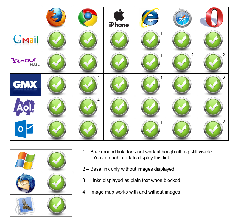
Conceptually, the @media query is the heart of responsive design, and is pretty straightforward. You define styles to activate based on the @media query information, so you can move, resize, hide, and show different elements in your email. You may be tempted to try using the “display: none” attribute to control the appearance and disappearance of different sections based on the screen size, but I don’t recommend it. Not all email clients recognize this attribute, and when they don’t things break down terribly. Suddenly, you have a page with all versions of your content displayed stacked on top of each like a garage sale. Some clients, such as Gmail, force you to jump through so many hoops to get it to work that you might as well not bother. You’re still better off making sure that your email is readable under all circumstances than wrestling with multiple hidden versions. This particular issue gets right to the heart of the problem with responsive design.
However the biggest problem I faced in creating a cross-platform compatible design came from one company—Microsoft. While Google’s issues with the “display:none” tag forced me to rethink my design approach, it was Microsoft Outlook that generated the most problems for me. Getting my design to work across versions of Outlook was a study in frustration. My layout would work in Outlook 2003, 2007, and 2013, but not in 2010. Once I got it working in 2010, I’d go back to discover that it no longer looked right in 2007. The biggest problem was getting the tables to line up consistently. A quick search turned up a few articles on the subject of using Microsoft Outlook and responsive email design. Unfortunately, many of the solutions offered in these articles only shifted the problems to other versions of the software. I suspect that many of these people were working off the assumption that once they got the layout to work in their version of Outlook, it would work everywhere. In the end, the insertion of this tiny bit of code proved to be the only answer that actually worked:
style=”mso-table-lspace:0; mso-table-rspace:0;”
And even here I had to adjust the spacing in some of the tables to keep the images from interfering with the text.
Herein lies the biggest problem with responsive design in email. With so many different clients using so many different standards, finding out what works starts as an Easter egg hunt, and turns into a repetitious process of trial and error. While the technology of @media is conceptually simple and gives powerful options, individual vendors adoption of the required supporting elements has made it far more difficult and complicated than it should be. Perhaps when all—or almost all—the CSS commands are accepted across the board in email clients, then we will see some real strides forward in email design. Unfortunately, as we all know only too well, those wheels move very, very slowly.
Picking Your Battles
So was it worth it? I spent at least two weeks worth of studying and two more weeks of coding and layout, trying to get my initial design to work. I chased after a few concepts that led nowhere, and things that worked in some places fell apart in others. There was some satisfaction in seeing my final results in action, but I think I would have had less trouble with it had I not been searching for a shortcut to the coding part of the process. Ironically, the final design that actually worked came about after I threw out the file I had been working on and started over from scratch—that took me a day (of course, I had already done all the groundwork). Clearly, the web designer with a stronger background in responsive design will have a shorter learning curve than I did, but that can also bring with it erroneous assumptions about what will and won’t work. If you are new to responsive design, you’ll need to do some prep work before you can even start to code things. Of the resources I used, Chris Converse’s tutorial on Lynda.com was, by far, the most useful. As I mentioned in the previous post, looking at how others have tackled the problem is invaluable in coming up with good results.
The more complicated your email design is, the more of a hassle it will be to convert it. Goolara’s newsletter format is relatively simple, but it still took me a few weeks to get it where I wanted it. A complex design might prove resistant to a good responsive reworking solution. Whenever possible, designing your email with responsive in mind before you start is preferable, and will keep you from trying to fit a square peg in a round hole. As always, testing is crucial. While rendering services can be very helpful with catching errors, there were a few instances where what I received from the rendering service did not match the results I was getting with the actual email software, so use caution and test with actual mailings whenever possible.
The question you need to ask yourself is whether the effort you put into creating a responsive design is taking time away from segmentation and dynamic content efforts to make your mailings more personal. Larger companies, where the design is separate from the coding, won’t find this to be much of an issue, but if your designer is also the person who codes the file for email purposes, you’ll need to take into account the added time that they may require to get everything to work correctly. If it comes down to a choice between a nice responsive design and the good use of dynamic content, I would always choose the latter. An email that addresses the specific interests and needs of a recipient is going to have more engagement than one that is merely easier to read on a phone. More and more people use their phones and “phablets” to read their email, but they’re still more likely to respond to an email that is relevant to them over one that merely looks good.
If you would like to see the results of my experiments, you can subscribe to the Goolara newsletter here, or you can write to me at jimm@goolara.com. You’ll also find me on Twitter: @JimAtGoolara. Happy emailing!

 The Goolara Blog