2013 was an interesting year. 2012 ended with Oracle buying Eloqua, and 2013 ended with Oracle buying Responsys. Who will they buy next? 2013 began with Salesforce CEO Marc Beniot telling a crowd at CES that email was dead, and then turning around and buying ExactTarget a few months later. It was also the year that marketers finally got over their infatuation with social media after several reports showed that far-and-away the most effective digital channel for marketing is still email.
We’d like to take a look what landed in our inbox over the year. Here’s a round-up of some of the most interesting examples. Some of it is inspired, some of it is confusing, and some of it is just plain awful. Several of the mistakes shown here are things that can happen to any of us, but they stand as good reminders that email isn’t just about writing content and sending it—it is also about proofing and testing.
Alt Tag Fun
Ya’ got something against “T”s?
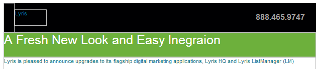
Lyris gets points for using a colored cells with reversed text, but if you ever needed a reminder to check your alt tags as carefully as you check your content, this is it. In Lyris’ defense, at least they had an alt tag. I can’t say the same for Hugo Boss, whose email always lands in my inbox looking exactly the same:

Slightly better—but only slightly—is J. Crew. Here’s their solution to the alt tag dilemma:
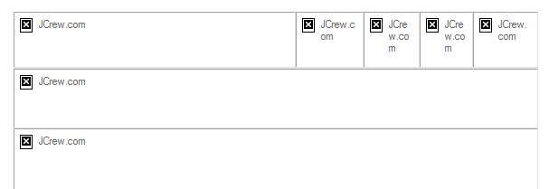
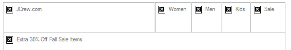
Last September, for a week or two, someone who knew what they were doing must have taken over J. Crew’s email preparation, because suddenly the email was going out with actual, meaningful alt tags:
Sadly, it appears to have been a blip on the chart. Within a couple weeks they were back to the generic “jcrew.com” alt tags on all their images.
You’re using an image because…?
It’s always heartening to see someone use alt tags to further their message. That can be anything from a simple “Turn on your images to see what you’re missing,” to fully styled alt tag in a colored cell (see The Finer Points of Styled Alt Tags for more on how to do this). But this alt tag from Generator Research takes the cake:

Bizarrely, the missing image is nothing more than this same list as a gif file, which raises the question: Why bother with the image at all?
Delivery Problems
Some problems are beyond the control of the sender. Network slow downs, unexpected glitches, and certain browser extensions can ruin the best email design. Here are a few examples of emails that were probably fine back at the office, but ended up a mess when they arrived in our inbox.
Text still rules
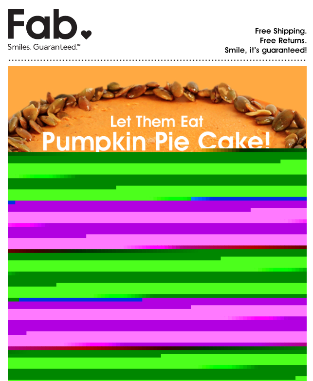
This is a great example of why you should always include text in your mailings. We’re not sure why this email from Fab got screwed up in transmission, but had they included some text it would have mattered less. As it stands, the only visible message is something about Pumpkin Pie Cake. Is it a product, a cookbook, or just a joke? I’ll never know because the only other text in this email were the legal notices, address, and unsubscribes mandated by the CAN-SPAM act.
WOT the heck?
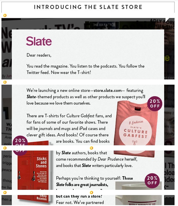
There are a lot of sneaky pitfalls that can ruin the best planned email. This one from Slate might have been okay had they not decided to convert everything in their mailing into images. They were careful to include the “display:block” command with each of the image sections, but because I use Web of Trust (WOT) with my browser, each of the image segments is slightly displaced by WOT’s symbol insertion. Admittedly, this wasn’t entirely their fault, but their choice to use an image instead of a combination of text and images certainly exacerbated the problem. Had they used actual text for the message and separated the decorative elements from the images that need links this wouldn’t have happened. [Note: For more information on this topic, see our blog post Using Text to Deliver Your Message.]
Subject Line & Sender Disasters
The single most important pieces of text in your email are your subject line and your ‘From’ address. Before they’ve even opened the message, these things will say something about you, and if that something is not good, then it doesn’t matter if that mailing has the best, most persuasive content in the world, no one will bother to look. Here are a some rookie mistakes from people who should know better.
Call me dyslexic
This piece of email came from Digital Marketing News:

Digital News Marketing = DNM? If you’re going to misspell something, try not to let it be your From address.
Who is ANSI_X3.4-1968 anyway?

You may have seen this subject line structure before. The problem is that the encoding didn’t match the chosen character set. The headline used an em dash (it should read: “EEC 2014—Early Bird Special Ends Tomorrow”) but for that to work, the subject line must be encoded properly. You’ll see this most often when using email-injector programs, such as the Javamail API included in Java, instead of the software from a professional ESP. Any decent email marketing software should be able to avoid this problem. But even a single test email would have exposed this problem, so testing cannot be overlooked.
We care, now go away!

In our blog post, Of Senders and Subject Lines, we talked about what a bad idea it is to use “DoNotReply” as a sender address. Somehow, it’s not surprising that it’s a phone company that makes this mistake, but the fact they did it on an email claiming that “your opinion matters” almost pushes this one into satire.
The Linkin’ Logs
There is one simple rule in email design: If you have a picture of a product, the link on that picture should go to that product. Sadly this rule is sometimes ignored. Some marketers cut down on links in hopes of improving their deliverability (there are better ways to achieve this), but it can lead to its own problems. Here a few examples of bad linking choices.
Look at this! Now try to find it!

Bed, Bath & Beyond was the first out of the gate with Christmas-based emails. Before the candles had gone out on the Halloween pumpkins, BB&B was sending holiday messages. This email forgets the basic rule that when you show a product, make sure that the link goes to a page that features that product. In this email, clicking on any of these items takes you to the main page as noted in the red tabs below the images. In all these examples, the products shown are not on the first page, and in some cases, don’t show up until the last page. It would have been a far better strategy to either show a picture of the first product in the section, or link to the actual products and have the red sub-tabs go to those main landing pages.

Even worse is this email from H&M. Not only don’t the individual images link to the products shown, they don’t link to anything at all. The only link in this email is at the little “Visit us today” text below the image. Way to miss an opportunity H&M. The same goes for NuForce, whose layout suggest there will be links, and was almost custom designed for image-mapped links, but no links exist.

Alignment Issues
Alignment can be tricky. Forget one “display:block” command and everything falls apart. But some things just don’t need to happen. Here are a few problem emails that came our way last year:
Why did the web designer leave the restaurant?
If you haven’t heard the joke already, the punchline is: Because there were too many tables. Web designers hate tables. A few years back, it was mandated that tables should be for tabular dated only and not for image and text alignment. For that, we were told, you should use divs. The only problem with this advice is that someone forgot to tell the email clients, many of whom have barely entered the 21st century when it comes to HTML compatibility. So what happens when you hire a web designer to create your email? Most of the time, it’s not that big of a problem, but there are tell-tale signs if you know where to look. For instance, here is the right edge of three images in an Andrew Marc email:
 If you look closely, you’ll see that this is slightly misaligned. It’s a very small issue, and clearly the designer decided it wasn’t worth worrying about, but there is really no reason for these images to be out of alignment at all. The designer is showing his (or her) web design background by stacking these images up in a div. A simple table would have eliminated the misalignment entirely. This particular email also contained a chunk of JavaScript—a big no-no in email design, and the white gaps between the images have a whiff of “I meant to do that!” about them.
Still, in the grand scheme of things, it could be worse:


Some of these suffer from the classic missing “display:block” problem, but not all. The Old Navy/Piperlime email at the top was the result of a 100% width assignment on the first cell, instead of the desired 700px width. This was obviously an oversight, but a test email should have caught it.
Microsoft strikes again
We don’t know what it is about Microsoft, but they certainly do like to make designing email a challenge. Every email browser they offer is different. On one hand, Outlook.com can handle more HTML5 commands than any other email browser out there, while Live Mail seems to ignore almost everything. A recent development with Live Mail that’s worth keeping in mind is the way it handles style information, and, more importantly, the way it handles sizing. Here is the visible portion of an email we received recently:
And here is the same email after we chose “Display Images”:

This happens if the image or cell has included width information, but not height information. Had this particular image include both height and width, the text portion of the message would have displayed in the window, improving its odds of being read.
Put Your Money Where Your Mouth is
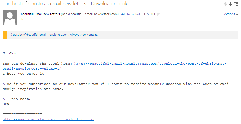
Nobody says email has to be pretty, but if what you’re trying to promote is “beautiful email newsletters,” then you’d better have something to show for it. This monospaced, bland message does nothing to enforce the idea that the author knows anything about aesthetics.
Ending on a Good Note
Not all email is bad news. Some email marketers are doing an excellent job of making email interesting an exciting. Here are a few examples of above average work from the past year.
Thanks for Subscribing
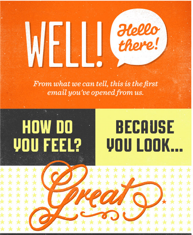
Everyone sends out some sort of alert to notify people that they have subscribed to a company’s email, but few make it as much fun as Upworthy. The great thing about this notice is that it makes you look forward to receiving the email instead of immediately regretting signing up for it.
Beyond Mosaics
Last Spring, we did an article here that covered the use of Mosaics. Mosaics are a way to use colored table cells to imitate an image. Most of the time, mosaics aren’t worth the effort because they can needlessly increase your email’s file size if you try to make them too detailed, and end up looking clunky if you make them too coarse. Pizza Express in England has found a better way to deal with it by using mosaics sparingly and making them just detailed enough to get the idea across. Here’s a beautiful example of their work from last Valentine’s Day:

Normally, the mailings from Pizza Express don’t get this complex, but they always use colored cells to make their email interesting whether you have images turned on or not. In the example above, for instance, the cells use a palette of blue, red, and black for their background colors.
Pizza Express pulls out all the stops for their birthday email design, which looks like this when the images are turned off:
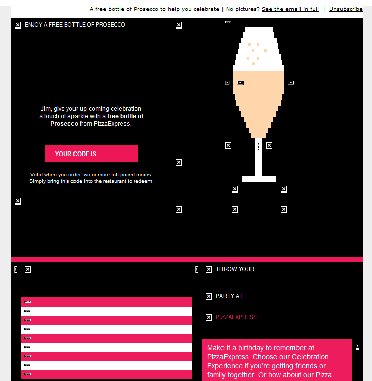
Not bad, but the design goes further by using an animated gif when the images are displayed:
 Nice work Pizza Express.
We hope you’ve enjoyed this look back 2013. Perhaps there is some schadenfreude in seeing the mistakes of others, but here are things to be learned: make your email visually interesting, but not at the expense of text, don’t neglect the subject line, in email, tables still rule, and—most important of all—test before you send.
HAPPY NEW YEAR!


 The Goolara Blog