
The hottest topic of discussion in the email marketing field right now is that of responsive design. Responsive design means that email changes its appearance if the viewing device falls within certain size ranges. For instance, suppose you have an email that features three columns of information in 12 pt type. It may look perfect on a desktop, but open the same email on a smart phone and suddenly that 12 pt type is reduced to three pt type and is virtually unreadable. Of course, the reader can always double-tap or pinch-out (zoom) to expand the text to a legible size, but asking your readers to do anything is always a dangerous proposition. It’s always best if the reader doesn’t have to do anything to receive your message and you make it as easy as possible for them to respond to the Calls to Action.
There’s no question that responsive design can help with this. It will automatically format your email according to the parameters you’ve set ahead of time and display the email in the optimal format. When used carefully, responsive design can help improve recipient response. So wouldn’t you always want to use it? Well, maybe not. As with most aspects of email marketing, there’s more to the story than meets the eye.
Talk is Cheap
A quick search of the keyphrase “responsive design email” turns up lots of posts that tell you the advantages of using responsive design in your email. Not one of these posts, however, gives us much useful information on how to do it. “Use @media queries” is the standard mantra, without a shred of information on how to do so. It’s probably not a coincidence that several of the emails I’ve received from the companies that are posting about the advantages of responsive are not using it in their own emails.
One recent blog post states that “adopting responsive design to your website and digital communications isn’t difficult.” It may not be difficult compared to building the space shuttle or performing brain surgery, but when it comes to creating email, responsive design adds considerable complexity to the process. For this reason, some ESPs now offer responsive templates. That’s fine as long as you don’t plan to exert much control over the appearance of your mailings. A few are beginning to offer tools for dealing with responsive design, but even here, much of your control over the design is lost to pre-coded sections of their choosing. If you want your email to have completely unique characteristics, you’ll still have to handle the coding yourself.
Media Queries
As I mentioned earlier, the secret behind responsive design is a feature of CSS called media queries. A media query looks something like this:
@media only screen and (max-width: 425px) {
#image2 {
display: none;
}
…
In the example above, the image designated as “image2” disappears when the width of the display is 425 pixels or less. Media queries let you control virtually every element on a page. You can change the fonts sizes, the positions of the images, whether or not an image will appear at all below a certain size, and much more. As one might imagine, this kind of power comes at a cost, and not without a few caveats.
Design and Design Again
Creating a responsive email means first designing a page, and then designing it again…and again. If you want to optimize your email display for several different platforms, you’ll have to adjust the design for each one accordingly. Sometimes, this means little more than adjusting the font size and moving some images around, but if you’re not careful, you can spend a lot of time trying to get the email to behave in all situations and the next thing you know, you have six different size settings in your styles. Responsive design can be very finicky about things such as position, sizing, and which units of measurement you choose to use. Like all code writing, it is also unforgiving when it comes to spellings and matching up brackets. Multiply this by how many different versions you decide to create and you can see where things can get complicated fast.
Once you’ve created your responsive design, you’ll need to test it across various devices. Here’s where things get tricky. Your design may look great when you view it as a stand-alone file in Chrome, but suddenly all its features fly out the window when you look at the same HTML with the same browser in Gmail. Congratulations! You’ve just discovered the main problem with using responsive design—the issue of head tag information.
What’s in Your Head
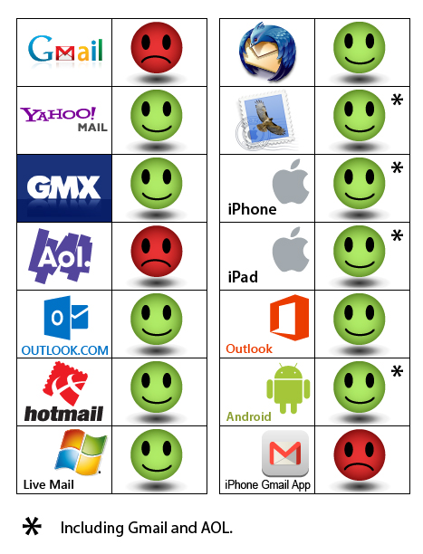
The biggest limitation to using media queries in email comes from the fact that media queries cannot be inserted inline. To take advantage of media queries, you need to include head tags in your HTML. All well and good, except that many email clients are going to ignore your head tags and replace them with their own information. Suddenly all those carefully constructed formats are gone, leaving your email looking more generic than ever. To complicate matters further, this will vary depending on the device you are using to view the email, and which app you are using to view it. A mailing sent to Gmail will show none of the style characteristics when viewed in a browser on a desktop. It will look fine when you view it using the Mail application on the iPhone, but it won’t if you view it on the same phone using the Gmail app. Here’s a chart showing which email clients accept head tag styles and which do not.
The Scalable Alternative
The alternative to responsive design is scalable design, which has been around for a while. This simply means that you design your email so that it is readable on any device, regardless of its size. If the positioning of images and text is critical, those old email standards, tables, are still the safest way to go. Tables don’t scale down very well, so you’ll want to keep the maximum width low—around 650 pixels or less—to ensure that the type is still readable on a phone. Tables also don’t allow the elements to interact with other elements that are not in the same cell, so you won’t get the type reflowing around an image when the window is resized. On the plus side, they are still the most compatible way to control image positioning, and they can be used with responsive design as well.
Div tags may appear to be an attractive alternative, but they are not. They have the advantage of being more flexible, so you can have type flow around an image when the window gets to small for the type and the image to appear side-by-side. And because they don’t scale down like tables, the type stays readable on small devices. But div tags won’t work everywhere, and when they don’t work, it can be a disaster. There is still no consensus on div support, so some email clients support some aspects of divs while others do not. Outlook.com and Hotmail, do not currently support the float attribute, so everything ends up stacked on top of each other. Other email clients, such as Live Mail, ignore the overflow command, which can cause elements to overlap and ruin the layout.
Responsive design may be advantageous in creating email that is optimized across different platforms, but you can’t rely on it in all circumstances. You’ll still need to make sure that your email looks good when the media queries won’t work. The type must remain readable on smaller screens. In some cases, using divs instead of tables can go a long way toward making your email more compatible with devices such as smart phones and tablets, but, as mentioned above, this can lead to even bigger problems, particularly with older client software.
The Automated Approach
You can create responsive designs the old-fashioned way, by entering the HTML code a line at a time, but there are tools that are intended to help simply the process. Dreamweaver lets you use the media queries with the fluid design layouts. This gives you three choices of screen sizes with which to operate. Unfortunately, Dreamweaver automatically includes a Javascript file, which is a taboo in email design. Another program that has been getting a lot of attention lately is Edge Reflow, Part of Adobe’s new Edge series and available through the Creative Cloud. But is Edge Reflow the answer to the problem, or just another layer of complexity? Tune in next week for Part Two: Working with Edge Reflow.

 The Goolara Blog
2014, trend is responsive designs. You will lose many inquiries if you don’t have multiple screen email templates.
That is one train of thought. I don’t know if I entirely agree. I’ve seen some designs that work just fine on various platform without being responsive. I do prefer responsive design myself, but I still make sure the design is readable on a small device when the @media queries are ignored. That’s the real key. I do think that email marketers looking to add responsive designs to their emails might do well investigate services such as yours unless they are really ready to roll up their sleeves and get down and dirty with responsive email design. As the fourth article in this series point out, it’s not exactly a doddle.