 Update: As of April 17, 2015, Google has discontinued the Grid View in Gmail.
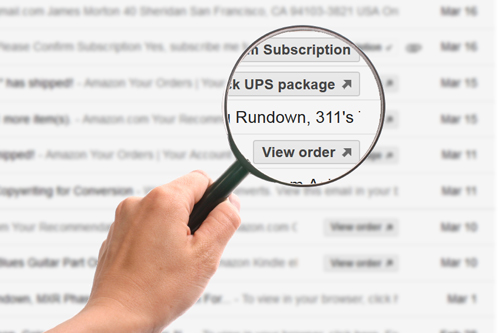
In our last article, we looked at the grid view Google is beta testing for the Promotional tab in Gmail. Like most other ESPs, we like what we see, and think it has the potential to improve the relationship between email recipients and the promotional mailings they receive. In this article we’ll look at ways to take advantage of this feature to improve your open rates.
As we pointed out in the last blog post, leaving the image that appears in your grid view up to Google makes no sense. You could make sure that your hero image matches Google’s preferred dimensions (580 × 400 pixels), and keep all other the images below the threshold of acceptability (233 × 161 pixels), and that would probably work, but let’s face it, even if you do this, you’ll still want to back that choice up with—at the minimum—the following lines of code:
<div itemscope itemtype="http://schema.org/Offer">
  <link itemprop="image"
       href="http://www.example.com/product_image.jpg"/>
</div>
In this way, you avoid unhappy surprises. Since the code points to an image’s URL, it only requires that the image exists somewhere on the web. Our tests show that it doesn’t have to be in the email at all. This gives us the perfect opportunity to ensure that the displayed image is optimized for Gmail’s grid view and helps us provide a good-looking image no matter what the contents of the email contains (see also, the longer form of code in the previous post).
Creating a Grid View image
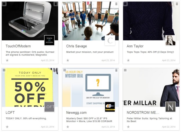
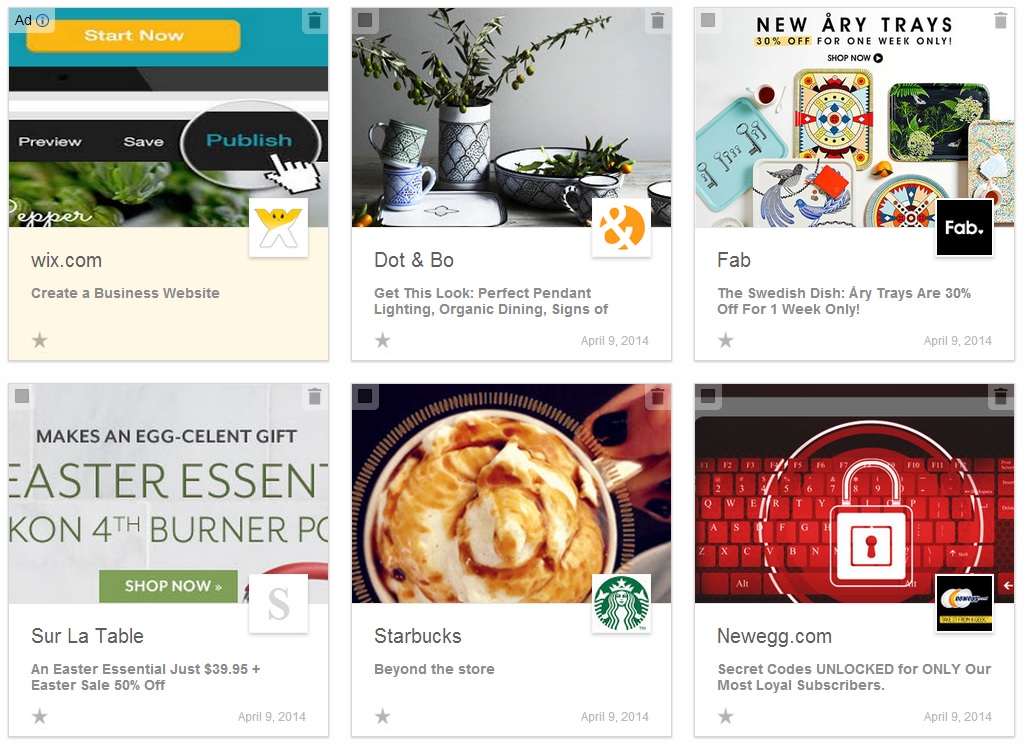
To demonstrate the how and why of this, let’s take an actual recent email from Sur la Table—a Seattle-based company that specializes in cooking equipment. Their emails are filled with enticing images, but they’ve developed two very bad habits. The first is that they place all their text in the images (see Using Text to Deliver Your Message), and the second is that they then slice these images instead of using image maps (see Keeping It Together—Image Slicing vs. Image Mapping). The grid view defaults to the first image that is large enough to fit the preview, which means in nearly all of Sur la Table’s emails, the displayed image is a cropped bit of the text portion of an image, creating particularly ugly grid view displays.
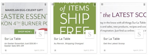
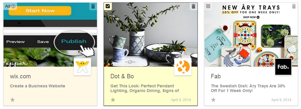
None of these emails from Sur la Table gives us any idea of the mouth-watering pictures that await us inside. The middle one, at least, seems to be offering something (free shipping), but the other two are almost meaningless. If we open the email on the right, we see that the mailing has an attractive image as the main component of its contents:
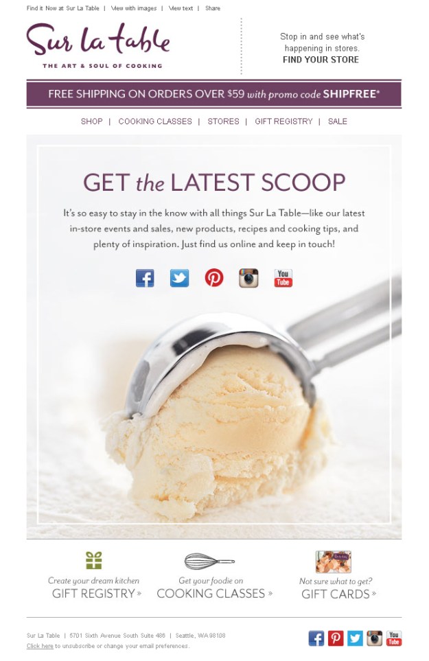
Obviously, if you were going to choose which portion of this email to use for a visual display, the ice cream scoop would win hands down. By itself, a scoop of ice cream has no hook, so we’ll add the bit about free shipping that appears at the top of the page using the same purple they use in their copy. We also noticed that Sur la Table has not yet registered their Google+ account. If an email in the grid view either does not have a Google+ account, or it has not been registered, the panel displays either the first letter of their email address or domain name. We’ve added Sur la Table’s Google+ profile image from their account to finish the corrected email for the grid display:

Now we have a panel that works. It’s by no means perfect, but it is substantially better than what we had when the process was left up to chance. I would also recommend that Sur la Table change their Google+ image to something that scales down better than the picture of their original store.
Grid View Images = Reader’s Digest
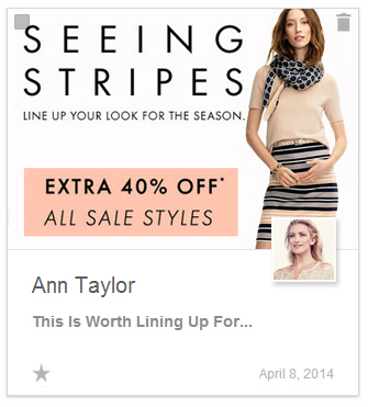
Sometimes your email may have two or three main messages scattered in different parts of the copy. By creating a grid view image, you can consolidate these pieces of information into a sort of executive summary. For instance, here is the grid view for an email from Ann Taylor:
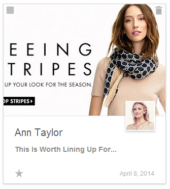
“EEING TRIPES” isn’t much of a message. Even if you do figure out what the message is really trying to say, it doesn’t seem to have anything to do with the image until you look at the email:
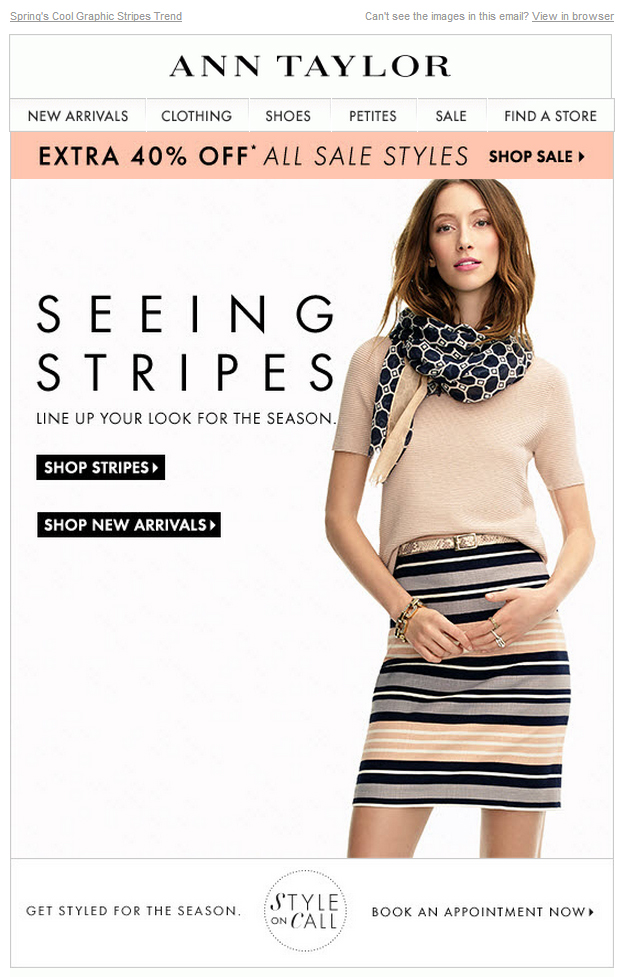
Now the headline makes more sense. Clearly the topic of discussion is the skirt, and not the top, so let’s make sure that the skirt is shown in the grid view image. While we’re at it, let’s also add the “Extra 40% Off” offer to the image since sale notices are good sources for clickthroughs. Here’s our revised grid view:
Imaging Text
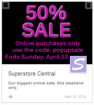
You’ll notice that we are straying from our usual recommendation to keep text and images separate. In a previous blog post, we discussed the advantages of keeping text and images as separate as possible. It improves your deliverability and it ensures that even when the images are turned off, your message gets across. While that’s still true for the content of your mailing, combining text and images as separate elements is not an option with the grid view. It has to be an image. If there is a textual message that you want to get across, you will need to convert it to an image. Here’s an extreme example:

This may not look like anything special, but here’s how it appeared in the Promotion grid view:
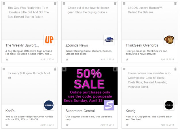
Google’s choice of gray type on a light gray background makes all the other panels fade into the background. You may think this is an exaggeration, but it is not. The Superstore Central was an imaginary test file that I sent using Justin Khoo’s testing page.* Aside from the addition of the Google+ logo after the fact (since it was an imaginary company, it wasn’t an option), this is exactly how everything appeared on the page. No Photoshop tricks were used to move the panels around or replace them.
Amazingly, all of these emails had images that were large enough to serve as a display image, but were ignored either because they left off the height information, or they sliced up the image, or they started the page with a long and narrow image. Clearly this is a worst case scenario (or best case, if you are Superstore Central), but it demonstrates that right now, if you start adding the link tag for the promotional display to your email, you’ll have an edge over everyone else.
You’ll notice that the final line of text is not centered, but is shifted to the left to keep the Google+ icon from blocking the date. When you’re choosing or designing an image for the grid display, you should always keep this in mind. Even if you don’t have a Google+ account, the grid view is going to place that square over the image. In the previous section, had we made the image of the woman any bigger, the Google+ icon would have covered the striped skirt.
Even if your email has no images, as long as it has an HTML component (not a text-only email), you will want to create a preview image for the grid display. Otherwise, you could end up with something like this:

Size Matters
To create an image for the grid view, you first need to make sure its dimensions fall between 580 and 233 pixels in width and 400 and 161 pixels in height. You may be wondering why Google is requesting such a large image when, on most devices, the actual size of the displayed image is closer to the minimum than the recommended 580 × 400. Google hasn’t released any information on this, but we assume it is either to prepare for some future features (a pop-out display, for instance) or to make sure its compatible with any future device resolutions. If your image is the correct height or width, but is either very tall or very long, it might still cause problems, so you will want to size the image accordingly before you proceed. If the image is below the recommended size, but is larger than the minimum specifications, you should be alright.
To check the dimensions on your grid image, we’ve created a template that is sized according to the width recommended by Google (580 pixels) and the grid proportional height, which is slightly smaller than Google’s recommendation (398 pixels). [Note: The image may appear smaller than its actual size. To download, right-click and select “Save Image As…” from the drop down menu.]:

You can use this template by copying it and pasting it over the image you want to work with, then either choose the “Multiply” blending mode from the Layer menu (in Photoshop), or reduce the opacity (in other image editing software) to see how the image aligns to the actual image area. If your image is smaller than the white inner rectangle, it means it’s too small to use as the grid display image. If it is longer or taller in one direction, you will need to crop it accordingly. For example, here is an image that is the right height, but too wide:

If we left it up to Google, this image would either crop halfway through the model’s face, or it would not display at all due to its width. By moving around our template, we’ve found the optimal position for the image, which shows the model’s face, yet doesn’t crop off part of the text. You’ll then want to crop the image based on this position (remembering to delete the template layer, of course), which yields the following results:

In our second example, we have a considerably smaller image:

In this case, the image is already smaller than the recommended size, but it is larger than the minimum, so it is usable. The problem we have here comes from the checkbox in the upper left corner, which looks as if it will interfere with the text. When we size the template down to the image’s actual size, we see that this is still a problem:

Repositioning won’t help in this case. If it’s an option, we could move the text down to clear the checkbox. If that’s not an option, we’ll need to find a different image to serve for the grid display. Also keep in mind that the size of the type can be a factor as well. Smaller type that’s readable when you view the image at 580 pixels might lose its legibility when its scaled down to fit the grid view on your browser. As always, a test send is recommended (if your test email doesn’t land in the promotions tab, you can easily rectify this by clicking and dragging it to that tab).
More to Come…
We’ve only scratched the surface here when it comes to the possibilities that the view grid presents. Some experimentation is in order. They haven’t officially rolled out the Grid view to the general public, but you can stay ahead of the curve by signing up to take part in the field trials here. You will, of course, need the Promotions tab and image display enabled to use this feature.
One thing we’ve learned from Google is that they are not about to stop tweaking the Gmail interface, so we do recommend some caution and vigilance when using these techniques. It is entirely possible that Google will change everything again in a month or two.
*Justin Khoo’s help with this and the previous blog post was invaluable. Justin is always on the cutting edge of email design. You can find more great ideas on his Fresh Inbox blog.


