Category Archives: Email marketing

Keeping It Together—Image Slicing vs. Image Mapping

Note: With the increasing use of a smartphones to read email, some aspects of image mapping that may affect their usability on older phones. Always test!

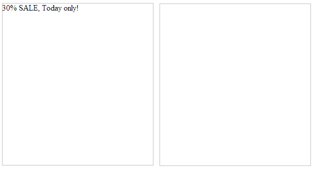
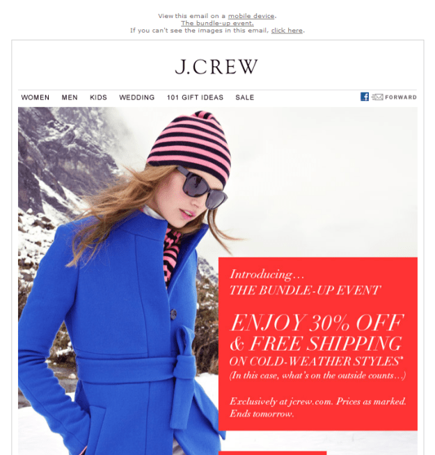
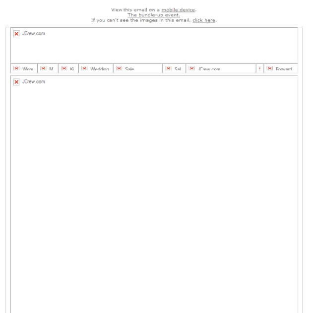
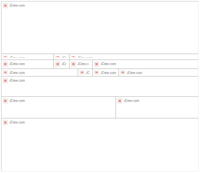
It is not at all uncommon to see the hero images in mailings sliced into several pieces. Email marketers have been using this technique for many years. If you normally first view your email with the images turned off, it is not uncommon to encounter an email with a table like this:

Blocked image view

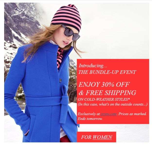
Only to have the following appear when you click “Display Images.”

Email image version

There are some good reasons to slice an image into sections. The best ones are:

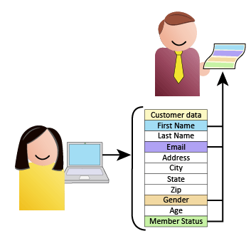
  • To provide text or barcodes within the image (see Using Text to Deliver your Message)
  • To provide animation without increasing the size requirements for the entire image
  • To reduce the image size for areas with only a few colors
  • To create informative alt tags for an infographic

But in most situations, slicing up an image leads to nothing good. It increases the HTML size and, since browsers only make a few requests at a time, it can slow down the rendering time for the image. When a single large image is requested, the data is sent continuously as fast as the server can send it, and with as much bandwidth as you or the server can provide. When there are multiple images, the browser can simultaneously request several of them at once—between 2 and 8 simultaneous requests are allowed from the browser at once, depending on the browser. But this is for all resources on the page, not just the images, so if you’ve split an image into 4 or more pieces, the browser must receive the first bit of data, then turn around and make another request for more data.  Each request has a round-trip time that mathematically must be longer than the time for a single request.

This process also creates more opportunities for problems to slip into the process. The finished image must be assembled in a table, and if any cell in the table has a problem, it can throw the entire image out of whack. We’ve all received emails with misaligned sections and unwanted gaps in an image where someone forgot to add style=”display: block;” to one of the img tags.

Forget What You’ve Been Told

Some people and even some email blogs recommend slicing up an image to help avoid loading problems in various email programs, but if the image really is big enough to create problems of this sort, it is already bigger than it should be. You would be better advised to reduced the size of the image using an image compression tool such as RIOT, which does a good job of dramatically reducing file sizes without much image deterioration.

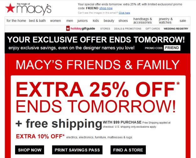
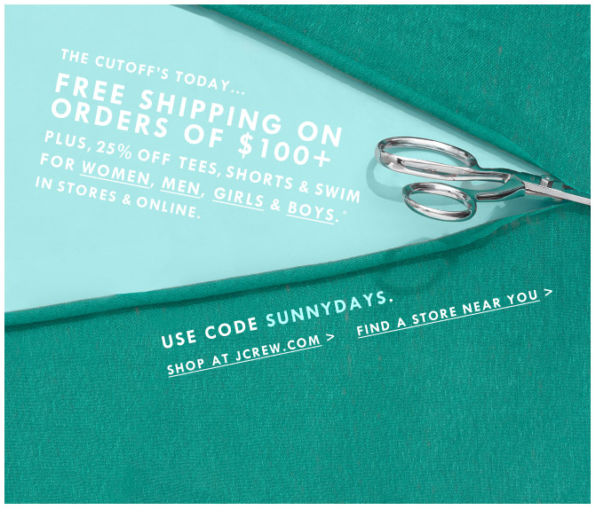
The most common reason for sectioning an image is to assign different links to different portions of the image. But this is also the worst reason to section an image. Here’s an example of a hero image from a recent Banana Republic mailing:

Hero image

And this is how they sliced up the image:

Hero image sections

The reason? So that anytime someone clicked on any part of the man it would take them to the Men’s Department, while clicking on the woman takes them to the Women’s Department. They also wanted the text in the upper left to go to various departments and the background to go to the home page. Here is how the image is linked:

Image map areas

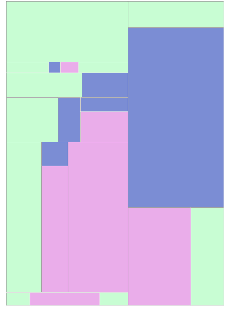
Green = Home Page, Pink = Women’s Department, Blue = Men’s Department

So how can you achieve the same thing without slicing your image into dozens of pieces? Try image mapping.

Email Image Mapping Comes of Age

You’ve may have read from past blogs and other sources that image mapping is problematic in email and you shouldn’t use it. “Don’t use image maps,” one website states bluntly. “They are not fully supported across all email clients.” While there may have been some merit to this argument a few years ago (that particular post goes back to 2007), today, image maps work virtually everywhere. Unless you happen to have an unusually large number of customers using Outlook 7, your recipients should have no trouble viewing or clicking image-mapped graphics.

Also, image maps can also cut down on the size of your email. The sliced image shown above required 112 lines of HTML and came in at 13Kb, compared to the image-mapped version, which required only 12 lines of HTML and took 2Kb. Here is the image map as it was applied to this picture using Dreamweaver:

Image Map shown

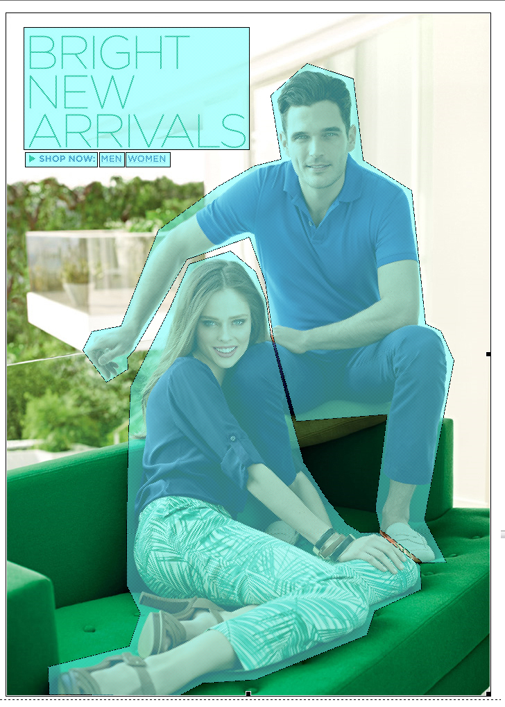
In this example, the image itself links to the home page, as do the “Bright New Arrivals” text at the top and “shop now.” The man and woman link to their appropriate pages.

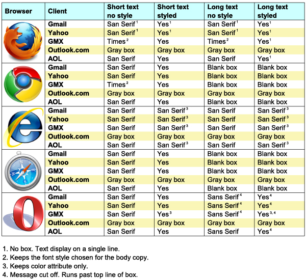
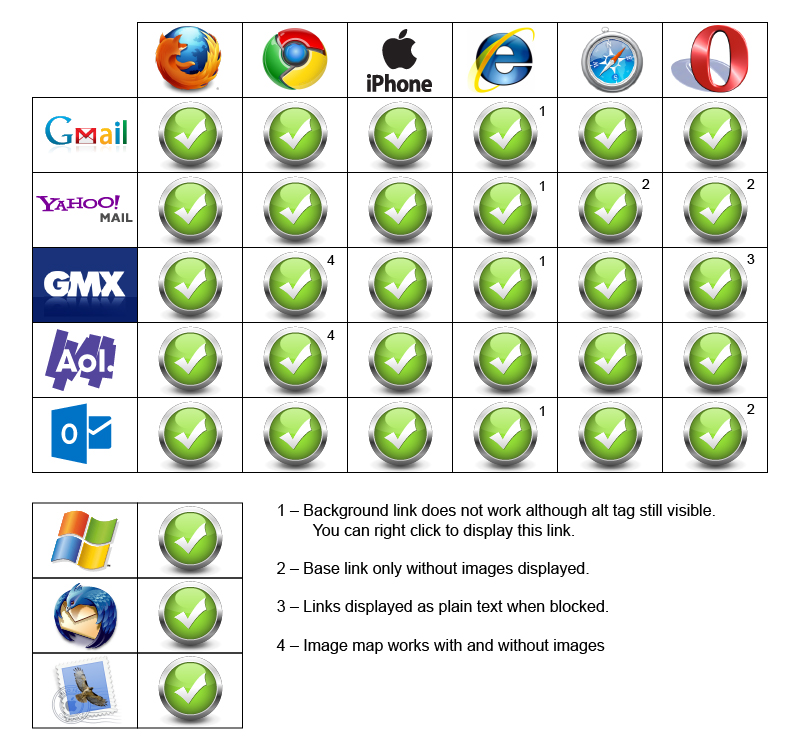
There are a few idiosyncrasies in the different browsers, but nothing to warrant a blanket rejection of the technique. In Internet Explorer, the link in the image is disabled after the image is loaded. Only the image map links are clickable. The background image, however, will still respond to right clicks and show its alt tag information when the mouse hovers over it. In some cases, the empty image box of a blocked image is still clickable, but the image maps may not be. In our trials, once the image is loaded the image map is active and clickable in all cases. In Gmail, when viewed with Firefox, image-blocked email displays only the alt text of the image with the appropriate link—no box and no image-mapped links—but the image maps become active as soon as the image is loaded. Our test, done in April of 2013, yielded the following results:

Image map comparison chart

Keeping the caveats listed above in mind, we recommend the following as best practices when working with image maps:

Always assign a link to the base image

Yes, these sometimes disappear after the image is loaded, but they do help provide links in email clients where the image is blocked.

Don’t get carried away

The more complicated your image maps are, the more HTML is needed to render them. It is possible (although highly unlikely) to create an image map that is so complex that you’ll end up with an email file as large as the ones created by sliced images. The image maps shown above are not exactly simple polygons, and yet they still resulted in substantially smaller HTML files than the ones using sliced images.

Provide default link-mapped areas

In the case shown above, two of the image-mapped sections go to the same place as the image’s root link. In this way, if the browser does not respond to the image’s link after the image map is loaded, that page is still accessible. If we wanted to be really thorough, we could have blanketed the image with mapped links, but this is often overkill.

In 2014, it came to our attention that image maps were exhibiting some strange behaviors on smart phones. On iPhones, the image and the image map had to be restrained in a table to function properly, and on Android phones the image map was reducing to half its size, rendering it useless. Our recent tests have shown that these problems have been fixed. People using older phones might experience problems, however, so its a good idea to keep track of your subscriber base to make sure they are seeing your emails the way you intended. For more information on both image slicing and image mapping, download a free copy of our Email Image Linking Guide, which includes detailed instructions for creating images slices in Photoshop and image maps in Dreamweaver. Available here.

So go ahead and use those image maps. Are you using them already? Have you done any deliverability tests with image maps versus sliced images? We’d love to hear your findings. Is there a reason we haven’t addressed here why you do or do not use image maps? Drop us a line and let us know.

Go to Goolara website

List Segmentation Landmines

But I've already unsubscribed!

Everything in email marketing starts with your list of recipients. How your particular ESP handles lists varies from provider to provider. Here’s a quick rundown of things to watch out for when you are working with list segments. A good understanding of the various models used to create lists will go a long way toward helping you avoid problems.

But I unsubscribed already!

A question frequently asked by email recipients is, “Why does a company keep sending me email after I’ve unsubscribed from their list?” It’s a good question, and the less tolerant respondents in the audience are apt to answer, “They are violating CAN-SPAM! Report and/or mark their email as spam!” While it is easy to understand the anger anyone feels upon getting more email months after unsubscribing, this time the marketer is not entirely to blame. They may be using an email marketing solution that creates separate lists for each segment. If you are faced with this problem, here’s a brief primer on how this happens and how to avoid it.

Here a list, there a list…

Let’s say you start with List A. This list has everyone who has opted in to receive your mailings on it. When a person unsubscribes from this list, they are immediately removed from all subsequent lists.

Start with a list...

So far, no problem. Now you create a second list (List B) as a segment of List A, and two more people unsubscribe from it. Everything seems to be in order, but because you are no longer working from your List A, the unsubscribes are only reflected in List B. We have two more unsubscribes, and as long as you are working from List B, everything is fine.

Create a new segment...

But if you go back to List A to create a new segment (List C), the two people who unsubscribed after the mailings from List B (outlined in red) are unpleasantly surprised to find they are back on your list. This time, they mark your email as Spam and all future email from you goes directly to the Junk Folder. In the meantime, another person has unsubscribed. Now you have three lists all with different unsubscribe information.

Create a third segment...

Pulling information in from other lists can further compound these problems. “I’ve got a great list in Excel on my computer,” someone might say. “Let’s use that too.” Unfortunately, this list has people who have previously unsubscribed from the other lists. Unless someone is riding herd over all of this, things can get pretty messy. Every time you create a new list and the changing from the various other lists are reflected in it, you run the risk of more and more people marking you email as spam. At a certain point, the ISPs start to notice this and move your email directly to the Junk folder for everyone.

Combining lists

Some ESPs solve this by treating every unsubscribe as a global action. In this way, the segments won’t matter. The problem with this approach is that sometimes you really do want to give people the opportunity to unsubscribe from a specific subset or topic. For instance, if you send out an email about an upcoming trade show, you may only want to target the people who have expressed a specific interest in trade shows. Any unsubscribes from a list like this shouldn’t be treated as global unsubscribes. They may still be interested in your products, just not in attending trade shows.

By the same token, the person doing the unsubscribing may, in fact, want to stop receiving email from you and their unsubscribe really is intended as a global action. Ideally your email marketing system should be able to offer a topic-level unsubscribe, a global-level unsubscribe, or both, all within the email, so recipients can make the choice that is best for them.

Unsubscribe Strategies

How your ESP handles segments, then, must be the determining factor on who you need to approach this issue. Ideally all segments pull their information directly from the master list, in which case, topically and globally unsubscribed recipients should automatically be removed from future distributions. However, if your ESP uses separate and distinct lists of recipients for segments, you’ll need to stay on top of those segment unsubscribes. Check with your ESP to see if they’ve provided tools for consolidating these lists, otherwise, you’ll need to handle it manually. Set up a schedule for checking and consolidating your lists. This isn’t even a best practice—CAN-SPAM requires you to honor your unsubscribes. If you don’t, technically, you are breaking the law.

Our solution

In case you’re wondering, yes, Goolara Symphonie does solve this problem. Our email marketing solution does not require you to generate separate lists. All recipient information is stored in a master database and the information is accessed as needed according to segment or “topic.” You can create as many different topics as you need, and these will all support both global and topical unsubscribes. You can create unlimited segments that target any recipient in the system based on any available criteria. Recipients who unsubscribe are automatically removed from any posting sent to that unsubscribe topic. To learn more about this process, or to see Goolara Symphonie in action, click here, or contact us at 1-888-362-4575

Go to Goolara website

The Finer Points of Styled Alt Tags

Whenever you send a mailing that contains images, there is a good possibility your email will end up being read by someone who has the images turned off. Most email clients default to images off, and many people leave it this way. That’s why it is always a good idea to include an alt tag that tells people what they’re missing. A good alt tag will inspire people to turn on the images. Images without alt tags are wasted opportunities.

A lot of people don’t realize that it is also possible to add style attributes to alt tags just like any other text. Styled alt tags don’t work in every email viewer, but when they do, they increase the visual dynamics of a mailing considerably. Like the alt information itself, the style attributes are included within the tag. As an example, consider the following bit of HTML:

30% SALE, Today only!

[IMPORTANT: For reasons known only to the people at WordPress, straight quotes are automatically converted to curly quotes. If you want to experiment with the HTML code listed in blue on this page, you will need to convert all the quotes in the code block back to straight quotes.]

Here is the same image sent two different ways. The example on the left is an ordinary alt tag, while the image on the right uses the code shown above.

Styled alt tag in Firefox

Not bad, but before you get too excited, there are some important things to consider before you use styled alt tags. Not all email clients and browsers handle styled alt tags the same way. The previous example was sent to a gmx.com email address and viewed in Firefox. Now here are the same two image boxes as they appear in Gmail with Firefox:

Styled alt tags in Gmail

In Firefox, Gmail and Yahoo don’t bother with the box dimensions, displaying the alt tags as lines of text instead. While not as useful as a box, which lets us know that we are missing an image, at least the text appears and is styled. But here’s what happens when we view the same email in Chrome:

Styled alt tags in Chrome

The styled information is missing because it is too long to fit on one line. In Chrome and Safari, if an alt tag is too long to fit on one line, it does not appear at all. This also is true for alt tags without style information, but, as you can see, the alt information fits without a problem as long as it isn’t styled. By increasing the font size, we’ve caused the text to wrap and disappear. The same thing happens on iPhones and Android phones.

By far, the least friendly applications when it comes to styled alt tags are the email viewing options offered by Microsoft. In Hotmail and Outlook.com, for instance, an email with the images turned off displays gray boxes with neither cell colors nor alt tags, styled or otherwise. In Outlook and Outlook Express, all styling is eliminated and every alt tag is prefaced with a statement about the protection of privacy. In Internet Explorer, styled alt tags viewed on non-Microsoft client sites keep the color information, but all other font characteristics are lost.

Opera will display styled alt tags, but, like Safari and Chrome, lines that are longer than the box width do not display properly. Unlike those browsers, however, Opera displays whatever text will fit the width of the box and the rest disappears off the right side of the image box.

To help you decide whether or not you want to use styled alt tags, we’ve constructed the following chart, that shows how the various clients, applications and browsers handle images and alt tags.

Styled Alt Tags chart

Based on the data in the chart, the most useful feature of styled alt tags is the ability to assign a color value to an alt tag, especially if most of your recipients are using Internet Explorer. It is the one style attribute that gets delivered across the most browser platforms. If you have alt information for a cell with a dark background color, adding style=”color: rgb(255, 255, 255);” to the IMG tag will help make the alt information visible. Here are two examples. In the box on the left, the alt tag has no style information. You can see that even though the cell color is slightly lighter than the one used for the styled alt tag, the alt information is difficult to read. The example on the right has the color attribute shown above added and is much easier to read.

Alt tag colors

The appearance of the text changes from browser to browser, so the alt tags should be checked by sending your test emails to one or two people who have access to the various browsers of various email clients. This is the surest way to check that your tags are viewable across various email clients and browsers. If you want to make the text appear larger, or in some other typeface, you’ll need to keep in mind that not everyone will be able to see your handiwork.

Using styled alt tags is a great way to add pizzazz to your email. As long as you are careful about the length and you test the email’s appearance across various browsers, there is really no downside to using them. The set-up is minimal, and you can always copy and paste the HTML information from previous emails once you’ve decided on styling attributes you want to use on a regular basis. If a substantial number of recipients are using Chrome and/or Safari, you’ll need to make sure that your alt tags are kept short and that any styling does cause the text to wrap. Also keep in mind that, as attractive as they are, they are not a substitute for actual text in the email (see Using Text to Deliver Your Message).

Want to learn more about how to use text and images in your email for maximum deliverability and effectiveness? Then check out our new white paper, Using Text and Images. Available in the Resources section of the Goolara website. Click here for a direct link.

Go to Goolara website

Using Text to Deliver Your Message

Email design isn't web design.Email design has its own rules and requirements. In this article we look at ways to improve the effectiveness of your email messaging with the smart use of text.

An important aspect of email is, of course, design. Graphic artists spend a lot of time adjusting images and page layouts to make their work look as perfect as possible. To the lay person, who is not accustomed to the ways of a designer, their endless fussing over which of three nearly identical colors they should use might seem like overkill, but graphic artists understand that good design is important to sales. A company’s website, brochures, business cards and everything else need to reflect their brand and they need to look good.

When the Internet came along, it threw a bit of a curve ball to many graphic artists. They had to learn new skills to get around the limitations of HTML. These are the same skills they need to make good looking email, but the number one mistake made by many graphic artists is to treat email design the same as web design. Email brings with it a host of unique design issues that are completely different from web design. The biggest difference comes in the way email handles images and text, and this is where many designers fall down.

A common technique for controlling the appearance of text on a website is to place the text in a graphic. In this way, the choice of fonts, placement, and other characteristics can be maintained even if the viewer does not have those fonts installed. But using this technique on email is not a good idea, for two reasons.

No Image = No Text

The default setting for most email clients is to block images. Among smart phones, only the iPhone displays images as a default. Of course, some people turn on the images, but most people tend to leave things with the default settings; it’s human nature.

Good Alt Tags will go a long ways toward helping people understand what they are missing, but even here, not all email browsers display the alt tags, and Microsoft Outlook 2007 goes one step further, adding its own security messages to the empty image boxes. Put another way, if you are using graphics-based messages, over half of your recipients are receiving it in the blandest form possible, and some aren’t seeing it at all.

If you really want to make sure that your message is reaching your public, you’ll need to offer some text to the recipients beyond what might or might not appear in your alt tags.

Text-to-Image Ratio

ISPs cannot read the text in images. Spammers know this and sometimes use images to get around filters that might shuttle their content automatically to the bulk folder. As a consequence, many ISPs now look at the text-to-image ratio to identify possible spam. When a marketer puts all the focus on images, the deliverability metrics suffer (as do open and clickthrough rates). Remember that the ISPs are ultimately the ones in control in this process, and a beautifully crafted image with the best marketing message in the world means nothing if the user never sees it.

A Tale of Two Emails

For purposes of this article, I am going restrict my conversation to two emails I recently received. One is from Macy’s and the other is from J. Crew. One is done with a good understanding of email and how it works; the other is designed using the traditional text as image approach and is less effective. I’ve used a few different email browsers here to show how different browsers treat missing images. First, here’s the Macy’s ad with images (only the top is shown here—there are more images below):

Macy's ad with images

Now, here’s the same ad with the images turned off (in Gmail):

Macy's ad with no images

As you can see, almost no information is lost. The ad still gets the point across and aside from the Macy’s logo and some other small formatted items, all the information you need is visible and visually interesting.

Now let’s look at J. Crew. Here is the ad with the images displayed:

J. Crew ad with images

It looks fine, but here’s how it looked when it arrived in my inbox (in Live Mail):

J. Crew ad with no images

Not so interesting anymore. What does this tell me besides the fact that it came from J. Crew? Even a few reasonably commented alt tags would have helped here, but all we get is “JCrew.com.” What makes this email so frustrating is that the problem could have easily been avoided with some care and forethought. Let’s look at the hero image. Here’s the original:

Example from J crew

The first thing you’ll notice is that the text is separate from the image. This makes it a perfect choice for using actual text instead of a graphic. By dividing the image into sections and placing these sections in a table, we can achieve the following:

alternate version of j crew hero image

Aside from a font change, this version delivers the same message, but more importantly, here is this version of the message when the images are blocked (in YahooMail):

J crew alternate without image

Now the message of the email is still rendered and readable to all recipients, regardless of their email browser settings. Graphic designers probably won’t find this solution particularly satisfying, but the visual dynamics created here by the text make it far more likely that recipients will respond to the email.

Everyone wants the best looking email possible. Of course, you want your images to display, and, of course, good design is paramount to better email response rates, but if it’s a choice between looking good and selling your products and services, then the choice becomes obvious. Images are great for making email visually appealing, but remember that text in email, like text on your website, is always more effective when it is left as text and not converted into an image. Plan accordingly.

Go to Goolara website

Here Comes Santa Claus

Santa and List

I noticed this morning that Starbucks is already using their holiday cups (this was written in 2012, well before the current cup controversy). Everywhere, retailers are ramping up their Black Friday and Cyber Monday sales pitches in preparation for this holiday season. While some people are grousing about stores jumping the gun on Christmas music, others can hardly wait. There’s a certain optimism in the air this year. People are ready to shop again. Last year, Cyber Monday surpassed Black Friday in sales, so expect more email competition than ever this year.

This is, for many retailers, the most important time of the year for their email to get through to their clients. For some retailers, the holiday season represents up to 40% of their annual sales. On average, it represents close to 20% of annual sales. Email sending increases during the final weeks in October and really gets going in the weeks before popular sales events, such as Black Friday and Cyber Monday. Retailers increase their send volumes by 47% on average. As a consequence, email services such as Gmail and Hotmail also ramp up their efforts to eliminate spam by tightening up their restrictions and by requiring higher reputation scores for received mail.

So what does that mean to you? For most people, probably nothing. If your clients have been engaged in the past and you’ve never had any trouble getting your email into the inboxes, then the holiday anti-spam measures of the folks at Google, Microsoft, and Yahoo won’t matter much. But if your reputation score is already close to the edge of acceptability, you might suddenly find your email winding up in junk folders more often than it had a month ago. This also means it is very bad time of year to be experimenting with list purchases and appends. Now would be a good time to pull up your reports and look at your metrics. Do you have any problem areas? In the example below, everything sent to comcast.net is ending up in the spam folder. Since the other domains are showing good results, the next question becomes, how many of my recipients are using this service? If for instance, you are sending out 750,000 email and three are getting block by Comcast, then this isn’t much of an issue. If, on the other hand, Comcast received 500,000 of that mailing, then you better take actions to correct this ASAP.

Problem with Comcast

The sad truth is that if you haven’t been paying close attention to these metrics all along, by the time November rolls around you are probably much too late to do much to help turn things in time to help your Christmas sales campaign. Nonetheless, there are still things you can do to improve your email marketing efforts during this holiday season. Here are the main ones.

Making a list and checking it twice

This is an area where many businesses fall down every year. If a recipient opts to stop receiving email from you, sending that person your holiday specials will not be looked on kindly. In some cases, this isn’t the fault of the business, but of their ESP. Many email marketing systems require you to create separate lists for each segment you create. You create a segment of men over forty and that’s a list; you create another segment of women under thirty and there’s another list. If you are using email marketing software that requires you to create separate lists for segmentation and topic categories, your chances of resending to people who have opted out of your list are increased geometrically. You’ll need to go through those lists carefully and make sure you haven’t made this mistake. If you are using Symphonie, this isn’t an issue as unsubscribes are always respected, even across segments.

Too much of good thing

While it is unquestionably important to strike while the iron is hot, don’t overdo it. Even at a time year when people expect more sales-related emails, they don’t want to feel overwhelmed. People expect more email at this time of year, but how much you send needs to stay in proportion to your normal engagement. If you been sending notices a couple of times a week, then daily emails might be acceptable, but if you’ve only ever send a recipient one email every two months, the sudden appearance of daily emails might cause the recipient to react negatively. It is far better to send a few emails with compelling sales pitches than tons of mediocre ones. By keeping close track of your metrics, you can correct these potential problems before they occur. If your opens and clickthroughs are showing dips when they are sent too close together, pull back on the sending a bit and see if that helps.

Subject lines are more important than ever

Since everyone is getting more email now than at any other time during the year, more email is being deleted before it is ever opened. People decide in an instant whether they want to read your email or not, and that decision is based almost exclusively on the subject line. If you fail here, it won’t matter how good your content is. Like the first sentence in a story, the subject line should intrigue the recipient enough to keep reading. If you aren’t doing so already, this is good time to use A/B splits to test various subject lines for their response rates.

Make it mobile friendly

These chilly winter evenings, people won’t be home in front of their computers, they will be out shopping and visiting friends. Many of these people will forgo reading their email on their desktops in favor of reading it on their smart phones. Products like the Apple iPhone, the Samsung Galaxy phones are changing the way people connect. Everyday, more and more email is read on smart phones instead of desktop computers. If you are designing your email to be read on nothing less than 17” monitor, you are in danger of losing sales from people who find your email too small to read on their Droids. One popular solution is responsive design, which adjusts the email’s format to match the size of the screen, but many ISPs still do not support this. Even if you do plan to use responsive design, make sure that your email is legible on a phone without it. [Note: For more on this topic, see our four-part series on responsive design.]

Last minute is often too late

You may have an idea of the exact time that you want people to receive your mailings, but keep in mind that most ISPs will begin to greylist more email as the volume of email increases over the holiday mad rush. They do this to manage their loads and slow down those senders without stellar reputation scores. But if the delay is long enough, it can mean that your email won’t land in the inbox until it’s too late. Your ESP should offer a feature to stop delivery attempts if the email isn’t delivered by a specific time.  There have been cases of one-day-only sales appearing in mailboxes the day after the event. Give your recipients a few days head start.

Get personal

People are far more likely to read your email if they feel like you are talking to them personally. Don’t neglect to use your merge and dynamic content features to make each email seem like it was hand written expressly for that recipient. For more on this topic, see Personalizing Your Email Marketing.

In summary, here our checklist of things to keep in mind as you send out your holiday emails:

  • Is your reputation score satisfactory? If not, contact any ISPs that presents problems to resolve this issue.
  • If you have multiple lists, make sure all the global unsubscribes have been removed from those lists.
  • Sending more email is okay, but don’t overdo it.
  • The subject line is more important than ever.
  • A/B test whenever possible.
  • Always allow enough time between a mailing and a specific date to allow for possible ISP greylisting.
  • Personalize the email with dynamic content when applicable.

Do these things and your email should arrive on time in the inbox and ready for the season.

Happy Holidays!

Go to Goolara website

Should You Use Mosaics in Email?

Using tables to create images where none are allowed.

A hot new topic in digital marketing is the use of mosaics to create images in email browsers where displaying images is turned off. Most email browsers, such as Gmail and Outlook, default to leaving images turned off. That means when you receive an email, any images in the email show up as empty boxes with some alternative text in place of the images (a good reason to always make sure your alt tags are always descriptive). A clever solution comes to us from Style Campaign in the form of their BMP to HTML Converter, which they offer as a free download on their website.

Major ISPs are already blocking mosaics, but not in the standard way they block emails. We’ll explain in a minute, but first, here’s a brief explanation of how mosaic software works: A digital image is made up of pixels. Mosaic software takes those pixels and converts them into empty HTML table cells. Each cell is given a background color that matches the color of the corresponding pixel. The end result is nearly indistinguishable from the original image. Here’s a screenshot showing our logo in both versions (the mosaic is on the left):

Mosaic and gif file

As you can see, the results are impressive. Suddenly you don’t have to worry about whether or not your images will show up. You can add visual information to any email, and visual information has a better chance of translating into sales.

But before you get too excited…

…there are some caveats, and they are big ones. First and foremost is the fact that most email and web design programs have trouble showing these objects accurately. Here’s what the table version of the Goolara logo looks like in Dreamweaver:

There nothing wrong with the mosaic, it’s just too much information stuffed into too small a space for a visual HTML editor to handle. Even here on this blog, I had to use a screenshot instead of the mosaic because the HTML editor for WordPress simply couldn’t handle the table. Visual HTML editors, such as Dreamweaver, want to show you the boundaries of each table cell and there’s simply not enough room to do so. The end result is a file that, while it may send okay, requires much more caution and testing before approval.

Also keep in mind that stuffing your email with tables this complex makes for a very large email file. So large, in fact, that some services, such as Gmail, may lop off part the file if you’re not careful, leaving you in a worse situation than if you’d actually used image files. In the case of our logo, the PNG file comes in at 10Kb compared to the HTML table version, which is 93Kb, and that’s before you’ve added a single line of text. The Goolara logo is a relatively small file—168 pixels by 75 pixels—but even here, we found that the email we sent was clipped after the mosaic in Gmail and Yahoo. Both of these programs required me to click a link in the display before they would download the rest of the message, which is much more confusing than the standard message about images being blocked. In the case of Gmail, the mosaic was slightly clipped as well, causing some artifacts at the bottom of the image.

Gmail effect on mosaic

File size is the real problem with mosaics.  The reason ISPs block images is because images require the browser to fetch files from the sender’s server, alerting them that the person has opened the email. To protect the privacy of their clients the ISPs allow each person to decide whether or not they want to see the images in an email. Privacy is not the issue with mosaics; it’s bandwidth. Say you send out 500,000 messages every week and each email, without the images, runs approximately 5Kb. That’s pretty big for an email already, but at that rate your sending out 2.5 Gigabytes of data. Now add our little 93 Kb image to that file and the number jumps to 49 Gigabytes! Suddenly you’re taking up almost twenty times the bandwidth to add a tiny image to the email. One way around this is to reduce the resolution of mosaic drastically, but then you end up with an email that looks like an Atari video game from 1982.  Beyond the bandwidth, the ISPs now need to store a message that is 20 times bigger than the previous average.  If many companies started to use this technology you could see that the cost to ISPs for storage and bandwidth could become quite significant.

These are all pretty big caveats. Right now, you should approach this technology with caution and use it only on images that are either very small, or are intentionally low resolution. Even so, you should keep track of your file sizes and remember that the bigger the file you are sending, the greater the opportunity for things to go wrong.

Go to Goolara website

I Want You, Not Facebook!

This is the second in series of articles about the use and abuse of social media in digital marketing. Today we will look at the practice of Facebook bait-and-switch, and why you should avoid it.

Facebook complaints

A trend we’ve seen recently is to use email to push for social site interactions. An email goes out offering customers a discount coupon, but when the recipients click on the link, they are taken to a Facebook page where they have to login or click “Like” to receive the coupon. Many people use social channels every day and are big fans, but a small percentage resist sharing their lives on social channels and do not want to be associated with a social site. Still others don’t mind using the social channels for personal communications, but refuse to connect to businesses. Sending these people to Facebook, Google+, or other sites will cause many to just ignore your offer and be frustrated that everything must be social.

Recipients expect active links in their email; it comes with the territory. What they don’t expect—and don’t like—is to be forced, without warning, to log into Facebook from a link for more information on your products or services. We’ve seen examples where a customer sent out invitations to a party event via email, but made the links go to a Facebook page. In some ways this is great marketing – as people confirmed they would be attending other people could see the growing list of attendees, and those that wanted to could comment. The problem was that not everyone wants to be sharing everything on Facebook, so many of the comments were angry customers asking why they had to use Facebook. Who knows how many non-Facebook users never even got that far. The company quickly backpedaled and provided a web page on their company site for people to go to (the link destination was changed on the fly, so recipients who were slower to click never saw the Facebook page).

A Facebook “Like” button in your email is still the best way to draw people to your Facebook page (ditto for Twitter, LinkedIn and Google+). If customers like what they read in the email, they can prove it by adding you to their Facebook list. From there it’s fine to reiterate the offer in the email and give them the opportunity to share it across their networks. Just remember that you’re still going to want them to get back to your website at some point. This eliminates the privacy concerns (both founded and unfounded), and, more importantly, it puts the analytic information back in your bailiwick instead of sharing it with Mark Zuckerberg. This also holds true for any ads that you’ve placed on Facebook. Link them back your site. Never forget that, regardless of Facebook’s marketing potential, people first and foremost consider it a place to contact friends, and not a place to listen to sales pitches.

Part One: Successful Social Media Tactics

Go to Goolara website

Successful Social Media Tactics

This is the first of a two-part series on social media and digital marketing. In this series, we’ll look at the advantages and disadvantages of using social media, and how to ensure your social media efforts don’t interfere with your email marketing efforts.

Facebook and email

Every day, it seems, a new channel pops up for marketers to use to get their messages out to the public. Many now use Facebook, Twitter, and YouTube (when video is applicable) to promote their products and services. Other sites such as Pinterest, Google+, and Foursquare are also gaining traction. Too often, though, marketers treat these various channels like baseball cards, trying convince the public to “collect ’em all.” To achieve this, marketers will use a teaser process to get people to connect to them on every channel. An email with a link to a coupon takes the recipient to the company’s Facebook page, where the person has to click the “Like” button to receive the coupon, and on the Facebook page, there is an announcement that you’ll have to follow them on Twitter to get special daily discounts.

There are, no doubt, a few people who enjoy this sort of scavenger hunt, but most people find it annoying. “Why can’t you just give me the coupon?” They wonder. The end result is frustration for the recipient and the potential to lose a customer you have worked hard to get. If they get a communication that says they should now sign up for a different channel to get what was offered in the first email, many people will feel frustrated, wondering why their chosen channel isn’t good enough. In our experience, emails sent to customers telling them to sign up on Facebook can lead to poor deliverability. They have higher complaint and unsubscribe rates, which leads the ISPs to direct more of your email to the junk folder. We’ve seen such a significant hit on deliverability that it can take several more engaging emails before the deliverability rates recover.

The customer that does sign up for all your social channels can also turn out to be more of a burden than a boon. If you are sending the same message in several channels, recipients may read the message in one channel, and not bother to look at it in the other channels. In the case of email, this means an email may get deleted without being opened, which the ISPs take as a sign that the recipient is not interested in receiving that email. If this continues long enough, the ISPs will take notice and start sending any new email from you directly to the junk folder. Additionally, many people will feel exhausted if the same message is delivered multiple times. Research indicates that most recipients don’t want frequent emails with the same basic content, but what if that message is magnified multiple times when the persons gets the email, but also one or more social sites, plus Twitter or other direct SMS? Clearly this will lead people to start tuning out on your message.

Different users like to be communicated with in different ways. Some people love social sites and don’t use email as much anymore. Others resist social sites and prefer the one-to-one communications of email. Whenever possible it is better to let the customers decide which channels works best for them. Communicate with people in the way they request, and don’t coerce them into changing channels or signing up for multiple channels.

Part Two: I Want You, Not Facebook!

Go to Goolara website

Of Senders and Subject Lines

Good email practices start with the sender and subject lines. If you don’t have these in order, nothing else matters. Here are some ideas for improving your deliverability.

dynamic content in subject line

Try this little experiment: Go to your email software, be it Gmail, Outlook, or whatever, and open it. Quick, what do you see? The first thing you’ll notice is the sender. It is usually the first item on the left, or appears above the subject line, often in bolder type than the subject line. Given this fact, it is safe to say that nothing is more important than a good-looking sender address, especially when one looks at the statistics: 64 percent of small businesses executives said they decide whether or not to open an email newsletter based on the sender,1 and over 50 percent of respondents cited knowing and trusting the sender as the primary reason for opening an email in the first place.2 Even more disturbing, 73 percent of people decide to click on the “report spam” or “junk” button based on the sender’s email address alone!3 Ideally, your sender information should be personalized enough so that they see either a name or company, or some other title that has meaning to them (“Advanced Widgets Weekly Newsletter”). Ideally, your Sender name should make sense to the recipient. If the mail is a newsletter, a sender name that contains the company name and the word “news,” or “newsletter” is helpful. If your company is large enough to have different branches with different branding, then it’s a good idea make sure the domain matches the sender information.

The second thing they notice, obviously enough, is the subject line. If the sender’s address has done its job, the subject line won’t have to work quite as hard to catch the reader’s attention, but that doesn’t mean you’re out of the woods yet. 35 percent of email users open messages because of the subject line. A relevant subject line is going to have a better open rate than a generic one, naturally, but what does “relevant” mean exactly? In one sense, it means a subject line that is personalized for the recipient, but when most people think of a personalized subject, the first thing that comes to mind is the dreaded “[First_Name], have we got a deal for you.” The ability to insert merge tags into subject lines has been so thoroughly overused by spammers that doing it at all is a risky proposition. It might be okay for a triggered email, such as a birthday greeting or anniversary, but even here, we caution against making a first name merge tag the first element in the subject line. Several studies report that people react more favorably to this tactic when the name is inserted at the end of the message (e.g., “Here’s a birthday coupon for you, Jim”). Others studies suggest that using the first name in a subject line at all is the kiss of death.

Dynamic Subject Line

A far better approach to subject line personalization is to use dynamic content instead of merge tags. So what’s the difference? A merge tag is simply a piece of information stored in a recipient’s demographics. First and last name, address, city, state, membership level, most recent purchase, age, gender, etc. are all examples of merge tags. Even the most basic email marketing application can insert one of these at any point in the email and the subject line. Dynamic content, on the other hand, is not a fixed piece of information, but is a form of request based on one or several variables. It is often represented in an “If/Then” format (if x is true, then do this). It can take the information in the demographics and break it down further (into age groups for instance), or combine two or more demographics to yield different results (women in California, for example).

Dynamic content requires a bit more advanced planning, but it pays off in the end. For example, if you want to offer people different discount rates based on their membership levels, you could create a logic condition that says if the customer’s membership level is gold, the subject line should read, “Here’s your 20% Gold Member only discount coupon,” while for everyone else it should read, “Here’s your 10% discount coupon for our store.” It is also possible to use more than one block of dynamic content in a subject line, so that, if you wanted to steer people to certain departments based on past purchasing patterns, or other demographics, such as age or gender, you can add these conditionals to the subject line as well. Clever combinations of dynamic content can make a subject line appear hand-typed specifically for a recipient.

Dynamic Sender

An even more powerful feature for email marketing is the ability to change the sender dynamically. As previously mentioned, the sender is the first thing anyone sees. With dynamic content, you could, for example, change the sender based on where a recipient lives. In that case, the mail could come from your West Coast representative for anyone residing in California, Oregon, or Washington; or a department store may want to assign reply duties to whichever department a recipient shops in the most.

Not all email marketing software offers the ability to add dynamic content to the sender and subject lines, but it is a feature you shouldn’t overlook. Marketers are moving away from simple email blasting, and beyond social media connectivity, with a trend toward using data to provide a unique experience for each email recipient. The business that is already doing this is ahead of the game.

To learn more about the dynamic content capabilities available in Goolara Symphonie, click here to visit the Features section of our website.

1Bredin Business Information
2ReturnPath
3Email Sender and Provider Coalition

Go to Goolara website