 Update: As of April 17, 2015, Google has discontinued the Grid View in Gmail.
Google is currently beta testing a new visual interface for the Promotions tab in Gmail that could revolutionize the way people interact with promotional email. If it is implemented in its current configuration, it will offer savvy email marketers a whole new way to get their messages across. Right now, its most impressive feature remains untapped. In the next two articles, we’ll talk about how you can use this feature to ensure higher open rates and stay one step ahead of the competition.
Last summer, Google introduced tabs to Gmail, segregating promotional mailings from email updates, forum notices, and the emails sent by friends. This change did not sit well with marketers, and many have tried to get around it by asking their recipients to please move their mailings from the promotions tab to the primary tab in hopes that this improves the chances for their emails to be opened.
Then Google started caching every email image. Although you still get information on open rates, things like multiple opens, geolocation, and viewing times no longer track back to the recipient. We speculated that it was part of an effort to control more of the data that passes through their servers. While we still stand behind that assessment, it appears that Google had something even more elaborate in mind.
Promotions Grid View
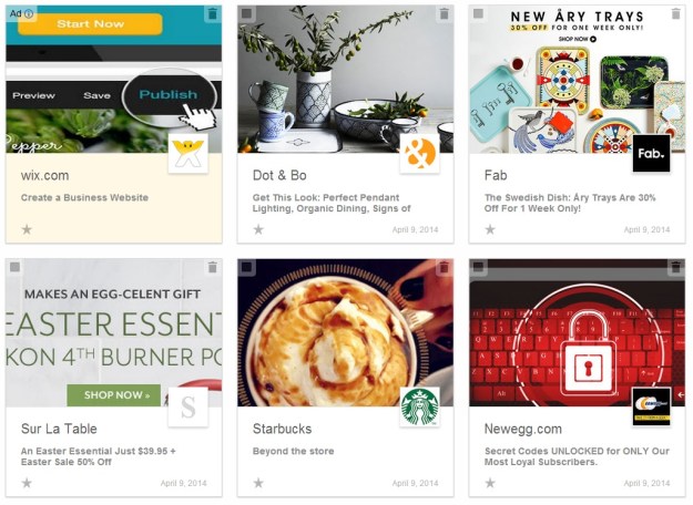
It is currently in beta, but when the Promotions Grid View is turned on, you’ll see your email in a visual grid. An image from the email is chosen for display and is scaled to fit. Your Google Plus icon appears in a small square at the bottom right of the image. It is probably not coincidental that the view grid bears a strong resemblance to the Pinterest interface. They have also added a button in the upper right corner of the tab that lets you toggle back and forth between the old list view and the new grid view. Every element of the list view is displayed in the grid view, but it is rearranged and, in some cases, dramatically resized in relationship to the other elements.
With the introduction of the grid view, there are now advantages in having one’s mailings land in the Promotions tab. As Facebook and Pinterest have proven time and again, an enticing image can lead to clicks. Whether or not marketers use this new feature wisely remains to be seen. At some point, it’s inevitable that some fringe-dwelling marketer will start using pictures of kittens to promote their products.
Email or Ad?
When Google introduced the Tabs last summer, one of the first things people noticed was that the ads, which were previously segregated above the email content, were now included at the top of the email list in the Promotions tab. They are identified as ads, and they are given a light beige background, but the fact they are within the Promotions tab made some cry foul. For those people, the new grid view is only going to make them angrier.
With the grid view, the ads are still placed as the first item in the list, they are still identified as ads in the upper left corner, and they still have a light beige background; but, as you can see from the image above, once you add images to the mix, these things get harder to distinguish, unless you know what you’re looking for. The first panel on the left is an ad. The middle panel is not an ad, but has been selected, which gives it a light yellow background. It is possible that once people get used to the interface, the ads will become more automatically identifiable and will be no longer considered duplicitous. It is also worth noting that the grid view always limits the ad display to one square, whereas the list view may contain more.
The Voodoo Grid
If an email that does not have an image specified for the grid display, Gmail will choose an image based on several variables. If it can’t find an image that matches the required variables, it will display either the alt text, or the first text in the mailing. According the specifications listed on the Google developer’s website, the grid prefers an image size of at least 580 × 400 pixels, but the grid display will accept anything down to 233 × 161 pixels. In some cases, if an image’s width is too much greater than its height (an image that is 750 × 161 pixels, for instance), the image won’t display even if both dimensions fall within the limits. If an image doesn’t have both width and height information for the image, Gmail may ignore it completely. There are several other idiosyncrasies that can affect an image’s display. Justin Khoo at FreshInbox has done a good job of cataloging these on his blog.
Choosing an Image
Fortunately, you don’t have to leave things up to chance. Google lets you choose which image to display in its Promo tab, and this is where things get interesting. To select an image for display, you can insert a bit of code into your email that tells Gmail where to find that image:
Insert this either before or after the email’s contents. If you prefer, you can use the longer version, which includes information about your company and your Google Plus address (more on this later):
Since the image in this case is coming directly from the provided href URL, the chosen image is not required to appear in the email. You could use an entirely different image, or, more logically, a modified version of an image from the email that is better suited to the grid display. The most powerful feature of the Promotions Grid—for the marketers at least—is the ability to use images that are specifically designed for the grid display without affecting the layout of your email. This opens up a whole new aspect to email marketing that, if other email clients follow Google’s lead, may result in an important change in email design.
The Visual Hook
In the past, the subject line was always the most important first element in an email. If the subject line didn’t compel the recipient to open the email, then it didn’t matter how good the content was, it would go unread. Coming in a close second in terms of importance was the From address, which is displayed either above or to the left of the subject line in most email clients. In the list version of the Gmail promotional tab, reading left to right, the From address is first, followed by the subject, and, if there is any room left for it, a snippet from the email contents (see The Complete Preheaders and Snippets Tutorial for more information on snippets and how to control their display).
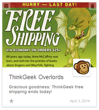
When reading text, our eyes naturally travel from left to right. The From address and the Subject line are given the same weight, and thus the same value, but it is still the subject line that compels us. The From line may help us decide whether or not we want to open an email, but the Subject Line is still the hook. Now here is the same email in the grid view:
It important to remember that this image was not made with the Gmail grid in mind (in fact, many of ThinkGeek’s emails are appearing in the Promotions tab without any images at all). Gmail looks for the largest image in the mailings and scales that image proportionally, then it displays the image from the top if the height is greater than the width, or centers it if the width is greater than the height. In this example, the height is greater than the width so the bottom of the image is cropped off. In spite of it, the image does a good job of imparting the most important information in the email. Reading from left to right is no longer an option, so the brain automatically categorizes the information, giving the elements the following levels of importance:
- Large image
- From address
- Google Plus profile picture
- Subject line
Technically, the Google Plus image and the From address are about the same weight visually, but your eye is still more likely to hit the From address first unless the Google Plus image is particularly striking (and if you haven’t verified your Google Plus page, now is a good time to do so). This means that the Subject line, which used to be the most important piece of introductory information in an email now resides in fourth place.
With the visual grid, in other words, the image is the hook, not the subject line. This is not to say that the subject line is no longer important, it is. It is still the hook in every other email client out there, and for anyone who opts out of the grid display in Gmail, but it does create something new for the email marketer to consider when putting together mailings. Since the grid view does not automatically expect the display image to be taken from the email’s contents, we recommend using this feature to create your own grid view images.
The Grid View Image
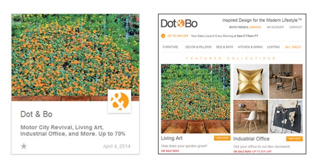
So why create a grid view image? After all, with a little care and forethought won’t your primary image serve the purpose? Yes, in some cases it can, but most of the time the images are there to serve a different purpose. In the first place, it is not always possible to assign the most useful image to the first position. Take this example from Dot & Bo:
The image that is displayed is in the most logical position in terms of the email content, but it does nothing for the grid view. In fact, nearly every other image in this email would have been better to get across the fact that Dot & Bo sells furniture for the home and apartment. Of course, Dot & Bo could have completely redesigned their email with the Gmail Grid View in mind, but why bother? A couple lines of code would have solved the problem.
Managing Grid View Images
You may not want to spend too much time working on images that will only appear in one email client, but if your email is either primarily text, or it does not contain specific images that lend themselves to promotion, you might want to consider creating an image specifically for the grid view. This is one of the biggest changes to hit the email marketing field in years, and you are going to want to take full advantage of this powerful new feature. You won’t want to miss our next article, where we’ll dig into the nuts and bolts of grid view design, demonstrating examples with quick and effective makeovers of real world mailings.


